S_V_H God Only Knows

God Only Knows, 29 3/4″ x 13 1/2″ Canvas, aluminum with wood features.

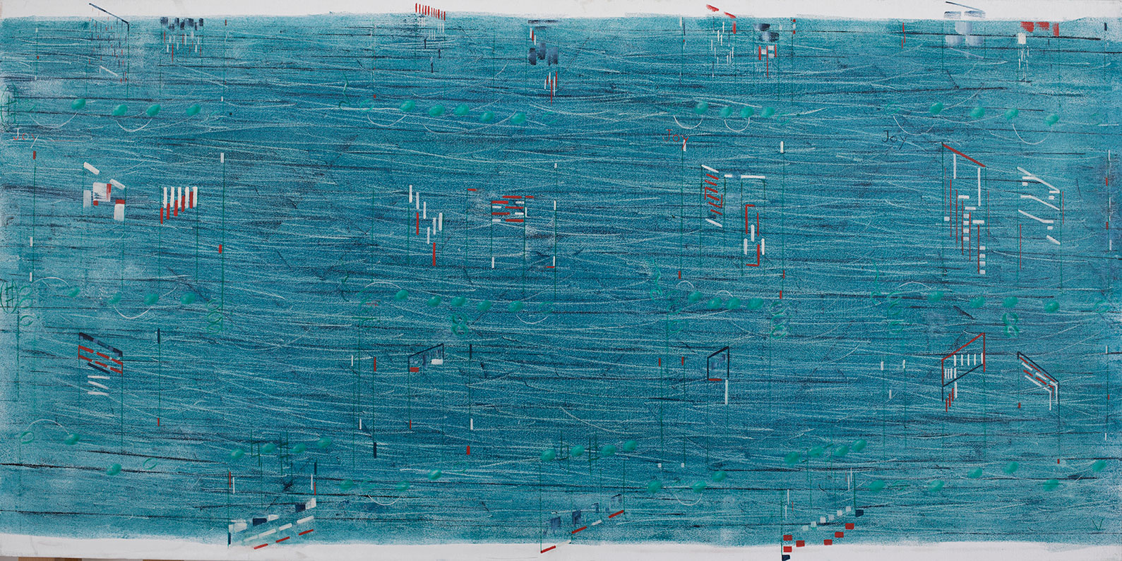
This little commission artwork is finished. It took a lot longer than I thought. The issue, and I already know this, is no matter the size of the artwork the prep, the decision-making and the problem solving ends up consuming the same amount of time no matter the size of the artwork.

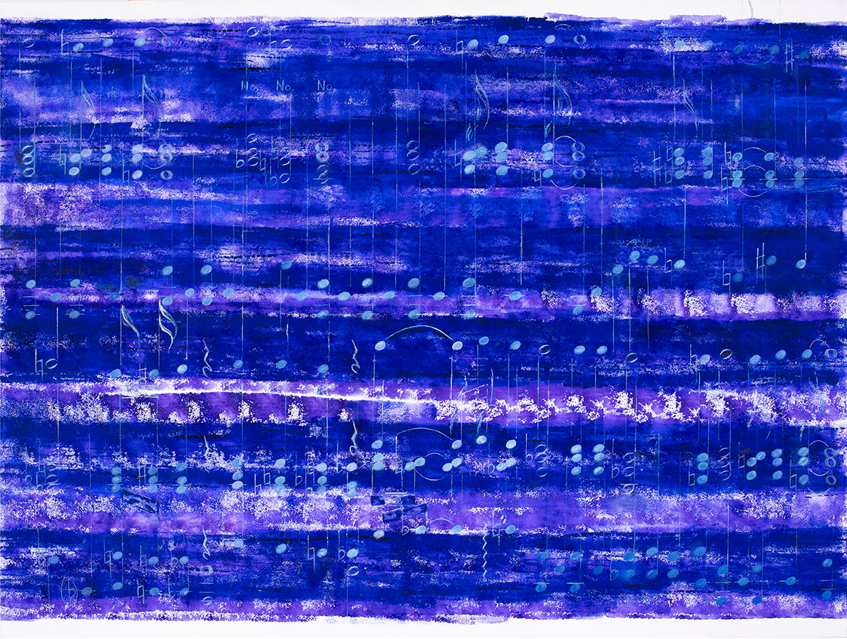
I am not comfortable working with the color green. That really is silly for I have a great range and variety of greens in jars to work with, and for this music green had to dominate the look.
So it does, but don’t expect the next artwork to carry on this look.

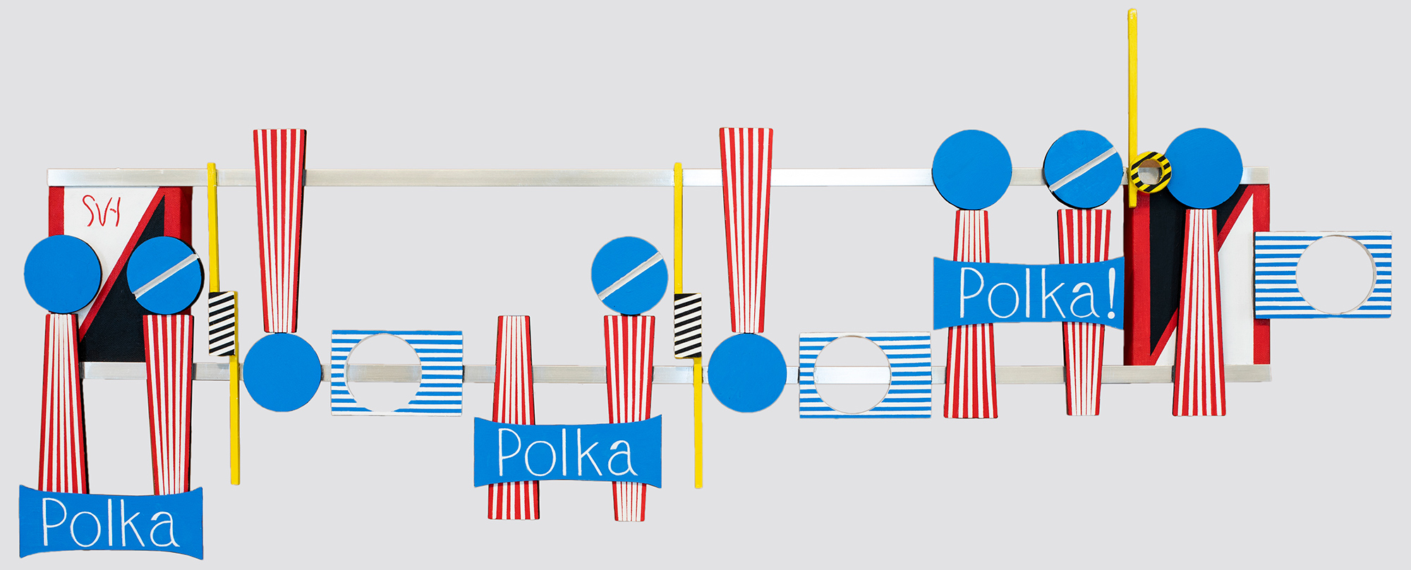
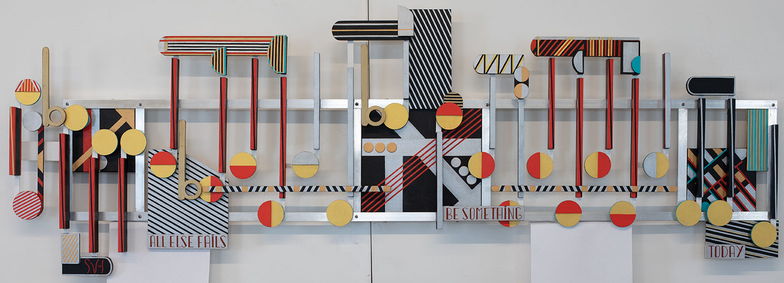
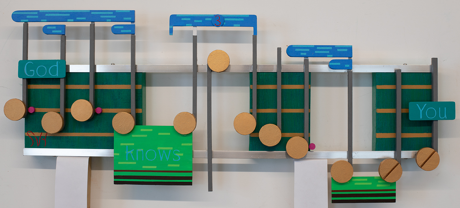
The words you see in this work, “God knows you,” come from the music’s lyric, “God only knows what I’d be without you.” What you see in these two sentences, are some shared words with different meanings.  My need, for any words that I use, is that together they do not refer directly to the music.  I always Google down three pages to confirm that there is no connection.  I actually like working with the words in this way.  These artworks go beyond the music that they start with, in direction and meaning. They also have greater depth than any abstract image of the music. As mention in many blog entries before, these artworks are a portrait of an individual piece of music. They represent a musical piece uniqueness and character.

I have to comment on two aspects of this artwork.  The blue you see above the canvases represent the sky. The lighter blue rectangles represent clouds.  The brighter greens and browns you see below the canvasses represent different layers of the earth.

Finally, I do not think I have ever used the word “God,” in any of my artworks. For this music it made sense. My lovely wife, Barb, pointed out that the word ‘knows’ was harder to read than the other two words.  Like all my earlier artworks I have always used one color for all the lettering.  This became a contrast issue after coloring in of the word ‘God,’ on a darker blue-green background,  and then using the same light blue for the word ‘knows’ that is on a lighter green background.  But, when I than tried a darker color for the word ‘knows’,  that made that word too prominent for its use.   My solution was to use the same light blue for all the words. This than allowed the important words “God and You’ stand out while the lighter looking word ‘knows’ to still connect the phrase.   A result, in doing the words this way, is that people will first see the capitalized words ‘God’ and ‘You, and then be presented  with the choice to read, or not, the softer looking in between word ‘knows.’  All this adds complexity, and challenge for the viewer to define their own meaning of this artwork and the music it is portraying.


Scott Von Holzen

S_V_H Liechtensteiner Polka Final Image


POLKA, POLKA, POLKA!
. . . . . .   ………   ………………….

This project titled, Liechtensteiner Polka, with the subtitle, Back-to-the-Future as a seven-year old living in a small town learning to play the accordion art project, is finished.

Below is a picture of my Father’s accordion, that I used for my later lessons.  I still have my little red accordion, but the bellows are bad. The bellows on this accordion are functional along with all the keys and the bass buttons.  Not bad for an accordion over 60 years old that never receive any special care.  To my disappointment it worth today what Dad paid for it originally.

I did have to adjust the straps, but still found myself struggling to put it on. The accordion is heavy.  After a little research on how to play and read the bass buttons, I eventually had the basics of the Liechtensteiner Polka, although not good enough to video the results. This art project is now over, and music from Mozart is up next.


To practice my instruments is a decision I have to make everyday in my Studio. I use my Studio time for creating and promoting this Art. Everything else that consumes Studio time than takes away from those goals.  The result is that although I would love to play the Liechtensteiner Polka on the accordion, I still cannot. I need more practice.  The accordion will stay in my studio to compete for Studio time along with my saxophone, violin, guitar, and my piano. Little do they know that I enjoy listening to great music more than actually practicing music.  Maybe this will change as this Art matures,  and I am looking for new directions in music.  Maybe, would it not be wonderful,  if someday I could actually play on any instrument, the Music I paint.

Scott Von Holzen

S_V_H Vogue Final Image

Vogue, acrylic on three canvases, with aluminum and wood features, 64 1/4″ in length by 22 1/4 in height.

Vogue, what the Hell are we looking at here? For the first time viewers of this blog they probably see a mixed media abstraction, minus fabric and beads.* To returning quests  Vogue’s style (stripped of emotion) is that of a three dimensional representation of a flow of music that is the theme Vogue. Looking at Vogue I can see this artwork in either way. Together that means Vogue shifts from the main purpose of the background which is to physically support the music.  With Vogue this is a return to the blending of the music into the artwork as seen in these early examples.

Joy to the World – 2006
Mood Indigo – 2007

Aspects of how Vogue blends the music into the background can be seen in comparison with In The Mood, the current header image of this blog site.  The obvious difference with Vogue is the amount of decorative design, and the overall use of the same colors for the music and the background, not seen in In The Mood.

A notable physical change with Vogue is the spacing of the music which is purposely tight, to create more tension between pieces. In comparison the music from In The Mood spreads across the background as if to take up space, resembling sheet music. Another blending technique is in the stem design. The stems used for In The Mood are all standardized, similar to their appearance in sheet music. With Vogue the sheet music look is broken by the varying depth of the stems across the artwork.

I consider Vogue a major work because of its size, complexity, and the time required, over three weeks, to complete. Vogue is the third original artwork completed this year. That means a possible total of only twelve new original artworks for 2018. That is not much output, that became startlingly obvious when the local gallery took seven of my current artworks. This left the number of newest works for other venues, very thin. That is where the development of my mini-artworks, that average each a day or less to produce, will help the production numbers.


(This video like all my videos starts out great for the first few seconds, and then quickly deteriorates into a lot of mumbling and incomplete sentences.  What saves this video is the self deprecation of the lyrics discussion near the end.  It is a laugh.)

Scott Von Holzen

*reference to a local artist genre