S_V_H Mercy, Mercy, Me final image

Mercy Me Constructive Sculpture 65.5L x20.5H x3.75D

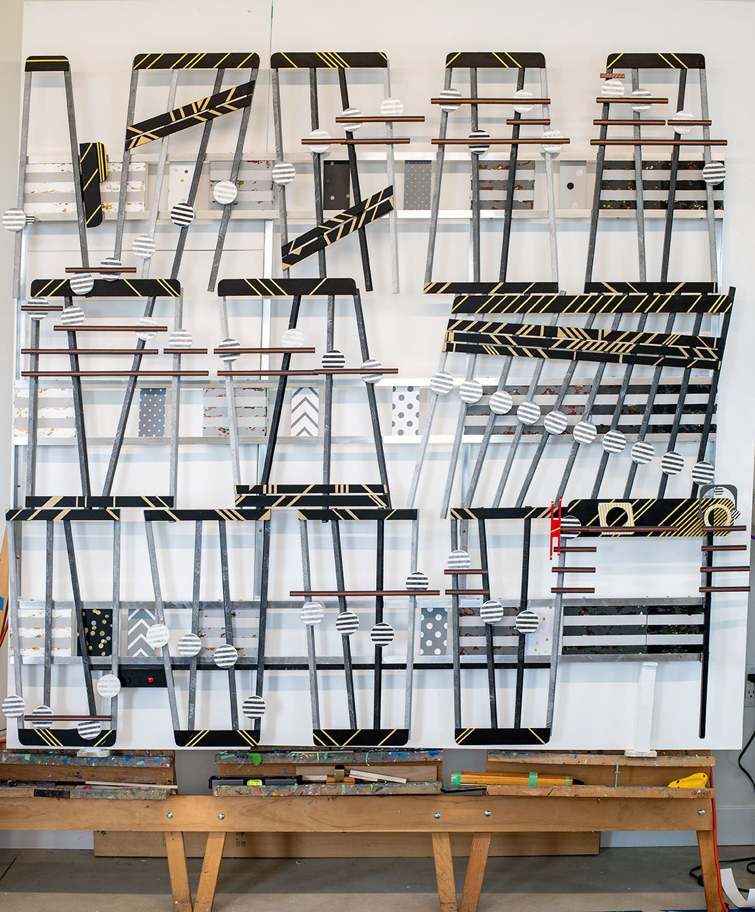
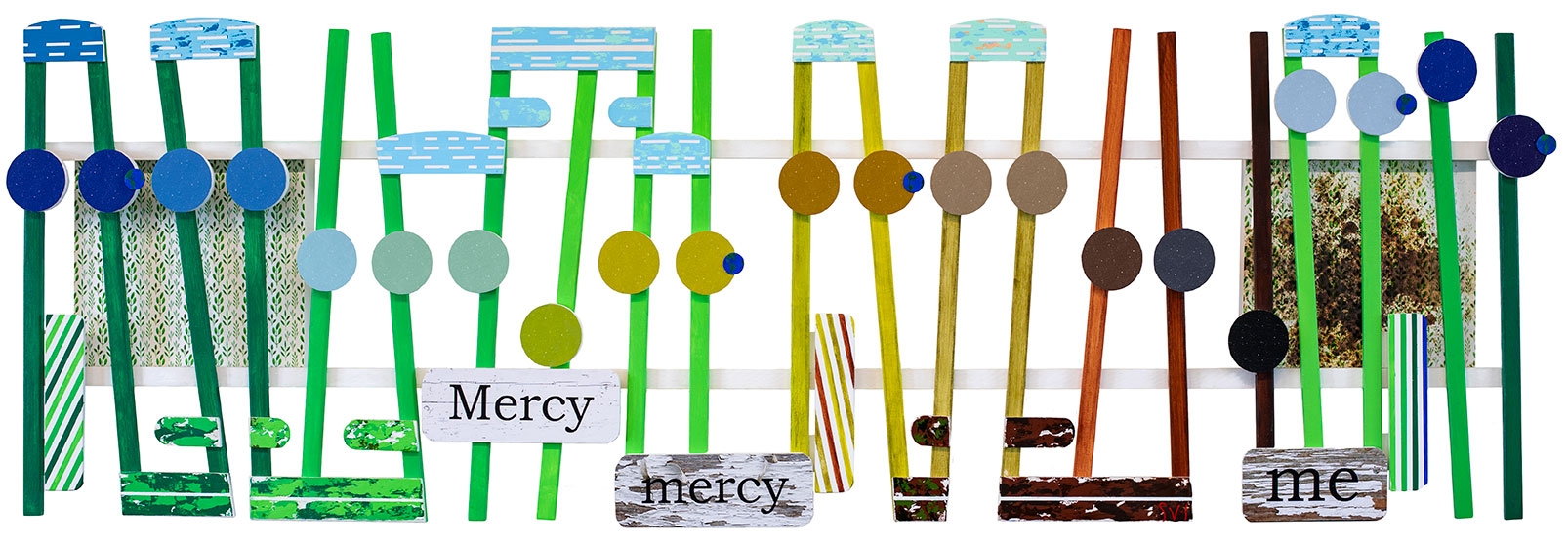
This is the final image of the music of Marvin Gaye, Mercy Me.  This artwork’s submission offers another opportunity for an upcoming exhibition that has an environment theme.  Early this year, I decided to not take part in any Art Fairs.  To make up for that lost exposure I made plans to apply to Call for Artists opportunities available in the state.  This spring I submitted my artworks to the Madison Museum of Contemporary Art, The Trout Museum, and to the local ArtsWest Exhibition.  They accepted me at both ArtsWest and the Trout but I missed the outstanding chance to show in Madison.  After applying for those shows, to my surprise, I found no other new up-and-coming Call for Artists chances to show in the state.  That was the motivation for me for this local show.

While working on Mercy Me, I received a new Call for Artists from the Pablo Center for the Arts for their 2nd annual Art show.  This is the same show last year that rejected Mozart’s Turkish March.  This year The Turkish March is on view at the Trout Museum.  Rejections are a part of finding your way.  Although disappointed by not being a part of the Pablo’s grand opening,  I moved on with only minor surface damage.  With that in mind, for this year’s Pablo show I will up game and create another even more outstanding artwork: The Blue Danube from  2001 Space Odyssey.   Under time constraints I felt it was now time to finish Mercy Me.

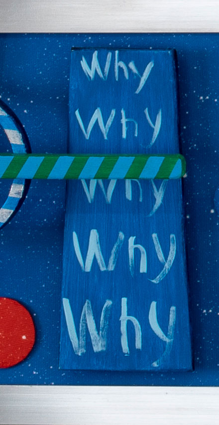
I saved time on Mercy Me by not installing the music hardware.  If the artwork makes it into the show, then I will upgrade Mercy Me with its accompanying music.  I then reconsidered the time-consuming job of hand painting the words for this artwork.  That resulted in finding three digital images of painted wood in different stages of peeling.  Those images are the backgrounds for the printed words Mercy, Mercy, and me.  I have always painted the words in my artworks knowing that art reviewers judge the quality of the craftsmanship.  For times’ sake printing saved a day’s worth of work, besides adding meaning to this artwork’s message: our responsibility for maintaining our environment.   The collage works by Pablo Picasso, and the combines by Rauschenberg, and my age made me reconsider the value of saving time.  I appreciate craftsmanship but the message should judge art.  Mercy Me took 22 days to complete.

Scott Von Holzen


S_V_H The Theme Schindler’s List – Final image

Constructed Sculpture of streched canvas, digital canvas prints, aluminum, and wood. 71.5 inches wide by 65.25 inches high.
L65″ x H71″ x D4″

I have completed the artwork, The Theme from Schindler’s List.   This picture is the largest project using aluminum framing.  The Theme from the movie Schindler’s List is six feet wide and sixty-five inches high.  If I had designed this artwork in 2018,  it would have been a long pencil-shaped flow of music eighteen feet.  What changed began in late 2018 with Africa the first artwork with multiple sections.  The boxy shape of Africa eliminated the limits of reasonable length and make hanging the finish works much easier.  There is still cleanup, photography, and a video to produce.  After, the plan is to hang this painting in the living room, for no other reason then hanging is a safe method for storing it.

Every new artwork comes with different challenges that need solutions.  From this project beginnings, I wanted this artwork large.  Big artworks have more impact on the viewer.  What I found out was that big artwork are difficult to handle in the more limited space of my current studio.  Not that I cannot do it.  In the past, this was not such an issue for I bolted multiple canvases together to create larger works in a studio that had the advantage of length.  I could then unbolt them for travel.   For this project, I needed a similar approach with my current angled aluminum framing.  The solution was to detach the bottom third aluminum framed section. I also experimented with another size reducing idea that allowed the music and the artwork to stay large but compacted.  Instead of reducing the size of the artwork I eliminated the spacing between the three sections. The recent artworks, Africa, Giant Steps and Rainbow have a considerable spacing between sections.   Although more manageable, I found that the build took on a busy confusing look.  This concern increase with placing the ties and beams.  All those narrow rectangle shapes painted black with gold striping could easily add clutter.  I wanted no more added confusion to this artwork.  My solution was to reduce their size and aligned them all across the artwork horizontally to counter all the vertical movements.

After, a long delay I upgraded the sound system used in this artwork.  In the past, I used a small plastic recordable sound box, used with stuff animals. It comes with a 1/2-watt amp with an inch size speaker. This worked well in my artworks because one model came with a  10-inch extension wired play button. This allowed me to mount the sound box inside the back of a canvas and the push button on the artwork.   For ten dollars each, this was an effective and cheap solution.  My new sound system comprises two, three-inch speakers powered by a two-watt stereo amplifier along with storage for audio files which I add using a computer.  In comparison, the price for this stereo upgrade is forty dollars.   What makes it worth the cost is my growing understanding of the capabilities of the free notation software by MuseScore.   I can now create ever better arrangements to play through a sound system with improved dynamic range, clarity, and depth that justifies the cost.

This artwork’s color style comes from the black and white movie Schindler’s List.  Red is the only stand out color used on the one sharp.  This color is to acknowledge the scene from the movie of the girl in the red coat.   As for the color gold, I learned its effects from past artworks to enrich the color black.  Finally, the small gray and black digital prints on canvas mounted wood I added for interest and to fill space.   I used two as faceplates for the speaker boxes.

I am unsure about doing another large work.  Looking back to 2012 I painted thirteen large The Four Seasons paintings over two years.  I finished them in a larger size studio. More room made it easier to handle fifteen-foot paintings and larger.  My current studio is nice but has less space for such size works. I can do large size works again, without a “bigger boat.”   Organization of my studio space will be an important factor in my success with my next big one.

I accomplished what I wanted to with this artwork. It is a good portrait of a touching and enduring piece of classical violin music. My next project is Mercy Mercy Me (Ecology).  This work will be my entry for a local exhibition that is due the first week in June at the local Pablo Art center.  I already have three rejections from them.   Hum, “things that make you go, hum?”  This could be my fourth not interested, but by applying, I am in the game, where I need to be.    Hum, at this moment, that is the way.


Scott Von Holzen

S_V_H Over the Rainbow 2019 Final image

Over the Rainbow L57.75 ” x H39″ x D3.5

Over the Rainbow 2019 is finished.  Rainbow painted in the style of Giant Steps has that improvisational look that originally I thought would only work with Jazz artworks such as Giant Steps and So What.  Rainbow shows that this jazzy more relaxed style of the music does adapt to the ballad,  and will probably work with other music genres, including Classical.  Another benefit of the music styled more casually, is that this than solves a longtime issue, of how to portray motion in a static artwork.

Over the years I have tried different ways to simulate motion in the artworks.  I even researched motion that was important to the art and social movement Futurism.   Good examples of my best earlier attempt at motion can be seen in a number of the Vivaldi Four Season’s artworks.

Vivaldi’s The Four Seasons Autumn Allegro. Length 15 feet.

For the Vivaldi Artwork Autumn to try to simulate motion I added a smaller circle inside the larger musical circle.  The illusion I wanted was that of a spinning ball inside the larger circle moving clockwise across the artwork.  The results were always mixed.  Other examples of this technique can be found in artworks from 2012 until 2015 when I finally abandon the idea with the switch to raised wood for the music.

As mentioned before the idea to allow the music to go off vertical comes from the artwork Blue Poles by Jackson Pollock.   An interesting critique of this artwork comes from the site jackson-pollock.com. “According to art historian Dennis Phillips,……… Because we look for the poles and miss much of the rest, the name is simply too distracting.”  Phillips is right for  I saw the poles as musical notes and the background as just that.  That is probably why there are no other mentioned Pollock’s with similar poles.

In summary, there are two big changes that occurred in Rainbow and earlier in Giant Steps.  The first is that I have moved away from longer than wider artworks, that were standard since the beginnings of this art, to a more squared look with the music now stacked in sections.   A practical reason for this move is the difficulty in storing these long delicate, with multiple parts, artworks.   Actually, no matter their length, my artworks these last few years, I have found,  can only be stored safely when laid down.  The other even bigger change, that also goes back to the beginnings of this art, was to drop the consistent upright stance of the music which, of course, resulted in making these new artworks look less static.

One troubling issue that lingers still, and affected Rainbow, was how to paint or not paint the canvases. There was even a moment that I thought about leaving them all white (my Robert Ryman moment).  Rainbow is just the latest artwork where I have questioned what purpose the canvases served, besides support for the music.   I escaped back to reality by deciding to paint only the two center canvases in an outer space type Rothko look.  I then added a variety of canvas-covered round wood pieces (I like circles having nothing to do with the music for their disruptive effect) for interest, and to connect the painted canvases to the other four covered by canvas prints.

Finally, I should mention the blue piece of wood with a relaxed handwritten word, why, repeated five times.  For this version of Over the Rainbow, instead of choosing Judy Garland’s version of the music, I chose Keith Jarrett’s jazzier performance and stunning ending. This artwork’s music is “If happy little blue-birds fly beyond the rain-bow why oh why can’t I?” These words are all sung by Judy Garland without any slow down until she sings the last word I.  All those extra whys is because of Keith Jarrett performance of those same last few notes,  where he slows down dramatically, drawn each note out.  On the first why he almost seems to pause.  At that first why is where I decided to add the extra whys, for fun, and to channel a tribute to Jean Michael Basquiat, and his painting that includes five Moses.

I am still planning on adding the red music button for the music to Over the Rainbow.  When I am finished I will post a video.

Scott Von Holzen