S_V_H Final Images & cover for Yellow

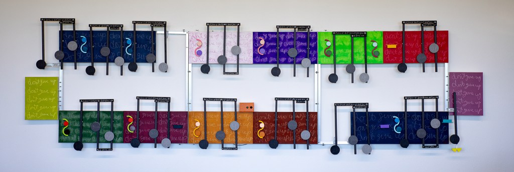
The new project Yellow offered the opportunity to use up some of my many shades of acrylic yellow. Or at less I could use those yellows that I had not dried out over the years. I have not used a lot of yellow in this art until this year. I have two music boxes where yellow is the dominate color. The other 2023 yellow was an experimental vertical for a Bach piece in which the music drops quickly. I thought the color yellow would add emphasis to the music.

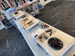
Back of Yellow showing all the disconnects needed to break down this artwork for travel.

I work long on these artworks that when I finish them, I truly feel finished and wish only to move on. Here are a couple of reflective thoughts on this work.

My original idea for this project was to make a shorter and smaller work around six feet. Unlike the previous project, Closer, I did not want to do another long horizontal. Although that did not happen, even though early, I chose 4inch 2way speakers with a 2 Watt stereo system instead of the 5×7 speakers and 20watt used in Closer.

I always chose for the visual part of the artwork an interesting part of the cover music. But since the visual part of the artwork only samples a small piece of the music box, that part has to portray a stand out part of the cover, and more so also presents an interesting visual.

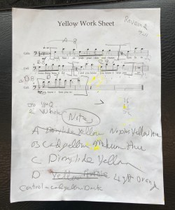
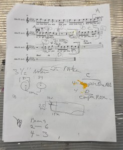
For this music box, there was only one section of the cover music that I thought would work. The pre-chorus has the visual look along with a nice beginning and ending (seen below in the worksheet). This choice then required a large reduction in the notation’s size to fit all the music. Even doing that, the artwork horizontally would have stretched to 114 inches. Yellow would be longer than the artwork Closer. To resolve this, I divided Yellow into two parts (similar to Closer) to under the 6 foot travel length. Then, to reduce Yellow’s length, I overlap the two sections to bring the artwork under 8 feet.

Sample taken from 8 pages cover of Yellow
The visual sample of the pre-chorus (seen in the edited sheet music above) starts at 26 seconds and ends at 45 seconds.

My other comment about this artwork was because of its divided sections needed for traveling. It was a learning and challenging experience to wire, and to balance for hanging, the two different arms of this work.
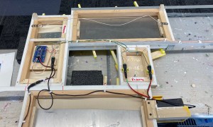
The speaker and controls wiring for Yellow

Scott Von Holzen

S_V_H Closer final image and music

The music box Closer ≈ L111″ x H22″ x D8″

This artwork’s color choices continue the trend of the previous artwork, Don’t Give Up. What I am trying to accomplish is to move away from the standard relationships of colors seen in a color chart. The two small end canvases are examples of this. Each of those canvases is a complementary color to the main connected canvases. But they are not complimentary to each other. With my past use of color, I may not have done it that way.

The left canvas is a light orange. I would have considered using orange’s complimentary color, which is a light violet for the far right canvas. Except then, its connected canvas would have to be painted yellow to remain complementary. So much yellow would have unbalanced the look of the artwork, and would not fit the music. I am a self-taught colorist, and therefore it has been a slow evolution. Right now my position is I want color to enhance the look of the flow of the music, provide a space for some lyrics, keep being in the background, and therefore emphasize the depth of the artwork.

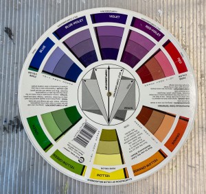
Your standard art store color chart

Talking about many years, as mentioned in the video, I have been painting music for over seventeen years. That is a decent artist’s career. What is missing from my artist journey is an acknowledgment in the air that this art at least blows a light flutter through the leaves of the tree of art. The lyric from form the song Scientist by Coldplay puts this all into perspective.”… Nobody said it was easy.” Taking that into perspective, therefore, I am putting this artwork aside and moving on to my next project, Yellow, also by Coldplay.

The music box soundtrack to Closer
Backside in progress of Closer

The center of the artwork is where the speaker wire disconnects. This allows me to unbolt the canvases into two pieces for travel. The two center canvases show the free-standing metal plates to which the note magnets connect.

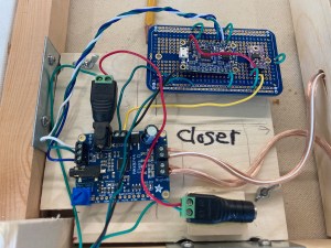
Closeup of Closer’s custom-built 20watt stereo system

The design of the stereo system has the look of, it’s a wonder that it works. Obviously; it does. The twenty-watt amp is on the lower left. I store the cover music on the soundboard at the top. Over the years, I have built a lot of these same systems. I construct them with a lot of careful soldering and multiple checks along the way. In the end, I am relieved each time that they work. The appearance is secondary. Besides, how else could I arrange all those wires? A feature I now do mounts the stereo system on a removable board. Removing the two wing nuts and the connected wires allows the entire stereo to be serviced outside the artwork.

The worksheet for the cover music for Closer

I thought I would include the end page of the worksheet for this artwork. The artwork visualizes the last three lyrical lines “We ain’t ever getting older.” I really dislike the word “ain’t.”

This YouTube video discusses Closer and plays the cover music version that I have since tweaked.

Scott Von Holzen

S_V_H Final image Don’t Give Up

Don’t Give Up ≈ L168″xH48″xD4.75
The music box Don’t Give Up rambling, and somewhat entertaining discussion of the artwork by the artist.

I started this artwork on June 16th with the creation of the cover music. I completed the project enough to do a final image, on July 31st. That timeline is about right for a large, complicated artwork project in the busier summer. Because of the many complications, notably hanging this artwork and keeping it from sagging over time, my wife suggested in the future not to go so big. I agreed. This project was one-of-one. Big art teaches big lessons, which I will use to improve the performance of a more reasonable eight-foot art project soon. Many of the issues I had with this project began with the need to break it down for travel. That meant three large pieces, about 48 inches by 42 inches, with detachable speakers. Connecting three such size pieces together to be a perfect rectangle puts a lot of pressure on the middle section. It would have been wiser and easier to have gone with two six-foot sections and detachable speakers. Although, with a lot of second, third and fourth efforts, I have the artwork hanging decently on the studio wall. For the next three weeks and three days, I will hang it at The Art Garage in Green Bay, Wisconsin. Will this large artwork make a statement? I doubt it. Will returning to making smaller, less expensive artworks make a statement? I doubt it.

In the early years of this art I received my first rejection letter. It was from a submission I made to the Center for Visual Arts in Wausau, Wisconsin. The artwork was my classic and wonderful 2007 painting of Beethoven’s Für Elise. They told me this artwork’s market was too small and would only appeal to musicians.

Für Elise 2007

I thought differently. I believe this art would appeal to anyone who liked music. It actually sold on my Etsy stores because the buyers knew the music. This art might have succeeded early if I would have developed a simple and easy painting style and did all commission works of requested songs. But, I hated the idea of doing commission works for the money. Besides, I wanted to paint the music I loved. And in time, all those early Etsy buyers slowed to a trickle for my artworks and even my prints sales fell over the years. I let the artwork store go, as shipping costs rose, and my style changed. The original plan for my two Etsy stores and even my Amazon store was to get this art’s name out there. That never happened. Like my exhibitions, I do the work and pay the price to show, and the results have always been the same: nothing to talk about. So it goes.

Scott Von Holzen