S_V_H The Blue Danube Waltz image 1

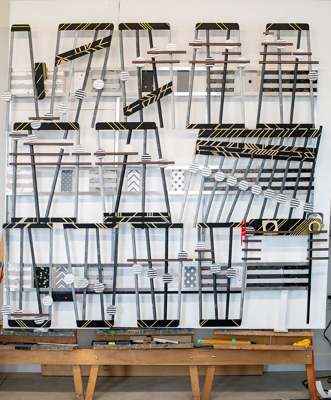
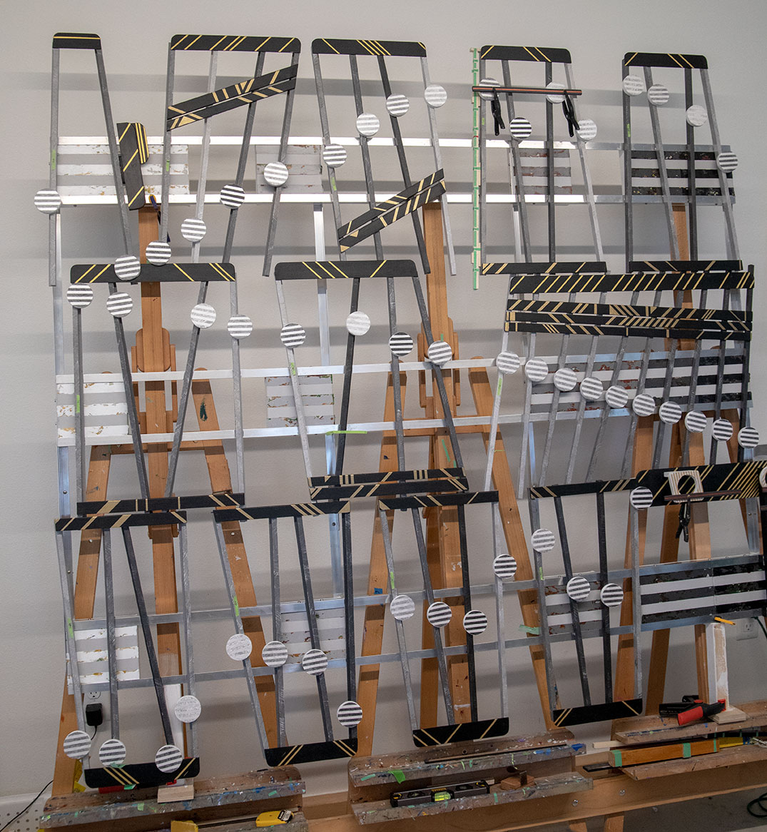
The first image of my newer projects show this small gathering of lots of pieces that took time and effort to produce. This artwork, The Blue Danube Waltz, will follow the trend of stacking the art in sections to form a rectangle look.  Otherwise,  my pre-2019 pencil shape style lengthens this artwork to over twelve feet.

Once upon three years, I was a student at the University of Wisconsin Madison. On rare occasions, on campus, I would go to a movie.  I recall only two times, but not at a theater.  On campus, now or then, movies were free or cheap.  One movie I remember seeing was Deep Throat. Yes, that movie. How could you not?  Away from a small town, I had a deep curiosity in the ways of the big town.  The other more memorable movie, that left a lasting impression, was 2001 Space Odyssey. This movie stirred emotions for Johann Strauss’s waltz,  and the theme of this artwork, The Blue Danube.  The unpredictable combination of the 3 4 beat of a waltz and images of earth from space captivated me.  Here is a clip from that unforgettable sound and visual of The Blue Danube.

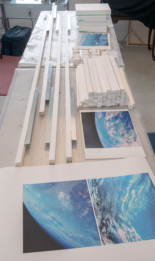
In this initial image, you see the second version of digital canvas prints.  The first time I printed them I took their look from the movie clip to be more green than blue. Looking at the accompanying scenes the earth appears in an array of bluer green colors.   Noticing that, I removed the first set of glued prints from the canvas.   No matter how I disliked reprinting, I pulled back on the green.  I increase the color blue to give the oceans a more natural look.  Using colors from a video as a starting point is a frequent procedure for me.  It connects the art to the music.

I mentioned in a blog post about last years rejection by The Pablo Center’s Annual Juried Exhibit: Confluence of Art.  What a way to motivate me.  This year’s judge may again reject this art.  The judging varies each year and is subjective, and uncertain even if the art is ready for prime time viewersTo make some sense of this nonsense, I have a favorite quote from Velveteen Rabbit, “…. once you are Real you can’t be ugly, except to people who don’t understand.”  For me, the quality of this art is there, but if it does not win recognition, unlike the art world, I understand.

Scott Von Holzen


S_V_H The Theme Schindler’s List – Final image

Constructed Sculpture of streched canvas, digital canvas prints, aluminum, and wood. 71.5 inches wide by 65.25 inches high.
L65″ x H71″ x D4″

I have completed the artwork, The Theme from Schindler’s List.   This picture is the largest project using aluminum framing.  The Theme from the movie Schindler’s List is six feet wide and sixty-five inches high.  If I had designed this artwork in 2018,  it would have been a long pencil-shaped flow of music eighteen feet.  What changed began in late 2018 with Africa the first artwork with multiple sections.  The boxy shape of Africa eliminated the limits of reasonable length and make hanging the finish works much easier.  There is still cleanup, photography, and a video to produce.  After, the plan is to hang this painting in the living room, for no other reason then hanging is a safe method for storing it.

Every new artwork comes with different challenges that need solutions.  From this project beginnings, I wanted this artwork large.  Big artworks have more impact on the viewer.  What I found out was that big artwork are difficult to handle in the more limited space of my current studio.  Not that I cannot do it.  In the past, this was not such an issue for I bolted multiple canvases together to create larger works in a studio that had the advantage of length.  I could then unbolt them for travel.   For this project, I needed a similar approach with my current angled aluminum framing.  The solution was to detach the bottom third aluminum framed section. I also experimented with another size reducing idea that allowed the music and the artwork to stay large but compacted.  Instead of reducing the size of the artwork I eliminated the spacing between the three sections. The recent artworks, Africa, Giant Steps and Rainbow have a considerable spacing between sections.   Although more manageable, I found that the build took on a busy confusing look.  This concern increase with placing the ties and beams.  All those narrow rectangle shapes painted black with gold striping could easily add clutter.  I wanted no more added confusion to this artwork.  My solution was to reduce their size and aligned them all across the artwork horizontally to counter all the vertical movements.

After, a long delay I upgraded the sound system used in this artwork.  In the past, I used a small plastic recordable sound box, used with stuff animals. It comes with a 1/2-watt amp with an inch size speaker. This worked well in my artworks because one model came with a  10-inch extension wired play button. This allowed me to mount the sound box inside the back of a canvas and the push button on the artwork.   For ten dollars each, this was an effective and cheap solution.  My new sound system comprises two, three-inch speakers powered by a two-watt stereo amplifier along with storage for audio files which I add using a computer.  In comparison, the price for this stereo upgrade is forty dollars.   What makes it worth the cost is my growing understanding of the capabilities of the free notation software by MuseScore.   I can now create ever better arrangements to play through a sound system with improved dynamic range, clarity, and depth that justifies the cost.

This artwork’s color style comes from the black and white movie Schindler’s List.  Red is the only stand out color used on the one sharp.  This color is to acknowledge the scene from the movie of the girl in the red coat.   As for the color gold, I learned its effects from past artworks to enrich the color black.  Finally, the small gray and black digital prints on canvas mounted wood I added for interest and to fill space.   I used two as faceplates for the speaker boxes.

I am unsure about doing another large work.  Looking back to 2012 I painted thirteen large The Four Seasons paintings over two years.  I finished them in a larger size studio. More room made it easier to handle fifteen-foot paintings and larger.  My current studio is nice but has less space for such size works. I can do large size works again, without a “bigger boat.”   Organization of my studio space will be an important factor in my success with my next big one.

I accomplished what I wanted to with this artwork. It is a good portrait of a touching and enduring piece of classical violin music. My next project is Mercy Mercy Me (Ecology).  This work will be my entry for a local exhibition that is due the first week in June at the local Pablo Art center.  I already have three rejections from them.   Hum, “things that make you go, hum?”  This could be my fourth not interested, but by applying, I am in the game, where I need to be.    Hum, at this moment, that is the way.


Scott Von Holzen

S_V_H The Theme (Schindler’s List) image 4

This artwork is looking less chaotic by adding my slurs, beams and even a tie.  Those features help to break up the vertical back-en-forth visual wishy-washy of the music,  while also filling space.  Their mostly horizontal placement connects to the artwork’s three frames,

This artwork is part of the project to answer two questions: can I make larger artworks in a breakdown way so I can transport when needed.  I accomplished that.  I can remove the bottom section of this artwork which then allows the top two sections to fit in the back of RAV4.  Second, can I lay down my music flow in a less rigid way ( a difficult task considering that I do read and understand musical notation) and move even more away from the design rules of notation.  That change would not affect the casual viewer, but for those that read music (an important group of supporters), to decipher the music of the artwork would be more challenging.  Here is the story behind why I came up with the second question.

Last fall I exhibited at the Falling Leaves Art show.  The show was indoors at a nearby high school that had a wall made to hang items.  This then made my setup easy and simple.  It was at this show that I hung a signature artwork, Mozart’s Turkish March, that also had a music box installed.   This artwork did not get accepted (a major disappointment) for the first art show at the grand opening of our new art center.  I thought this fine work needed to be shown in public. It was during the setup that the high school music teacher came up to me, and after taking a  quick look at the artwork, told me what the music was before I play the music.  That was a big surprise.  I don’t recall thinking that he had heard me playing the music, or if he had overheard that it was a Mozart artwork.  After he left I had a strange feeling that my artworks were still uncomfortably too close to sheet music.   I felt that after more than twelve years of trying to separate my art from sheet music, at less with music teachers,  my feelings were how easy I was still making artworks that a trained musical eye could still connect my music flow to sheet music.   Of course, I  feel that people following the flow of the art,  when playing the music, or knowing the music is and always will be a fundamental part of understanding this art.  That was certainly still obvious today 2018’s Turkish March.  It is with this experimental artwork, thought of an advanced 2020 project, that I am experimenting with loosening up what is left of my own rules of sheet music.  If this works it then may be necessary for musicians to read the title of the artwork for the clue to deciphering what the theme of the artwork is.   On second thought, maybe it would have been a lot easier to paint music in a unique style if I never learned to read music.  On third thought, I would not be painting music,  it all, if I did not at first understand the notation behind the music.

Scott