S_V_H Metamorphosis 2 image 1

Metamorphosis 2 plan layout. This image length is 100 inches with ten inch wide speakers boxes.
Metamorphosis 2 Music Box draft cover music.

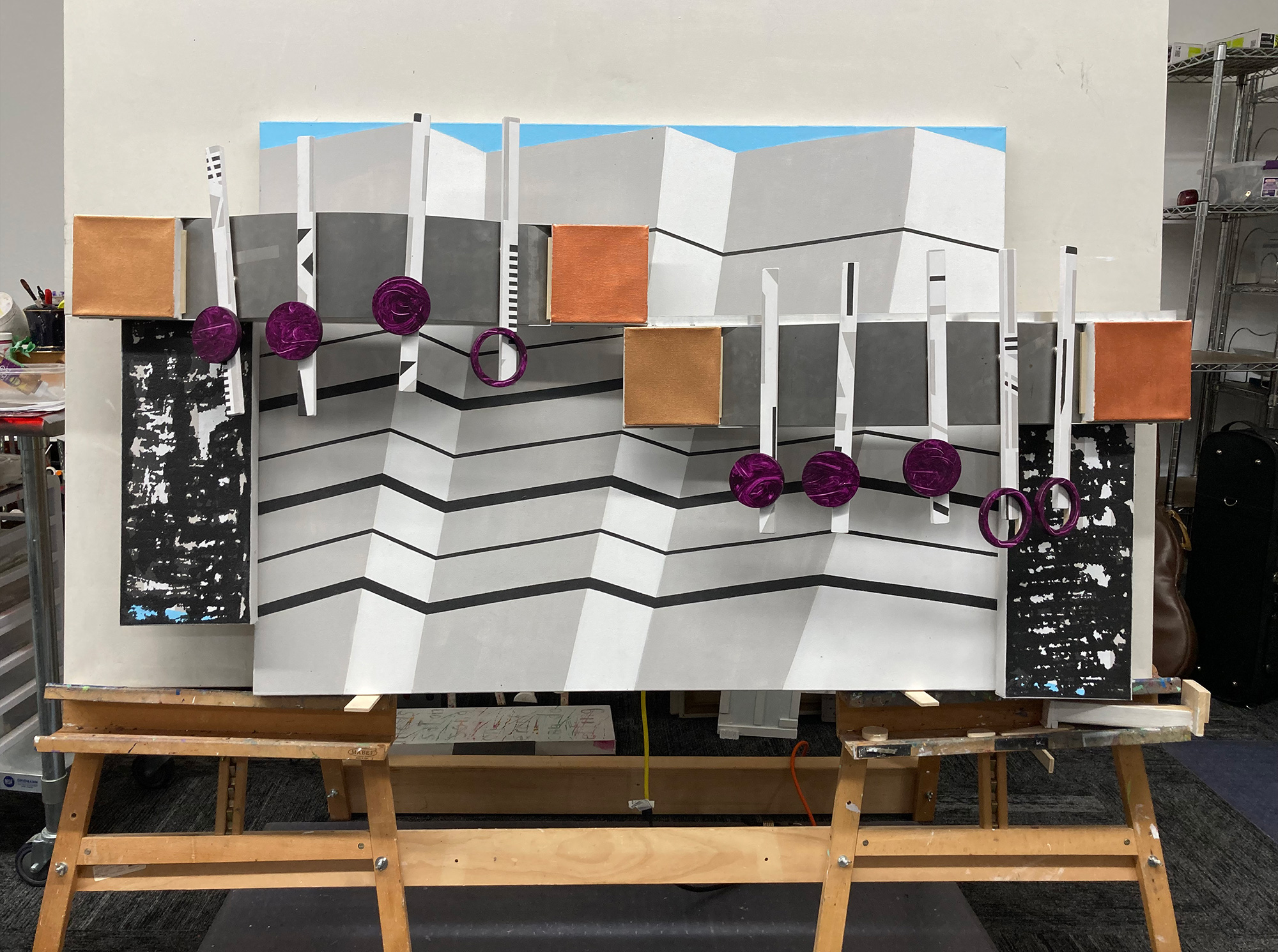
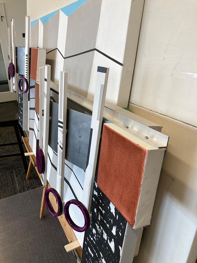
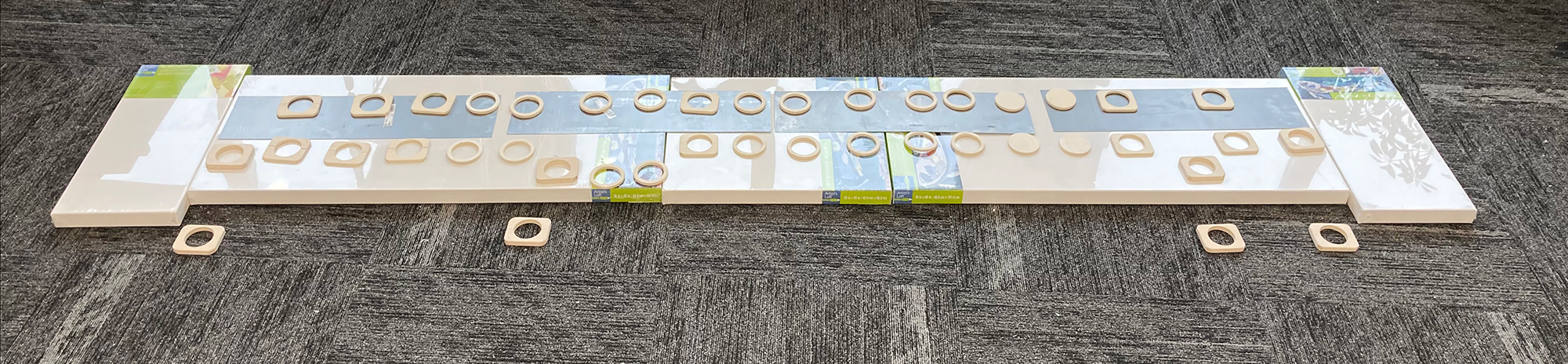
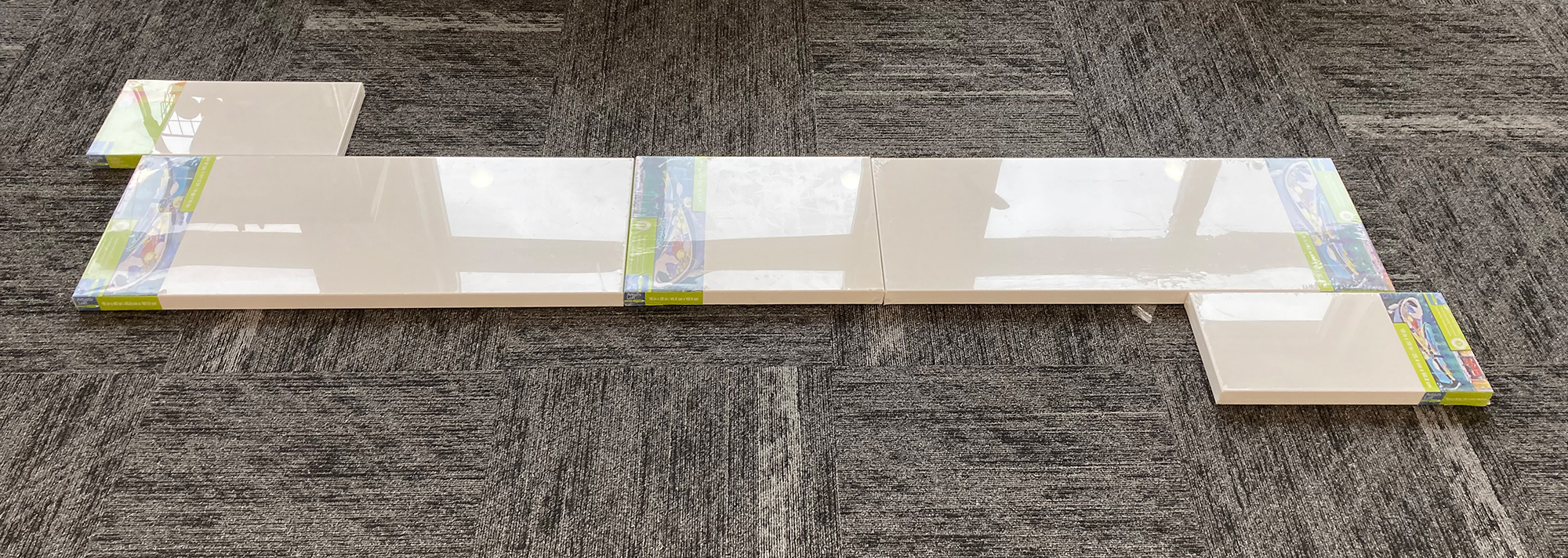
The length of this artwork, including the music boxes, is ten feet. This size will not travel well. In order to exhibit this artwork, it will need to be dismantled. To do this, the 16×20 inch middle canvas will be bolted on both sides to the main panels, secured with wing nuts that are removable. This enables the artwork to be broken down into three pieces for travel.

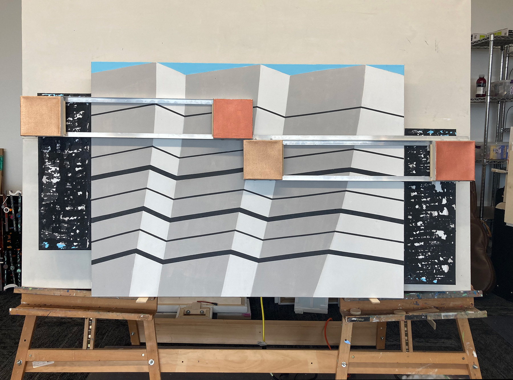
I did not show in the preparatory image above, but I will set the two speaker boxes on top and in front of the main canvases. This design accommodates the depth needed for the speaker boxes. This method I used in the Beethoven project to allow the main canvases to hang closer to the wall when hung.

The cutting out the wooden pieces of the music has from the start been a messy, noisy, tedious, hassle. This grew worse when I started adding playable music to my artworks. To match the increasing length of the music, the number of notes also grew. At first, I only needed to cover a short phrase or a sentence from the music. My cover music soon became mini soundtracks. This then required me to use increasingly smaller notes in order to place them on an artwork that I could handle reasonably. I dislike small notes. That then resulted in the change in this arts philosophy with the move to sampling. That story is told in the 2020 last Christmas painting blog.

In the past, I made the switch from quarter inch to half inch lumber when creating notes two inches and larger in diameter. For this project I have returned to using quarter inch wood for the 3 inch half notes and slightly smaller quarter notes. Doing that saves production time, cuts the dust, and reduces the tedium of the cutting out and sanding. I plan on using half-inch wide for the base notation because of their deep dramatic sound in the cover music. Also, influencing my better use of my time is the ever improving cover music that I have enjoyed creating. This means that the definition of this art as both a visual and a performance presentation is increasingly becoming balanced and of equal value.

As I neared the end of this blog entry, I changed the plan. Realizing that a ten foot long artwork would limit exhibition placement “In the search for empty walls” (my quote), I moved the speaker boxes to the sides. This reduces the overall length to nine feet. That will be an improvement if I solve the probably design issue when attaching the music.

Scott Von Holzen

S_V_H Philip Glass’s Metamorphosis 2

This is the piano only music box draft of the audio cover of Philip Glass Metamorphosis 2. I need this first in order to build the music.

I edited this 4 minute long music down to around a minute-and-a-half, for the next music box,

Starting at 1:45 Philip Glass in 1988, playing live Metamorphosis no. 2

I have, over the years, wondered about the composer Philip Glass, but thought his music was too inventive to work with. For reference I checked iTunes, which I have not used in years, and found four pieces of his music out of over 23,000 songs I own. Of those four songs none have a rating. In my iTunes days, I had little interest in Philip Glass’ music. Obviously, ” I was so much older than. I am younger than that now,” for his time has arrived.

That happened when I was hunting for music after finishing the Beethoven’s 5th project. Still in a Winter mood, no matter the lack of snow piles, my plan was to do another classical music box. To keep the cover music learning process going, I stayed with the piano as the principal instrument. I first turned to Chopin, but I have already done enough Chopin to last for now. Certainly there have to be other classical composers not named Chopin, Mozart, or Beethoven that would make an interesting music box. One search solution was to listen to playlists that fit that requirement. In Spotify, I found the playlist, 50 Greatest Pieces of Classical Piano. Only a few songs in I heard Metamorphosis no. 2 and thought its haunting melody was perfect for my mood. Now that I have a decent piano version of the cover, the next step is to cut out of wood the many half and whole notes I will need. I know the notes will be large and more than the Beethoven work. That means I am going to have to innovate to keep the main canvas under six feet required for travel.

Scott Von Holzen

S_V_H Beethoven’s 5th image 3

This image shows the design of this music box, with the two side canvases out front of the main Gehry canvas. Length 68.5 inches.
Side view showing the 8.25″ depth of this artwork

The two first image shows the testing arrangement of the opening notes of Beethoven’s 5th Symphony place on sheets of curved steel crossing the main Frank Gehry background canvas. The side view image shows the right side speaker box now placed out front.

Wikipedia link to image

Even though the artwork will represent those first famous beginning notes to the 5th Symphony, the unfinished music box audio instead places that dramatic starting music at the end. It is my effort to create anticipation of the obvious.

The image below shows the original concept, with the speaker canvases bolted to the Gehry canvas. This worked fine until I created the speaker boxes. Because the speaker canvases were mounted even with the main canvas, their added depth of 60 millimeters extending from the back brings the main Gehry canvas out from the wall. This is not ideal for the hanging wire on the Gehry canvas. Plus, having all three main canvases even across the artwork flattens the artwork. This is seen in the earlier image below. Bringing the two speaker canvases out front of the larger main canvas pushes the music of the artwork out to a depth of 8.25 inches. This is the deepest artwork I have ever created.

The three main canvases even across the artwork.

For the four smaller 6 by 6 inch canvases I chose the Beethoven’s friendly colors Iridescent Copper and Copper Light. Those colors also work in the style of Frank Gehry’s. I see his art as disruptive architecture. That is exactly what I want this art to be: more arty, less crafty. Their solid coloring needs more interest and maybe a closer connection to the Gehry canvas is my concern.

Scott Von Holzen