S_V_H 3rd image of All too Well

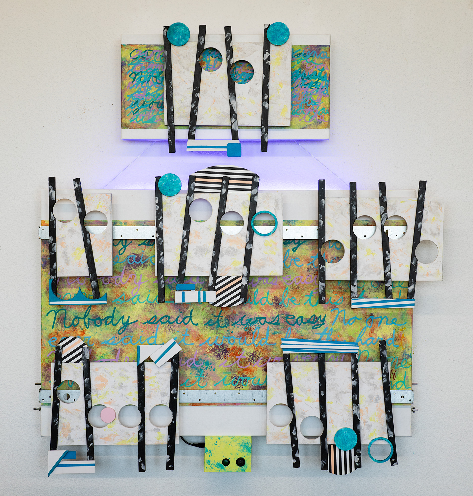
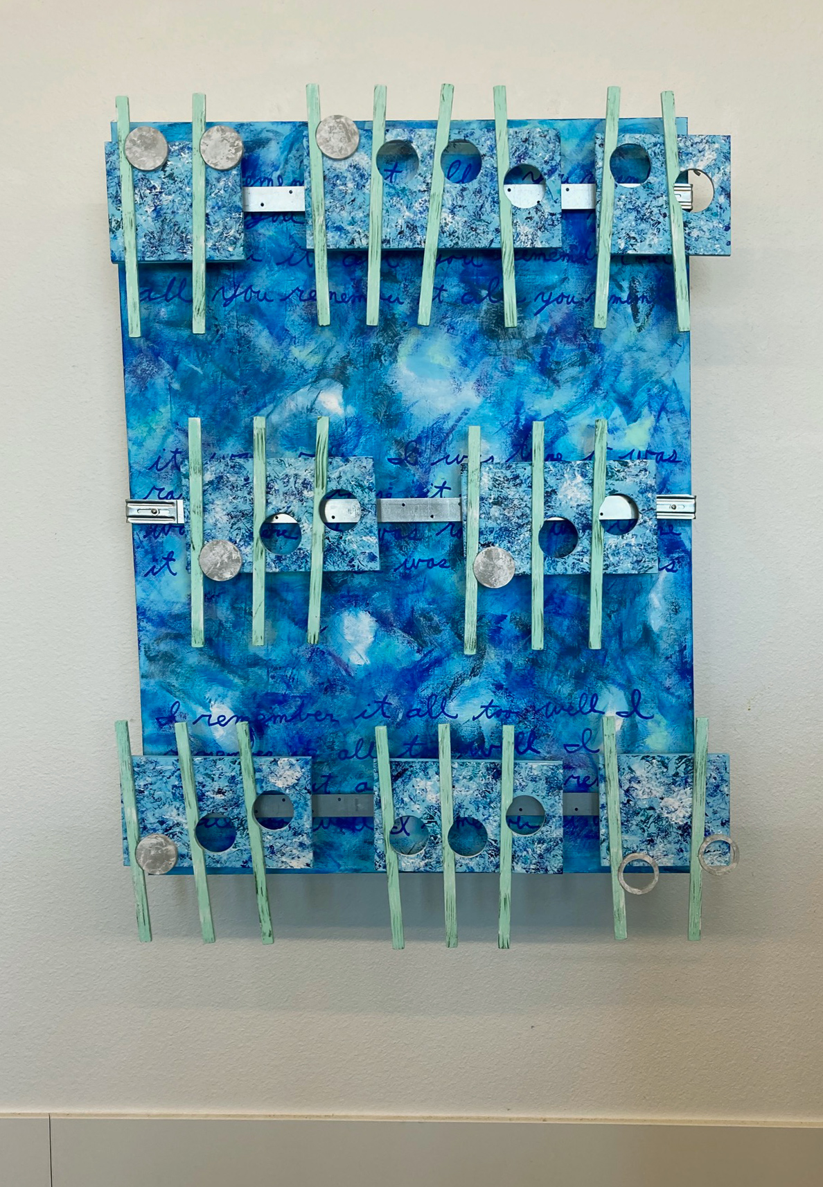
The repeating groups of words under the attached music match the flow from my cover music of All too Well: “you remember it all,” “it was rare I was there” & “I remember it all too well.” On the backside of this artwork I have already added the speaker boxes that then push this artwork out 6 plus inches from the wall. I was not sure I could take an ordinary canvas and mount it far out from the wall, but the side look works, and the side mounting of the speakers improves the stereo soundstage. Still to be worked on is the building of the stereo system, the mastering of the cover music and the fine tunning of the artworks sound quality.

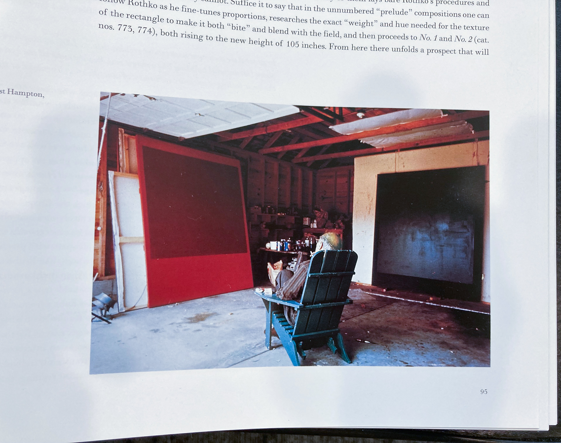
The move to using canvases measuring 36 inches in height by 30 wide, as mentioned before, is from taking another look at the style of Mark Rothko’s much larger sized artworks he created on rectangular canvas. This choice to use a consistent sized canvas has good reasoning. An important positive is that smaller and consistent size artworks are easier to travel and to store. A marketing point is that the rectangular shape of art remains the major look hanging in galleries. In comparison much of this art over many years has been irregular shaped, or stretched long (consistent with the look of sheet music). What is an unusual look is this year’s move to smaller size artworks. Surprisingly, the idea to reduce this art size resulted in using two different sized canvases hung together. Another positive is that using a consistent size canvas provides a template for future artworks, simplifying their construction, saving time and money (this art is all self funded). Finally, I looked at Mark Rothko’s hundreds of vertical rectangular canvases, never hearing or reading any review a complaint about their consistent shape. Similarly, I have never heard a remark about the different shapes of this art. If the rectangle worked for Rothko, I think I can make that same shape work for this art. Maybe for years.

Scott Von Holzen

S_V_H 2nd Image All too well ………………………….(plus, I am done chasing my tail)

All to Well main canvas

This canvas background image I like the diverse use of colors and the depth. This style of blending different colors together, so far, accomplishes what I want with a background: a straight forward delicate balance of self-effacing mix of colors that projects interest, and a new look for this art,

It took me a while to find this image of Mark Rothko, that for me, best portrays this artist. It reminds me of another, more famous image by Rembrandt. I relate in depth to both artists, especially Rothko in his style and rectangle canvases. These two images have pointed me back in a direction that, over time, my pride has selfishly pushed aside. This art was supposed to be about the art and only the art from my first music painting in early 2006. It is a reminder of who I once was. That original artistic purpose has encouraged and supported me throughout the years, beyond my expectations. But there has been at times a wavering. If I focus on originally what gave this art life, then that means I must subjugate concerns for fame and fortune. The enormous benefit to this is that I can avoid the typical pressures all artists eventually face when driven by the need to compromise their art for exposure and financial gain. Nothing wrong taking that path, but I prefer to follow in the spirit of Robert Frost: “Two roads diverged in a wood, and I— I took the one less traveled by, and that has made all the difference.” The difference is this art only has to please one person, me. This then allows no constraints, no rules. I chose my own compromises. I chose my direction. I chose all the decisions about this art. This allows me to reject conflict, remorse, disappointment, and frustrantion. Therefore, when I wish to, I can play the art game without expectations, for my goal is clear. To be true to oneself, I know the work ahead has only one direction, down that path that is far less traveled.

What I mean by chasing my tail seems obvious from my comments above, but I will summerize: It’s the art, stupid. Never forget, it’s the Art. Therefore, your’re direction is obvious: keep on keeping on.

Scott Von Holzen

S_V_H The Scientist final image

The Scientist ≈ H42.5xL38.5xD6 inches

I did not really want to do another Coldplay song, but the music was too interesting to pass up. This music caught my attention when I was in a Thunder Road mood. I idea that my music mood has a range comes from listening to the up lifting Bruce Springsteen’s “Thunder Road (Live VH1 Storytellers),” to his followup, which counters Thunder Road, his reflective song “The Promise (Live in New York City).” Bering in a Thunder Road moment, I still needed the backup of the music’s lyrics that appear on the artwork. They read: ” Nobody said it would be easy. No one said it would be this hard.” Although I don’t think the casual viewer understandably finds this art difficult to grasp, this music’s words are relatable to me and others. They point to the value of the music being portrayed. This contrasts with the dizzying artspeak that major galleries use to describe the art and the artists they represent. Check out the Gagosian gallery’s understandable word salads, descriptions.

For this project I opened up my choices of colors to colors that only kinda work together. I have found that colors that seem to go somewhat in the same direction look fine on the finish work. An example of this is the colors of the main canvas. I list titanate yellow and a yellow green. Those colors worked together. I then mixed in a complementary medium violet, a relatable cobalt teal, and finally drifted off the color wheel with light magenta and a deeper orange. All look fine after I balance the strengths of each of the colors so that they flowed together across the canvas. My changing emphasis is now on using color strategically across the artwork’s appearance, rather than relying on dominant solid colors to dominate the artwork and therefore the viewer’s attention.

The music box cover of The Scientist

I love what I have accomplished with this cover music. What is being played and heard from each note of this cover, from its emphasis to its blending, is based only on my choices. There is no AI help in the production of this music. I know well that AI could surely improve the quality of the master of this cover, to the possibility of even being fine art music, but this art is not about fine art. My artworks reject fine art, for that is not who I am. Therefore my music to be real must come from me. I understand that many significant advantages of an AI assistant, but did Mozart, Beethoven, or Vivaldi have assistants? To be real art. The art has to be real. To be real, the music has to be real. AI is not real, not human. I am. I am here. AI machines will live forever, I will not. This is my time, my moment to let fly the butterfly effect on contemporary art.*

Scott Von Holzen

* “The butterfly effect is the idea that small, seemingly trivial events may ultimately result in something with much larger consequences” – HowStuffWorks