S_V_H Just Another Day Image 1

This color theme comes from a building. I will explain.
The setup
This is an advanced version of the music box software created in the StudioOne DAW software.

Just Another Day is music by Jon Secada. Here is a better live video and sound presentation from a Stound Stage performance in 2017. This music was originally released in 1992.

This music is not a classic from my past. I do not remember if I ever listened to it when it was first released. It is a nice catchy pop tune that I thought I could work with. I have new drum software and this music has a simpler drum beat to start the learning process. Also, I wanted to do a smaller artwork and the song’s chorus length works for the artwork and the cover music.
I must admit that I have forgotten any other motivations I could have for painting this music. Many of my music choices just happen. I probably heard this song on a Spotify Daily Mix, and it fit the mood and the size of the music I wanted to paint.

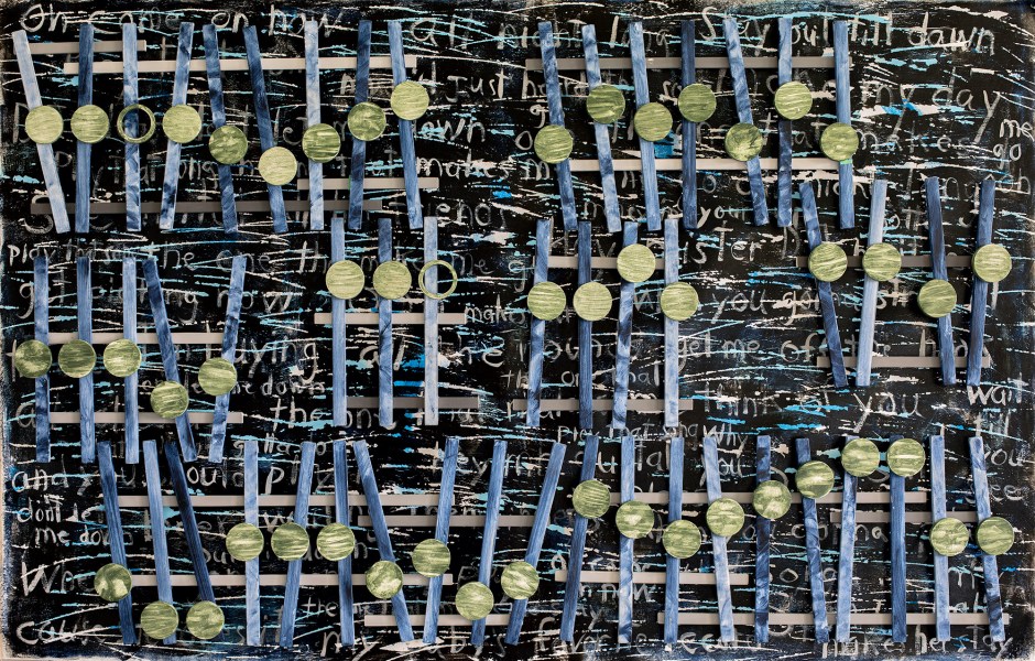
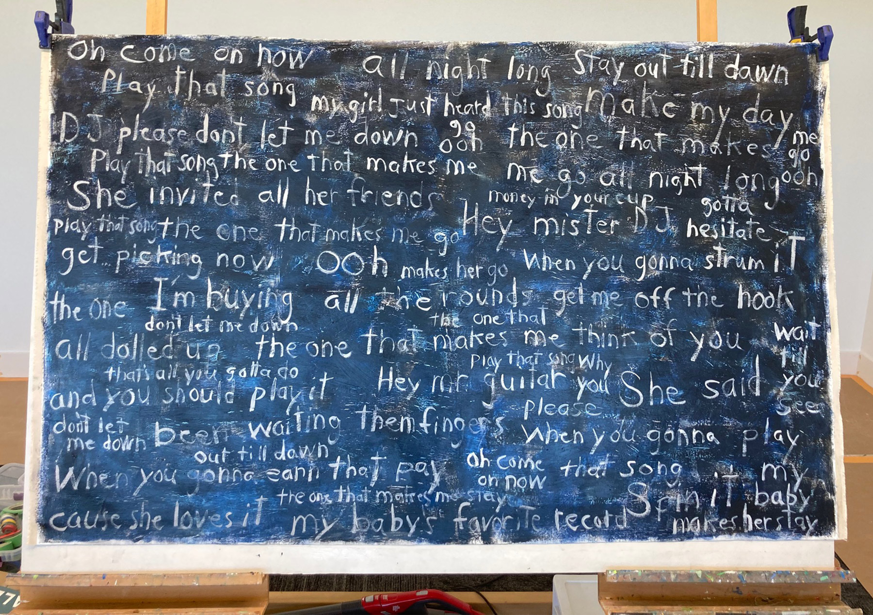
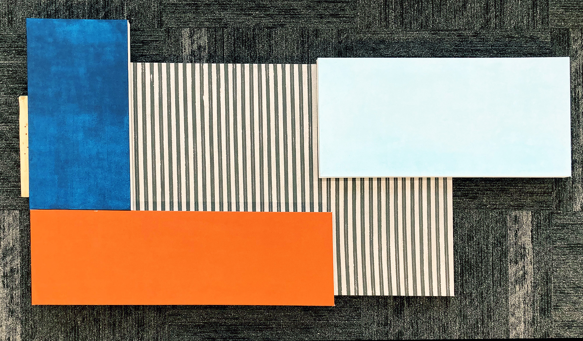
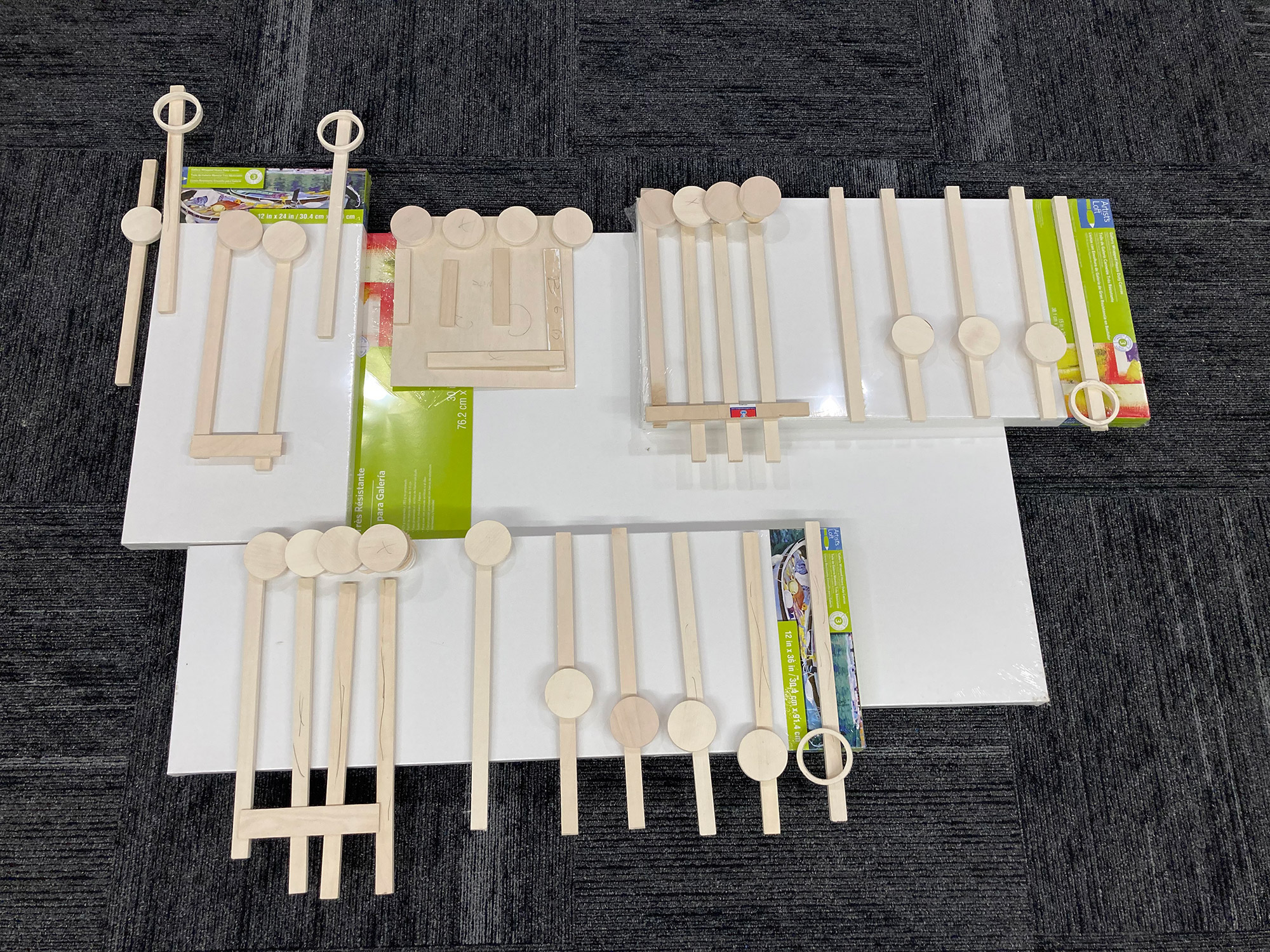
The plan was to use canvases from my ample stock for this project. These blog images and the audio sums up what I have been doing, for 60 to 70 plus hours 7 days a-week, since the middle of February. The smaller image is the setup for this project. I should have done that on Your Song. One goal of Just Another Day was to reduce the over length of the artwork by placing the speakers inside the artwork and not attaching them to the outside. This would create a smaller size work easier to store when that time comes, and it will. This project will be under six feet by four feet in height. Because of the limits of these four canvases, I had to cut back my original music sample. When laid out, the artwork music stretched to ten feet.

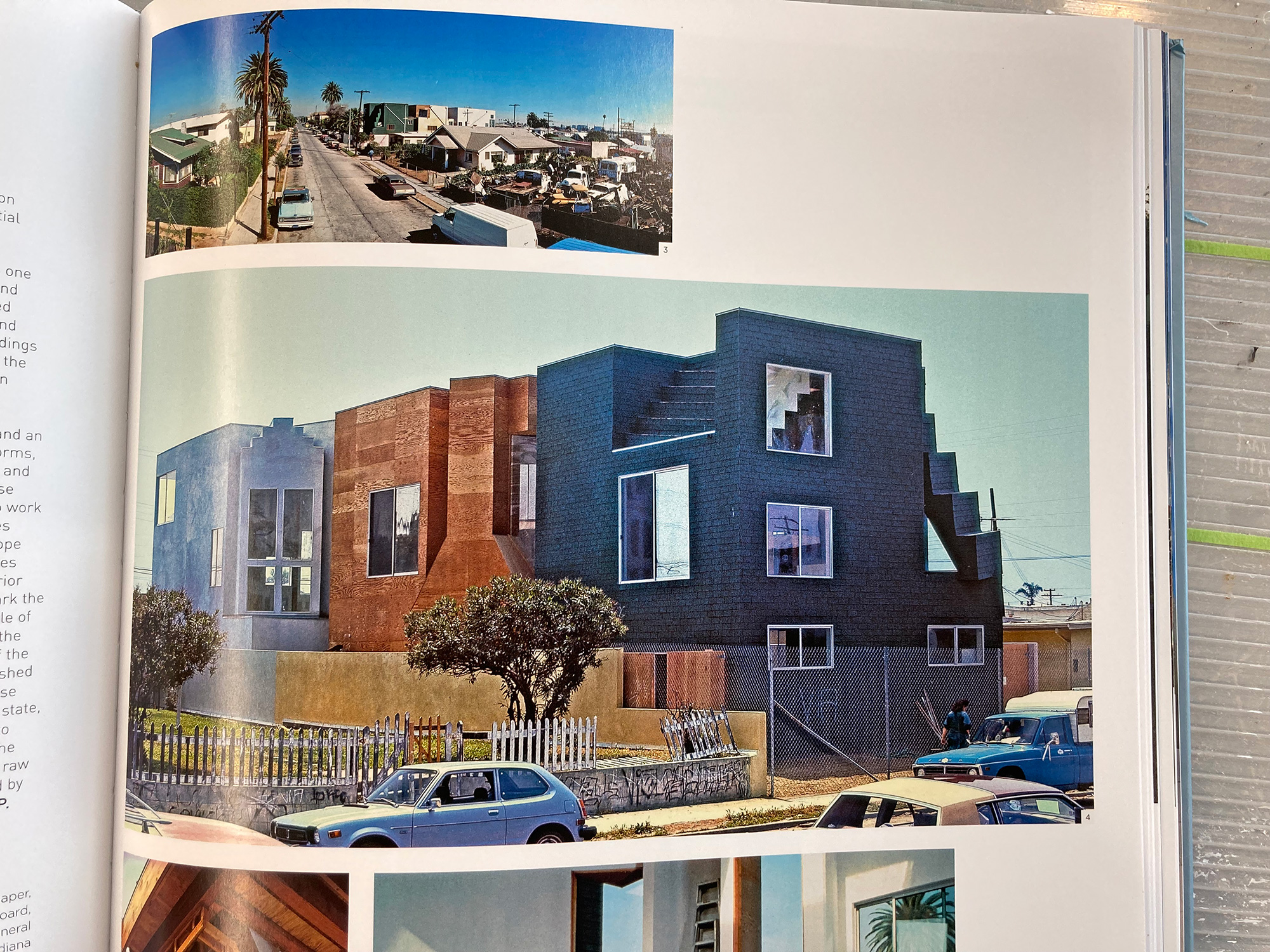
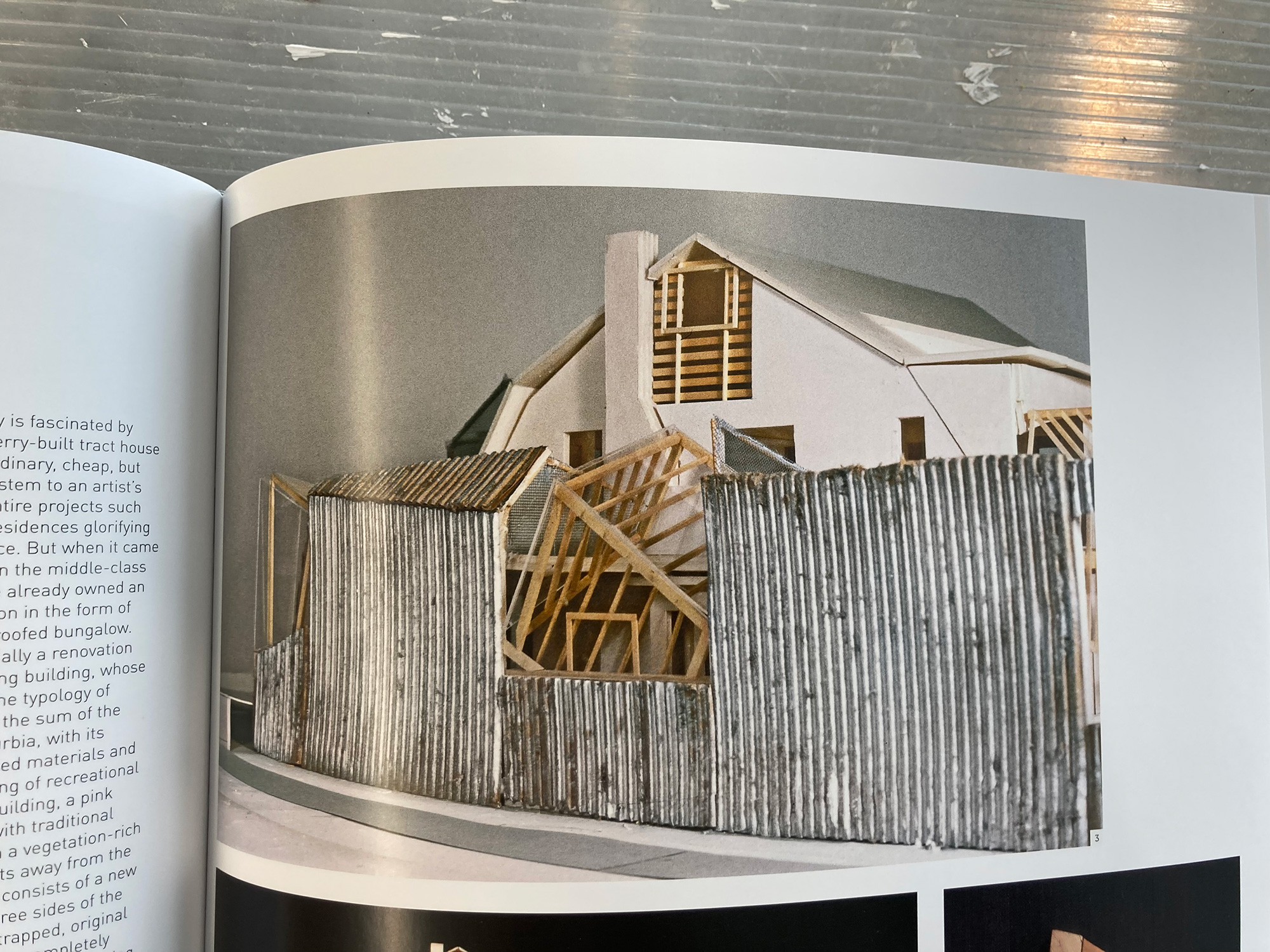
As for the larger blog photo, the colors and the design come from these Images from the LACMA Museum exhibition catalog, Frank Gehry. Not only has this art style been influenced by dead artists: Vincent Van Gogh, Pablo Picasso, Mark Rothko, Henri Matisse, and Jackson Pollock, it also has many other influencers, including the living architect, Frank Gehry. On the large canvas, the striping did not photograph well with the iPhone. The silver color looks awful, while the contrasting color is a lighter shade of black, meant to represent the Gehry image of corrugated metal.

As for the cover music, I am astounded by what I have accomplished with the software. Even though what I am doing is basic, simple, fairly straightforward, and nothing that anyone could not also do. I cannot help but being pleased with my growth and understanding of digital music, created using the (DAW) StudioOne. So it can be.

Scott Von Holzen

Play that Song, the Artwork, finished

These are the words with the music. I am not displaying lyrics, only words. In the early days artworks had a word or two. In time that changed as their number became more common and complicated. That was when a remembrance came to mind.

In my earlier summer job days I worked at my father’s car and truck dealership doing whatever I was told to do. While there I was in awe of the sign painter and his beautiful hand lettering who painted the customers’ truck doors. I thought of him when adding words became increasingly important. Seeing back to his slow motion painting and precision lines influenced my lettering style and personalize my the font style I used. It was as if I was assuming the position as a lettering painter. My artwork word standard became a challenging and time-consuming task. For example, I wanted to make sure all the letters looked similar and had the right width, height and spacing.

It was only recently when I was going to fill entire canvases with words that I came convinced that my precision letters and the time this type of lettering required no longer made sense. My alternative because a looser and more like my natural hand printing style. Besides, I thought after painting all the words, my next step would be to take a pallet knife and scrape parts of them away. I added another reason for my lettering change with this project.

When standing back from the artwork and seeing the words, the thought came to me: I was looking at graffiti. Now, I do not know if that is the right description for graffiti artists certainly are better word craftspeople, and better at using more elaborate fonts. Maybe my wording is more a reflection of the hand printing style used by Jean Michel Basquiat who was not a graffiti artist. All the words in this artwork are in my natural abstract graffiti style, which fits this music filmed in the city and works with the darker background and the scrapping.

The image above is the artwork in a near finished look. This is the first artwork using the technique where the music is held onto the canvas with magnets. When I hung the art pieces to the canvas, to take a photo for an exhibition, I knew the top coat of paint was still sensitive to scratching and could easily be damaged by the pressure of the magnets. Now days later, as the top coat is hardening, I am testing lighter strength magnets with different covers to prove that they are a viable hanging option that can be easily moved and removed.

I have not signed it yet, nor have I built the aluminum frame that enables it to by hung and supports the music. I was in a hurry. I wanted to meet the deadline for a major local show at the Pablo in Confluence Center in Eau Claire. My submission application made it in on the 24th meeting the deadline. My current stand is to not do group exhibitions, especially if there is an entrance fee, but this show is the exception. It is the most important art show in this area and more so I want a one-person show from the Pablo. This is an example of pay to play ($20 entrance fee) and playing to find a way.

Part of the Exhibition application

I will know by July 30th if this artwork makes it in the Jurored exhibition. I will then build the frame and add the music. The drop off is not till September. Otherwise, it will go to storage, and I will have another reason to hate group exhibitions.

Scott Von Holzen

S_V_H Play that Song rough cut

I like to keep the cover music for this artwork around one minute or less. That does not always happen, but this is the goal. I have my reasoning. Go to any museum and stopwatch the viewers as they pause at your favorite Van Gogh, Turner, Matisse, Picasso, or Rembrandt, painting. You will notice their stare time is around 30 seconds. Looking at the timing for this art my guess is less than 30 seconds for the viewer would soon discover the music push button. That then adds a one minute, more or less, of extra viewing time. Finally, to bring the total view to near two minutes, I would probably get extra starring seconds once the music stops and before the confused viewer finally moves on to the Picasso. That added average viewing time would certainly help this art stand out in a person’s memory, and make the great ones envious.

Every cover song starts with the piano as my foundation for my notation. If the music has voice, then I include a better representative, either a string or woodwind instrument for their Legato (dictionary meaning is a smooth flowing manner, without breaks between notes.) For this rough cut version of the cover music I am using the software Notion for the Alto Flute, Viola, and Cello for voice parts, supported by the piano, banjo and drums.

In the past, before sound, I would use a phrase from the music in order to create the artwork. When I first added music, its purpose was to help the viewer follow the musical notation the artwork was displaying, which then enhanced their experience. That worked for a while. Eventually, as my musical skills increased, the cover music grew not only longer but included more instruments. This resulted in the increasing difficulty in following the artwork along with the music. I made this even worse because the artworks were also getting bigger to accommodate the increased length of the cover music. My temporary solution was to make my notation smaller. When I discovered even I was having trouble following the music along with the artwork, I knew that the causal viewer would simply stop trying. The solution became to have the artwork cover only parts of the cover music for the artwork. At that moment, the artwork no longer controlled the music. No longer am I creating artworks. They are now presentations with the visual and the sound being equal partners. 

Creating a presentation with this music makes added sense considering that this is not a major piece of music, and after counting the lead vocal notes for the cover music. They added up to over one-hundred. If I would then go with my average notation size, which is 50 millimeters, the artwork would have a length of over sixteen feet. That would be the size of a major Vivaldi artwork, and a silly waste of time for this small, but adorable song by the band Train.

This is my 81st day back Home and the first posting of the start of a new project. I am still working in a temporary studio. Yesterday, they installed the commercial carpet squares in the soon to be new permanent Studio.

Scott Von Holzen