S_V_H Final Images & cover for Yellow

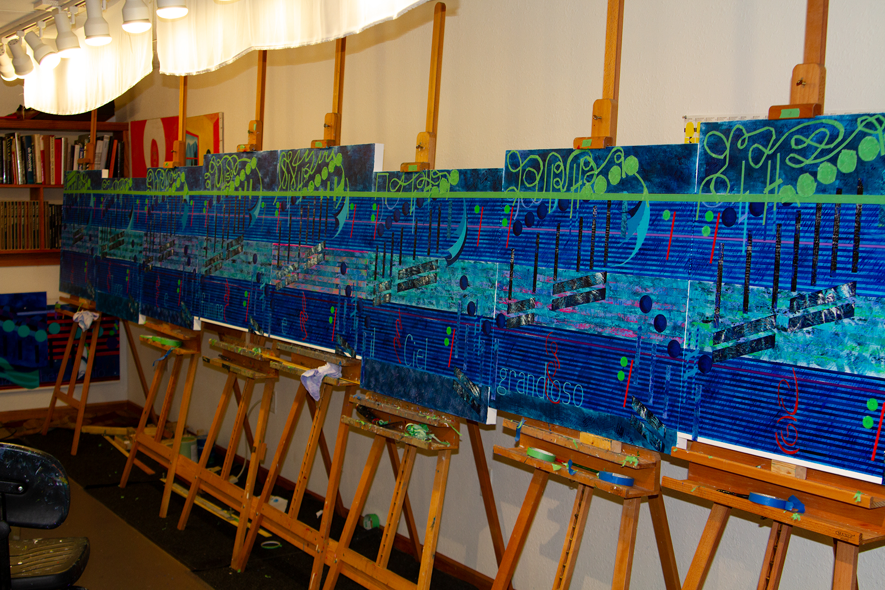
The new project Yellow offered the opportunity to use up some of my many shades of acrylic yellow. Or at less I could use those yellows that I had not dried out over the years. I have not used a lot of yellow in this art until this year. I have two music boxes where yellow is the dominate color. The other 2023 yellow was an experimental vertical for a Bach piece in which the music drops quickly. I thought the color yellow would add emphasis to the music.

Back of Yellow showing all the disconnects needed to break down this artwork for travel.

I work long on these artworks that when I finish them, I truly feel finished and wish only to move on. Here are a couple of reflective thoughts on this work.

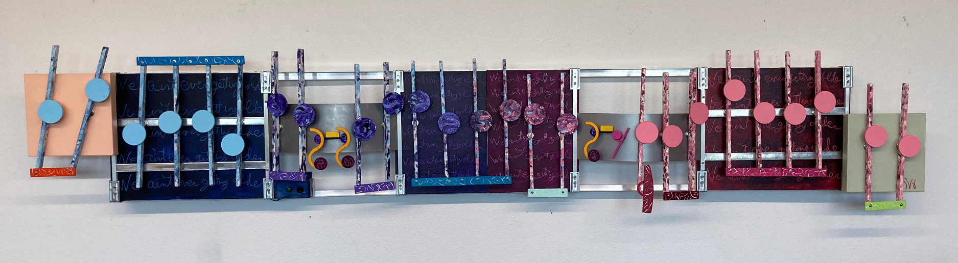
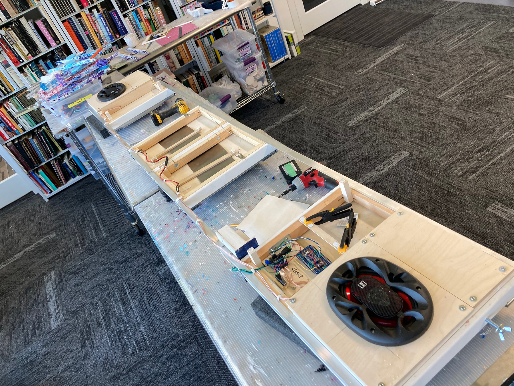
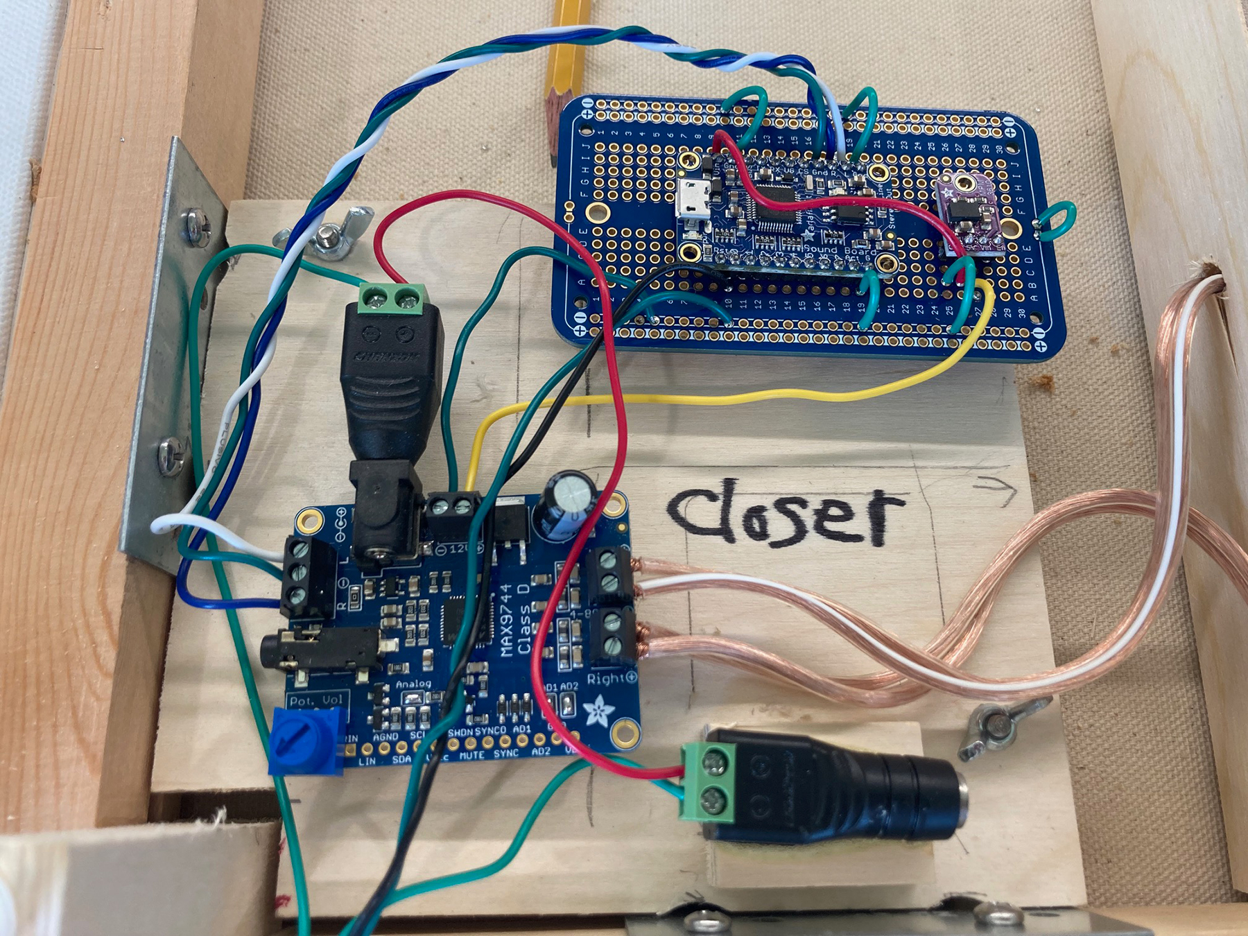
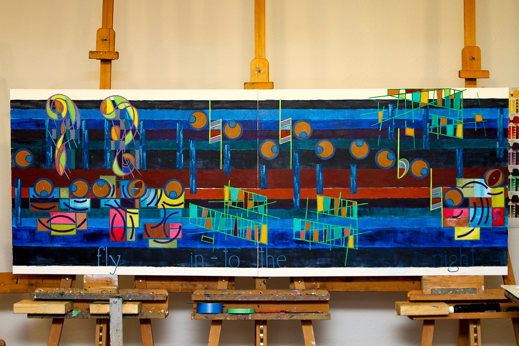
My original idea for this project was to make a shorter and smaller work around six feet. Unlike the previous project, Closer, I did not want to do another long horizontal. Although that did not happen, even though early, I chose 4inch 2way speakers with a 2 Watt stereo system instead of the 5×7 speakers and 20watt used in Closer.

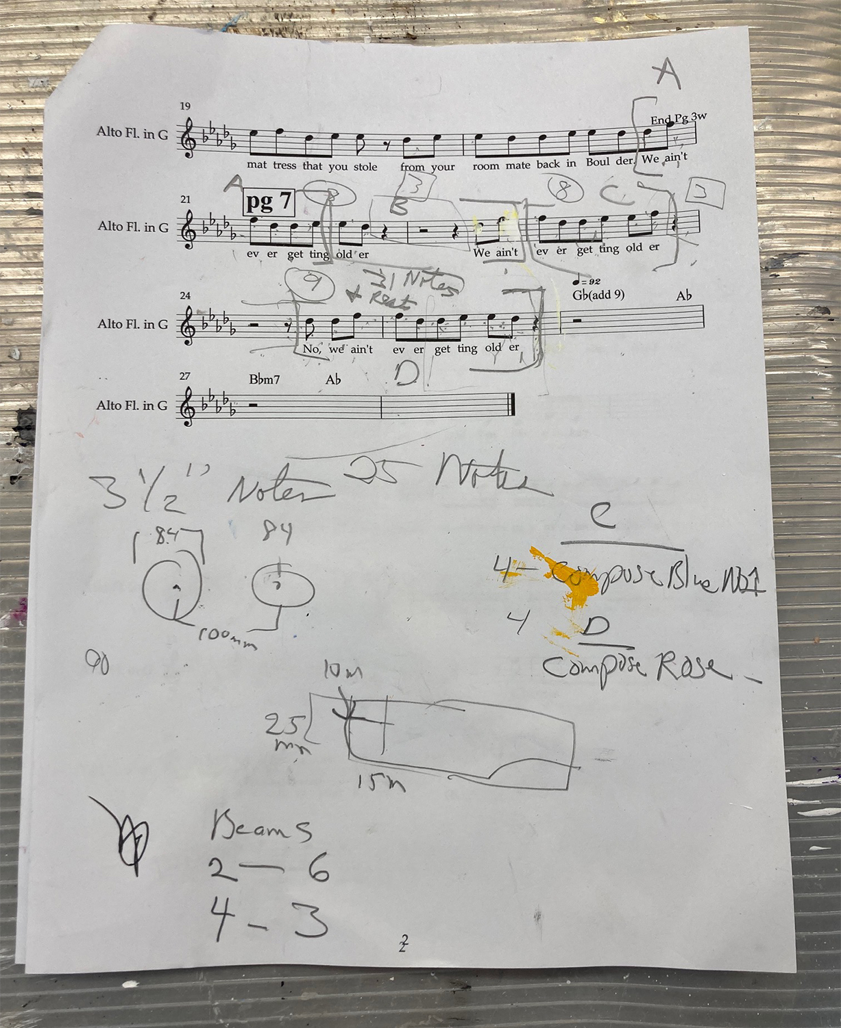
I always chose for the visual part of the artwork an interesting part of the cover music. But since the visual part of the artwork only samples a small piece of the music box, that part has to portray a stand out part of the cover, and more so also presents an interesting visual.

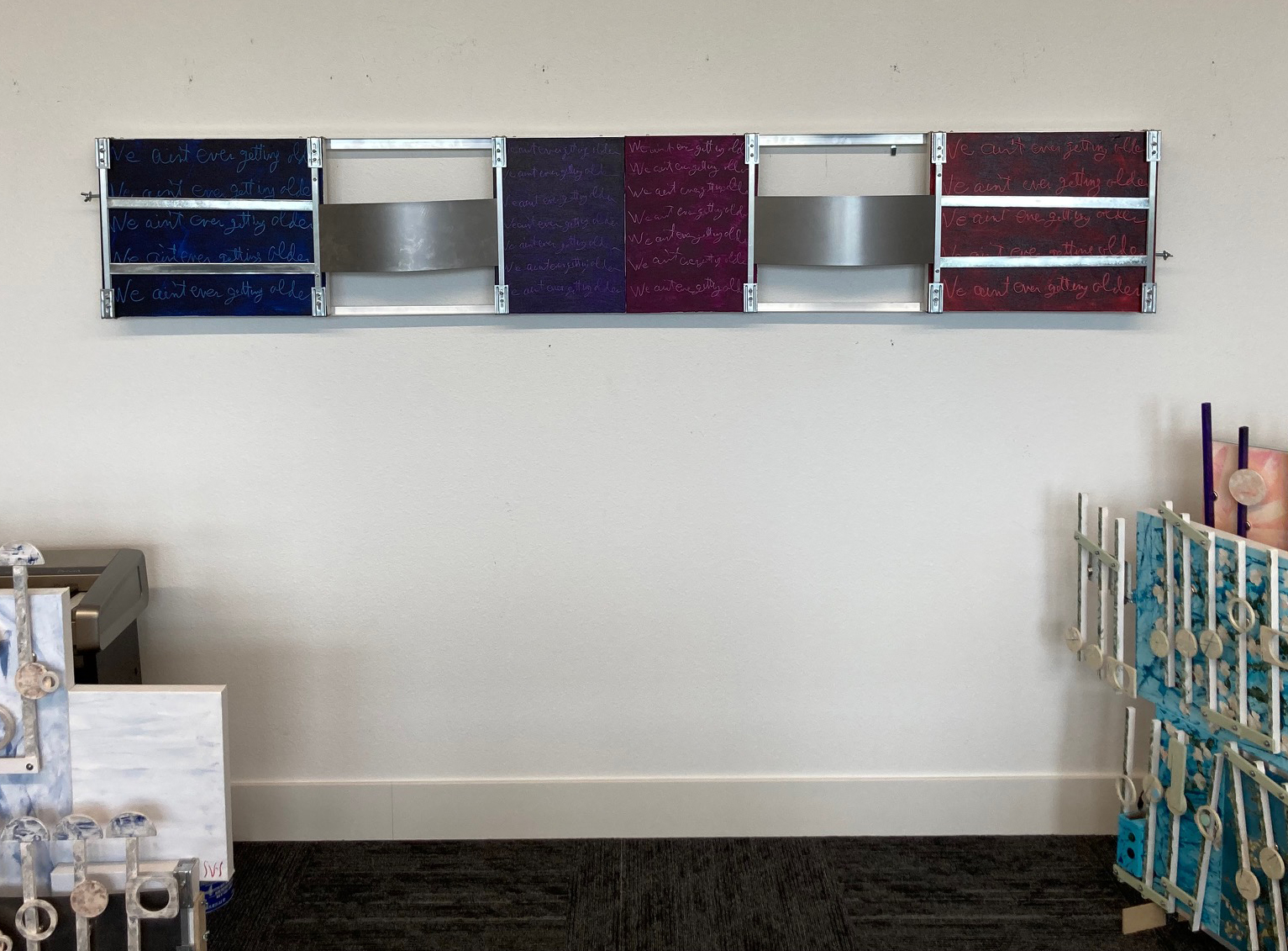
For this music box, there was only one section of the cover music that I thought would work. The pre-chorus has the visual look along with a nice beginning and ending (seen below in the worksheet). This choice then required a large reduction in the notation’s size to fit all the music. Even doing that, the artwork horizontally would have stretched to 114 inches. Yellow would be longer than the artwork Closer. To resolve this, I divided Yellow into two parts (similar to Closer) to under the 6 foot travel length. Then, to reduce Yellow’s length, I overlap the two sections to bring the artwork under 8 feet.

Sample taken from 8 pages cover of Yellow
The visual sample of the pre-chorus (seen in the edited sheet music above) starts at 26 seconds and ends at 45 seconds.

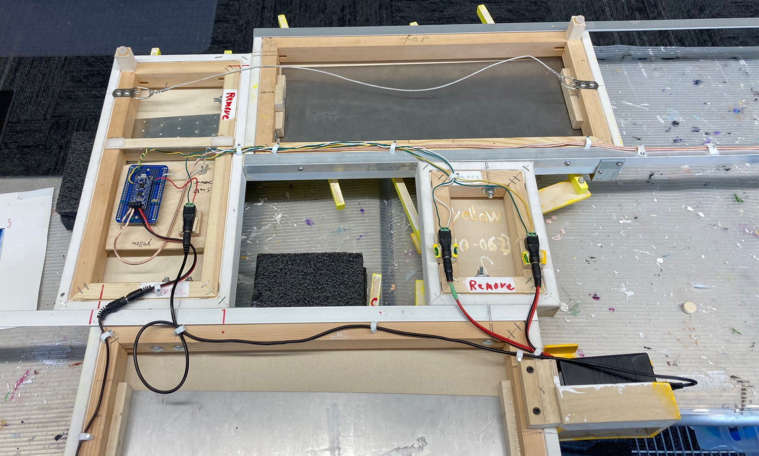
My other comment about this artwork was because of its divided sections needed for traveling. It was a learning and challenging experience to wire, and to balance for hanging, the two different arms of this work.

The speaker and controls wiring for Yellow

Scott Von Holzen

S_V_H Closer final image and music

The music box Closer ≈ L111″ x H22″ x D8″

This artwork’s color choices continue the trend of the previous artwork, Don’t Give Up. What I am trying to accomplish is to move away from the standard relationships of colors seen in a color chart. The two small end canvases are examples of this. Each of those canvases is a complementary color to the main connected canvases. But they are not complimentary to each other. With my past use of color, I may not have done it that way.

The left canvas is a light orange. I would have considered using orange’s complimentary color, which is a light violet for the far right canvas. Except then, its connected canvas would have to be painted yellow to remain complementary. So much yellow would have unbalanced the look of the artwork, and would not fit the music. I am a self-taught colorist, and therefore it has been a slow evolution. Right now my position is I want color to enhance the look of the flow of the music, provide a space for some lyrics, keep being in the background, and therefore emphasize the depth of the artwork.

Your standard art store color chart

Talking about many years, as mentioned in the video, I have been painting music for over seventeen years. That is a decent artist’s career. What is missing from my artist journey is an acknowledgment in the air that this art at least blows a light flutter through the leaves of the tree of art. The lyric from form the song Scientist by Coldplay puts this all into perspective.”… Nobody said it was easy.” Taking that into perspective, therefore, I am putting this artwork aside and moving on to my next project, Yellow, also by Coldplay.

The music box soundtrack to Closer
Backside in progress of Closer

The center of the artwork is where the speaker wire disconnects. This allows me to unbolt the canvases into two pieces for travel. The two center canvases show the free-standing metal plates to which the note magnets connect.

Closeup of Closer’s custom-built 20watt stereo system

The design of the stereo system has the look of, it’s a wonder that it works. Obviously; it does. The twenty-watt amp is on the lower left. I store the cover music on the soundboard at the top. Over the years, I have built a lot of these same systems. I construct them with a lot of careful soldering and multiple checks along the way. In the end, I am relieved each time that they work. The appearance is secondary. Besides, how else could I arrange all those wires? A feature I now do mounts the stereo system on a removable board. Removing the two wing nuts and the connected wires allows the entire stereo to be serviced outside the artwork.

The worksheet for the cover music for Closer

I thought I would include the end page of the worksheet for this artwork. The artwork visualizes the last three lyrical lines “We ain’t ever getting older.” I really dislike the word “ain’t.”

This YouTube video discusses Closer and plays the cover music version that I have since tweaked.

Scott Von Holzen

S_V_H Closer image 3

The latest wall-mounted image of the main frame of the artwork Closer.
The last remaining easels were photographed on August 24 before their removal from the studio.
Photograph of BirdsFly (over the rainbow the first music painting) on a Mabef easel, January 30th, 2006.
A January 1st, 2012 image of three of the same model Mabef easels holding the music artwork Black Bird.
Today’s Mabel’s version of my easels is still available at Michaels.

In this latest studio, I have been finding it increasingly difficult to display my artwork on my historic easel system. For safety concerns, I even began strapping the artwork to the easels, which had mixed results. Finally, after 17-plus years of displaying this art on easels, I have placed all my easels in storage.

I first started using a similar style of Mabef easel pictured above in 2006, which I purchased on sale at Michaels, an art supply store. This reasonably priced easel had in-store availability, is not bulky, fairly light, easily and confidently adjustable, is on sale a lot, and has proven over the years to be flexible, strong, and sturdy.

Even early in this art, many of my works were two feet by four feet and even larger. Eventually, I needed more of the same Mabel’s easels, which I purchased whenever they were half-price, around a hundred dollars. There are other well-designed and sturdier easels. They were also a lot more expensive and did not provide the flexibility I needed. I could easily add more of these lighter easels as my music artworks became larger and longer over the years. For my Vivaldi’s Four Seasons series, I used seven easels to hold artworks from the series that reach a maximum of twenty feet. You can see in the Vivaldi photo the flexibility of these sized easels to adjust up and down to match the positioning of the artwork’s different canvases. And yet it was time for a change. I will from now on hang my works for viewing on 100-pound handers placed 16 inches apart across an unused studio wall.

Image from 2015 of the final Vivaldi Four Seasons artwork supported on seven Mabel easels

I am near the finish of Closer. I am impressed with the sound of the music and will post the final image and the final music box music in a couple of days. Hopefully (every artwork goal) Closer is the One that will eventually shake-the-tree. To quote Meat Loaf from the song Everything Louder Than Everything Else, “If the thrill is gone then it’s time to take it back.” May this artwork be everything louder than everything else,

Scott Von Holzen