S_V_H One Thousands Years image 1

One Thousand Years,
with the notes turned incorrectly to the right

This is a commissioned work requested by my brother for his son’s wedding later this August. I will not say anymore about this beginning of this project, for there is an interesting technique I stumbled carelessness into.

The music for this project was written and sung by a Christina Perri that I have never heard of. It has over 2 billion views on YouTube. Watching and listening to it I number of times did not change my opinion of the song. For me it falls into the category of ordinary love song. I song I would never have painted.

Even though I could have had many artwork sales for wedding songs, I have chosen not to. Songs like this are the reason. I chose and paint songs I am, at the time, emotionally connected to. That is my choice. My art. My way.

This art has never been about money, no matter the cost of time and monies of the last sixteen years painting music. This art is big. How big I do not know, nor can I grasp its true meaning or value. I do know it is part of a personal challenge to accomplish something special that started early in my life. Through the creation of these music artworks I am seeing an opening to an eventual self awareness. Back to reality, and out of my comfort zone, this commission work from my brother is a worthy and appreciative challenge. To quote the poet and philosopher Coldplay ” Nobody said it was easy.”

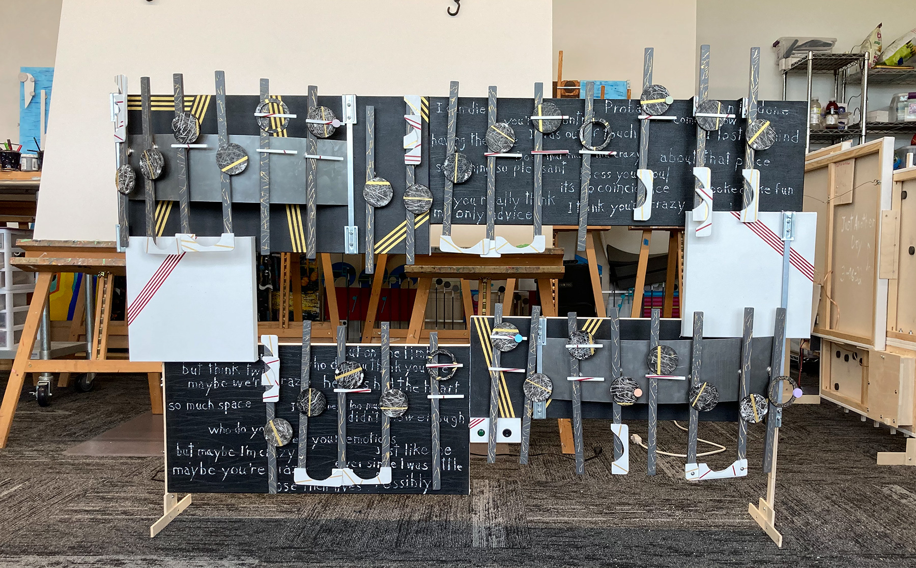
Well, that is the background of the music. Once I had a decent start for my cover music, I switched over to producing the pieces for the artwork. Now, I am going to lose everyone not into music notation rules. I broke a big one. Strange, I thought I had already demolished all the rules of notation accept the up down movement. I will explain.

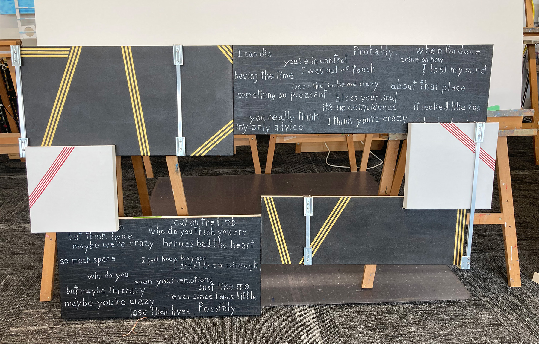
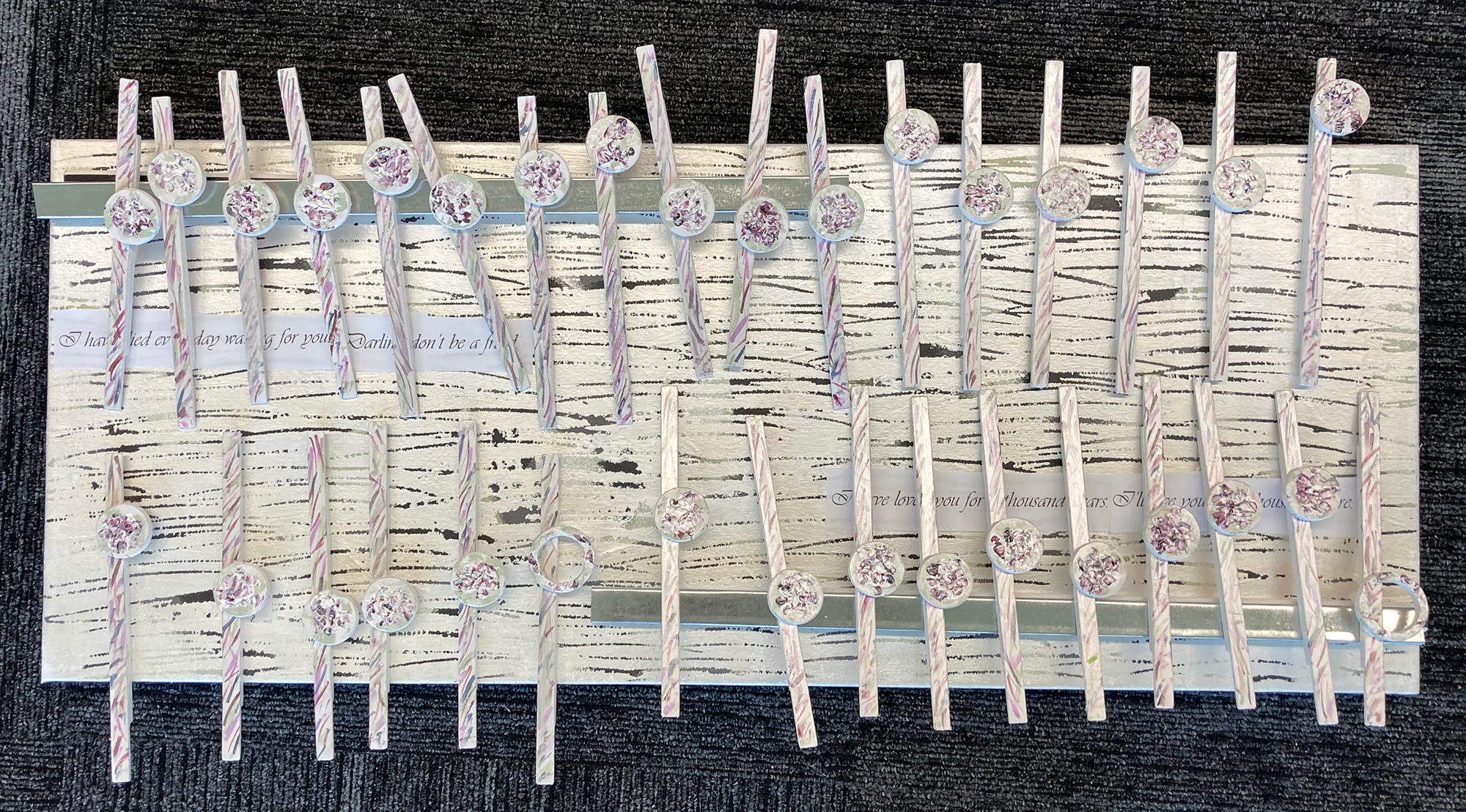
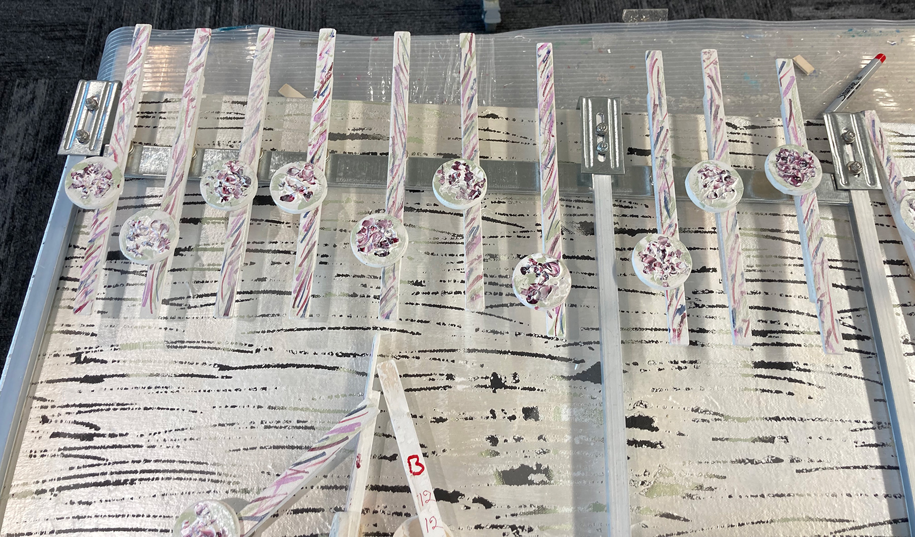
In music notation generally and individually, the notes from B down the musical staff face left with the stem to the right. Notes above B than are turned and face right with the stem to the left. As you can see in the image provided. All the notes from my cover music were turned to the right with the stems to the left. That is wrong. All the notes for this music are lower than the B position and therefore should have been turned to the left. I have always obeyed this notation rule in the past, thinking the left-to-right and back-en-forth of the notes added interest to the artwork.

At first I could not believe I made such an error, but this project is rare, in which every note of the cover music faces the same way. I got in a note putting together rhythm that ended up with every note pointing the wrong direction. I thought I could easily solve this issue by flipping top to bottom. That did not work, everything was off. I also noticed that when turning the notes correctly to the left, I did not like that look.

The music flow felt blocked by all those stems, one after another. My solution was an easy mix solution. I decided for multiple reasons to leave most of the cover music notes pointing in the wrong direction. The change I made was to take a few notes that are below the music staff, remove the notes from the stems, and replaced them turned to the left.

Example of notes turned the correct notation direction.
Final note setup with a mixed of upper right facing
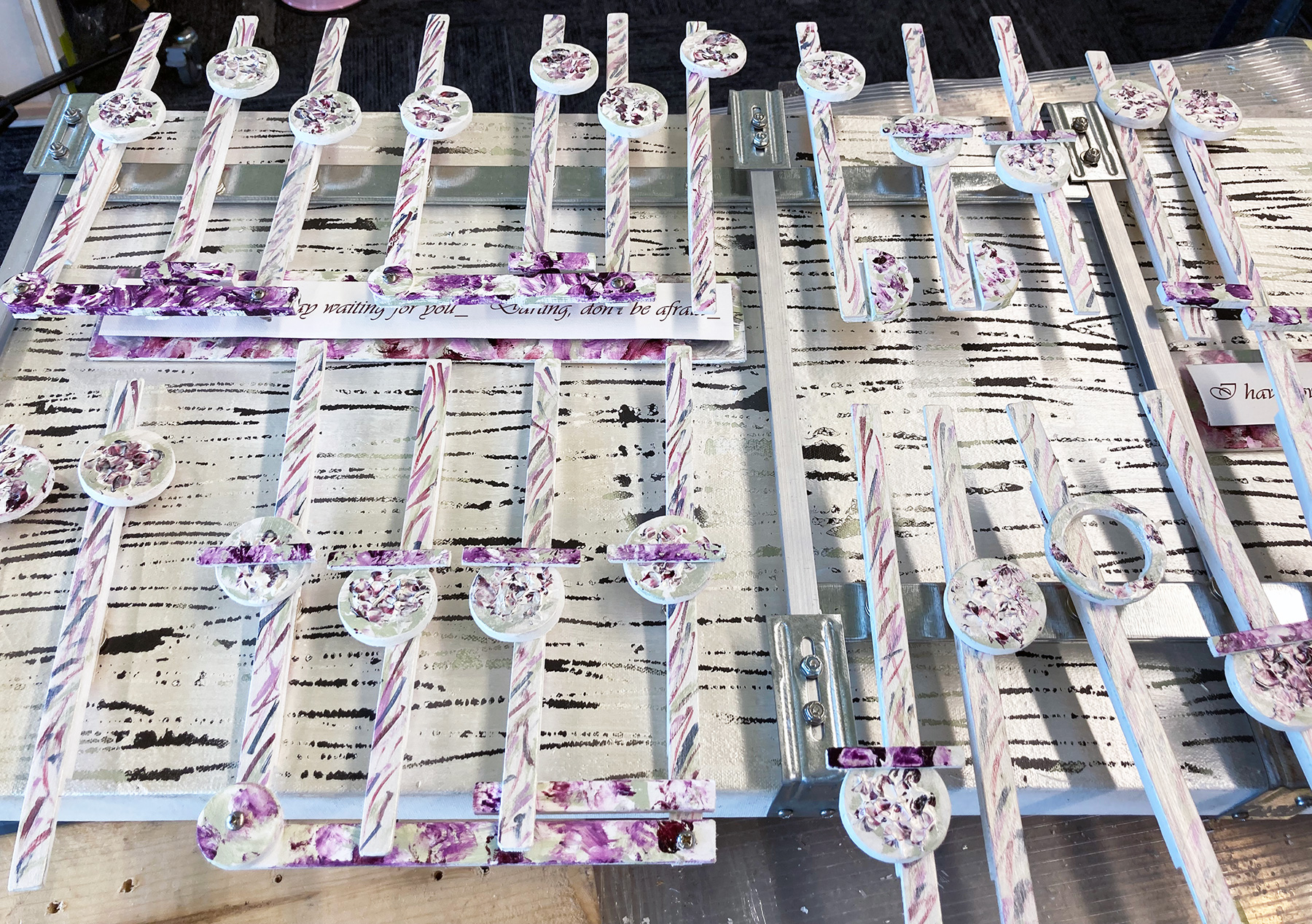
and lower left facing notes.

Three attempts at the background canvas.
Final, in the middle

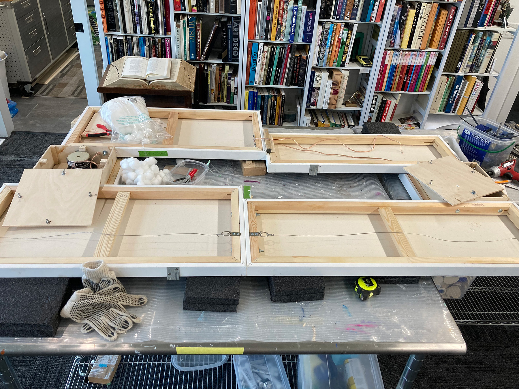
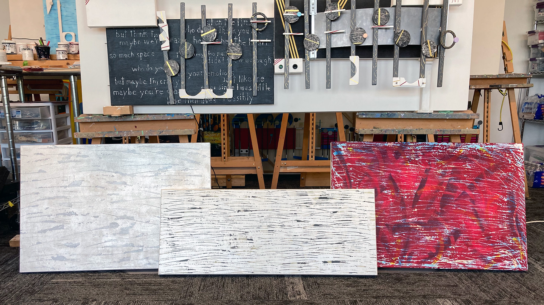
In the above image the 24×36 inch scratch off canvas on the right is my first attempt. The plan for that canvas was to use the colors from the YouTube video of the music. Then my wife, Barbara, informed me that was a no no. I had forgotten the bouquet image. Even though I tried to repaint that first scratch off canvas was beyond a simple recovery. My next attempt is the 24×36 canvas on the left.

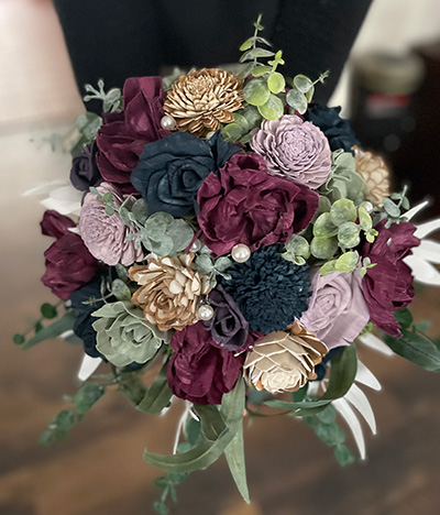
This time after trials, the plan was to use the Golden Acrylic colors of Permanent Violet Dark, Alizarin Crimson Hue, Permanent Maroon, Titan Green Pale and shades of Neutral Grays, along with Titanium white to mix whatever that other color is.

Starting with the base color design based on the banquet image on a new 24×36 inch size canvas, I tried to figure out what would look the best with the color Maroon and its various tints and close relatives. After I did the scratch off, I decided my plan for the base did not turn out as I wished it would have. Out of desperation and thinking in terms of wedding pretty, I glazed the entire canvas with Iridescent Pearl Fine. That move ended up covering everything, which luckily included the scratch off that displayed my crappy base paint layer.

I liked to look, and so did Barb mentioning the gray color that she could see in the base coat. The problem was that the base coat was actually shades of Maroon and Violet Dark that I had partially covered with a coat of Pearl. Her comment got me thinking. In the banquet flower image, strangely, there are gray flowers, so I thought I would go with shades of gray and a little of the other colors for the base, once again on a new canvas. That solve another problem I finally noticed: the 24×36 canvases I started with were too large for the music notes I had created earlier. I chose a smaller 16×40 inch sized canvas which better balanced with the size of the music.

Scott Von Holzen

Roger’s poem, dedicated to the memory of my Brother Roger who passed away a year ago this coming August 9th. In each new blog post I will add another section of this poem. Here are sections 1 & 2 of 15.

Roger’s poem

The sun in winter
is all too short.
Who knew as you move through our lives,
that yours would follow the winter sun.

Winter arrests time
for thought and reflection
that February afternoon.
Dressed for warmth
we venture out,
Into the soft light,
surrounded by stillness,
not an oak leaf stirring.

Scott Von Holzen

S_V_H Crazy Final Image

This is the final image of Crazy with its stands attached. When close to finishing an artwork, I will build the stands to allow better access to complete the work. The alternative would be to place the artwork on easels, making it difficult to access the stereo system, or the music notes attached to the canvas with magnets on the backside.

Although I signed and dated this artwork on July 22nd, I soon realized that I was not done. I forgot all those interesting musical items that add interest to the work. I am referring to all those small white objects attached to the music that in musical terms are the dots, beams, sixteen notes, and staff lines.

Crazy W66.5″xH45″xD8″

Here are my, this-work-is-finally done, comments on the Music Box Crazy posted on YouTube:

I have created a new website, emptywallsart.com, to better market this art and to support and promote the works of 6 other artists that are a part of the group. Organizing artists was only made possible with the help of two of the other six members, Jeff Nelson and Christy Skuban. This website is to be used to sell group exhibitions for Galleries and Art organizations.
Our group has the foundational connection in that we are all three-dimensional artists. Four of us are wall mounted and two are sculptural artists. We then offer the flexibility to a gallery, for example, the option to choose which artists would fit their best interests. Because of the diversity and the talent in this group, there will be kinks to be worked out. A positive side of this collaboration will hopefully come with the larger resource in ideas and venue opportunities to promote and sell our three-dimensional art to ever larger markets. My thinking is that the group will become greater than the sum of its members.

This is the Home page for EmptyWallsArt

It is obvious, even to me, after reading a few of these blog posts, how frustrating it has been to find ways to, as I would say, “break on through to the other side.” I have tried Art fairs, in and outdoors, local and distant exhibitions, and websites to market this art, and they all eventually reach the same level and result: no movement in this art. A show begins and ends, an exhibition begins and ends, an art sale occasionally begins and ends. As a wise man at an outdoor art fair told me, all these art venues reset every year.

These types of art exhibitions are fine to add names and dates to an art resume, but that is all their worth. Understandably, this art is not your typical craft work (make up your own definition of craft versus art, mine way below) that fills these shows and is appealing to the public for their prettiness, highly polished look, or eye-catching use of color. Therefore, I have made this turning point: “insanity is doing the same thing over and over again and expecting different results.” ~ Albert Einstein.

Something I wish to document and share:

The one-year anniversary of the passing of my brother, Roger, is drawing near. In my tribute to him I wrote a story poem that took months for me to complete. At his celebration of life, this last June 4th, I read it aloud, with encouragement from my family. I believe this story poem contains many universal moments and meanings about the difficulties of losing someone close to you that others may relate to.

I started writing this story poem in early February and finished the last changes in early June. It took so long to produce that I felt for me and Roger’s memory I would release it slowly. The poem is in fifteen different sections. The plan, starting with this post, is to make public the first section of this poem. Then, in the next fourteen blog posts, I will add another section until the poem is complete. Here is the first of fifteen sections of my poem dedicated to my brother Roger Von Holzen.

Roger’s poem

The sun in winter
 is all too short.
Who knew as you move through our lives,
that yours would follow the winter sun.

Scott Von Holzen

Art vs Craft

All art is craft
Not all craft is art.
the difference is
art was and always will be
an ever open revolving door
of perception.
Craft is a product

S_V_H Crazy image 2 update

The Music Box Crazy

I have always liked this song for reasons unknown. I never thought of painting it until I was watching a YouTube Art video and heard another cover of it by a street singer. Here is that cover of Crazy heard right from the start of the YouTube video by James Kalm:

The colors for this music box come from Gnarls Barkley’s outfit at his Grammy performance of Crazy and the violin section in this other YouTube live version:

The backside of Crazy showing the speaker install.

This is an advanced cover of the audio for the song Crazy. Like the YouTube video versions I liked these slower versions of the original.

This artwork needs to be completed. Its time has passed. The audio, as mentioned, is not done. At this stage the audio is being tested through computer speakers. The audio system for Crazy is my hand built system with its own custom speakers. When I am good with the sound of this cover on my computer speakers, a Bose system, I will then install that copy onto the music box and listen to that sound. Since the artworks speaker system is only two 4″ speakers, no doubt I will have to adjust it. I will then need to tweak the equalizer, the reverb, and balance, for example, until I hear a sound that is as good-as-it-gets. Then that is it.

Scott von Holzen