S_V_H Mozart’s Rondo Alla Truca image 2

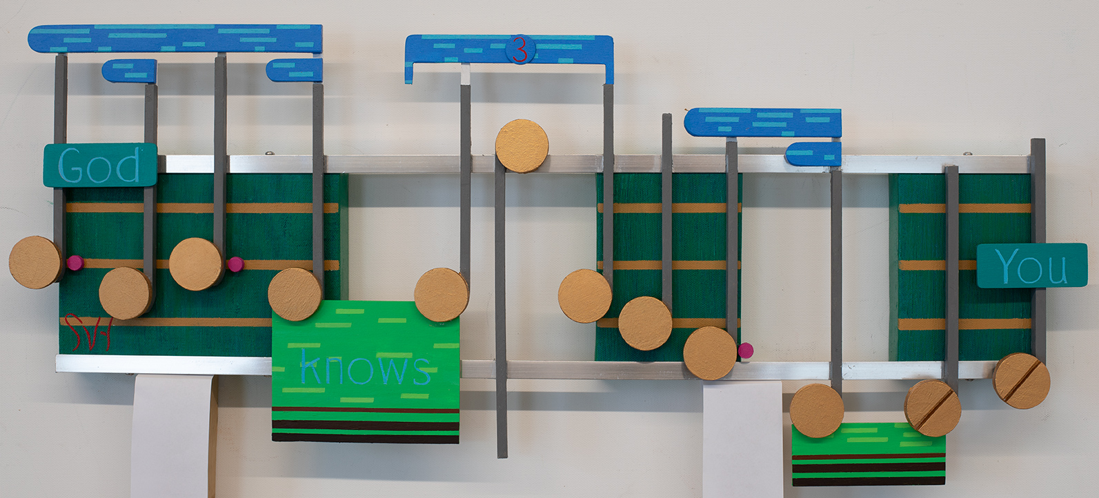
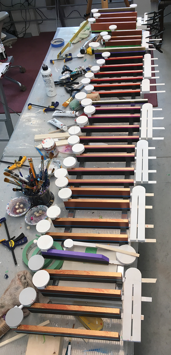
This is an artwork in progress, and not sections of a ladder with marshmallows attached to one side.  This  Mozart piece needs to be finished by June 18th, to be entered in the Inaugural art exhibition at the Pablo Center of the Confluence.  If selected this artwork will hang in exhibition on a wall, as a combination three-dimensional painting, sculpture, an assemblage artwork.  Until then,  this artwork is currently laying on a table in pieces waiting to be glued to a six-foot aluminum frame.

This image’s construction demonstrates the amount of craftsmanship that is now needed to portray Music. This art started as paintings of music.  Even today when asked what I paint, my response still is, “I paint Music.” Because of the physical work now needed to assemble these artworks I have lately wondered if I am becoming too crafty. This came to mind recently when a customer picked up a commissioned work.

On seeing their artwork for the first time, he quickly mention how the aluminum frame could be given a high gloss finish using wet high grit sandpaper.  I felt guilty when he said that. Than I thought his suggestion deserved some merit because the aluminum, even when carefully picked,  always has small scratches and abrasions that need to be removed.  I thanked him for his suggestion.  Latter, that discussion reminded me that most local art is exactly that,  ‘high gloss.’  The public sees a high quality finish as quality Art, and Artists comply.  I am sure many see such a finish as a way to improve sales and to charge more for their artwork.  What I see is a lot of local artwork that lacks originality and creativity, but sure is pretty.

Are you becoming to crafty?   For now the answer is probably, yes, but I see this art constantly evolving. My guess is that in time I will loosen up on accuracy in portraying music. This will allow me to move away from craftsmanship to more true assemblage. I think the true meaning of this art form will then begin to come into focus.  I also believe the fundamentals of the flow will continue, but everything thing else that depicts that movement is up for grabs. That openness to change is the product of me needing to innovate to avoid the fear of boredom.  I am also kinda-of-a geek: I am always looking for the next best thing.

Scott Von Holzen


S_V_H God Only Knows

God Only Knows, 29 3/4″ x 13 1/2″ Canvas, aluminum with wood features.

This little commission artwork is finished. It took a lot longer than I thought. The issue, and I already know this, is no matter the size of the artwork the prep, the decision-making and the problem solving ends up consuming the same amount of time no matter the size of the artwork.

I am not comfortable working with the color green. That really is silly for I have a great range and variety of greens in jars to work with, and for this music green had to dominate the look.
So it does, but don’t expect the next artwork to carry on this look.

The words you see in this work, “God knows you,” come from the music’s lyric, “God only knows what I’d be without you.” What you see in these two sentences, are some shared words with different meanings.  My need, for any words that I use, is that together they do not refer directly to the music.  I always Google down three pages to confirm that there is no connection.  I actually like working with the words in this way.  These artworks go beyond the music that they start with, in direction and meaning. They also have greater depth than any abstract image of the music. As mention in many blog entries before, these artworks are a portrait of an individual piece of music. They represent a musical piece uniqueness and character.

I have to comment on two aspects of this artwork.  The blue you see above the canvases represent the sky. The lighter blue rectangles represent clouds.  The brighter greens and browns you see below the canvasses represent different layers of the earth.

Finally, I do not think I have ever used the word “God,” in any of my artworks. For this music it made sense. My lovely wife, Barb, pointed out that the word ‘knows’ was harder to read than the other two words.  Like all my earlier artworks I have always used one color for all the lettering.  This became a contrast issue after coloring in of the word ‘God,’ on a darker blue-green background,  and then using the same light blue for the word ‘knows’ that is on a lighter green background.  But, when I than tried a darker color for the word ‘knows’,  that made that word too prominent for its use.   My solution was to use the same light blue for all the words. This than allowed the important words “God and You’ stand out while the lighter looking word ‘knows’ to still connect the phrase.   A result, in doing the words this way, is that people will first see the capitalized words ‘God’ and ‘You, and then be presented  with the choice to read, or not, the softer looking in between word ‘knows.’  All this adds complexity, and challenge for the viewer to define their own meaning of this artwork and the music it is portraying.


Scott Von Holzen

S_V_H God only Knows image 1

God only knows is a Series artwork  that for now is 27 1/2 inches in length and just over 6 inches in height.  This is also a commissioned project from the 1966 Beach Boys album Pet Sounds. This song reached number twenty-five, and the album number two, on The Rolling Stone’s 500 greatest songs and 500 greatest albums of all time.

Today, was the first time that I actually listened to the entire album. No surprise that I enjoyed listening to the hits Sloop John B, Wouldn’t Be Nice and God Only Knows. As for the rest of the album the music reminded me that my appreciation of the Beach Boys was just that, the hits. Of course the hits where the only Beach Boys songs I heard growing up with the transistor radio.

This basic color scheme for this artwork comes form the Pet Sounds album, and a later Pet Sound Sessions commemorative release:


The color green does not dominate a lot of my artworks.  It is a color that I feel needs the support of other colors, mainly blue, to make it work.  That is why I was glad to see a nice pale blue used on both album covers.  I will build the music from that color.

Here is a new version of God only Knows, sung by Brian Wilson,  who wrote the music:

Finally, here is the original studio version song by Brian’s younger brother Carl Wilson:

Scott Von Holzen