Mr. V. Elton’s “Sorry,” Neil & Barbara’s “Flowers” 1st images

First image of Sorry is the hardest word, by Elton John on the left. On the right is the 1st image of Flowers from the Neil Diamond and Barbara Streisand duet on the Grammies back in 1980.
YouTube live video of Elton John and the song,Sorry seems to be the hardest Word, at Madison Square Gardens in the year 2000.
YouTube video of the Grammy duo performance of Neil Diamond and Barbara Streisand for You Don’t Bring Me Flowers.
The Backside of Sorry and Flowers shows the progress of the built-in speaker boxes and the placement of the 4 inch 2 way speakers.
Images are from an email sent by the ARC Gallery

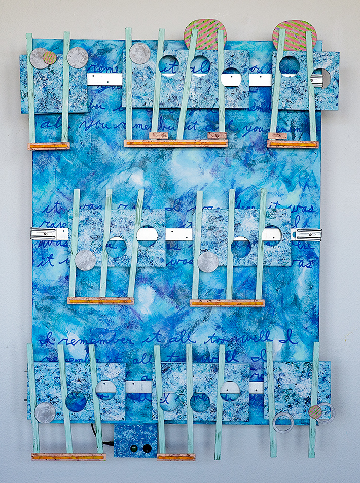
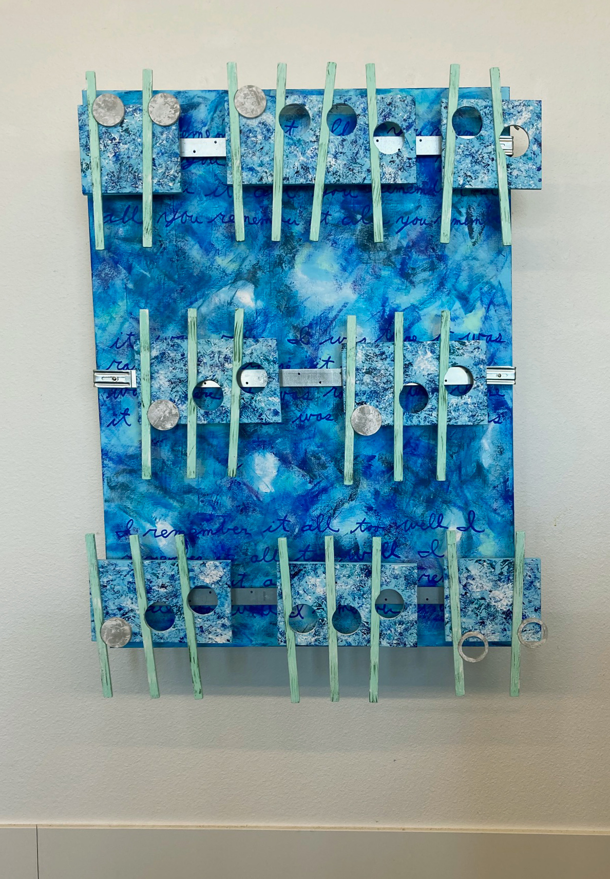
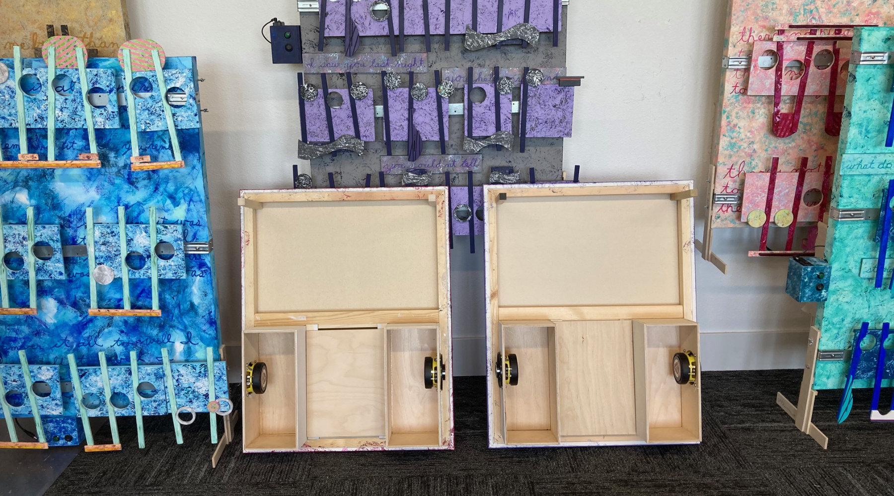
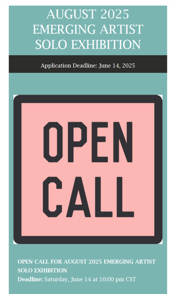
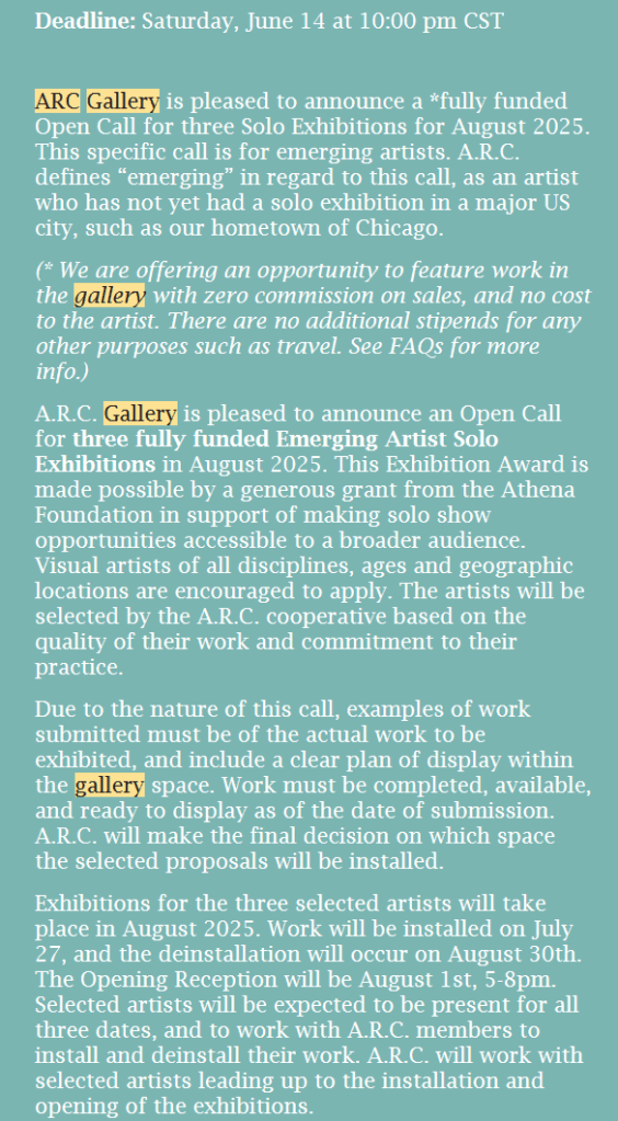
I received this Exhibit CALL from the ARC Gallery in Chicago, on May 12. It caught me by surprise, especially with the deadline date of June 14. This opportunity seems made for me after reading the exhibit details: “This specific call is for emerging artists. A.R.C. defines “emerging” in regard to this call, as an artist who has not yet had a solo exhibition in a major US city,…” This new exhibit was like the ARC Gallery judges must have felt bad about ignoring my Spring Entry, and they what to make up with second chances. I already have my theme “hook”. Mr. Brightside has been informed about this art exhibit, and he is standing by to assist. We have gone over the enormous amount of work I put into the Spring submission paperwork. He gave me what I requested: the good, the bad, the ugly. Of course he was nice with the good, and encouraging with the bad. As for the ugly he gave me a plan for the future. He believes we can improve my chances. This probably will be 2025s Make or Break opportunity. Brightside also suggested a goal to summit by June 10th. This ensured proper submission and receipt of the entry. That timeline would be tight for one 40 by 30 inch Standard Size artwork, like the artwork Crying. Thankfully, these two projects are much smaller in size, are are the first in my series that I call Essential. Essential artworks will be priced between sixteen and eighteen hundred dollars. Their canvas size is 30 by 24 inch wide.

For the Elton John project I found him dressed in a magenta jacket so I went with a Medium Magenta, and other magentas, black, and silver. For the project You don’t Bring me Flowers, all I had to work with was Streisand’s pant suite, and its correct color is a toss up ( I relied on the old video for the color of the base canvas). From that one color I will build the color pallet for this project. I should note I never try hard to match a video color with the artwork. I research the artist, and/or the songs’ video performance for a color theme. My vision for the colors used is a shotgun aim base color. From that foundation other added colors will spread out from there.

I have already picked the sample lyrics for “You Don’t bring me Flower’s” that will appear on the artwork. I took them from the live Grammy performance and the words chosen are not the same as my sheet music copy. I am posting these three ending song sentences: “You don’t say you need me. You don’t sing we love songs. And You don’t bring me flowers anymore.”

As for my sampling lyrics for Sorry seems to be the Hardest Word, I am working on finishing the cover music sheet music.

Scott Von Holzen

S_V_H All too Well final artwork & music

All too Well
≈ H45xL31xD9.5 inches

On an online video with Jimmy Fallon Taylor Swift mentions ” personnel favorites.” Her favorite on the Taylor’s version of the Red Album is the ten-minute long All too Well. I can relate to that in that of the 29 Taylor Swift songs on my Spotify Like playlist. five of them are different versions of All too Well. This music has a controlled driving beat, rhythm and harmony. It also comes in different versions, which also is appealing (video below). But it is not just the new ten-minute version of this music that finally caught my attention, it was the lyrics.

This is an alternate 10 minute version of All too Well (Sad Girl Autumn Version)

The lyrics for this music are exceptional (like “dancing around the kitchen in the refrigerator light.” But it is these specific lines that sparked my interest: “And I left my scarf there at your sister’s house, and you’ve still got it in your drawer, even now.” And then the much later circle back that convinced me: “But you keep my old scarf from that very first week ’cause it reminds you of innocence and it smells like me…….” These words sound honest and real life like to me, feeling genuine compared too much of pop music I listen to. Finally, I am always hesitant about choosing a fairly current piece of pop music, but the timing was right for this music to be a part of a first application attempt at a new exhibit.

Hopkins Center for the Arts

It was a disappointment when I looked to apply for a major art show and realized I was a few days past the deadline. The Hopkins International takes place this January at the Hopkins Art Center in Hopkins, Minnesota, a suburb of Minneapolis. I was fortunate to be chosen for their juried members’ show this fall, but The Hopkins International is a much larger exhibition that I last exhibited in 2019. Also, I was hesitant, which slowed my timing, to apply for this show. The drop off is only two days in early January, with the reception a week later requiring four winter drives through Saint Paul and Minneapolis. Missing this show made me think to pay closer attention to exhibition in the future. Encouragingly, my focus is now on three other open art calls to apply for in 2025 over the next couple of weeks.

I also have one current last opportunity for our remaining EmptyWallsArt group in a month long show at a wine and art bar this coming March. This project will be interesting, if this actually happens, for the theme that was agreed on was the four seasons. This takes me back to the thirteen Antonio Vivaldi artworks painted but never shown that I am still wishing to offer free to a public location and display. Ever since I added music, I have wondered about updating these artworks for a show that plays and lights up the music from the four concertos. The difficulty is that this would be a very large and expensive project to give away art so I can free up space for the future storage of art. But this bar exhibit allows me to test the idea.

My pilot plan opportunity is to build one artwork that will contain four canvases and the music from Antonio Vivaldi’s Four Seasons. When pressing the music button, the first canvas, Spring, will light up and play a short piece from that concerto. Once finished, the next canvas will light playing the music from the Summer Concerto, followed by the Autumn and Winter canvases and concertos. I would like to keep the entire music cover around the minute and half goal I set for major artworks. I believe I can technically accomplish this build. If so, it will be interesting if there is any reaction or better interest that merits further development of the Vivaldi Four Seasons canvases.

Finally, here are my thoughts on All too Well. It is difficult to take a 10 minute song and trim it down to one-minute thirty seconds, without a lot of comprise to the music. This I regret. I respect each of these music box covers, and therefore I do my best to represent the music’s fullness. This requires following the songs flow from beginning to end and arranging the intro, verse, and chorus and ending accordingly to fit the demands of time I have set. I feel good about the growing quality of these artworks and of their cover music. I am unsure about the music owners, but I pay them anyway, even though the money value of this art is questionable. So it goes.

Scott Von Holzen

S_V_H 3rd image of All too Well

The repeating groups of words under the attached music match the flow from my cover music of All too Well: “you remember it all,” “it was rare I was there” & “I remember it all too well.” On the backside of this artwork I have already added the speaker boxes that then push this artwork out 6 plus inches from the wall. I was not sure I could take an ordinary canvas and mount it far out from the wall, but the side look works, and the side mounting of the speakers improves the stereo soundstage. Still to be worked on is the building of the stereo system, the mastering of the cover music and the fine tunning of the artworks sound quality.

The move to using canvases measuring 36 inches in height by 30 wide, as mentioned before, is from taking another look at the style of Mark Rothko’s much larger sized artworks he created on rectangular canvas. This choice to use a consistent sized canvas has good reasoning. An important positive is that smaller and consistent size artworks are easier to travel and to store. A marketing point is that the rectangular shape of art remains the major look hanging in galleries. In comparison much of this art over many years has been irregular shaped, or stretched long (consistent with the look of sheet music). What is an unusual look is this year’s move to smaller size artworks. Surprisingly, the idea to reduce this art size resulted in using two different sized canvases hung together. Another positive is that using a consistent size canvas provides a template for future artworks, simplifying their construction, saving time and money (this art is all self funded). Finally, I looked at Mark Rothko’s hundreds of vertical rectangular canvases, never hearing or reading any review a complaint about their consistent shape. Similarly, I have never heard a remark about the different shapes of this art. If the rectangle worked for Rothko, I think I can make that same shape work for this art. Maybe for years.

Scott Von Holzen