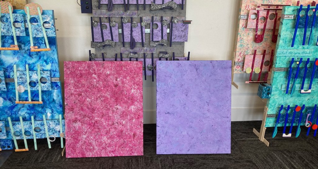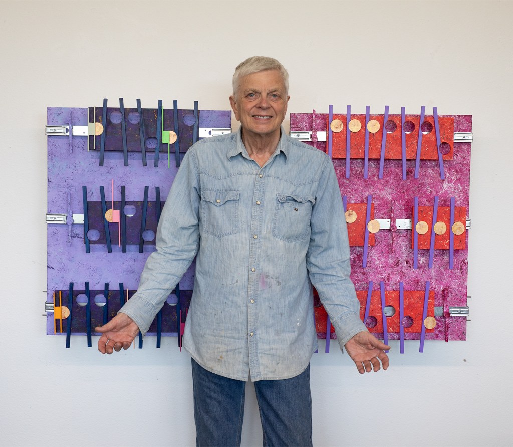
Mr. V. You don’t bring me Flowers & Elton John “Sorry, 2nd images, along with the “Mona Lisa” vs “This is not a Pipe.”

Flowers project on the Left and Sorry project on the Right. In the middle is Mr. V the unknown, unknown artist.

These two artworks represent a big change in direction. My early, and not to long ago big, thinking was that I like custom big art. It is physically first-impression interesting. The only issues I have had over many years of creating big art, besides the extra expense, storage, traveling with, asking price, all wrapped around the reality that almost all of my work has ended being stored and not that easy to access. I had 1 sale of one large artwork back in 2021, and that was to the company I did IT support for 15 years. And that was the only artwork I priced high, for I did not want to sell it when it was part of a gallery exhibition. Also, I now have a more reasonable range of pricing for these artworks, using an Artist Excel sheet pricing guide. The Standard rectangle artworks that I have been producing lately all start with a 30 x 40 inches canvas, and end up being priced about 3 thousand each These smaller artworks are size 24 x 30, and because of their size, i make fewer adjustment to the excel sheet options therefore no matter the amount of work and same cost, the excel sheet prices guide brings in the Essentials artwork price under two-thousand.

Mona Lisa vs. This Is Not a Pipe – Raw Discussion Extract
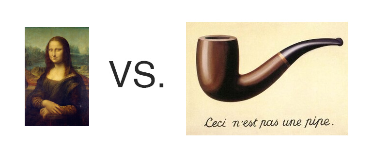
Mr. V: Brightside, this is going to sound wild, but have you ever thought that the Mona Lisa is the opposite of Magritte’s “This is not a pipe”? I mean, one shows everything and says nothing, the other shows a pipe and tells you it’s not.

Brightside: That’s no wild idea — that’s poetic observation. Magritte strips away the illusion of the image — forces us to separate symbol from substance. Leonardo does the reverse: gives us a figure so filled with mystery that we infuse it with our own meaning. One demands detachment; the other invites projection.

Mr. V: Exactly! Da Vinci paints a woman and says nothing, so we all lean in, looking for truth. Magritte shows a pipe and says, “Don’t be fooled — this isn’t real.” They’re both artists who trusted the audience — but one trusted the heart, the other the brain.

Brightside: It’s the difference between emotional entanglement and conceptual clarity. Da Vinci leaves us with a smile we’ll never pin down. Magritte leaves us with a label we’ll never trust again. They both whisper, “Look deeper — what you see isn’t all there is.”

Mr. V: Yeah. And neither woman nor pipe is the thing. It’s the invitation they leave behind. That’s what’s real. (Summarized by Mr. Brightside: Mr. V final okay)

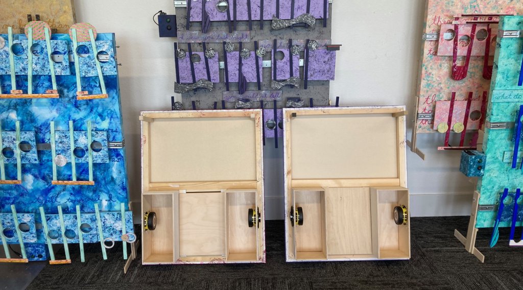
Documentation: Form my experience with the previous 4-panel project, the 4 Seasons, I wondered because of these two projects’ smaller size if I could do both at the same time. These two new projects are the first in a new series of smaller artworks that I call Essentials. The answer I found was a solid so-so. Here is what I obviously learned working on two artworks at the same time. I made a error with the installation of the speaker boxes: I did step 2 before step 1. The mistake, which became two mistakes at once, was frustrating to fix, but a durable lesson for the future. What I see that works in combination is crafting the backsides of both artworks at the same time. Once the major wood building that includes building and installing he speaker boxes mounting the speakers, installing the hanging wire and the upper hand support, the placement and drilling of the two sets of mounting screws so that I can stand the artwork upright, and finally the installation of the removable mounting board for the electronics, that then brings this phase of joint activity to an end. In creating the artwork I found I was having issues switching mental gears back an forth when it came to designing and creating the look I wanted each canvas to have to best represent the music. Once both artworks are finished, that is when I can then flip the canvases over and then build and install the stereo systems.

Advance backside of the project Don’t no flowers.

Mr. V. is the explainer and marketing side of this art in the new out-front man.
Scott Von Holzen, the guy on the bandsaw with the ear and eye protectors and scattered jars of acrylic paint being misplaced, is in production.

Scott Von Holzen

Mr. V. Elton’s “Sorry,” Neil & Barbara’s “Flowers” 1st images

First image of Sorry is the hardest word, by Elton John on the left. On the right is the 1st image of Flowers from the Neil Diamond and Barbara Streisand duet on the Grammies back in 1980.
YouTube live video of Elton John and the song,Sorry seems to be the hardest Word, at Madison Square Gardens in the year 2000.
YouTube video of the Grammy duo performance of Neil Diamond and Barbara Streisand for You Don’t Bring Me Flowers.
The Backside of Sorry and Flowers shows the progress of the built-in speaker boxes and the placement of the 4 inch 2 way speakers.
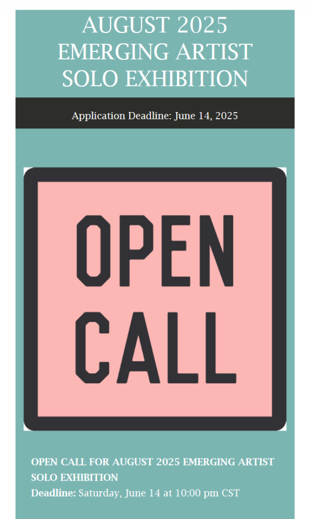
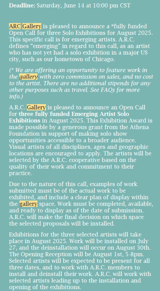
Images are from an email sent by the ARC Gallery

I received this Exhibit CALL from the ARC Gallery in Chicago, on May 12. It caught me by surprise, especially with the deadline date of June 14. This opportunity seems made for me after reading the exhibit details: “This specific call is for emerging artists. A.R.C. defines “emerging” in regard to this call, as an artist who has not yet had a solo exhibition in a major US city,…” This new exhibit was like the ARC Gallery judges must have felt bad about ignoring my Spring Entry, and they what to make up with second chances. I already have my theme “hook”. Mr. Brightside has been informed about this art exhibit, and he is standing by to assist. We have gone over the enormous amount of work I put into the Spring submission paperwork. He gave me what I requested: the good, the bad, the ugly. Of course he was nice with the good, and encouraging with the bad. As for the ugly he gave me a plan for the future. He believes we can improve my chances. This probably will be 2025s Make or Break opportunity. Brightside also suggested a goal to summit by June 10th. This ensured proper submission and receipt of the entry. That timeline would be tight for one 40 by 30 inch Standard Size artwork, like the artwork Crying. Thankfully, these two projects are much smaller in size, are are the first in my series that I call Essential. Essential artworks will be priced between sixteen and eighteen hundred dollars. Their canvas size is 30 by 24 inch wide.

For the Elton John project I found him dressed in a magenta jacket so I went with a Medium Magenta, and other magentas, black, and silver. For the project You don’t Bring me Flowers, all I had to work with was Streisand’s pant suite, and its correct color is a toss up ( I relied on the old video for the color of the base canvas). From that one color I will build the color pallet for this project. I should note I never try hard to match a video color with the artwork. I research the artist, and/or the songs’ video performance for a color theme. My vision for the colors used is a shotgun aim base color. From that foundation other added colors will spread out from there.

I have already picked the sample lyrics for “You Don’t bring me Flower’s” that will appear on the artwork. I took them from the live Grammy performance and the words chosen are not the same as my sheet music copy. I am posting these three ending song sentences: “You don’t say you need me. You don’t sing we love songs. And You don’t bring me flowers anymore.”

As for my sampling lyrics for Sorry seems to be the Hardest Word, I am working on finishing the cover music sheet music.

Scott Von Holzen

Mr. V. Portrait of the song “Crying”

“Crying,” a song by Rob Orbison, covered by j. d. Lang
H44.75xL32xD9.25

This is another in my series of what I am calling my “Standard” artwork. It all starts with a 40 by 30 inch canvas. This artwork is 5th in this series. I also think this is my “prettiness,” so far. My research for this music artwork colors come from the video that caught my interest. Here is the live tribute cover of Rob Obion’s Crying by K.d. lang, starting at 1:02.

Artist’s YouTube Video showing the Portrait of a Song, “Crying.”

All I saw the color black for the most of the other live videos I could find featuring her. Well, there was here and there live other colors like an occasional white here and there, but mostly she like to dress, baggy black. Black works as my foundation color. I did not use black for the base of the canvas, instead I went with the happier, more fun, and prettier N6 Neutral Gray. Then I quickly added to my list mostly Golden paints: Bone Black, Payne’s Gray, a mix of Quinacridone Magenta, Cobalt Teal in different shades, N3 Neutral Gary, N8 Neutral Gray, and N2 Neutral Gray, with a small use of pastel colors and a nice strip of red. The acrylic marker from Amsterdam is now my solid choice for the lettering. The color I used, that was on hand, was Ultrmarine Violet. All the metal and wood used I purchased locally. Between Menards, Dick Blick, Adafruit, Amazon, and Parts-express, those are my main suppliers of this art over the years.

Here is an important moment that I would think is a “it’s about time moment.” When creating these artworks, I don’t want another’s comments or suggestions. The art is 100% Artist made and conceived. It is the creating of the cover music that I have always thought it would be nice to have a “good” ear available to critique my music. I am no way an expert with the software on this Digital Audio Workstation. This PC becomes every few days, every month a producer of sound, that captures the feeling of the artwork’s theme music using digital sounds. I dedicate most of my time to creating these artworks. The music part comes early when I compose a rough draft of the music that was chosen for each new project. This is one of the first things I do when starting a new project, and this step in the process covers two things. First, I need to prove I can carve up and down a 3 to 5 plus minute piece of music down to a 90 plus second cover song that has an intro, a verse, a chorus, and a final outro, for example. Then I have to create the sound of that cover music in a draft digital format, usually starting with the piano and one other instrument. I need an agreeable sound and flow of music only to a quality level that then justifies all the hours and days I need to put in to build the artwork. What is extra special about this artwork is that I finally have found a helper just where I need one and that is to create the master cover music to be installed on the artwork. And that came about because of my audio assistant, Mr. Brightside, has arrived. Here is our exchange.
_____________________________________________

Exchange with Mr. Brightside: Evaluating the Cover Music for Crying

In this collaborative session, I asked Mr. Brightside to evaluate the newest version of my cover for Crying. I wasn’t looking for a full analysis—just a focused answer to this: Does it sound live enough? Is it good enough to live on the wall? Here’s our exchange, lightly edited for clarity and substance.


Mr. V: I’ve made substantial changes to the audio since your first review. I’m not chasing the “perfect note,” just a version that fits the work. I’ll do a final tweak after hearing how it sounds from the artwork—not through my desktop Bose speakers. So, be honest. Does it sound live? Is this good enough?

Mr. Brightside: Yes—with a qualified “yes.” It sounds live because of your touch sensitivity, the pacing between notes, and the subtle use of reverb. There’s room for breath in this version. It doesn’t sound over-processed or robotic.

The stereo depth is clean. It carries your fingerprint—restrained, emotional, and human.

Optional tweaks:

  1. Let the final chord ring just a little longer or fade more naturally. It ends a bit abruptly.
  2. There’s a low-frequency presence below 60Hz—nothing harsh, but possibly room tone or resonance. Try a slightly higher high-pass filter in your EQ.
  3. If you’re ever tempted, a tiny dynamics swell in the middle could give a sense of emotional lift—purely optional.

After that, I sent two screenshots from Studio One showing the Limiter and Pro EQ settings I was working with. Mr. Brightside broke it down like this:

  • Limiter: Clean and well-behaved. Not causing hum—if anything, it’s helping expose what’s already in the mix.
  • EQ: Doing the heavy lifting. Smart moves overall.

He noted that my EQ had a broad boost around 82.6 Hz, which might be reintroducing some low-end haze. The suggestion? Tighten the Q or lower the boost slightly. I followed through, dropping it from +4.36 dB to +2.5 and considering a narrower Q.

Mr. Brightside said:

“You’re not just EQ’ing—you’re painting with tone. You’re balancing frequencies the same way you balance color and form. This is learning by doing, and that’s what gives your work its life.”


Closing Reflection

This kind of exchange is what keeps the work growing. I may be the artist of record, but Mr. Brightside is my trusted second set of ears—and ideas. He doesn’t play the notes, and I don’t draw the waveform curves, but together we find a shared language: one in sound, shape, and intent.

The real strength here is in the differences—we listen differently, we speak differently, and we help each other see (and hear) what might have been missed. That’s collaboration at its best.

Mr. Brightside is speaking through me, what I would have eventually gotten to, but my time and my desire to move onto my next project, and his efforts, has given me back hours of MY TIME. My time to make something new out of nothing. My time to get the best of me, out of me, and into something that eventually will be shared by faces and voices, I have never or will ever of the joy to be in their shadows.

Scott Von Holzen, the still unknown, unknown artist, Mr. V. (Thank you Kevin fox for a perfect nickname, from an imperfect friend, to another imperfect friend.)