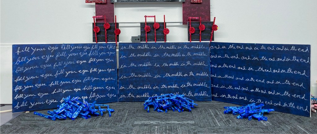
This is the first time I have used Liquitex acrylic pens for the cursive writing on these three panels. I learned quickly their use writing the words for Golden Slippers on the left. All did not go well. I made adjustments and the last two canvases’ appearance improved. I am a better printer than a cursive writer. That you can see in the cropped Vivaldi’s image below. But this current is no longer a product of that time.
When I saw the handwriting of Jean-Michael Basquiat, that gave me the excuse I needed. I needed an excuse? Before Basquiat I would tolerate the time-consuming perfection of the printed words seen obviously in all thirteen artworks of the Vivaldi series. When I looked at Basquiat paintings, I realize the difficulty of beautiful penmanship or calligraphy was no longer a necessity for this art. I could move on. That I could print or write in my own unique style was a relief. That is when I switched from printing the word to cursive.
My reasoning is cursive writing is more natural, and more fluid for me. Also, cursive, in my handwriting style, is so bad that at the time it takes on an abstract look, that printing lacked. I like that a lot. I am now comfortable with the look at my words on these artworks. Importantly, every letter carries with it the look of me. Therefore, I do not care if they are legible, knowing that by repeating them eventually the viewer will be figure out what they say.


As is obvious from the opening image, I am putting together all three artworks at once. I am also sharing their style and the colors used. What will separate each canvas are the words, the arrangement of the notes, and the placement of the speaker canvases. When finished, these three works will hang as one artwork.
I am creating these three artworks, as a triptych, to make a statement to my art group, EmptyWallsArt, and to the artist community that I am, I guess, still a part of. This needs to be done. I am well aware of the importance of what I am doing. I am also aware of how difficult it is for others to see the value of what is being done. The why answer is simple: this art rarely sells. That is my fault, for my emphasis has never been on selling this art. My focus, from day one, was to push art history forward in a different direction. Never was it about making money. Although, I would certainly love to cover my art expenses that run thousands of dollars each year. The failure to promote this art may be in not figuring out what marketing direction I should focus on. What I know is that cheap everyday contemporary arts’ value is in decoration, while art sold by Christie or Sotheby’s auction houses is an investment. Neither of those ideas is realistic for me. So it goes. So, I need another find another market idea to keep this art on the move.
Scott Von Holzen

