S_V_H Fine and Mellow image1

Fine and Mellow words and music by Billie Holiday.  This performance on live TV in 1957 was all I needed to convince me to paint this music. In this video  Billie Holiday sings Fine and Mellow  accompanied by Ben Webster, Lester Young and Coleman Hawkins, all on tenor saxophone, Vic Dickenson on trombone, Gerry Mulligan playing the baritone saxophone, Roy Eldridge and Doc Cheatham both on trumpet, Danny Barker on  guitar, Milt Hinton plays double bass, while Mal Waldron is on piano and Osie Johnson plays the drums. These are a lot of great jazz musicians all backing up Billie Holiday.


fine&Mellow_1

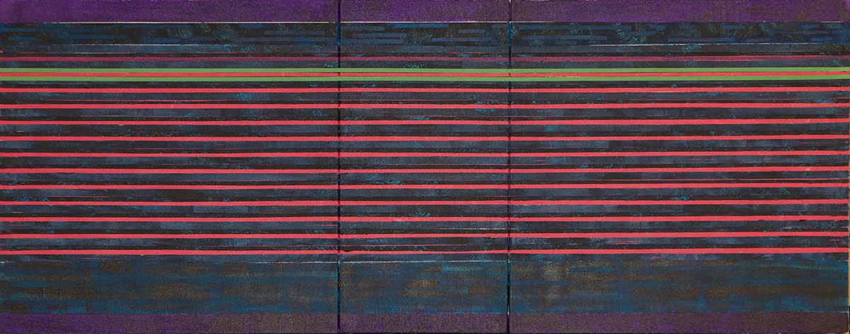
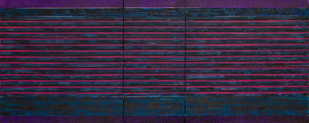
This early image of Fine and Mellow shows the original medium magenta stripping, after the first re-taping where I reduced the strip size by a half, to try to tone down its impact on the background. This thinning of the line helped, but the strip was simply not dark enough to fit the mood of the video.  In a change from many of my earlier works I decided to paint both the top and bottom white strip in shades of dark purple. Seeing how the purple appeared to work out, I once again re-taped the magenta strips and painted over them with a purple wash, which finally resulted in the background the mood I was looking for.

fine&Mellow_2Up next is the music. For the music my original thoughts where to use brighter colors to contrast with the background. Now, I am thinking differently. This is a rare black and white video of Billie Holiday singing a blues song, so to keep with the atmosphere of that music I have decided against any sharp separation of the music from the background.  Instead, I am going to try to create the effect of the music moving back-en-forth into the background,  and then swinging back out to the forefront of the artwork.
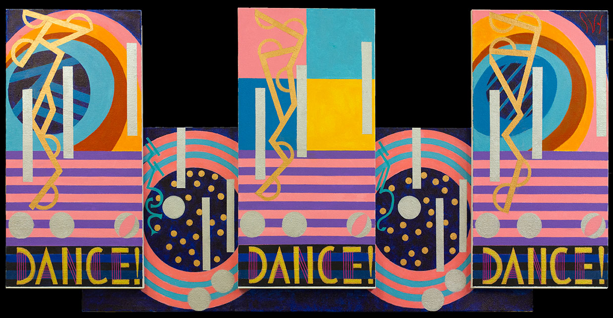
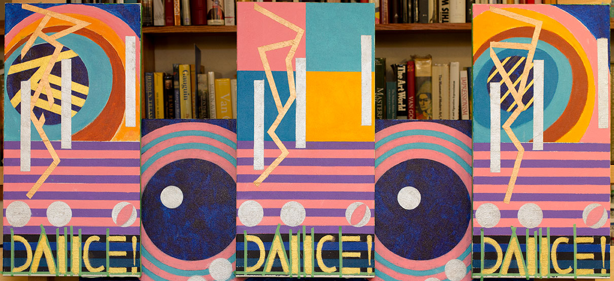
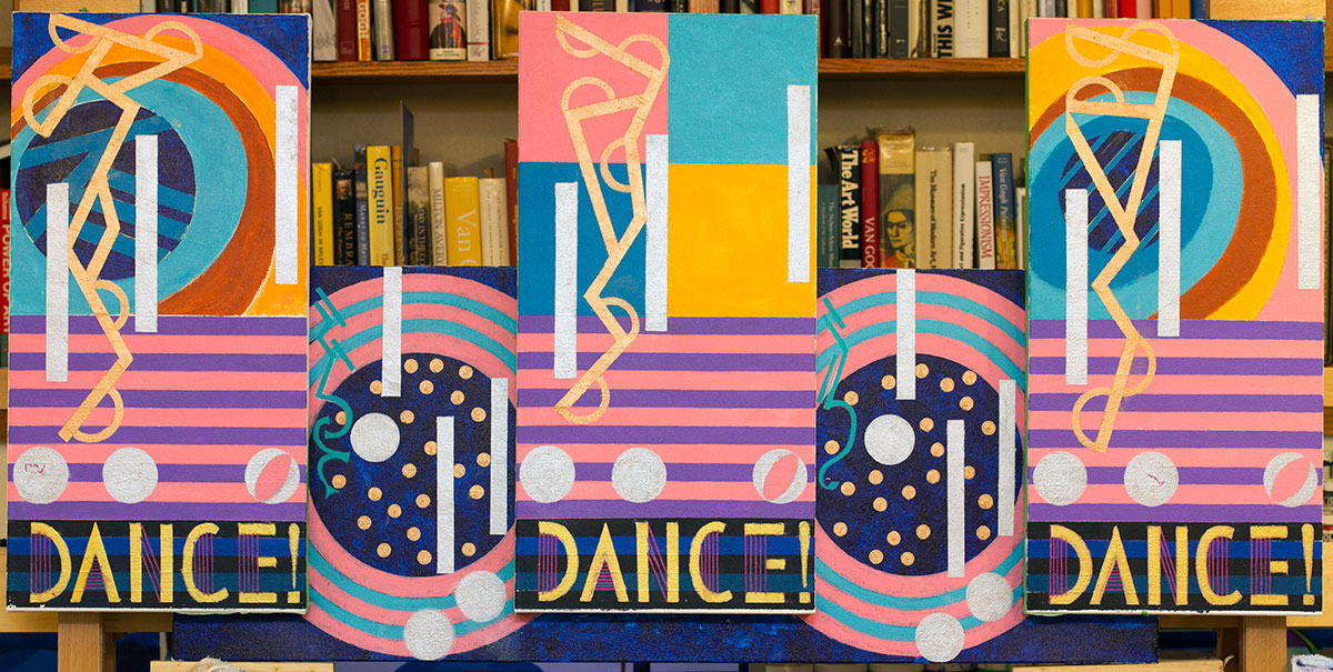
Scott Von Holzen


S_V_H I Won’t Dance Final Image

IWontDance_Final

I Won’t Dance is finished, and I am liking what I see. This artwork looks to challenge, looks interesting, and looks like nothing else. Now, none of those adjectives guarantee that this art form, including this artwork, will have any lasting value, but for now, if you want to own, I Won’t Dance, you will have to check out the listing on Etsy.

Once again here is the video this artwork is based on. I cannot tell you exactly what elements from this black and white film clip this artwork uses.  What does matter is what I felt watching Fred and Ginger interact, their style and the atmosphere around them. That is all I needed to create the theme for I Won’t Dance.

What do  I think of this artwork? Well, I will  tell you, it is crazy cool, and out of sight. Not only is this a great Jerome Kern song, it is catchy tune that, over the years, has been persistently a favorite song of mine,  popping up, and putting a smile on my face. Maybe I like this music because I am such a reluctant dancer. When I was in college I had to push myself  to ask the girl to dance. I was okay once I did, but up to that point, I was a one man debating team.  Well, I have grown since those days (although I am beginning to race back to the future), and the thought of dancing feels good to me.  I see this artwork as something special, and very approachable dance piece.  My  impression looking at I Won’t Dance  is that it makes you want to dance, dance, dance!  Enough said.  I should shut up, for this artwork had me at the first dance.

Scott Von Holzen

S_V_H I Won’t Dance image 3 & 4

IWontDance_4

I Won’t Dance is a painting that is going in its own direction, and not necessarily in keeping with my original idea of trying to keep the coloring and style simple. This became an obvious concern after painting in the music. I  like the background to play a strong role in the artwork, but with the second and fourth panel I am seeing a mess of shapes and colors that do nothing for the look or the music.

IWontDance_5IWontDance_5A

After writing that comment, I turned around to take a hard look at this artwork, and decided that I have not reached that artistic level to know how to keep a busy background from interfering with the music. That decision required a paint over, and what you see above is Image four of I Won’t Dance.  The original idea was worth a try, and less riskier with smaller works. This was an easy fix: small work, smaller mistakes.

A couple of interesting features with this last image is the font that I used for the words, and the doting used in the two inside sections of this artwork. The font I got  from an Art Deco book, and although it has been a lot of work, I thought it was a wonderful choice. For this artwork the art deco look works marvelously. Still, in that art deco thinking I needed something to break up those big blue circles, (the dark blue represents the masculine aspect of this work).  A simple effective choice was a large number of small circles painted in gold, the feminine contrast.

I have never painted anything like this, and maybe that is why I have, so far,  invested over a months worth of effort in I Won’t Dance. Originally, I wanted to be done with these small works in two to a max of three weeks.  Thinking this over, I now see that three-weeks  per small artwork makes more sense. This reasoning is because I am now spending more time teaching myself Music Theory, practicing piano, and learning the violin.  Soon, I will have an alto saxophone, which will need time and attention. My thinking is if I am painting music,  playing music, learning the language of music, or reading books about art or music, any of these options makes for a better artist.

Next up, is the final image of, I Won’t Dance.

Scott Von Holzen