S_V_H The Liechtensteiner Polka image1

No, I am not disparate for source material. And “Ja (yes)” this artwork’s subject matter is Polka music. Before you click on the link to Ten reasons you should lower your expectations,” or ” Fifteen ways to justify your personality flaws,” know that this was one of the few remembered songs that I played on the accordion when I was seven to maybe ten years old. “Ja das ist” the Liechtensteiner Polka.  I must point out, I  have to use a cheat sheet to spell “Lie_ch_ten_steiner.

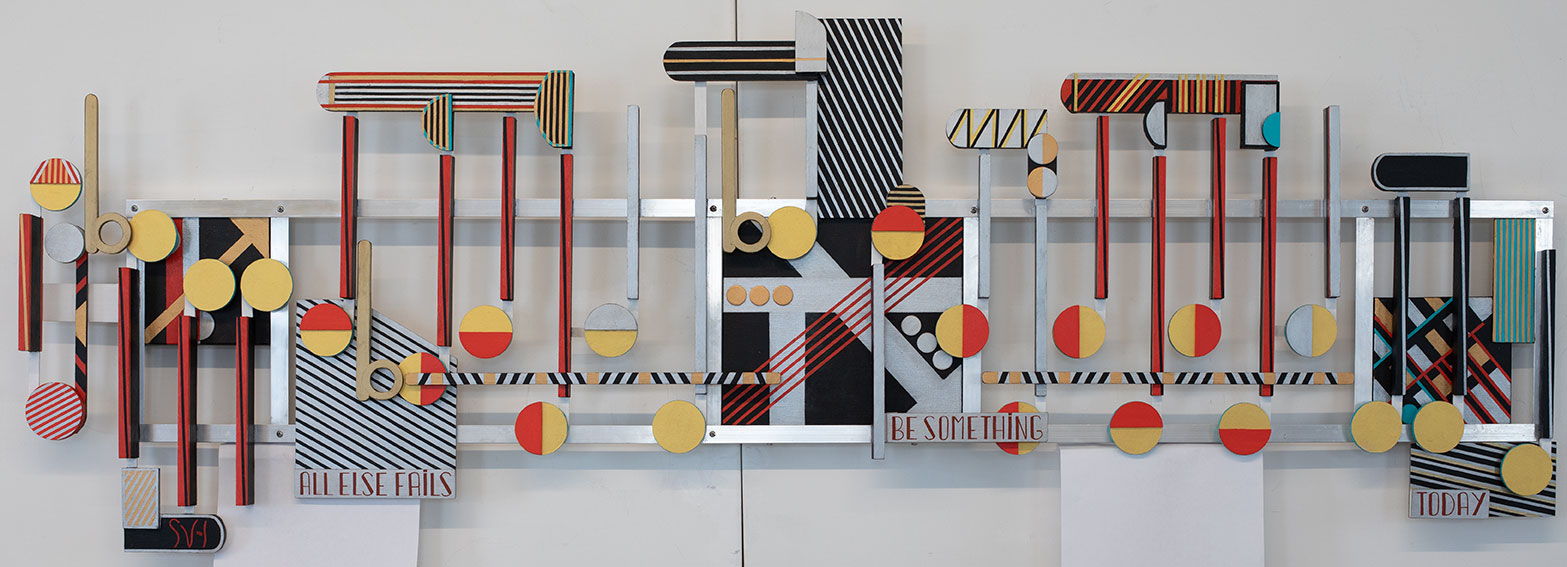
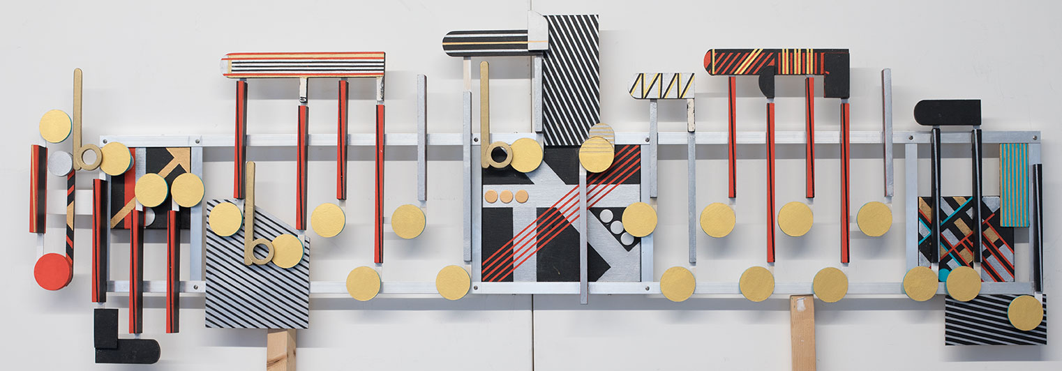
This is the first rather empty image 1 of the Liechtensteiner Polka.  This artwork now consists of two small 4 x 6 inch canvases with an aluminum frame, about 36 inches in length.  The white and black colors come from the costumes worn in the videos.

In my accordion days I remember this music as an instrumental:

What I have now found is that the Liechtensteiner Polka by Will Glahé reached to number 19 on the Billboard Weekly Top Forty in late December of 1957.  Sam Cooke’s You Send Me was number one, while Jailhouse Rock, by Elvis was number two that same week.  I would have been nine years old at that time. I have no memory of listening to either Sam Cook, Elvis or the Lie_ch_ten_steiner Polka.

In fact I was a little shocked when first listening to Will Glahé singing the Liechtensteiner Polka in German. I know it makes sense that Polka music is sung in German, but actually hearing my favorite accordion song in German, reminded me of old war movies about the Nazis and Adolf Hitler. I know not to stereotype Germany. My heritage is 50 percent German Swiss. Still, having an English version would have been nice, except for the, “Ja” parts of the music.  I was all in on that language. In fact after listening to this catchy tune multiple times sung in Germain, I  found myself singing at random moments,  with no clear reasoning, “Ja, Ja, Ja.”

Here is that vocal version of Liechtensteiner Polka:

I do counter the Germanic voices in my head by watching and listening to other videos, including the legionary David Bowie singing live, wind sweep hair and all, “Bring Me the Disco King,” a favorite.

"ja, das ist gut"

Scott Von Holzen

S_V_H Vogue Final Image

Vogue, acrylic on three canvases, with aluminum and wood features, 64 1/4″ in length by 22 1/4 in height.

Vogue, what the Hell are we looking at here? For the first time viewers of this blog they probably see a mixed media abstraction, minus fabric and beads.* To returning quests  Vogue’s style (stripped of emotion) is that of a three dimensional representation of a flow of music that is the theme Vogue. Looking at Vogue I can see this artwork in either way. Together that means Vogue shifts from the main purpose of the background which is to physically support the music.  With Vogue this is a return to the blending of the music into the artwork as seen in these early examples.

Joy to the World – 2006
Mood Indigo – 2007

Aspects of how Vogue blends the music into the background can be seen in comparison with In The Mood, the current header image of this blog site.  The obvious difference with Vogue is the amount of decorative design, and the overall use of the same colors for the music and the background, not seen in In The Mood.

A notable physical change with Vogue is the spacing of the music which is purposely tight, to create more tension between pieces. In comparison the music from In The Mood spreads across the background as if to take up space, resembling sheet music. Another blending technique is in the stem design. The stems used for In The Mood are all standardized, similar to their appearance in sheet music. With Vogue the sheet music look is broken by the varying depth of the stems across the artwork.

I consider Vogue a major work because of its size, complexity, and the time required, over three weeks, to complete. Vogue is the third original artwork completed this year. That means a possible total of only twelve new original artworks for 2018. That is not much output, that became startlingly obvious when the local gallery took seven of my current artworks. This left the number of newest works for other venues, very thin. That is where the development of my mini-artworks, that average each a day or less to produce, will help the production numbers.


(This video like all my videos starts out great for the first few seconds, and then quickly deteriorates into a lot of mumbling and incomplete sentences.  What saves this video is the self deprecation of the lyrics discussion near the end.  It is a laugh.)

Scott Von Holzen

*reference to a local artist genre

S_V_H Vogue Image 4

With this fourth image Vogue is nearing completion.  What still needs to be done are the words,  a few minor add-on wood pieces,  and the finishing. In past projects finishing meant mostly touching up the paint, and sharpening edges.  What will be different with Vogue is the finishing.

Vogue builds on the influences of the Vivaldi artwork RV531, mentioned in an earlier blog, and the recently completed commercial project, Like A Rock. Where Vogue differs from its predecessors  is the overall emphasis on the decorative.  In addition to my standard touching up I am going to look at adding some extra Art Deco features to Vogue.

My unwritten plan for Vogue was to abandoned more of the last influences of sheet music. With Vogue I am seeing the typical domination of the flow of the music, lessened  by other features that can also represent music.  With the artwork Vogue the next giant step forward may now be possible.  It is time.  After twelve years of work I need to finally step through that door, and close it behind. There are other handles needing reaching.

This is my 550th post. I think that is remarkable documentation of this artist’s journey.  The best is yet to come.

Scott Von Holzen