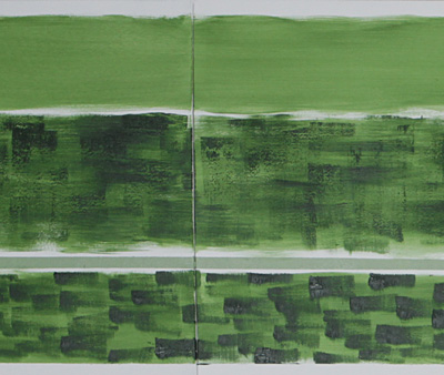
S_V_H Vivaldi’s “The Four Seasons(Spring)” Largo image1&2

Vivaldi’s The Four Seasons Spring II largo RV 269 the second in a series of 13 works to be completed.

This first image is 120 inches (3.048m) in length by 24 inches (.6m).  The result of this first stage, besides getting my brushes wet again, was to put down different flavors of paint that fit the mood of the music, to see what happens.  That is what you see above, nothing special, only a starting point.  Go to this YouTube link to  Itzhak Perlman’s nice rendition of  Spring.  At about 3 minutes and 20 seconds in, is the beginning of Spring – Largo.  This movement in Spring, is certainly not a favorite, but throwing some paint at it, will put the art and the music in the right light.
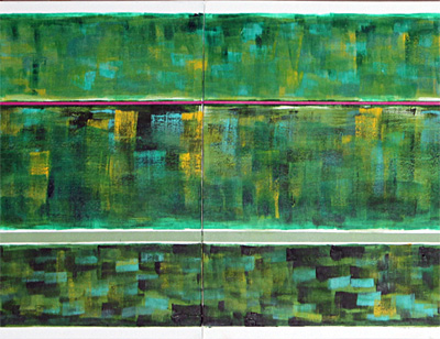
Now, this second image is where serious considerations begin to come into play.  The first image has a lot of movement across the canvas, but that has been slowed with the added horizontal brush strokes. Also, the edges where, either sharpened , or better defined, too pull the three parts together. A change, of lately, is that the backgrounds do not have to have that finished look, which  previously meant that a background had to be able to stand on their own, like a separate artwork.  Now, the thought is to work up a good, basic background, and than adjust it when the music comes into play.  That makes more sense, and what comes from experience, which is a good teacher as long has it is not an end in itself.   That is important, especially for a person of my age.  It is good to let-it-fly at times just to see what sticks.

Listening to Itzhak Perlman  and Vivalidi’s Spring.

From here, starts the next challenge.  A number of put-on canvases of different sizes have been prepped.  The music flow will be placed and worked into a good fit, and then the add on canvases will be figured out,  than attached,  which will give this work some life.  Green will still be the dominate color, like in  Summer – allegro non molto, but because it is spring, there will be spots of brighter colors across the work to pop it, and to reflect the season.  It makes sense to change the color schema, not only according to the season, but with each movement,  from early, middle, and late in the season.

Piano Man – Billy Joel

Robert Palmer – Bad Case of Loving You

Scott Von Holzen

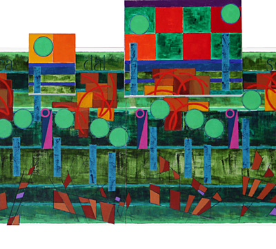
S_V_H Vivaldi’s “The Four Seasons(Summer)” Allegro Non Molto Final Image

Vivaldi’s The Four Seasons width about 110 inches (2.8m) by 38.5 inches (.98m). This painting is not the largest every photographed but what made it difficult, to photograph, was the added canvases, and a studio with less than eight foot ceiling.  A lot of work has to be done to get the camera, the flashes, and the artwork to work all together to get a decent, evenly light image, without glare, that is fairly square in appearance, with accurate color.  Even accomplishing all that, Photoshop is still a valuable asset that was needed to tweak the final image.  In the end, it is a good representation of the work.

Listening to Eva Cassidy – Somewhere Over the Rainbow

Still, it is not perfect, and the thought is to re-shoot this image, one more time with the camera higher up to remove seeing as much of the bottoms of the add on canvases as possible, and using Photoshop, to improve the bottom edge contrast.  The reason for this concern, over the image quality, is that there is a preliminary plan to print a few canvas images of each of the artworks from The Four Seasons series for distribution.

This first Four Seasons artwork shows the influences of the previous two works, that pioneered add-on canvases.  That is part of what is expected, and  that now sets a baseline for the next work, and those that will follow over the next two years. The disappointment of, what is expected, is that somehow I can not but feel the wish that this work had broken even more ground for such an important beginning of this seres.  Every artist has this hidden fear of  what if that is all there is, and not just Peggy Lee.

Sarah Vaughan – My Funny Valentine, sung live with her marvelous later voice.

To put that thought in proper prespective, here are some feelings about the  artistic steps made by this work.   That small smooth, straight green line that started this work, is something that will be carried over that will start all of the next works.  That simple line, like  a rope or tape around a package, holds the music and the artwork together, no matter what else was done.

Those six medium magenta and Deep Cyan rests (the narrow pink triangle objects, along side the small pink circles) all in a row make a statement, that demands attention.  I like that.  Those crazy beams, mostly along the bottom follow a color pattern that bounces along and keeps this work moving, are cool, and interesting in themselves, even without the music.  Those red slurs along the top, also, add greatly to the motion of this work, but unlike the beams their movement is contained.  Now take a look at how the flow of the music is slowed by the green note heads that are a solid color, without the inner smaller circles, that usually are added to spin the music along. The blue  shafts under the note heads are soft light blue that follow along and blend well with the background green colors.

Lets not forget to mention those wonderful Italian words for this artwork, and the decision that made Italian the language to be used on all the future Four Seasons canvases.  Finally, take a look at the final note on the far right? That one note, split and shifted as it is, brings the music to a stop, as it should, and creates a new interesting style direction.

Listening to George Carlin – Dumb Americans

Johnny Cash – If You Could Read My Mind

Let me put all of this in perspective.  Although most music has been written down as sheet music, to organized it, to document it, to make the sound available to others (I can go on-and-on) it is a fact that the paper the music is written on is just a starting point for the musicians that sing and play it.  Everyone knows that,  and this is what this art is dong:  playing and displaying music in its own way.  But, what separates these musical artworks from all other musical art is this artwork emphasizes on the actual flow of the music which is present in the music not matter who is singing or how it is being played.  Sure, the  movement of any of these artworks, matches the look in hundreds of different pieces of music, but that is good for it separates this art from sheet music. I am not trying to imitate sheet music, but only trying to display the a flow of music that relates to the title of the canvas, with a unique interpretation. That is the goal, that is expanding in look and meaning, with each new work.  So, maybe I should feel that this art is opening up as it should, with this first Four Seasons artwork, being a nice step forward in its unfolding.

Listening to Mozart – Serenade No. 13 KV 525

Scott Von Holzen

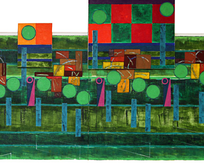
S_V_H Vivaldi’s “The Four Seasons(Summer)” Allegro Non Molto image3

Antonio Vivaldi’s Summer part 1, three panels (110 inches in length), with four add-on’s.  About 3/4 of this work is finished which leaves 12 and 1/4 canvases to go.

On all 13 of these canvases there will be added some of the words from the The Four Season Sonnets, attributed to Vivaldi.  It just seems like a great combination, wonderful music and words for all the unknowing to grasp onto, if the music do not move them. But!

In Italian here is the opening line of the Summer sonnet:  Sotto dura staggion dal sole accesa. That line would correspond with this canvas. You think it would be a simple translation to English.  It is not.  Here are a number of the translations that were found on the Internet and one from the Book Vivaldi Voice of the Baroque:  “Beneath the blazing sun’s relentless heat,”  “Under the heavy season of a burning sun,”  “Under a hard Season, fired up by the Sun,”  “In the harsh season scorched by the sun,”  “Beneath the blazing sun’s relentless heat,” “Beneath the baking sun,” and from the book “Under the heavy season of a burning sun.”  So, what is the best choice?  I have no idea.  So, I went to Google Translate, from Italian to English and for “Sotto dura staggion dal sole accesa,”  it said in English “Under a hard season of the sun on.”  That did not settle anything.

Here is the thought: since all of the sites started with the same Italian words, I have this choice which is to use the Italian words on these canvases.  It seems the only choice since the original sonnets where written in eighteen century Italian, who knows for sure what, if Vivaldi did write the Sonnets, just exactly what his words translated into eighteen century English where.  The meaning  of the words will rest with the viewer, and that is exactly what  has been the goal for all of this artist works.

Italian it is.

Scott Von Holzen