S_V_H The Beatles Triptych image 4

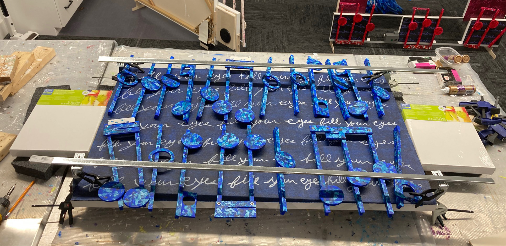
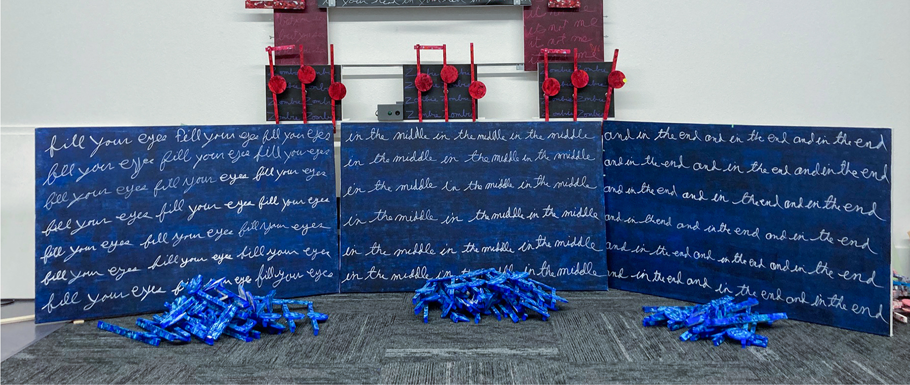
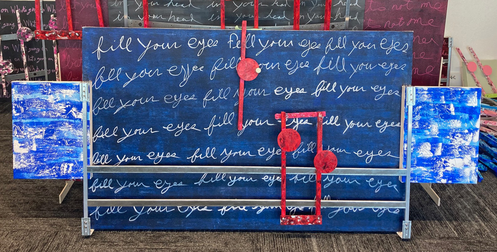
Above is an earlier update gallery image shows the probable arrangement of the music for the three Beatles artworks. I am using the notes from the previous project, Zombie, to show the music’s placement.

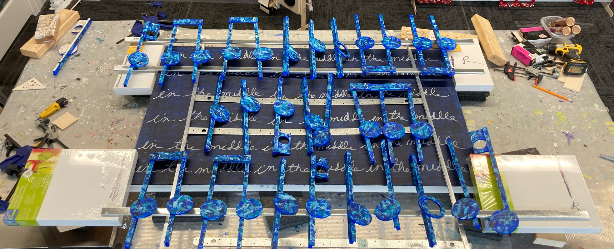
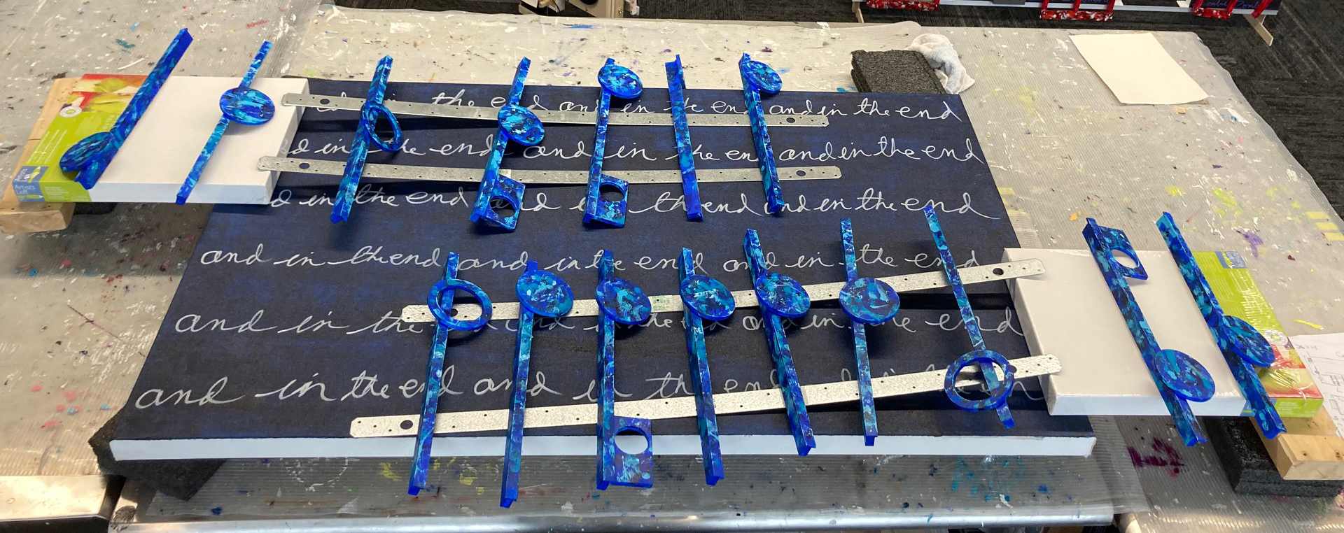
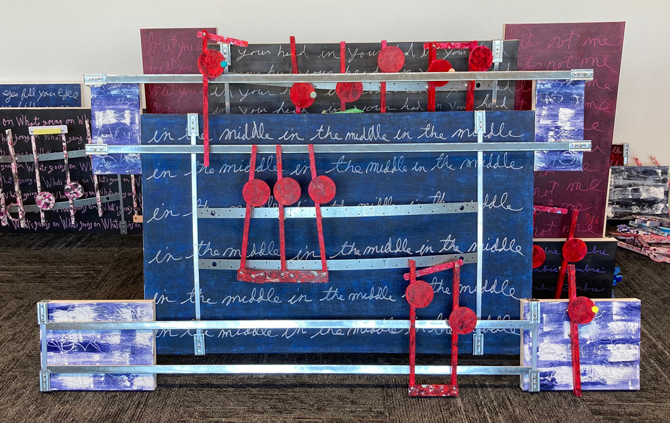
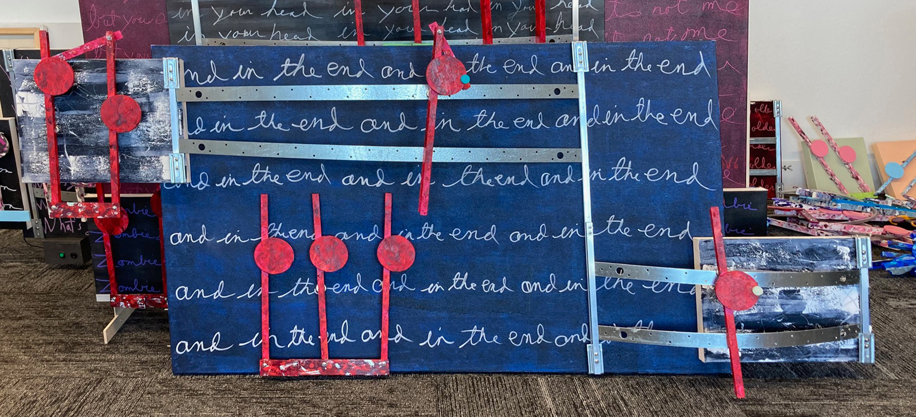
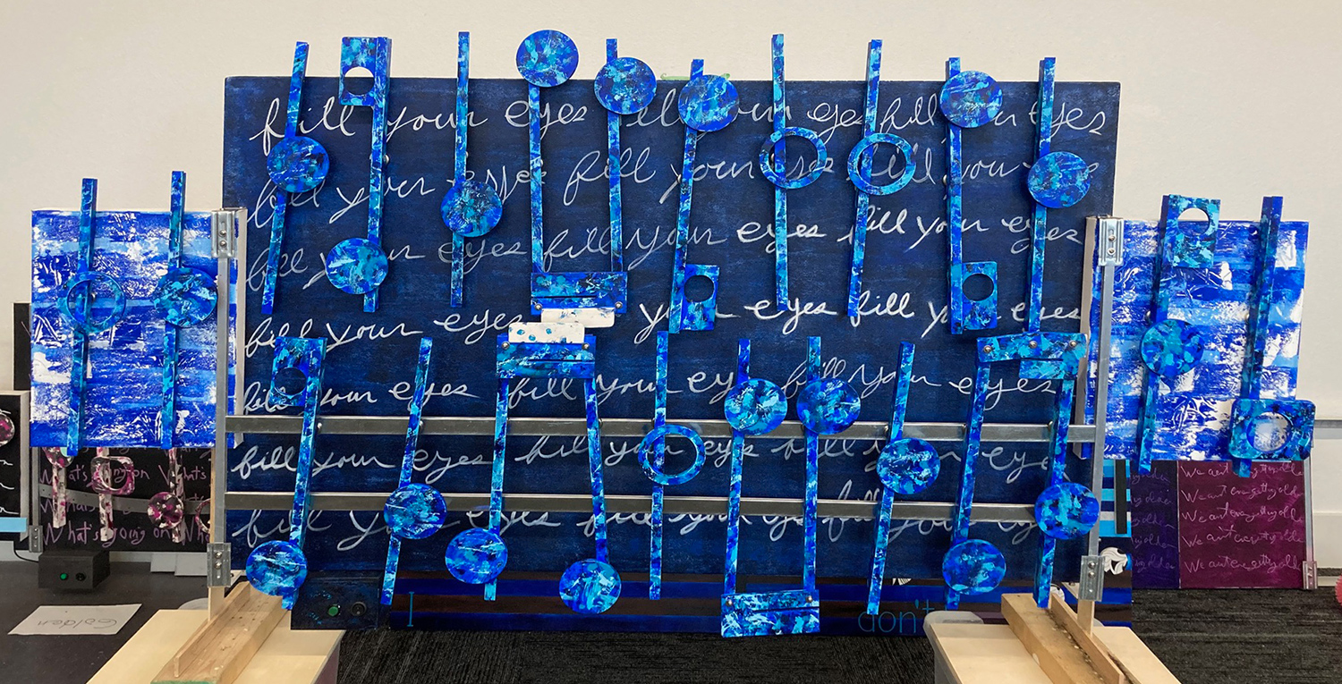
Four days later this next gallery displays the finish placement of the music for each artwork’s notes.

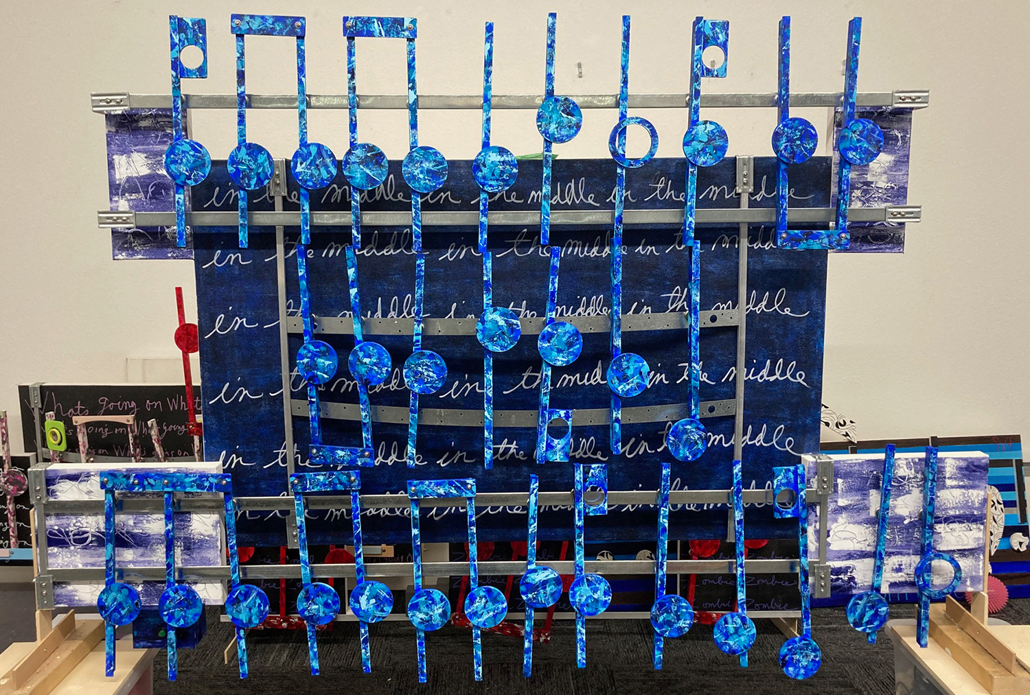
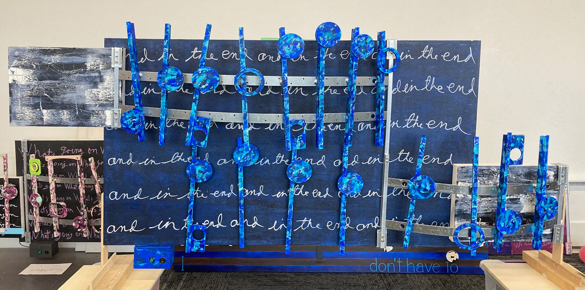
A pleasant surprise is that I am only nearing three weeks into this project. I took on the challenge of constructing three artworks, all at once, knowing my deadline was around the middle of this January. As of December 6th the visual part of this project is near done. Of course what made this possible was that each of these artworks share features and the same color chart. That saved considerable time to where yesterday I soldered together all three stereo systems.

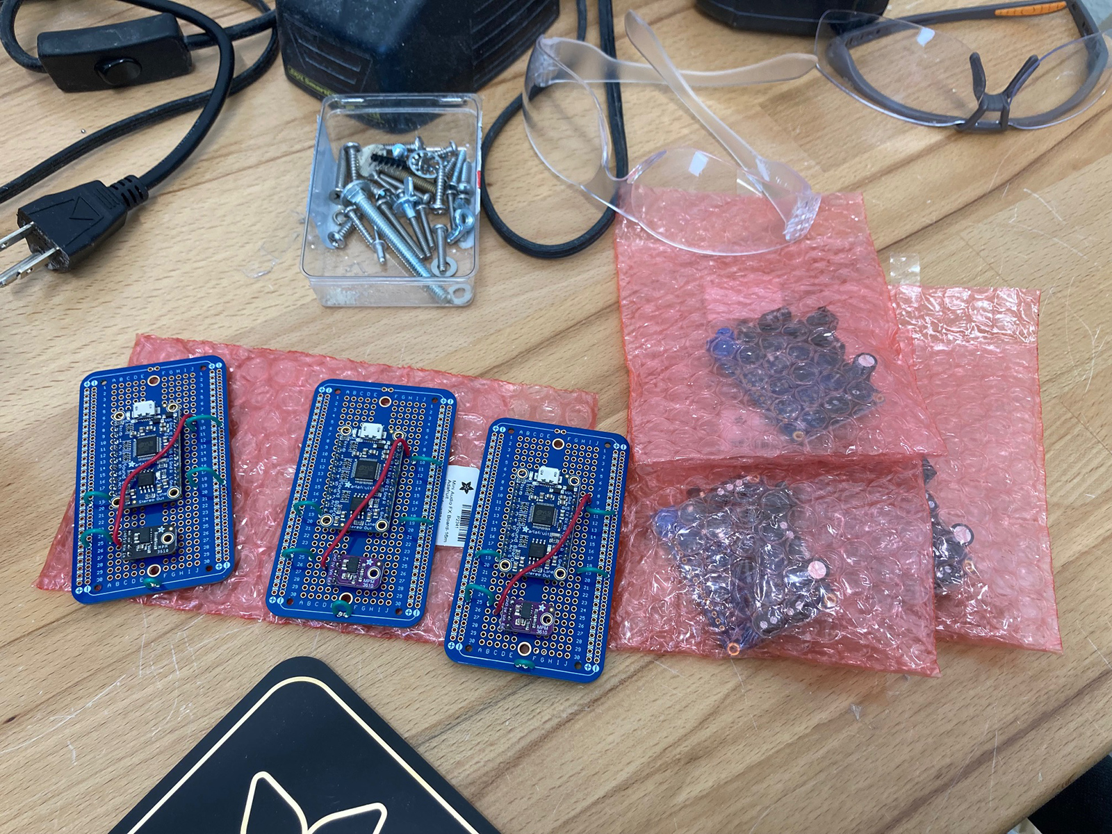
Creating the cover music for each of these songs is the next challenge. That starts soon after I post. After installing the music box music I will not be done. I need to develop a fresh approach to marketing this work. My reasoning is that I have never recalled no one ever saying to me, “I get it.” That is my fault. Even after 17 plus years of presenting this art, there has been no momentum breakthrough because I have simply failed to explain it. It is time to develop a new marketing approach to post alongside these artworks. To start, I need to present a better explanation of what this art means to me.

Most people understand what is art when it is recognizable. For example, picture a painting of a sunset across a solitude and silent pond. The still water only rippling with the passing of loons. All of which is hidden by a deep fall forest, surrounded by majestic old-growth white pines. This would be easy for me to visualize, and therefore, easy to appreciate. That would also be an example of what sells in this art area. Abstract also sells, for it is a picture of nothing. Therefore, a deep understanding is not required. But this art absolutely needs to be understood to be appreciated.

Therefore, alongside the artworks, I will hang brief details in images and words explaining how this art relates to the music it is portraying. I am not doing this thinking it will connect to the general viewer. I have never thought from this art start that would ever be possible. Instead, those images and words alongside the artworks are there for that one in the tens of thousands that has yet to view this art in person. That one individual that pauses, that hesitates to pass by. That one, that one that lives to visualize the possible. The one who silently acknowledges, “I get this.”

DECEMBER 7TH (PEARL HARBOR REMEMBRANCE DAY) supplemental update:
In this blog entry I mentioned an example of art that I could easily understand. This day I ran across an artist, who is having a current exhibition at the Overture in Madison, Wisconsin, that relates to that point.

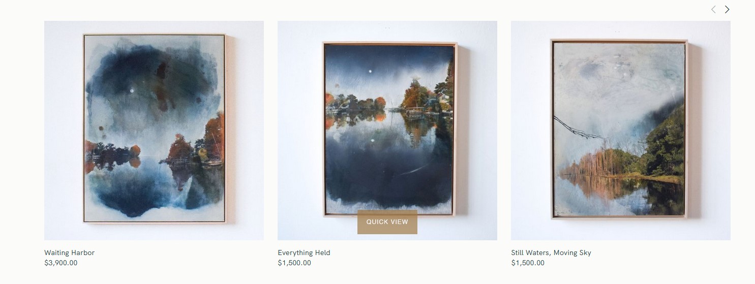
The artist’s name is Stephanie Barenz and although she is from Madison and not the Eau Claire area, I see her contemporary landscape art as a great example of art that should be easy to sell. And yet, although I admire her work, it is an undeniable derivative art made for in its moment. And there is nothing negative about that. She represents a good example of the best of what I see around me and elsewhere in contemporary art: well crafted, pretty and somewhat fresh art. She also presents what I would like to see more of and doesn’t: originality and/or uniqueness, which keeps me looking elsewhere.

Art throughout its history has been about making the sale. That changed somewhat with the blip that occurred in the early 20th century that shaped my philosophy on art. Still, today’s art remains driven by making that next sale. Art that is kinda different, but obvious in its intent, is an art that makes the money. That is reality. That is what today’s art is all about. As far as Ms. Barenz’s art is concern, again I like it, and her art deserves respect. The things at a glance I wished I would have seen are the loons and white pines, which surprised me. Hopefully, she has such images I did not see. Or otherwise maybe when she is up in Northern Wisconsin early or late in a summer day, she will have along her sketch pad.

Scott Von Holzen

S_V_H The Beatles Triptych image 3

I now have a working layout for the three artworks for The Beatles’ triptych project. I do this to confirm that all the sampling notes fit on each artwork. Below, I am showing the layout image that illustrates the hanging order. Following the same order of Paul McCartney’s video featured in the previous blog, the first image on the left will be Golden Slumbers. The center image is Carry that Weight. The right image is The End.

In the past, I have worked on one project at a time from start to finish. Every new music box project begins with the creation, in PerSonus Notion, of a draft cover of the music. I then take my cover sheet music and chose the sample that would be the worksheet for portraying the music. I did not do that with this project. Instead, I first put together the worksheet sample for each of the artworks. This change came about when I decided I needed to build all three artworks together. I decided that each would share a common design, the same use of color, and other visual features. This came about because of time constraints needing all three completed by the coming mid to late January. That then pushed me to get this multiple project going, knowing that the cover music was secondary to the need to have completed artworks. Currently already deep into this project, the time line looks a lot better. I believe now that I will have both the artworks and their music boxes completed before they’re hanging in January.

Currently, I am working on the backside of the artwork Golden Slumbers. The image below shows the installed steel plates across the top side of the artwork and in the speaker box. From the layout seen above for Golden I have added to both speaker boxes a steel plate to move two notes from each row off the main canvas. I had to do this after using the arrangement of the layout. I realized that twelve notes across a thirty-six inch canvas would be a tight fit.

Scott Von Holzen

S_V_H The Beatles Triptych image 2

The Beatles Triptych main canvases from left to right: Golden Slippers, Carry that Weight, and The End. In front of each is their completed musical notes. Each canvas is 30 inches by 36 inches.

This is the first time I have used Liquitex acrylic pens for the cursive writing on these three panels. I learned quickly their use writing the words for Golden Slippers on the left. All did not go well. I made adjustments and the last two canvases’ appearance improved. I am a better printer than a cursive writer. That you can see in the cropped Vivaldi’s image below. But this current is no longer a product of that time.

When I saw the handwriting of Jean-Michael Basquiat, that gave me the excuse I needed. I needed an excuse? Before Basquiat I would tolerate the time-consuming perfection of the printed words seen obviously in all thirteen artworks of the Vivaldi series. When I looked at Basquiat paintings, I realize the difficulty of beautiful penmanship or calligraphy was no longer a necessity for this art. I could move on. That I could print or write in my own unique style was a relief. That is when I switched from printing the word to cursive.

My reasoning is cursive writing is more natural, and more fluid for me. Also, cursive, in my handwriting style, is so bad that at the time it takes on an abstract look, that printing lacked. I like that a lot. I am now comfortable with the look at my words on these artworks. Importantly, every letter carries with it the look of me. Therefore, I do not care if they are legible, knowing that by repeating them eventually the viewer will be figure out what they say.

A close up of my formal words, in Italian, of Vivaldi’s summer allegro 2013
This is a good example of Jean-Michael Basquiat printing of words from the Whitney

As is obvious from the opening image, I am putting together all three artworks at once. I am also sharing their style and the colors used. What will separate each canvas are the words, the arrangement of the notes, and the placement of the speaker canvases. When finished, these three works will hang as one artwork.

Here is an early logo for the upcoming group show of EmptyWallsArt’s first major show of 2024

I am creating these three artworks, as a triptych, to make a statement to my art group, EmptyWallsArt, and to the artist community that I am, I guess, still a part of. This needs to be done. I am well aware of the importance of what I am doing. I am also aware of how difficult it is for others to see the value of what is being done. The why answer is simple: this art rarely sells. That is my fault, for my emphasis has never been on selling this art. My focus, from day one, was to push art history forward in a different direction. Never was it about making money. Although, I would certainly love to cover my art expenses that run thousands of dollars each year. The failure to promote this art may be in not figuring out what marketing direction I should focus on. What I know is that cheap everyday contemporary arts’ value is in decoration, while art sold by Christie or Sotheby’s auction houses is an investment. Neither of those ideas is realistic for me. So it goes. So, I need another find another market idea to keep this art on the move.

Scott Von Holzen