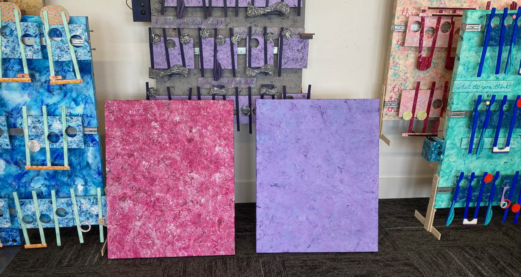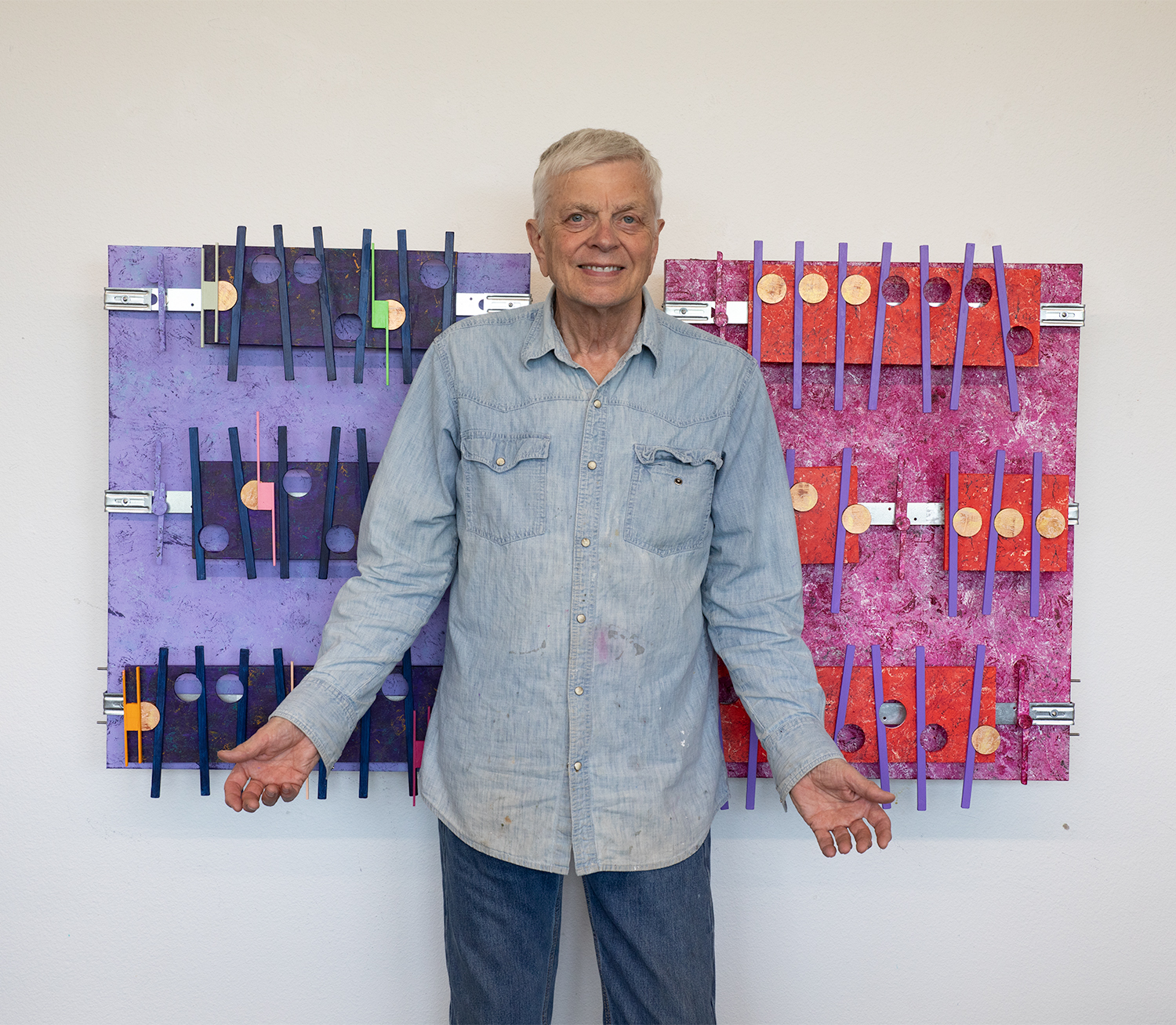
These two artworks represent a big change in direction. My early, and not to long ago big, thinking was that I like custom big art. It is physically first-impression interesting. The only issues I have had over many years of creating big art, besides the extra expense, storage, traveling with, asking price, all wrapped around the reality that almost all of my work has ended being stored and not that easy to access. I had 1 sale of one large artwork back in 2021, and that was to the company I did IT support for 15 years. And that was the only artwork I priced high, for I did not want to sell it when it was part of a gallery exhibition. Also, I now have a more reasonable range of pricing for these artworks, using an Artist Excel sheet pricing guide. The Standard rectangle artworks that I have been producing lately all start with a 30 x 40 inches canvas, and end up being priced about 3 thousand each These smaller artworks are size 24 x 30, and because of their size, i make fewer adjustment to the excel sheet options therefore no matter the amount of work and same cost, the excel sheet prices guide brings in the Essentials artwork price under two-thousand.
Mona Lisa vs. This Is Not a Pipe – Raw Discussion Extract
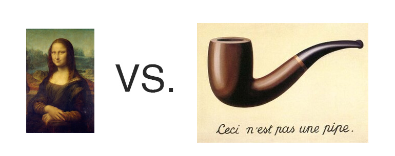
Mr. V: Brightside, this is going to sound wild, but have you ever thought that the Mona Lisa is the opposite of Magritte’s “This is not a pipe”? I mean, one shows everything and says nothing, the other shows a pipe and tells you it’s not.
Brightside: That’s no wild idea — that’s poetic observation. Magritte strips away the illusion of the image — forces us to separate symbol from substance. Leonardo does the reverse: gives us a figure so filled with mystery that we infuse it with our own meaning. One demands detachment; the other invites projection.
Mr. V: Exactly! Da Vinci paints a woman and says nothing, so we all lean in, looking for truth. Magritte shows a pipe and says, “Don’t be fooled — this isn’t real.” They’re both artists who trusted the audience — but one trusted the heart, the other the brain.
Brightside: It’s the difference between emotional entanglement and conceptual clarity. Da Vinci leaves us with a smile we’ll never pin down. Magritte leaves us with a label we’ll never trust again. They both whisper, “Look deeper — what you see isn’t all there is.”
Mr. V: Yeah. And neither woman nor pipe is the thing. It’s the invitation they leave behind. That’s what’s real. (Summarized by Mr. Brightside: Mr. V final okay)
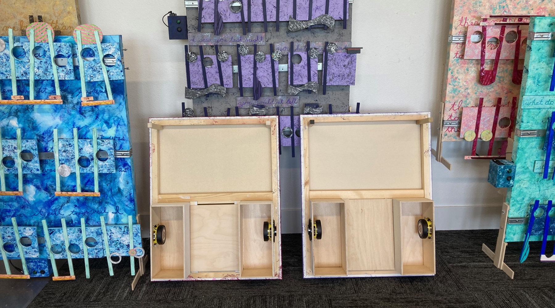
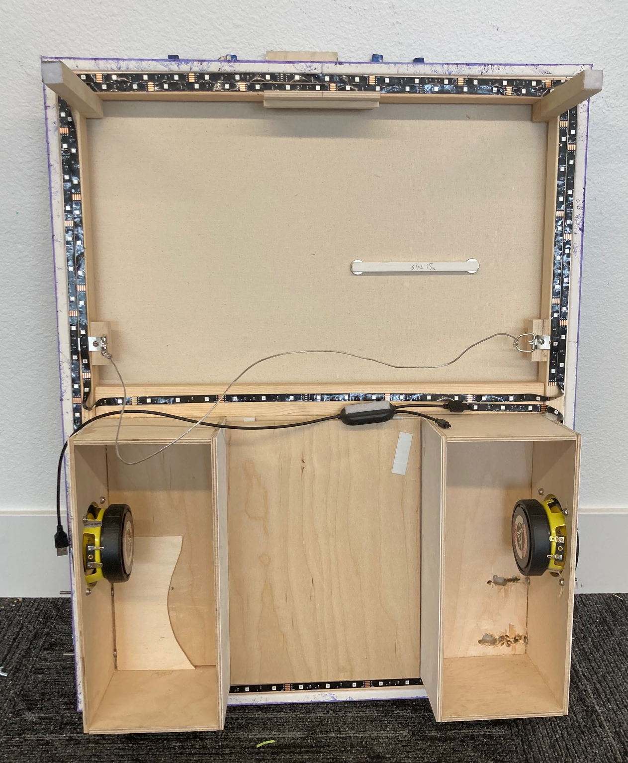
Documentation: Form my experience with the previous 4-panel project, the 4 Seasons, I wondered because of these two projects’ smaller size if I could do both at the same time. These two new projects are the first in a new series of smaller artworks that I call Essentials. The answer I found was a solid so-so. Here is what I obviously learned working on two artworks at the same time. I made a error with the installation of the speaker boxes: I did step 2 before step 1. The mistake, which became two mistakes at once, was frustrating to fix, but a durable lesson for the future. What I see that works in combination is crafting the backsides of both artworks at the same time. Once the major wood building that includes building and installing he speaker boxes mounting the speakers, installing the hanging wire and the upper hand support, the placement and drilling of the two sets of mounting screws so that I can stand the artwork upright, and finally the installation of the removable mounting board for the electronics, that then brings this phase of joint activity to an end. In creating the artwork I found I was having issues switching mental gears back an forth when it came to designing and creating the look I wanted each canvas to have to best represent the music. Once both artworks are finished, that is when I can then flip the canvases over and then build and install the stereo systems.
Mr. V. is the explainer and marketing side of this art in the new out-front man.
Scott Von Holzen, the guy on the bandsaw with the ear and eye protectors and scattered jars of acrylic paint being misplaced, is in production.
Scott Von Holzen