S_V_H What’s Up first image

The first image of the main canvas which is 24 inches by 48″ inches.

What’s up is my next project. A lot of times a song pops into by Apple AirPod while walking my wonderful friend for life, Zelda, our Irish setter mixed poodle. And something in it, either the lyrics or the melody, catches the current mood I am in. That is how I keep on, keeping on. This time, my next project song came to my attention after listening to my Spotify Discover playlist. The song I heard on that playlist was a new cover by Dolly Parton of the song What’s Up. I have long ago added the original version of What’s Up by 4 Non Blondes in my Like playlist. Therefore, it has been there, but the Dolly Partons version surprised me. Then I saw that Linda Perry, who wrote and sang the original 4 Non Blondes version, was accompanying Dolly. That gave Dolly’s cover a lot of credibility and the confirmation I needed to spend the next few weeks working with this music.

The official 4 Non Blondes video with 1.6 billion views. so far.
Here is a cover by Dolly Parton that I never expected. Well done, this version features Linda Perry on the guitar who wrote this song. This video has 1 million views in two weeks at this writing.

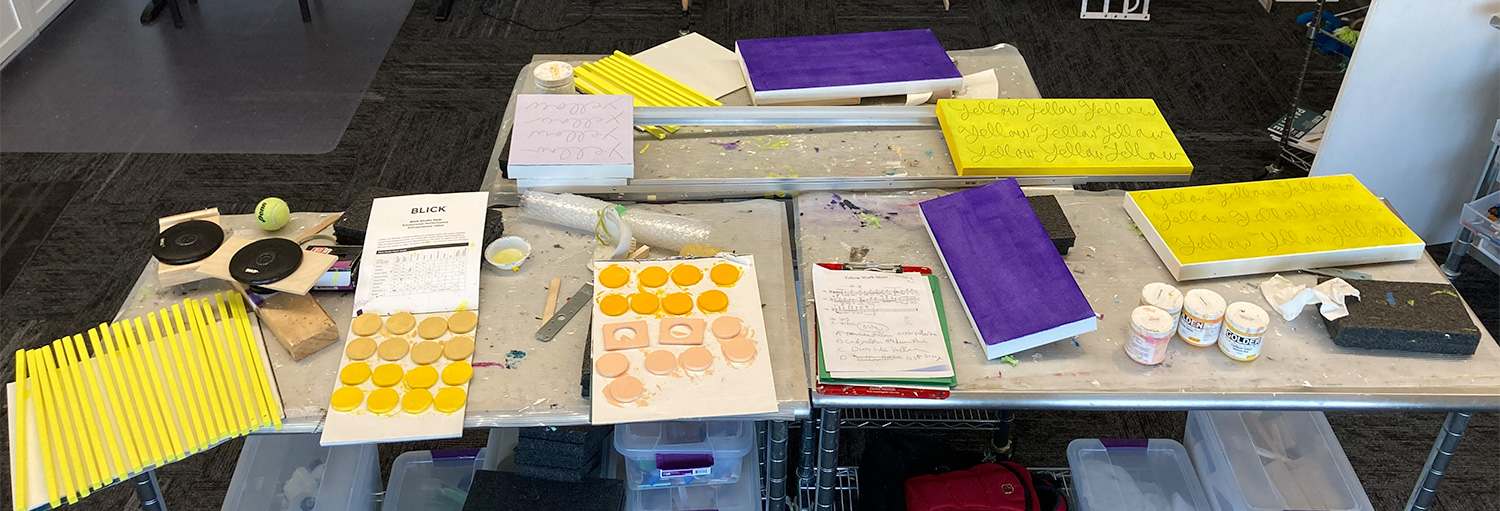
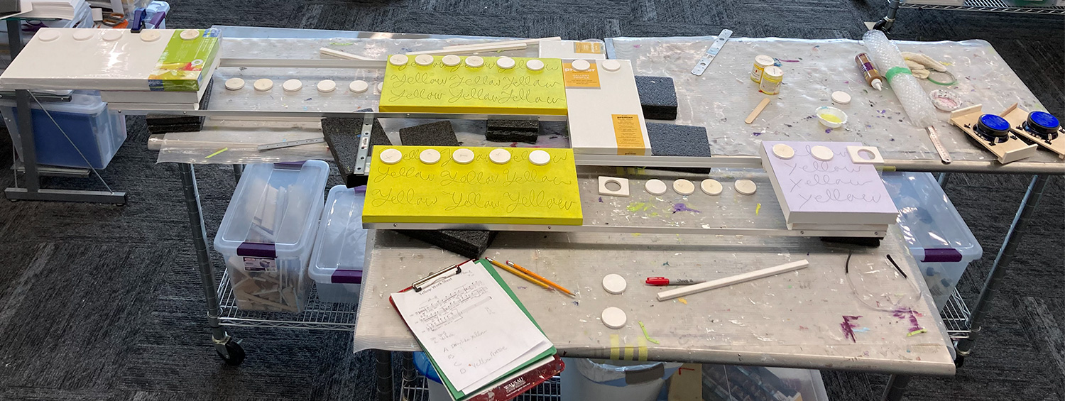
I want to keep this artwork small. That means I will power my cover music with my standard 2 watt stereo system. To keep this project smaller in overall length, I first thought of installing the speakers on the backside of the main canvas. Instead, to give this work depth (a must for this art) I will lay the left and right speaker canvases on top of the main canvas instead. Also, because of the low number of notes, I am going with 3.5 inch in size. Along with the added speaker boxes, that will push this artwork’s length to around 6 feet. Still, compared to most of my projects, this one is small.

This audio is a late draft for the music box cover of What’s Up.

The pink repeating words “What’s goin on” dominate the image of the main canvas,” This is was my first time use of acrylic marker pens. I choose the color pink for this music which is performed by 4 non-blondes. Considering how many of my artworks include words, finding this easy to use, hopefully archival writing option took a long ago to find. Being the unknown, unknown artist, without a fine arts degree, has its consequences. Upon looking closer, Into the black background I have also scratched into the paint those same words, “What’s going on,” To note I left the question mark off the artwork to allow the viewer the flexibility to query their meaning.

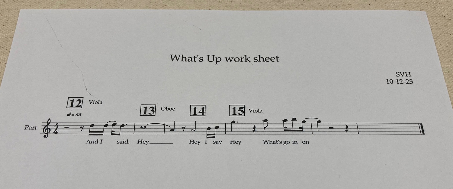
It is only recently I have created a separate worksheet, alongside with my sheet music. In the past, I would print out my entire cover music and then outline the part in the sheet music the visual would be sampling.

The worksheet version of my cover music for What’s Up

Scott Von Holzen

S_V_H Final Images & cover for Yellow

The new project Yellow offered the opportunity to use up some of my many shades of acrylic yellow. Or at less I could use those yellows that I had not dried out over the years. I have not used a lot of yellow in this art until this year. I have two music boxes where yellow is the dominate color. The other 2023 yellow was an experimental vertical for a Bach piece in which the music drops quickly. I thought the color yellow would add emphasis to the music.

Back of Yellow showing all the disconnects needed to break down this artwork for travel.

I work long on these artworks that when I finish them, I truly feel finished and wish only to move on. Here are a couple of reflective thoughts on this work.

My original idea for this project was to make a shorter and smaller work around six feet. Unlike the previous project, Closer, I did not want to do another long horizontal. Although that did not happen, even though early, I chose 4inch 2way speakers with a 2 Watt stereo system instead of the 5×7 speakers and 20watt used in Closer.

I always chose for the visual part of the artwork an interesting part of the cover music. But since the visual part of the artwork only samples a small piece of the music box, that part has to portray a stand out part of the cover, and more so also presents an interesting visual.

For this music box, there was only one section of the cover music that I thought would work. The pre-chorus has the visual look along with a nice beginning and ending (seen below in the worksheet). This choice then required a large reduction in the notation’s size to fit all the music. Even doing that, the artwork horizontally would have stretched to 114 inches. Yellow would be longer than the artwork Closer. To resolve this, I divided Yellow into two parts (similar to Closer) to under the 6 foot travel length. Then, to reduce Yellow’s length, I overlap the two sections to bring the artwork under 8 feet.

Sample taken from 8 pages cover of Yellow
The visual sample of the pre-chorus (seen in the edited sheet music above) starts at 26 seconds and ends at 45 seconds.

My other comment about this artwork was because of its divided sections needed for traveling. It was a learning and challenging experience to wire, and to balance for hanging, the two different arms of this work.

The speaker and controls wiring for Yellow

Scott Von Holzen

S_V_H Yellow as architecture

In early 2023, for a series of three paintings, I used prominent buildings designed by Frank Gehry as my color and design templates. Looking back in my videos, I found an explanation in this blog post video 9 minutes in why I did so. My reasoning comes together this way: “I like taking a piece of art (a major Frank Gehry project) and making art out of it….I guess that is what I am doing with my music, my music boxes I am taking music art, the art of music, and turning it into the art of art.”


Today I see this art’s connection to architecture also in a physical way in that I too design and built these artworks. But the important understanding comes from the blog site, All About Architecture. The article says “Architects start with abstract ideas and create something real, while artists start with real things and make them abstract.” That may be true, but my art comes with a circular twist. This art starts with real music. I then go abstract with a visual background, that is not a staff, populated with my own abstracted note design, which is not notation. Then, with a push of the artwork button, reality returns as the artwork plays the cover music of the original music.

I recently looked up information on the Farnsworth House design by the architect Miles Van der Rohe.

Later, early design for Yellow that disconnects in the middle for travel.

Have I moved on from Gehry and am now challenging my inner Miles Van der Rohe? I see a comparable architecture design in the early version of the music box, Yellow, and the Farnsworth House. I like the long and narrow design for it works with my notation. This time, though, I wanted something different that was still architectural in design.

September 20th image of the music box Yellow with the previous artwork Closer in need of a final quality photographic image. Nearly 8 feet.

With this new look I did test and find that I could balance the artwork using only the top yellow canvas for the hanging wire. The addition of the two smaller gray canvases creates a sturdy connection between the two separate sections that were needed for travel. These two canvases connect the artwork with five 1/4 inch carriage bolts tightened, that are easily removable with wing nuts.

The music box Yellow, progress September 15th
The music box Yellow, progress September 16th.

Scott Von Holzen