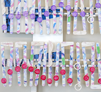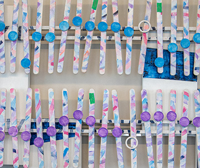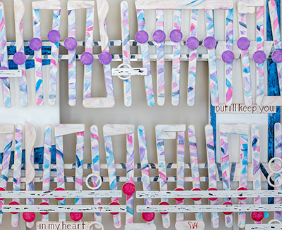
S_V_H Blood Brothers (My Brothers) final image

My Brothers, wood metal, canvas, acrylic paint L43.5″ x H41″ x D4.25

This is the final image of the project Blood Brothers, now titled as My Brothers.  This artwork has run its course.  My worksheet has a beginning date of 12-29-2019.  I finished this work on the twentieth of February.   Thankfully, my time was not all spent on finishing this project.

I finally step it up and built a new website, updated the links to https:// and had it installed with the help of Brett Widmann a friend from my old workdays. This new main site will be easier to maintain.  It also gives me the opportunity to present a greater range of personal artist insight and videos that explain the art.  On line and in these blog entries hopefully, I can build a stronger connection with the viewer.

My style with My Brothers now completes a phase of this evolution that started early last year.  I have seen good progress but would like even more changes in how I represent visually music.  One option I am looking at is to build my artworks in smaller sections and then mount them on some kind of background. If nothing else, I am looking at breaking away from the regimented look of my flow that still resembles sheet music. The music it is displaying will still define the art, but for 99.9 percent of all viewers, the fewer notation rules I follow the more interesting art.  And finally, I have to figure out how to better integrate the visual with the audio.   Like I mentioned, my audio is no longer that easy to follow along with the flow of the artwork.  So, that means most viewers don’t know what to do.   Either they can look randomly at the artwork while listening to the music or pay no attention to the artwork while listening.   Or finally, stick with how it used to be by trying to follow the flow of the artwork when listening to the music.  My challenge is to make the viewing of the artwork and the listening to the audio a seamless experience.  Once I figure out how to do that.  I think I am on my way.

My final thought on this artwork is that I like the scratched and dent look.  This artwork presents a real-life image with plenty of meaning, without preaching or lecturing the viewer. This look comes from the lyrics from the song Blood Brothers:

“On through the houses of the dead past those fallen in their tracks
Always movin’ ahead and never lookin’ back
Now I don’t know how I feel, I don’t know how I feel tonight
If I’ve fallen ‘neath the wheel, if I’ve lost or I’ve gained sight
I don’t even know why, I don’t know why I made this call
Or if any of this matters anymore after all
But the stars are burnin’ bright like some mystery uncovered
I’ll keep movin’ through the dark with you in my heart
My blood brother”  – Bruce Springsteen

Finally, moving along.

Scott Von Holzen

S_V_H Blood Brothers image 4

I already mention the influence of Will the Circle Be Unbroken on this project.  My explanation for the scratching and scuffing of The Circle was that I thought a less finished look better represented the edginess, the struggles, the roughness, and difficulties of the growth of early Country Music. The lyrics from the music represented the fear of lost and had nothing to do with the look of the artwork.  Although Blood Brothers also features a lot of scratches and scuffs, unlike The Circle, this time it is the lyrics from the music that shape, and define the physical flaws in the artwork. These are the lyrics from the song Blood Brothers that I built this artwork around:

“I don’t even know why, I don’t know why I made this call
Or if any of this matters anymore after all
But the stars are burnin’ bright like some mystery uncovered
I’ll keep movin’ through the dark with you in my heart
My blood brother” – Bruce Springsteen

These words and others from the lyrics reinforce in me the difficulties it is to keep near close and understanding relationships with those dear to us as the years pass by.  Unlike The Circle where the scratches and scuffs represent more the history of Country Music, in Blood Brothers all these deep cuts, scratches and scuffs although not stained with blood,  are stained with blue, red, and violet colors, which represents the flesh of three Brothers.  All those chips, and doubts, dents, and fears, cuts, and regrets, flaws, and disappointments, stand for decades of lives being lived day to day. That is what defines this artwork.

Scott Von Holzen


S_V_H Blood Brothers image 3

When I turn away from the computer image of Blood Brothers and look at the artwork, the difference is startling.  Although that is predictable, I cannot underestimate the visual difference. To see these artworks in person pulls the viewer closer, at less out of curiosity.  Then they see the push button that draws them dangerously near to the artwork. They press the green button.  Surprised, they realized that they have touched the artwork, breaking one of Art’s greatest taboos.  The music plays. It pushes them a step back to notice the depth, the precision,  and the diverse texture of the painted wood and canvas.  The artworks overall presence pops into their view.  The song ends. They move on.  That could be an experience of a gallery visitor or not as they pass by without more than a glance. It all depends.  Seeing this art being experience by strangers is an award. The problem is finding enough public visibility. Up to now, my best efforts to show these artworks have been by absorbing expenses and fees to apply to group exhibitions or even worse art displayed in tents at Art Fairs.  Last year was my best showing in exhibitions. The results from all those public viewings were zero responses.   Add that zero to the many other zeros of creating artworks for shows and not being juror’d in.

An example is the finely finished little artwork, Where Have All the Flowers Gone.  This project I made especially for a local exhibition that also features paired floral arrangements that harmonize with each artwork.  This is the local Pablo’s Center’s largest attended show. This artwork titled, Where have all the Flowers gone, I thought would be a perfect match for any florist. Where have all the flowers gone? Look there they are in the vase next to the painting.   As for this current project,  Blood Brothers, I am in search for exhibitions options.  The look of Blood Brothers and more on the influence of the artwork, Will the Circle Be Unbroken

Scott Von Holzen


S_V_H Blood Brothers image2

This image two of Blood Brothers I have staged to show the music before I attach it to the background.   My original idea was to attach two photos of me and my two brothers.  The first image placed at the beginning of the artwork would have been an early childhood image with me holding Jeff the youngest.  Then at the end of the artwork I planned to place a recent image of us three brothers.  The more I thought about this artwork and the great time being spent on its creation,  I decided to eliminated the photos.  I do not produce a lot of artworks in a year.  A personalize artwork would hurt its meaning.  The theme of this artwork, the bond of brothers, is  universal.  I left the photos out of this project and instead changed the white color of the music’s disks.

Instead of photographs representing my brothers,  I picked three different colors to represent we three brothers.  For the top section of the artwork I painted all the disks blue.  That color represents my brother Jeff, and the color of Chevrolet blue, that is his business over many years.  The middle color is a violet color to represent Roger. Violet is a color band from the Rainbow flag.  Finally, I choose a red color for me.   I have always signed my artworks in red.  That comes from Frank Lloyd Wright’s signature.  I did a paint test of these three colors.  I went with the artistic norm of the day and painted them in plastic solid colors.  Solid shades of color that I call baby colors did not look to be a part of the artwork.   Changing my mind, I took a damp cloth to remove the paint.  I stopped when my random removal of paint resulted in a look that worked with the artwork.  I then took a file and scraped each note hastily.  I then lightly sanded each disk.  Last,  I applied a light-colored  glaze that matched the note color.  There is some thought behind why I damaged the paint.

This art made a breakthrough with the artwork, Will the Circle by unbroken (rejected this year, my the Trout Museum SECURA exhibition).  I gave that artwork a rough worn look that I thought better represented the story of this classic country song,  and early Country Music.  I continued that look and idea of that theme with Blood Brothers I think the lyrics of this song tells a story of struggle, personal flaws, and faith in a family no matter the shortcomings or misunderstandings.  Maybe this music speaks to life full of complicated conflicts. That is what this artwork reflects in its lack of exhibition quality prettiness.    No bright, perfect art here. There is enough of that crap out there already.  Here you find bits of the truth in canvas,  wood and paint.   This art’s meaning is in the emotions of seeing that first paint scratch on your shiny new car, the red wine spilled on white linen, that decision you should have never made,  or the perfect life, that you never had.  Each morning we pick up the pieces of ourselves, and press on.  So it is with this artwork.


Scott Von Holzen.

S_V_H Heaven’s Wall Final Image

heaven_Final

Heaven’s Wall is finished. This little work, only 40 inches in length, turned out to be an experimental artwork where I changed up my style.   One new change occurred in the background where I added curved lines on each panel. I then shaded along those lines to blend out some of the stripping. This accomplished three things:  added motion to the background, broke up the stripping (a more musical look), and finally created overall a large amount of added interest.   This I followed up with another exercise in drip painting.  Although I answered some questions, and accomplished what I wanted to,   I still do not have consistent control, or a comfortable feeling towards dripping.

That first flow note on the left I manage to create a different look based on an earlier work, Fine and Mellow.  I like the use of the colors pink and green around that note,  Those colors where also used in the far right panel, which helps to unite the three canvases.

Heaven’s Wall is my first artwork that has a feel for Gospel music, although I probably would not say that this is a Gospel piece, more Rock than church choir,  the music certainly is up lifting and the words do have a Gospel message.  The decision to paint Heaven’s Wall came easy.  I was out walking, and wondering what I was going to paint next, when this song played in my headset.  I ignored the fact I had recently finished another Bruce Springsteen artwork, The Ghost of Tom Joad,  maybe because the timing of the music fit the time I was in at that moment of choice.

Tomorrow,  I will embed a video about this finished painting in this blog.  In that video I could say something which inspired me to create this painting, but I will probably not.  At this point my only thoughts are I am glad the project is over,  lets clean up,  and put together the next  artwork, to see if I can do better.

I start each artwork with lots of enthusiasm, purpose, thought, and dedication.  When finished  all that euphoria that went into the painting has all emptied out, in what you see in it.   The finished work is then left alone on the easel, waiting its turn to be slowly moved about, from here to there, until it finally finds its self stack, losing its identity,  one among  all the others.

Scott Von Holzen

S_V_H Heaven’s Wall image 3

heaven_3This is the third image, of artwork of the music called Heaven’s wall.  The flow of the music is in place.  What is left to do is add three ties, the words, do clean up, and hopefully finish this painting tomorrow.  The final step is the clean up process in which I sharpen edges, touch of the paint, and add interest to those areas in the background to improve the contrast of the music and the background.

What else is new is that I worked on the three-dimensional look of the artwork, which is hard to see in the image above. I did spread the paint on thick for my beams and my shafts.  I also lifted the musical flow off the surface of the canvas at those spots where I will add the words.

This is not a complicated work, and not a large work, but what I keep discovering is that size means little in these painting.  I have this silly expectation that I can complete smaller works quicker, and in that way I can increase my production of artworks.  So far I have never seen that happen.  It takes about the same amount of effort, and time to produce each artwork no matter its physical size.    The larger works do need a little more paint, a little more time to spread that paint,  and more canvas,  but the materials, and way more important, the time to complete different size works I have found to be negligible.  Still,  because of common business practices,  my charge difference between  a large artwork that is six feet in length, in comparison to a three-foot painting, has always been considerably more. That makes obvious sense and is a good reason  that I should do larger paintings,  which give a greater return for my time spent.  In the past I have done larger painting, of course not for the return, but instead because painting big works is a lot more fun to do, and for their greater visual impact.  But that thinking, lately, has changed.

I still like painting large works,  but lately I have seen a dramatic increase in the cost of shipping of long objects.  This has made the pricing of many of my earlier larger artworks a lot more difficult. It is hard to balance what I think is my perceived value of a painting, and the final cost of that painting to the buyer.  Since most of my potential customers live hundreds to thousands of miles from me,  that extra cost does become a  consideration for doing smaller works.   Even a greater persuasion for me to produce smaller painting is the reality check that none of my customers, so far, have been collectors.

My current buyers are people who do not want an artwork to dominate an entire wall, like the art for the art itself, and have limited funds. What that means is that they want small works, to a point that even three-foot in length may be too long for their needs. This is all good for keeping my  shipping costs lower,  but it also does suppress my asking prices.

I understand this art has never been about money, but it would be nice to at least cover my time.   Going beyond that, the biggest advantage for painting smaller works may be the practical consideration that they will take up a lot less storage space.  That means I can stack more discounted priced artworks, instead of only a few large premium paintings, in my limited studio space.  Wow, that is a relief.
Here is a live version from a Bruce Springsteen concert in Perth in 2014:

Scott Von Holzen

S_V_H Heaven’s Wall image 2

heaven_2

Heaven’s Wall is a small experimental work that is not moving along fast enough for me. Although I am giving this project my best effort, that I have over two weeks of work into this artwork, and the finish is not near, bothers me.  Of course I paint in my world, and that world hates schedules, and lately life has disrupted my stream of thought with walls along my imaginary path.  I guess in truth, so it goes, and so must I. That means,  lets move this discussion to what is going on here in this second image.

I mentioned early that there is way too much stripping going on in this work.  I said I wanted to counter that,  and now you see what I have come up with. I did not want to go too crazy here.  I only wanted to try something new that I was sure I could pull off.  And I  accomplished that by keeping my efforts small and consistent across the canvases. This then becomes a realization of a new idea. My mind then churns over this idea, evolving it to where I eventually become aware of further possibilities. This then gives me a new choice to move this art forward, if I take it, which I always do.

That is what you see, in its beginnings,  in the image above. This is not break through painting.  It is me building on the past efforts of others, and it is me finding possible opportunities to create some dramatic backgrounds in the future. I am partnering with this art, and I am evolving with it. There is so much yet to learn. That is what this art through music is telling me.  In truth, once again,  I am a blue collar painter confronting each new artwork’s challenge. They all speak in one voice, make me different.  Try harder.  And oh yes, try that new idea.

Scott Von Holzen

S_V_H Heaven’s Wall

heaven_1

This is another Bruce Springsteen artwork. It is small.  I have had second thoughts about painting this music.  My concern is that I have already painted three other Springsteen works: the beautiful and marvelous Thunder Road, the large Man at the Top, and the lately finish Ghost of Tom Joad. Since this work is a petite forty inches in length, I felt this size makes this work an easy to handle experimental work, which may be the reason it slipped in.  I do like this music for its  uptempo music.  I have wanted to paint a gospel song, not for its message, so much, but for its emotional spirit that is so catchy. For now this is music will suffice for this genre.

It surprises me that I am using so much stripping on such a small work.  I did not expect that, and I am not sure exactly what I am trying to accomplish with all this horizontal moment. I do know,  because of concerns about all the stripping, that it may be time to try another idea out for the backgrounds.

Actually, I do have that idea: I would like to try to create some hard edges with some shading to cover the strips in some form of a Cubist  style,  or better in a Futurism look like what I saw while visiting the Reading Public museum.  The painters of Futurism made efforts to display speed in their paintings. I may be able to create a better sense of movement across these three little canvases by using a combo of these two styles. Here is first, a Cubist painting by Picasso, followed by a Futurism work by Balla. Both images from Wikipedia

Pablo_Picasso,_1910,_Girl_with_a_Mandolin_(Fanny_Tellier),_oil_on_canvas,_100.3_x_73.6_cm,_Museum_of_Modern_Art_New_York.250px-GBallaArt

The fact that I am looking for a new technique, is enough to tell me, that this may be the right time, and the right size artwork,  to try some thing fresh.

Here is a YouTube version of Heaven’s wall.


Scott Von Holzen


S_V_H The Ghost of Tom Joad Final Image

The Ghost of Tom Joad final image

I have completed The Ghost of Tom Joad. This artwork proves to me that it is easier to test new ideas when working on a smaller size canvas. I used two new techniques in this work that I plan on developing, and experimenting with in future paintings.  The first one is drip painting.  Dripping paint is not a great artistic breakthrough. It is a technique that I have ignored, until I stumbled on a dripping method that was convenient to use, consistent, and with fairly precise control. The second new technique, if you look closely at the enlargement,  you will see a number of small square wooden pieces that I have attach to this artwork.  I am fascinated by the unlimited opportunities that attaching painted pieces of wood to canvas can offer.

These two methods each can add interest, and more important depth, in edition to using multiple layers of canvases to make that three dimensional, sculptural look possible.  But not every artwork works well with layered canvases.  Now,  with the option of dripping, and adding small wooded pieces to the canvas surface,  I can give even a traditional flat rectangle artwork a little of that three dimension look.  I am always after this to better reflect the depth of the music I am portraying.

My original idea for The Ghost of Tom Joad  was to use earth tones to keep the coloring muted and the contrast lower.  I found out once again, that it was hard for me to limit my pallet.  I may have an opportunity to actually limit my pallet with this years Birthday painting, at the end of July.  My Birthday painting I start and complete in one day.  A simpler color scheme, with smart use of tints and shades, could save painting time,  and be an opportunity to experiment with a cleaner appearing,  less cluttered looked.


Up next is another small artwork, and a Blues Classic, Sweet Little Angel. I cannot seem to get enough of B B King so I thought it was time to do one of his own classic songs.  Since this is a Blues piece I can see this as an opportunity to create a simpler artwork.

Scott Von Holzen


S_V_H The Ghost of Tom Joad image 4

theGhostOfTomJoad_5

This is the painting The Ghost of Tom Joad in a late stage. I have completed all the important parts of this artwork.  Next up I will be adding interest, and cleaning up the image. I do not have much to add about this work beyond you are seeing, in this painting,  pieces of styles from a number of earlier works. But, if you scroll down the blog page and look at the Billie Holiday painting,  I just completed, you will see an entirely different style. What that shows is that this art does not evolve from work to work, but instead it comes from the music that I am portraying.  Up to now you are seeing an overall style evolution partially driven by the chosen music, but probably also pushed on because I do not want this art to stand still. As I have said many times in the past, I am persevering in this fine art quest to find out how it will actually turn out. I want to know ‘does he really make it in the art world.’ To get to that end, duplicating myself is the last thing I want to do. Evolving from the past is good and necessary, repeating begins the end. This art can fail in multiple ways, but it must not me that is the cause.

Scott Von Holzen