S_V_H Rhapsody in Blue final image

Rhapsody in Blue 87 3/4″ in length by 21 1/2″ maximum height.

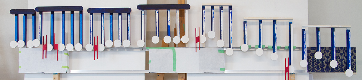
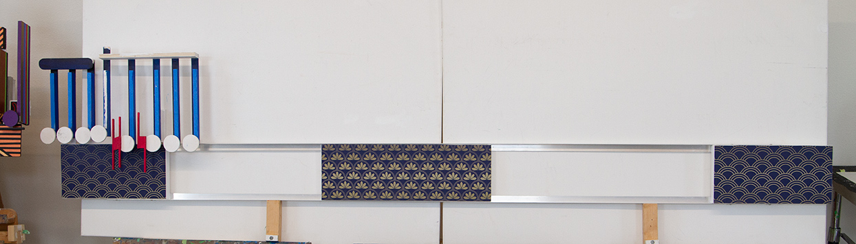
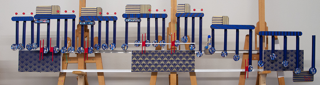
I built Rhapsody in Blue from the previous artworks, Vogue, and Ronda All Turk.  These three works are the major artworks for 2018, not only because of their size, but because they may have given me the opportunity to shake the artistic tree.  This final image of Rhapsody’s contributes to that shake up.

Rhapsody in Blues obviously quivers the tree visually, because of its unusual handling of the subject matter.  Portraits, and landscapes, and abstract paintings are all positioned  on their backgrounds. This is not true with Rhapsody where the subject matter is physically independent from the background.

What is that rustling of the leaves I am hearing?   Well that is Rhapsody presenting a  look that drops the stylistic use of the splish-splash use of color seen in much of today’s art.  Rhapsody also combines two different forms of abstraction seen in the expressionist coloring of the music  while the rest of the painting uses the solid colors of colored color field painting. The limbs and leaves of the artistic tree are now swaying about.

And finally, to shake the fruit from the tree,  I replaced much of the background with space and air leaving the stretched canvas, decorated in Art Deco, to symbolize a background that serves little purpose.

Each of these paintings could help to define music to the viewer as something that is not to be heard but felt.  If that is so than I am heading in the right direction. If the viewer see these three paintings as original fine art pieces than I am certainly staying this course.  And yet I am far from seeing any of that happening.  None of these artworks have sold,  or received any attention including appearing in public.  Until that day arrives I will keep doing what I have always done: move on to the next project, while keeping my focus on shaking that damn tree.  To step up the pace I might have to bring out the saw.

The Giving Tree, a favorite book of mine by Shel Silverstein


Scott Von Holzen

S_V_H Rhapsody in Blue Image 2


For Rhapsody in Blue, I am following my current practice of building the artwork in sections off of the canvas frame.  In image two you can see the seven sections that compose this work.  Each part is carefully constructed so that when added to the artwork everything aligns.

What makes it practical to create these artworks this way is that I have all the beams parallel the frame of the artwork. This removes a common style of sheet music, where the beam changes it angle based on the up or down positioning of the flow.

I have always depicted accurately the up and down flow of the artwork. Breaking these artworks in sections has me thinking of  Cubism.   I would like to find a way to allow the artwork to still flow from left to right but in a lot loser, and disconnected format that still represents the music I am portraying.

Scott Von Holzen


S_V_H Rhapsody in Blue image 1

Rhapsody in Blue first image may be a little strange-looking considering it is long and narrow with the main subject matter above the framework of the canvases.  Right now this artwork is 85 inches long by 16 inches high.  I am seeing a lot of challenge ahead because of this unusual configuration. Luckily, I have a copyright free version of the music so that will be attached to this artwork.  Although most of the music runs together and includes a lot of orchestration I did find a small clarinet solo for this artwork that begins and ends nicely.

Here is Rhapsody in Blue from the Disney movie Fantasia 2000. The music this artwork is portraying is from 4:14 to 4:18:

Thinking I have gone to far,  I am backing off of the fairly wide and random use of color seen in my two previous Mozart works, Rondo Alla Turca, and Serenade No. 13.   I went in that direction after seeing this trend in commercial and local artists that got me thinking about the Color Field painters. The problem I am now realizing is that there are a lot of loud looking and disjointed use of solid colors in today’s art.  I see this as not advancing the early great colorist like  Mark Rothko, Frank Stella, Morris Louis, and Piet Mondrian, What I am feeling is that this type of art is generally boring and uninspired,  and often visually devaluing color.  Generally, I do not like mural painting, but for all its prettiness, I eventual went from very colorful to being dismissive of this 2018 mural image located downtown:

Those feelings led me to the realization that the current crop of in the style of color-field artists are not getting their inspiration from Art history,  but instead from baby toys:

That leads me to this totally over the top mural by this seeming respected street artist Hense:

Still, the kid lives on: the bigger the Crayola box the more crayons and colors to surprise. But I am moving on with the help gained from my experience at the Minnesota Marine Art museum in Winona.  That trip has given me the incentive to revisit the fundamental reasons for color in art.  By taking a closer look at how the past masters in art handled color, maybe I can find a new direction.  Even a hint of an idea could offer an interesting twist on the color blue,  that is Rhapsody in Blue.

Scott Von Holzen