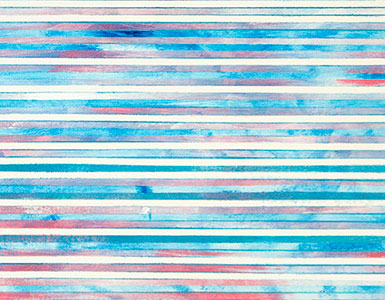
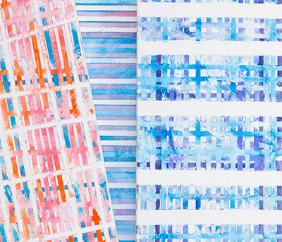
Let it go is a small five panel commissioned artwork. What you are seeing in image one are the main background canvases. This is a change in my style that started first with the paintings, Chasing Cars, and Fly me to the Moon. On small-sized artworks there is a lot less open spaces so it was a simple practical decision to paint the entire background canvas first and then later attach the other canvases. Another idea I wanted to test on a small work, was how extensive I could add stripping, not only horizontally, which was the norm in the past, but vertically. You can view my early effects of this style with image two.
This second image has some strong color contrasts, that I did before I watched the video for this music. When I did I realized that I had drifted a considerable distance from the color scheme of the music video.. It is not that I wanted to duplicate the video, but like in the artwork for Northwestern Missouri State University Wings of Victory, also a commissioned work, where the School colors played an important part in the painting, the video from the movie Frozen, defines the mood and colors of the music. I felt, looking at image two, that I had moved to far away from the music. I also felt I had drifted away from my original thinking about what color choices I would use for this art piece. Even without watching the video, I knew, from the beginning, that for this painting, the colors white and blue would dominate. As you can see in the final image, I pull it all back to my original plan.
When I think about a song and how I will paint it, my first decision for every artwork is to pick a couple of colors that I think would best represent the mood and the theme I wish to present. For Let it go it was blue and white. For the recent painting, Chasing Cars, brown and blue popped into my head. For Fly Me to the Moon, it was obvious that many different shades of blue would dominate. And next up, Vivaldi’s Spring Movement three, nickname the Storm, again what I see are many shades of blue, probably accented with violet.
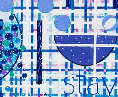
Let it go Final image, consists of five panels with a height of 20 inches by a length of 41 inches. Looking at my information I started this work on September 2nd. It is now November 2nd. That means I have spent two months on this one project, although, the actually painting on the work began on October 10th, I am still surprised that this work only took three weeks, for it felt more like that two months. The reason is, as mentioned above, the deep tie this music has with the movie. There was some time wasted about how I thought I had to draw in some snowflakes. Then I realized after two failed painting sessions, that I had to let this artwork define it self, and I wisely let the movie go. When I did that everything slowly came together. What you see in this final image is a nice artwork with the emphasis on the blues and whites. What you also see is an artwork that defines itself. and that has evolved not form a music video, but from its own existence. I like it that way, for it has always ended that way.
Here is my Video Comments on this artwork. It has been a while since I have done a video, which is a disappointment. As you can tell, very early, this is a one take presentation. I do not see any reason to not just let the words flow, and hope the viewer will get some idea of what I am doing. Hopefully, they will enjoy the ups and downs of an unscripted presentation.
You can purchase prints of Let it go from my ETSY Print store.
Scott Von Holzen


