
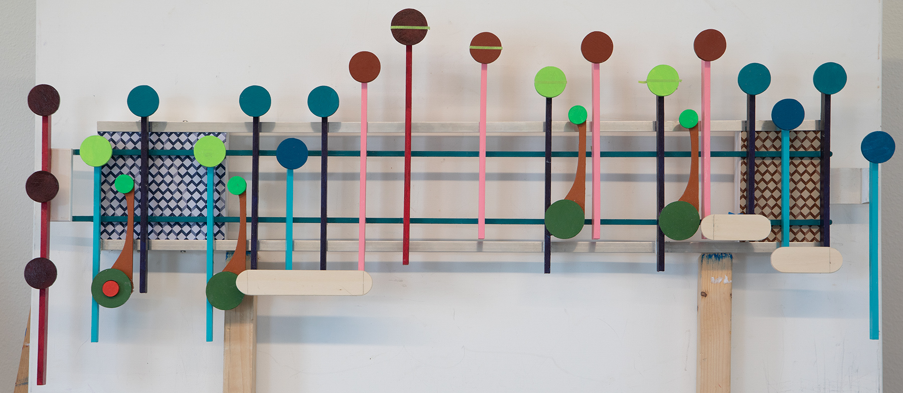
 This artwork carries on the freer use of color and design that originated with the last two works, the Art Deco inspired Vogue and the brightly colored Mozart’s Rondo Alla Turca. What makes this Serenade different is that I moved the music to the center of the stems. That technique first appeared in the artwork Liechtensteiner Polka. In the polka project having the music centered in the middle of the stems made sense because of the accordion bellows referenced in the shape of the stems. In this artwork I centered the music for the reason that I wanted to break another sheet music rule of aligning the music along the edges of the stems. This change had no affect on the flow of the artwork, the foundation of this art style.
This Serenade then follows the design of Rondo Alla Turca by using a small spacer to connect the music to the stems so that the music is at different levels based on the changing heights of the stems. This is also a change from earlier artworks where I kept the stems separated from the music or their connection diminished as much as possible. For this Serenade allowing the music to flow not only up and down across the horizontal, but also up and down the depth of the artwork, makes this representation of Mozart’s Serenade closer to the visual representation of the sounds of the music.
By moving the music away from the edges of the stems I did create an interesting possibility. This artwork could be viewed as having the look of different flavored lollipops. To take this further it is easy to see the music in the Liechtensteiner Polka artwork as ice cream cones. Yes, I have come a long ways with even further to go. Until the next big idea comes along, it looks for now, that the treat look is in vogue.
Scott Von Holzen
