
I photograph this image in the daylight. It does not capture the feeling that crossed through me on the evening before when I placed this young artwork on an easel and walked back to see if it worked. It worked. Even in a well lit studio, the sense of darkness still spills into the room from six large north-facing windows. The emotion I felt at that one moment was like, wow maybe I am on to something here.
Over the years I have used words in many artworks. Each time I do, and still do, I have chosen words from the music lyrics that were general enough to avoid any feeling of copyright. I would choose words from the artworks notes that were general in meaning, but would offer different meanings to the reader beyond the words used in the lyrics. Recently I changed that up by choosing small general reading phrases from the lyrics. I would place a phrase randomly on the artwork, insuring that there were no continuous lyrics to be found. To justify this use of the music words in this way, I would scratch and tear away small ragged pieces of top layer of paint that then damaged the words. That then made most of the painted words difficult to even impossible to read. After doing this a few times on several artworks, I felt all I was doing was diminishing, to destroying the value of words on the artworks. Instead of words to be read, they looked more like a scrabbled abstraction feature of the artwork. That is when the artwork Don’t Give up came along. That project allowed me to return the power of words to my artworks, while eliminating my concerns with their use in the music.
The word sample for the visual part of the artwork, Don’t Give Up, was an easy choice. I went with the ending of my cover music, which was, Don’t Give Up, repeating twelve times. To write them, I could have done what I have done in the past. For the first note of the first Don’t Give Up, I could have picked to paint the word, “don’t”. Then on the next repeat of don’t give up, I would have chosen the word “give” the second note in the repeat. Then on the third repeat of don’t give up, I would paint in, “Up.” This pattern would then repeat to the end of the artwork. Similarly, looking at the 2011 artwork, Hallelujah that artwork uses syllables instead of whole words, from the word Hal-le-lu-jah that repeats four times across the artwork. But I had a better idea.
The breakthrough was that the words, don’t give up, are a common language phrase, so I did not need to conceal them. Sensing that freedom of use, I thought, why not repeat those three words across all the canvases and even the music? Not only were those words important to my cover music, but they stood out on their own as a statement open for interpretation by the viewer. But there was a problem. I wanted the words to have a fluid movement appearance.
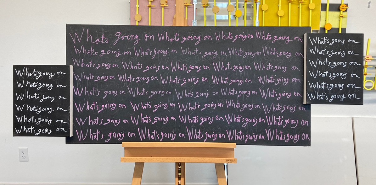
The best way to write the words in a spontaneous way, is in a cursive style. In the past, the only way I have displayed words has been in the print style. Although for me, writing words in a fluid quick motion using acrylic paint was a skill I lacked. The only option that came to mind, and I used with Don’t Give Up, was to scratch the words into the freshly applied layer of paint, using the end of a wider rounded paint brush. That actually worked well. Later I lightly glazed over the words to reduce their contrast. That same technique is what I first did with this current project using the words what’s going on. These three common language words from the lyrics are part of the sample that is the visual part of this artwork. Then I had another idea. Doing some art research, I found a set of acrylic pens that are hopefully archival. I then heavily glazed over my scratched in version to reduce contrast. That is when the fun began. I wrote with little effort only my previous wording of what’s going on, with a brighter, mostly legible cursive writing in a pink version of what’s going on. That color choice comes from the songs four non-blondes band. Finally, I didn’t and don’t care how pretty or poor, sloppy, or illegible my cursive writing looks. The viewer can simply see the pink color as powerful words or an abstraction if they so wish. Plus, my writing looks definitely human and a demonstration of what makes this art me and no one else. A lot of all of today’s art lacks originality, replaced with a colorful look that is so finely and perfectly finished that it loses any feel of being created by a human. Instead, it’s art that looks pretty to be pretty, prostituting itself for the quick stranger sale.
Scott Von Holzen
