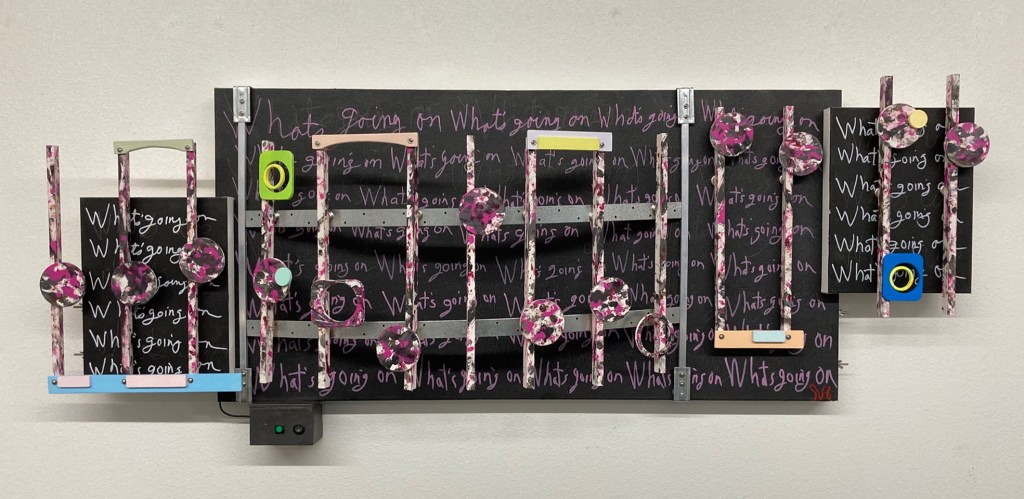
I find the color combination in this artwork challenging. The colors chosen for the canvases, the notes, and the stems all come from the 4 non-Blonds official video of this music. Looking at the video, the words “grungy girl rockin’ ” come to mind, represented by the artworks splashed on shades of black, gray, darker, deep reds, and brown. To offer a counter color theme, I applied 12 different pastel and soft colors here and there. These lighter, brighter colors represent a softer feminine pallet, adding interest and depth while reducing the color effects of the artworks’ main color theme. Because of the importance of this arts physical design, I use color as a tool to enhance the artwork’s appearance and not as the standalone theme.
I want to mention a little more about my repeating words that began with Don’t Give Up. Although they are difficult to see and read on this artwork, there are 15 dark shadow writings of both, don’t give up, on the main canvas, and 6 what’s up on the two smaller side speaker panels. On the main canvas, I have added 32 pink, what’s going on, and another twelve white on the speaker canvases. The total then is 44, somewhat legible, what’s going ons. The why of my use of repeating words is a long story. Those three words’ purpose here is to not to be overlooked, and not to let their meaning be only that of the music.
My chosen three words are from the music lyrics. I feel their use is okay since I see them as public language usage. Also, I could have taken, as I have done in the past, hours to handcraft them. I don’t have the time or patience for that anymore. Instead, I chose the unique look of my handwriting. A style of writing that fits well with the look and theme of this artwork.
Scott Von Holzen
