
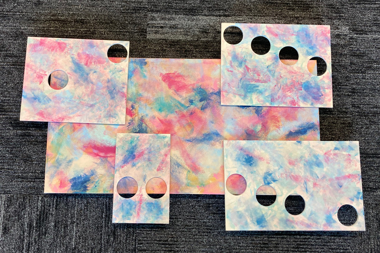
What is nice about these mini works is the commitment in doing them is not as large, intensive, or needlessly overwhelming as it was with the comprehensive works that took a month or more to complete. With these mini artworks I save time, increase production, have less to lose, and they offer me more freedom to experiment. This is what I see in this first image of Love Theme.
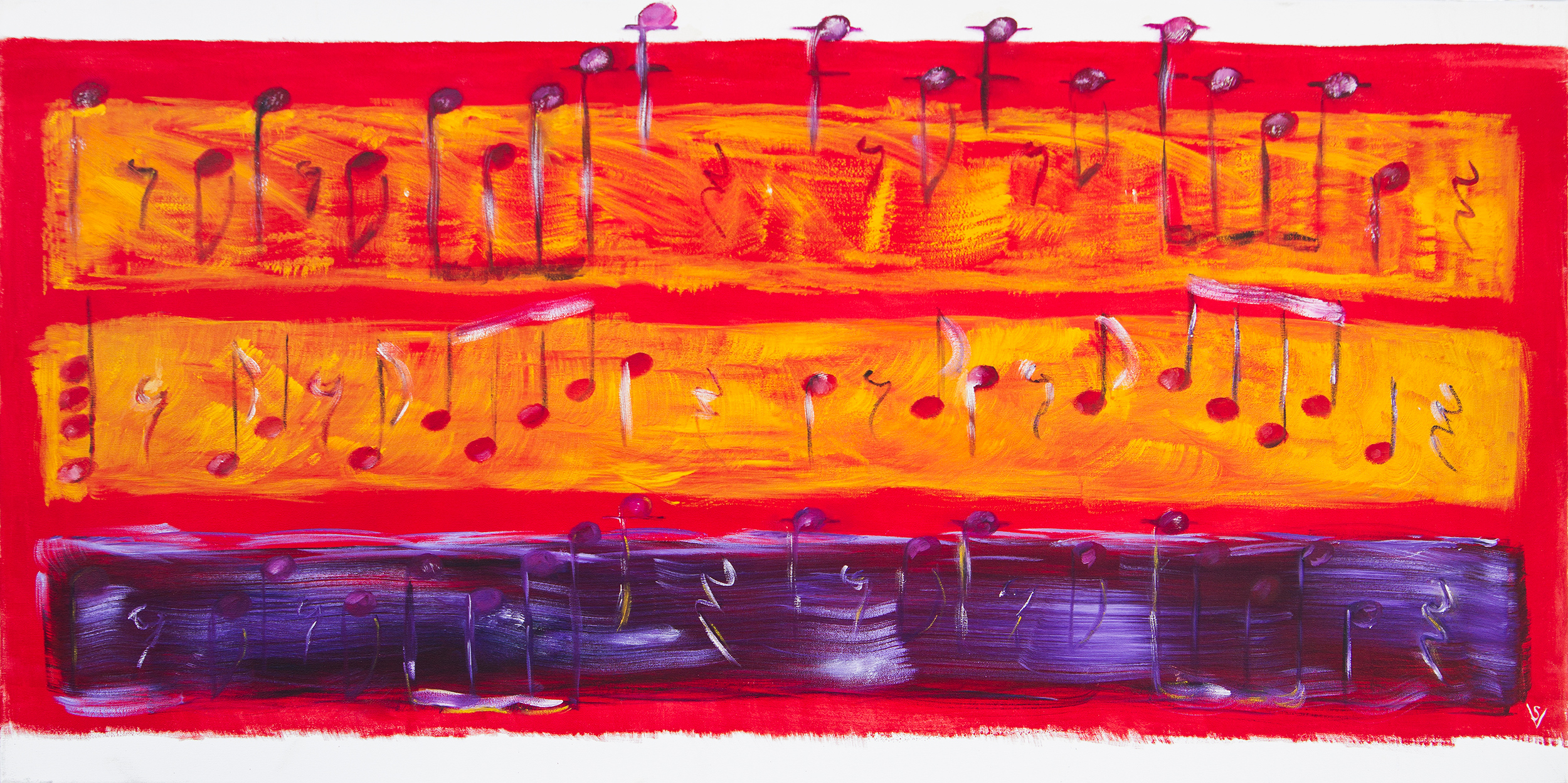
In the past, Mark Rothko, a leading figure in the Color Field movement, first inspired my approach to color in these musical artworks. His rectangles of solid colors gave me the idea of using them as a substitute for a musical staff. See the image below of a very early 2006 work that I wish I had never sold.
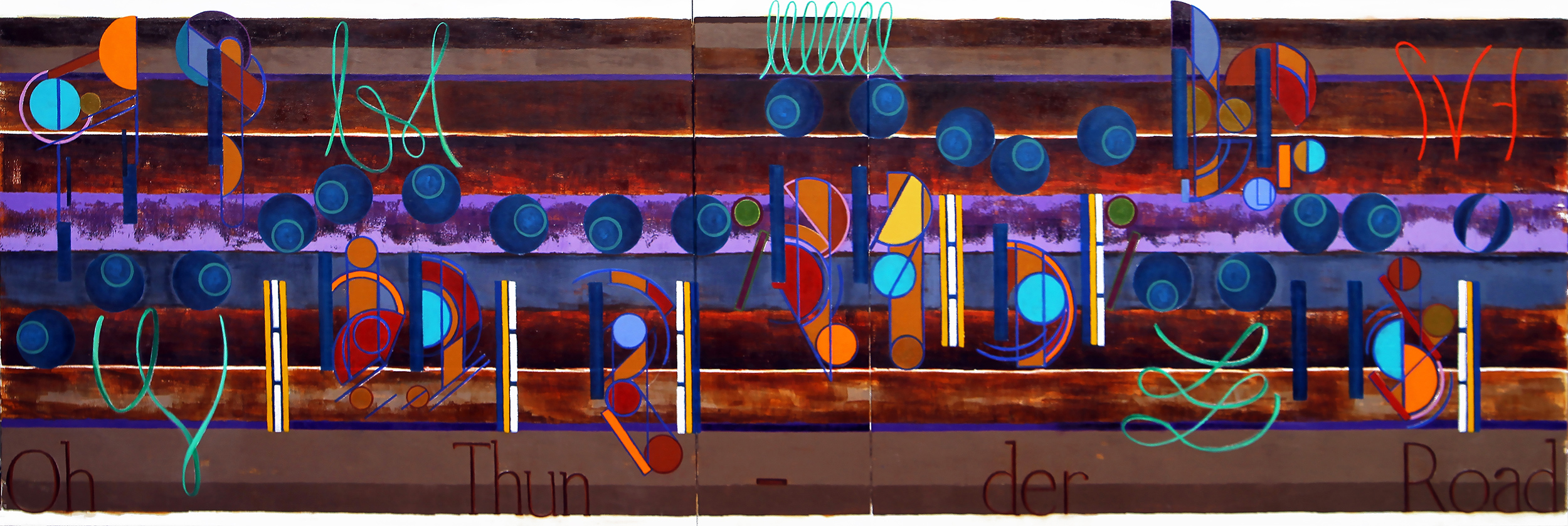
You can see the evolution of the Rothko rectangles in the 2011 artwork Thunder Road, which is and will always be in my personal collection. It hangs today in my Studio alongside another favorite, the 2011 artwork Hallelujah, which shares a similar style.
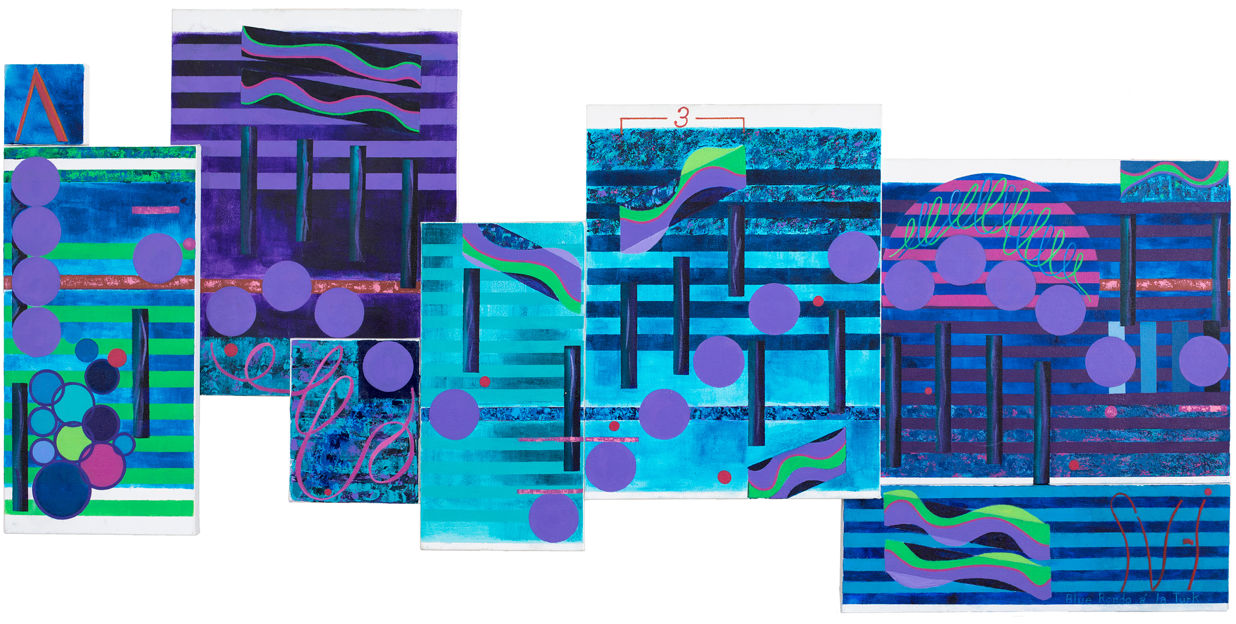
I tweaked my use of color with the Dave Brubeck artwork Blue Rondo á la Turk. For this project I discussed my first attempts to use the squeegee style of Gerhard Richter.
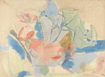
Of course up to this day, my use of solid colors continues in the tradition of Color Field painting techniques. Although this new artwork, Love Theme, looks different in technique. I looked to the style used by the Color Field painter Helen Frankenthaler and her “landmark,” use of staining on her influential artwork, Mountains and Sea. It is from this artwork that I choose the colors and attempted her style although on primed canvas.
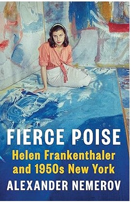
Finally, I am reading the book, Fierce Poise, about Helen Frankenthaler and wondering about the influence, or not, of Jackson Pollock and his use of unprimed canvas years earlier.
Scott Von Holzen
