S_V_H Vivaldi’s Four Seasons Summer Presto image2

summerPresto_2

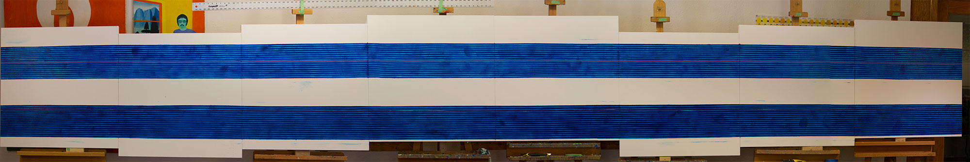
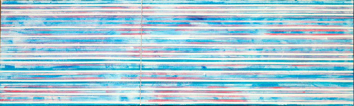
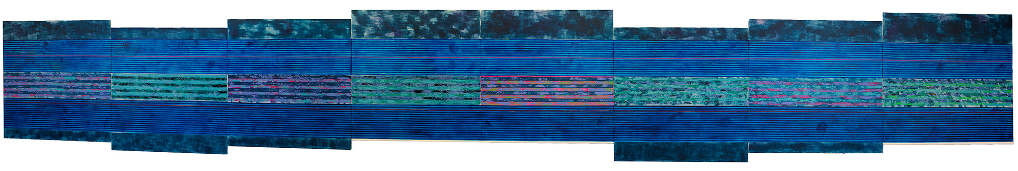
Summer Presto from the Vivaldi Four Seasons series.  Composed of eight panels each thirty inches, this artwork reaches a length of twenty feet.  What you are seeing is the background completed, for now.  Blue dominates this artwork because  the theme of this movement, from the Summer concerto, is a  storm.  Along the edges I have created the forward and backward flow that appears in the clouds of an approaching storm. The narrow strips in the two wide bars of color is where much of the music will appear.  Then between the music I again have gone with another back-en-forth created from using two different patterns. This neutral area does then add interest, drama, and variety to the artwork.

Understand, this music is about a  summer storm, but I am in no way trying to physically depict a weather scene. Thousands of artists that can do that better than I would ever.  Instead, I am going for something less predictable, which I would think, can represent nature, but also shows the range of this artist’s style. If you stand far enough back, to take in the entire work,  you would see that it is the center area of this artwork that dominates this work. Those sections are there not to represent the storm theme, although, they strangely enough, work will with the rest of the background.  Their main purpose is to shake up this artwork,  challenging me, and the viewer to take this artwork beyond the music.

For now, this is it for this artwork. With the Holidays coming up I need to turn my attention to this years Christmas painting.  For 2014 I am painting A Big Red Sled, made popular by the band, The Killers. It is an interesting piece of music that I can relate to, and I find the music interesting.. Normally, my first thought about the Christmas artwork,  is to keep it simple and easy. I tried that with this music, but I could not do that which lead to the struggle to except that part of the music that was the most difficult. Next, I had difficulty finding a physical design for the music. Last night I thought I figured it all out, and prepped three larger canvases for the artwork. This morning I was looking at my earlier Christmas works, and the 2012, Let it Snow, made me change my mind.  I have now finished a new setup for this artwork that consists of smaller canvases, but more of them.  I have gone from three large flat canvases to six, with four to be attached on top of the background. As far has the look, I am seeing wide bands of gold with narrow silver strips for separation. That is about in for Big Red Sled, for now.

As for the Vivaldi I will work on it, here and there, over the next month, and post a new update in early January.

Scott von Holzen


S_V_H Vivaldi’s Four Seasons Summer Presto image1

summerPresto_1


This is the last great painting of The Four Seasons, that I started in March of 2012.  When finished this series will consist of be thirteen paintings in all. You can see the previous Vivaldi Four Seasons works at this Page.  You can tell by  the enlargement,  of this first image, that this is a large painting. It consists of eight canvas panels each thirty inches by thirty inches, for a total length of twenty-feet. This is certainly the longest work of the Vivaldi series, and very near being the largest in the group. The length of this work quickly adds up when you consider that the 64 painted strips, in this first image, total  1,280 feet of paint.

Here is a good orchestra version of this 3rd Movement from Summer.  What you will see in the painting is from the 24th second to the 32nd second of this music.

I have a David Garrett version that is a favorite of mine,  but could not find it on YouTube.  Here is another YouTube version by him:

This third movement is nickname The Storm, so it is a bad weather related image I see.  I picked those 8 seconds from the music because you can hear and feel the driving rain and hall. The words I have chosen from the  Summer Sonnet are from the line: Thunder and lighting split the Heavens, and hail-stones.

Obviously, I expect to be using a lot of dark colors, mostly blues, maybe with some dark greens, along with a lot of different splashes of bright colors to increase the drama and movement in the work. You can see some beginnings of this sense of movement by looking into these two wide strips at the random shades of blue.

All eight canvases are of the same size, with each representing, in musical terms one measure. By being connected at various heights they follow the up and down of he music, which adds to the sense of movement.

This work along with the other twelve canvas will eventually be sold as one. As I have mentioned in the past, I do not want these works split up.  I do not expect, except on rare occasions,  that I will ever see all thirteen artworks on display together.  I do see them being shown,  by the season they represent in smaller groups of three, with Summer having four works. Whoever purchases these works, I am certain will be strongly connected to all of them. I can say this  from what I have learned by the reactions from the patrons of this art.

These are people with money in the game, and so I know they are being honest. I have been constantly surprised by the bond that forms between the artwork and the owner. I cannot explain it. I do not understand it. But it is there.

What I do know is that even though I put everything I have into creating these works, that in itself appears to have little to do with how others react to them. They see something else in their artwork that becomes important for them. They do not visualize whatever I did to create them, or my reasoning behind the works creation.  They do form a special attachment to their artwork.  And that I do understand. In whatever shape that bond is, I too have it.

For me it is that mysterious something, that captivates, and pushes me to see, to know, and to find out how far this art can go. In short it is that something that is unknown, not only for me, but for those that own these works, that brings this art meaning.  And for the owners of these artworks, I can only thank them, for I have consistently fallen short of understanding just what is going on. I guess, that will remain, the conundrum that so far I have no right answer.  That is just fine with me. I find it fun not knowing.

Scott Von Holzen


S_V_H Let it Go two images & Final Image

letItGo_1

Let it go is a small five panel commissioned artwork.  What you are seeing in image one are the main background canvases. This is a change in my style that started first with the paintings, Chasing Cars, and Fly me to the Moon.  On small-sized artworks there is a lot less open spaces so it was a simple  practical decision to paint the entire background canvas first and then later attach the other canvases. Another idea I wanted to test on a small work,  was how extensive I could add stripping, not only horizontally, which was the norm in the past, but vertically. You can view my early effects of this style with image two.

letItGo_2

This second image has some strong color contrasts, that I did before I watched the video for this music.  When I did I realized that I had drifted a considerable distance from the color scheme of the music video..  It is not that I wanted to duplicate the video, but like in the artwork for Northwestern Missouri  State University Wings of Victory,  also a commissioned work, where the School colors played an important part in the painting, the video from the movie Frozen, defines the mood and colors of the music.  I felt, looking at image two, that I had moved to far away from the music. I also felt I had drifted away from my original thinking about what color choices I would use  for this art piece.  Even without watching the video,  I knew, from the beginning,  that for this painting,  the colors white and blue would dominate. As you can see in the final image,  I pull it all back to my original plan.

When I think about a song and how I will paint it, my first decision for every artwork is to pick a couple of colors that I think would best represent the mood and the theme I wish to present.  For Let it go it was blue and white.  For the recent painting, Chasing Cars, brown and blue popped into my head.  For Fly Me to the Moon, it was obvious that many different shades of blue would dominate.  And next up, Vivaldi’s Spring Movement three, nickname the Storm, again what I see are many shades of blue, probably accented with violet.

letItGo_FM


Let it go Final image, consists of five panels with a height of 20 inches by a length of 41 inches. Looking at my information I started this work on September 2nd.  It is now November 2nd. That means I have spent two months on this one project, although,  the actually painting on the work began on October 10th, I am still surprised that this work only took three weeks, for it felt more like  that two months.  The reason is, as mentioned above, the deep tie this music has with the movie. There was some time wasted about how I thought I had to draw in some snowflakes.   Then I realized after two failed painting sessions, that I had to let this artwork define it self,  and I wisely let the movie go. When I did that everything slowly came together. What you see in this final image is a nice artwork with the emphasis on the blues and whites. What you also see is an artwork that defines itself.  and that has evolved not form a music video,  but from its own existence.  I like it that way, for it has always ended that way.

Here is my Video Comments on this artwork.  It has been a while since I have done a video, which is a disappointment.  As you can tell, very early, this is a one take presentation.   I do not see any reason to not just let the words flow, and hope the viewer will get some idea of what I am doing. Hopefully, they will enjoy the ups and downs of an unscripted presentation.

You can purchase prints of Let it go from my ETSY Print store.

Scott Von Holzen