S_V_H A Great Big Sled Christmas 2014 final image

aGreatBigSledFinal

A Great Big Sled Final Image. Here is another version of this wonderful Christmas song with a modern edge to it. When you hear those bells, you are listening to this artwork.

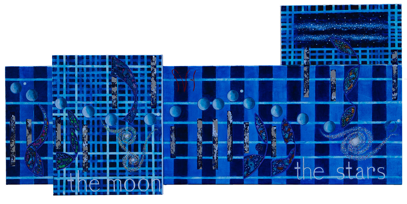
This finished  artwork uses six canvas panels with a finished length of sixty inches. Any picture of this artwork will never compare with seeing it in person. No image I can produce captures the look of the gold and silver paint that dominates this work. This resulted in a long struggle to produce a decent canvas image for this years Christmas cards.  Finally, under the press of mailing dates, and the conclusion that I could not produce a match of the work, I did my best to print something. This years Christmas card printing is largest ever with thirty copies.

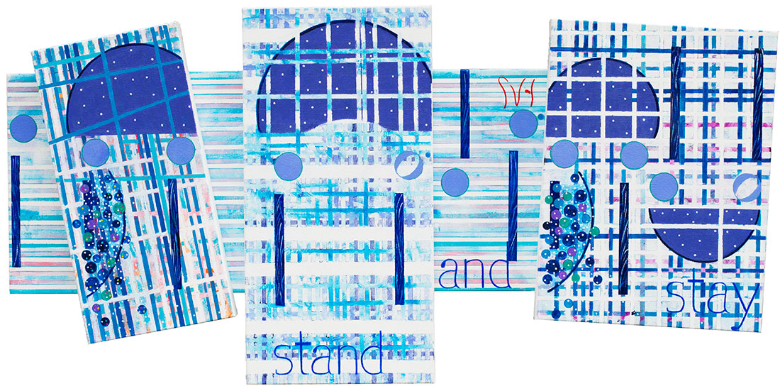
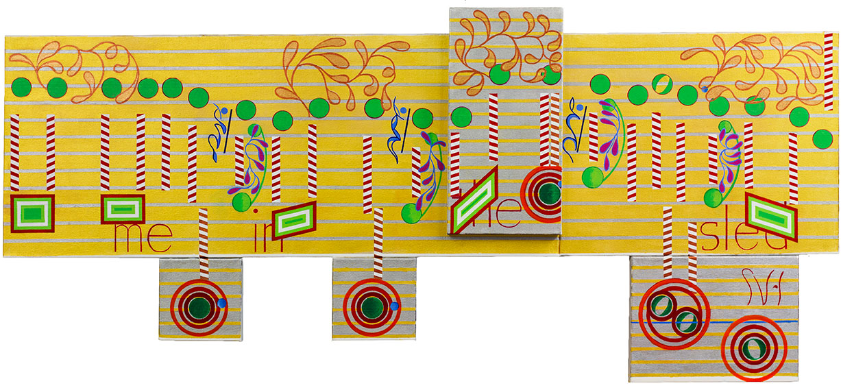
Looking at the overall finished artwork I like the look of the candy cane stems. They were a lot of work,  not tedious, but time-consuming.  I especially like the look of those long blue objects that are my version of musical Rests. I painted over a dozen Rests, each different from the last, in the last Vivaldi. You can see that look being carried over in this artwork. What I am seeing in my Rests, is a good solution in design that has quickly become a mature style. The Rests will certainly evolve over time, but not out of need or necessity.

My symbols for the bell sounds, surrounded by extra circles, are nothing special, but they work, filling space while adding interest, and the opportunity to add extra canvases to make the look of this artwork, unique. My musical vine looking Slurs, you see all across the top of the canvases, and repeated in a red color in the music, give a Christmas look to the work, and fill space while pushing the music across the canvas. My red and green rectangles I like for their sharp edges counter the rounded forms of the slurs and the other rounded objects in the music. My choice of words where the best option, that balance well, and flow nicely across the painting. Still, If I would have had another choice I would have left out the word ‘me.’  I like words to connect personally to the viewer,  leaving me out of the picture, but this did not work.

As this art has taught me over the years, I have come to respect the limitations when producing each painting.  Each of these finished artworks are a display of an abstract idea that is music, and the price of admission that allows me to paint another. I always hope that my next artwork will somehow solve the disappointments with the last painting, but I know that Music is a vastly diverse language, so that challenge is great.  I have to constantly look at my art and question how I paint, and if I can find another, better way, to visualize sound that a viewer can relate to.  This makes everything complicated because for this art to evolve artistically, I have to keep an open mind, with all of its options, no matter the direction this may turn me.  It is that search to find new ways to apply the colors of acrylic paint to pieces of canvas, that will forever remain the goal. This years Christmas painting breaks no new ground, solves no problems, and answers nothing. That is what I expect from the last artwork of the year. Instead, in all of its non answer glory,  It is a summary of this art’s 2014 style that leaves open another opportunity for improvement. On to 2015 where the best artwork is yet to be built.

Scott Von Holzen


S_V_H Let it Go two images & Final Image

letItGo_1

Let it go is a small five panel commissioned artwork.  What you are seeing in image one are the main background canvases. This is a change in my style that started first with the paintings, Chasing Cars, and Fly me to the Moon.  On small-sized artworks there is a lot less open spaces so it was a simple  practical decision to paint the entire background canvas first and then later attach the other canvases. Another idea I wanted to test on a small work,  was how extensive I could add stripping, not only horizontally, which was the norm in the past, but vertically. You can view my early effects of this style with image two.

letItGo_2

This second image has some strong color contrasts, that I did before I watched the video for this music.  When I did I realized that I had drifted a considerable distance from the color scheme of the music video..  It is not that I wanted to duplicate the video, but like in the artwork for Northwestern Missouri  State University Wings of Victory,  also a commissioned work, where the School colors played an important part in the painting, the video from the movie Frozen, defines the mood and colors of the music.  I felt, looking at image two, that I had moved to far away from the music. I also felt I had drifted away from my original thinking about what color choices I would use  for this art piece.  Even without watching the video,  I knew, from the beginning,  that for this painting,  the colors white and blue would dominate. As you can see in the final image,  I pull it all back to my original plan.

When I think about a song and how I will paint it, my first decision for every artwork is to pick a couple of colors that I think would best represent the mood and the theme I wish to present.  For Let it go it was blue and white.  For the recent painting, Chasing Cars, brown and blue popped into my head.  For Fly Me to the Moon, it was obvious that many different shades of blue would dominate.  And next up, Vivaldi’s Spring Movement three, nickname the Storm, again what I see are many shades of blue, probably accented with violet.

letItGo_FM


Let it go Final image, consists of five panels with a height of 20 inches by a length of 41 inches. Looking at my information I started this work on September 2nd.  It is now November 2nd. That means I have spent two months on this one project, although,  the actually painting on the work began on October 10th, I am still surprised that this work only took three weeks, for it felt more like  that two months.  The reason is, as mentioned above, the deep tie this music has with the movie. There was some time wasted about how I thought I had to draw in some snowflakes.   Then I realized after two failed painting sessions, that I had to let this artwork define it self,  and I wisely let the movie go. When I did that everything slowly came together. What you see in this final image is a nice artwork with the emphasis on the blues and whites. What you also see is an artwork that defines itself.  and that has evolved not form a music video,  but from its own existence.  I like it that way, for it has always ended that way.

Here is my Video Comments on this artwork.  It has been a while since I have done a video, which is a disappointment.  As you can tell, very early, this is a one take presentation.   I do not see any reason to not just let the words flow, and hope the viewer will get some idea of what I am doing. Hopefully, they will enjoy the ups and downs of an unscripted presentation.

You can purchase prints of Let it go from my ETSY Print store.

Scott Von Holzen


S_V_H Improv Fly me to the Moon final image


FlyMe_Final

Fly me is compose of four canvases with a length of 40 inches by at most of nineteen inches.This little blue gem, stands out as a special work.  The strong dark verticals of the background represent the strong and solid beat of this music song elegantly by Frank Sinatra. Of course all the blues are a statement about the darkness of night and the wonders of dark skies.  In this work you seen nebula’s and galaxies and in the upper right top you have a view of our own galaxy, the Milky Way. You see in the flow of the music the drifting across of  little planets that float untouched far above the drama of the background. The words ,”the moon, the stars,” say it all and then say so much more.  What an amazing treasure a potential buyer will have. We will see if she has the courage to tackle owning this most wonderful work of art, known only to me and now to you.


Scott Von Holzen