S_V_H The Beatles Triptych

Golden Slumbers ≈L68.5″xH35″xW6.5
Golden Slumbers music box
Carry That Weight ≈L73.5″xH51″xD7″
Carry that Weight the music box
The End ≈L70.5″xH36″xW9.5″
The End the music box

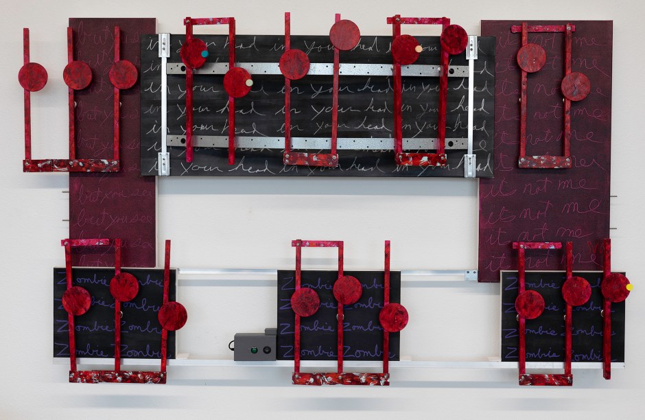
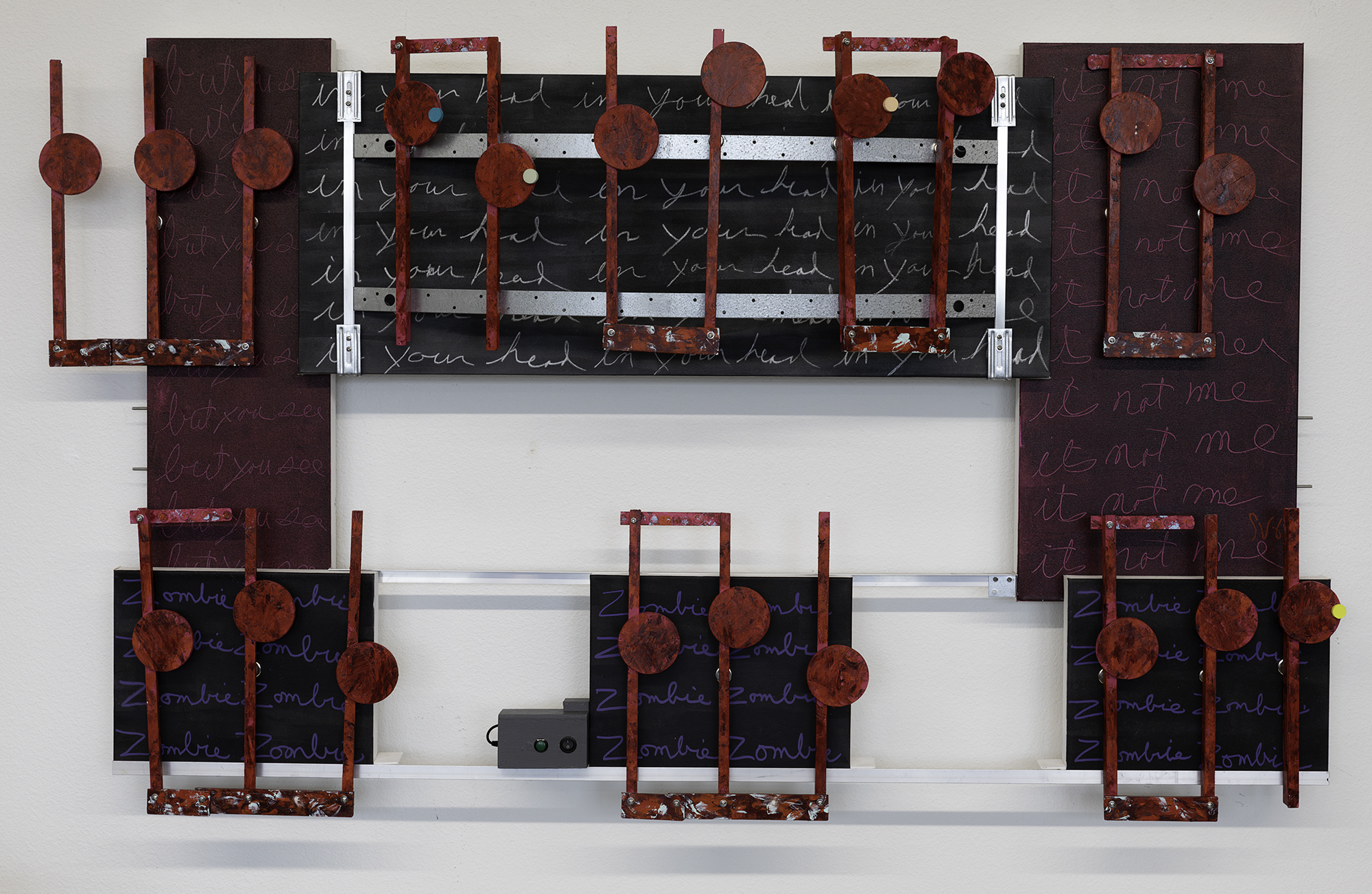
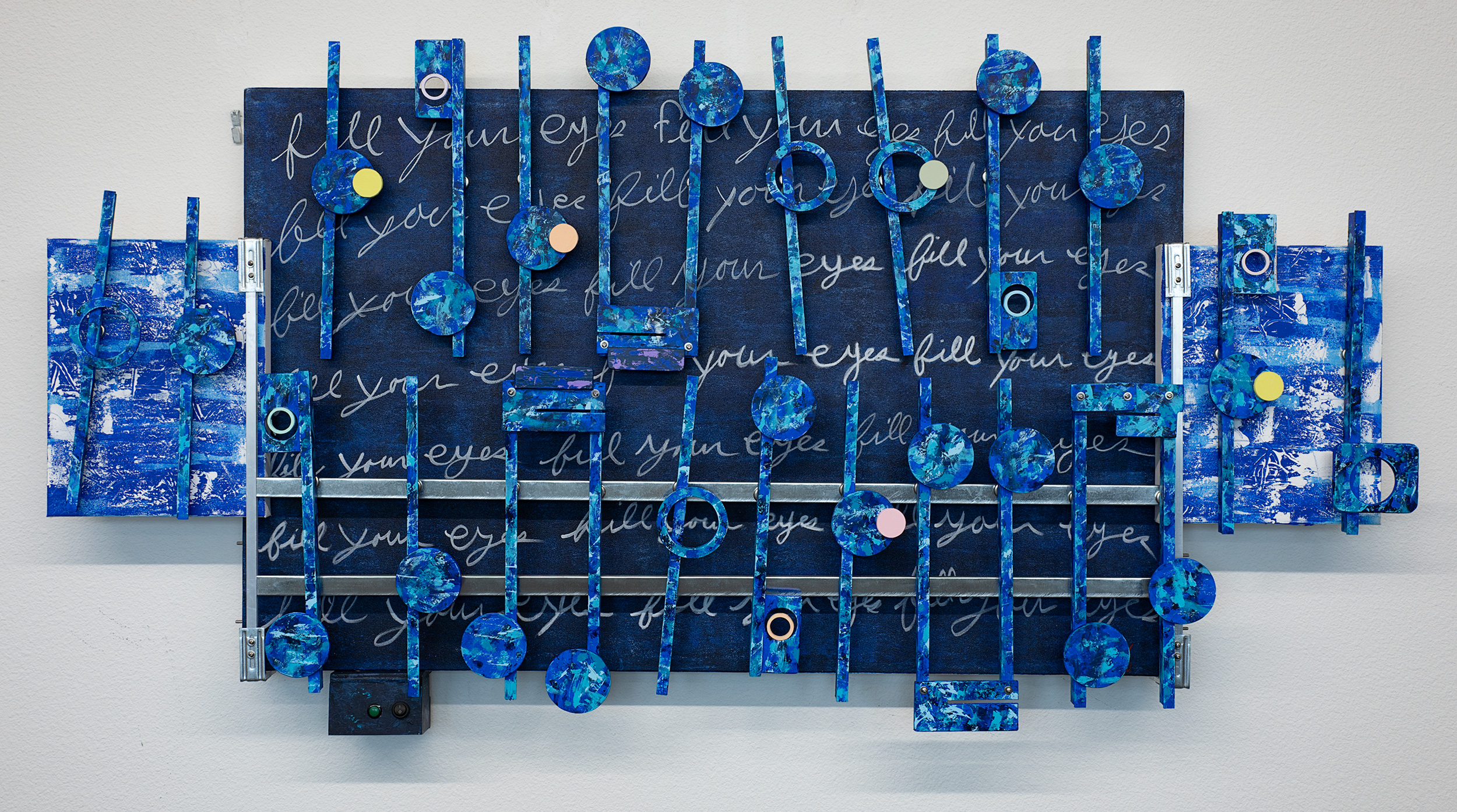
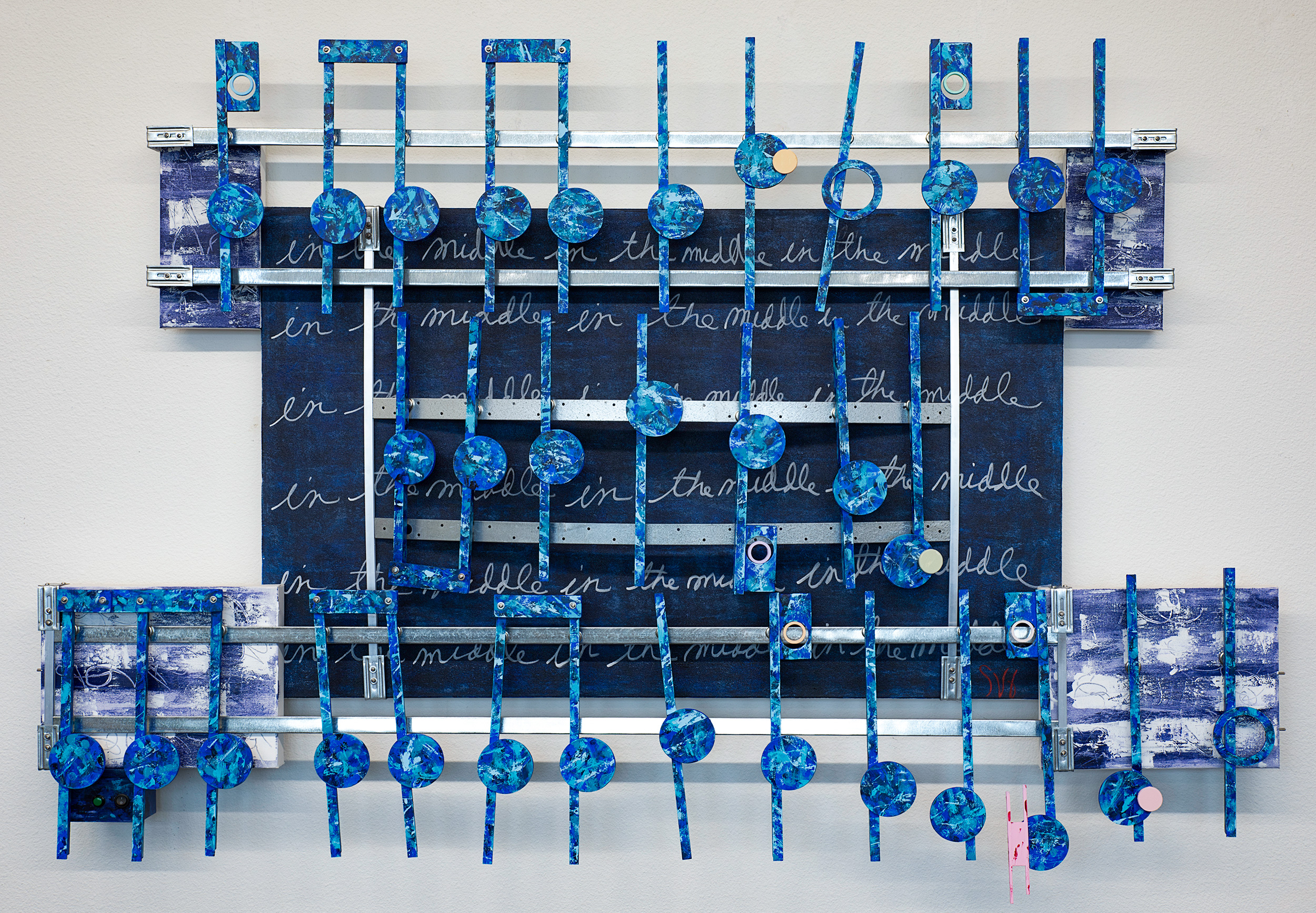
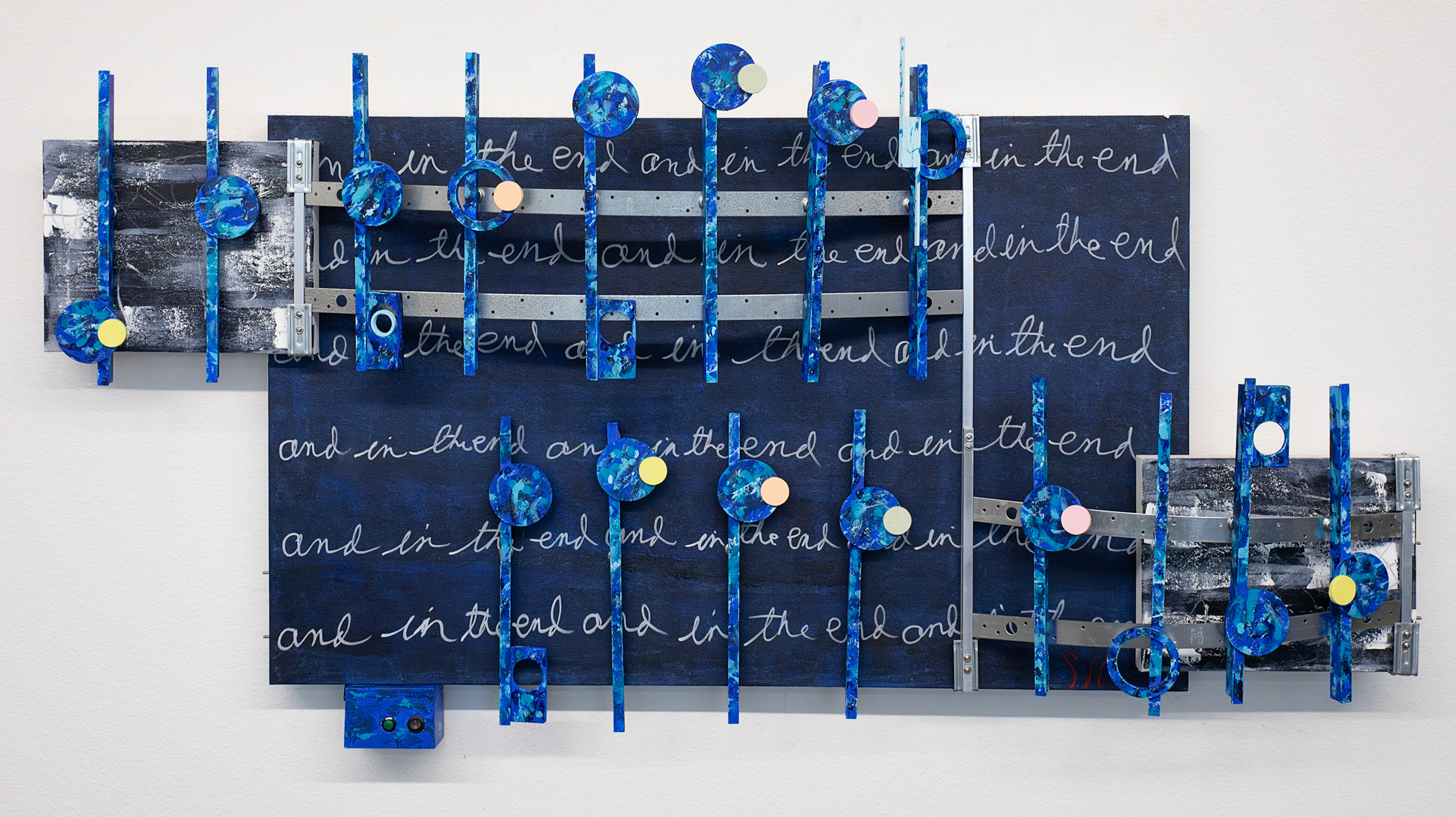
I signed Golden Slumbers on December 15th and the others on the 17th. The surprise is that I started and completed all three works in a month’s time. This entire process came into focus when I had in stock three 36 x 48 inch background canvases. The close musical relationship also helped. I could then use the same overall style and color plan tweaked for each artwork. By following the same designs of the previous 2023 artworks, I saved considerable time and effort. This then allowed me to build all three artworks together through each stage of production. The last motivation to complete these three works as quickly as possible was the drop off date of early January. Even though I completed all the preparations for this triptych for the upcoming exhibition, I have a surprise.

The curator, Christy from our group EmptyWallsArt, for the upcoming exhibition has limited wall space for eleven 3D artists that will be showing. Eight of the artists, including one new member, are from our group, EmptyWallsArt. The host then required the addition of invited artists. This was a hard search in this area for me and, Christy who signed up three guests artists for the show.

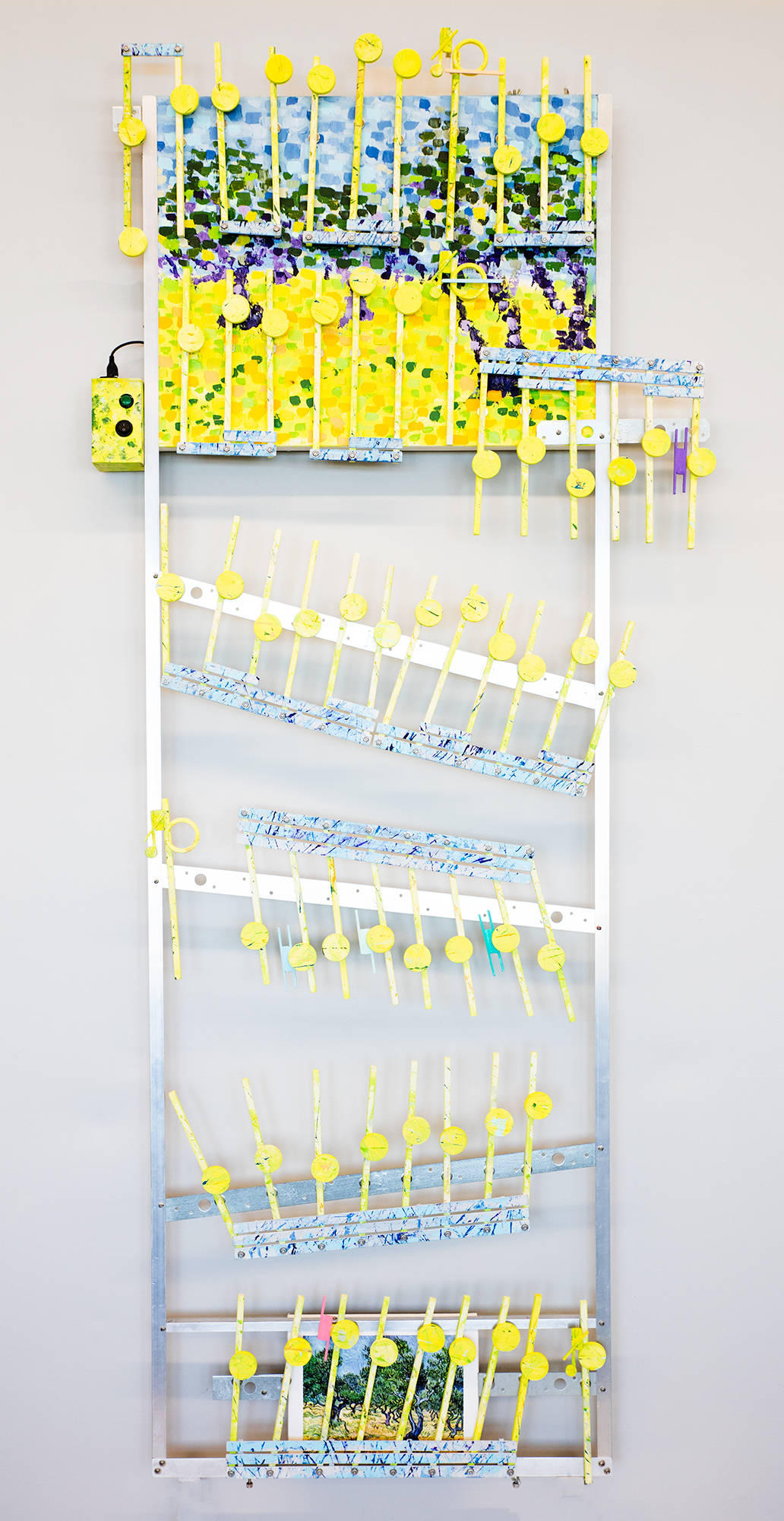
Christy also informed me she wants to ensure that “all the artists have a fair amount of room since the exhibition wall space was limited.” Right away after reading that, I knew my Beatles triptych would not fit: I requested wall space of a bare minimum of twenty-four feet. I then offered alternatives directing her to my portfolio on the EmptyWalls website. I did not want to break apart the Beatles triptych. Between us we chose three other artworks.

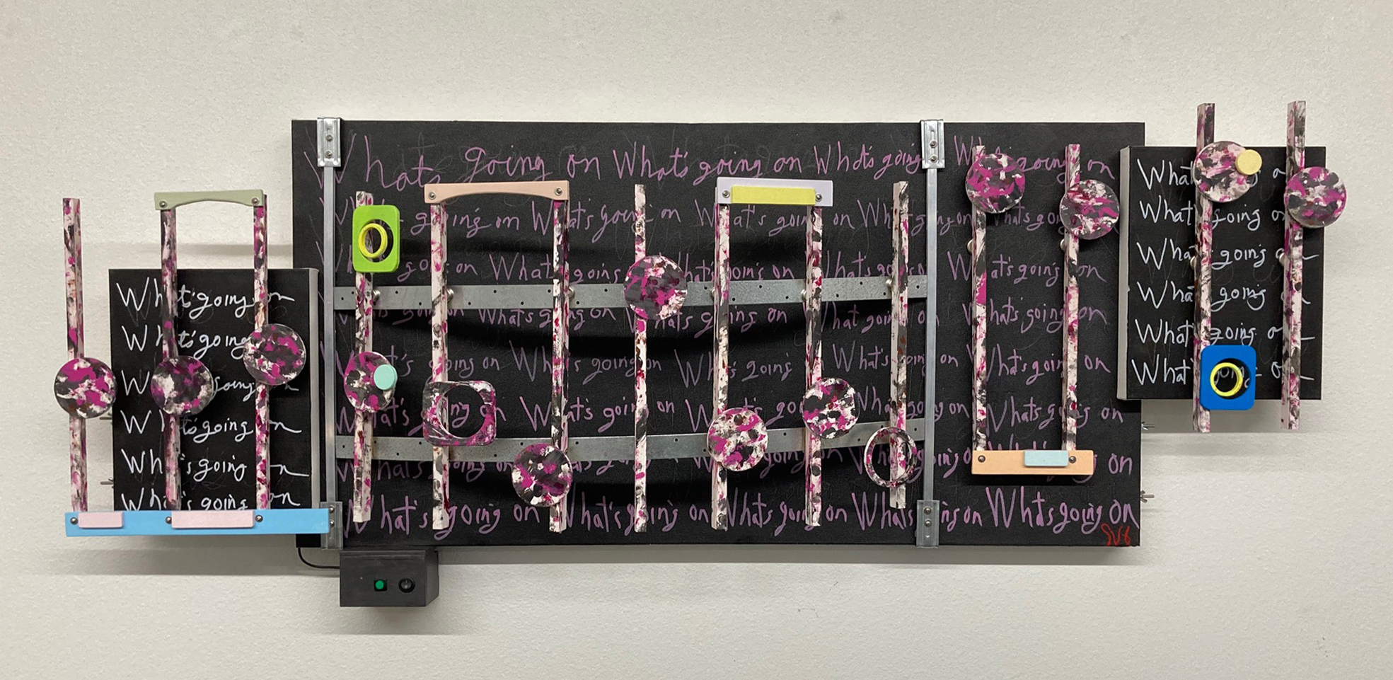
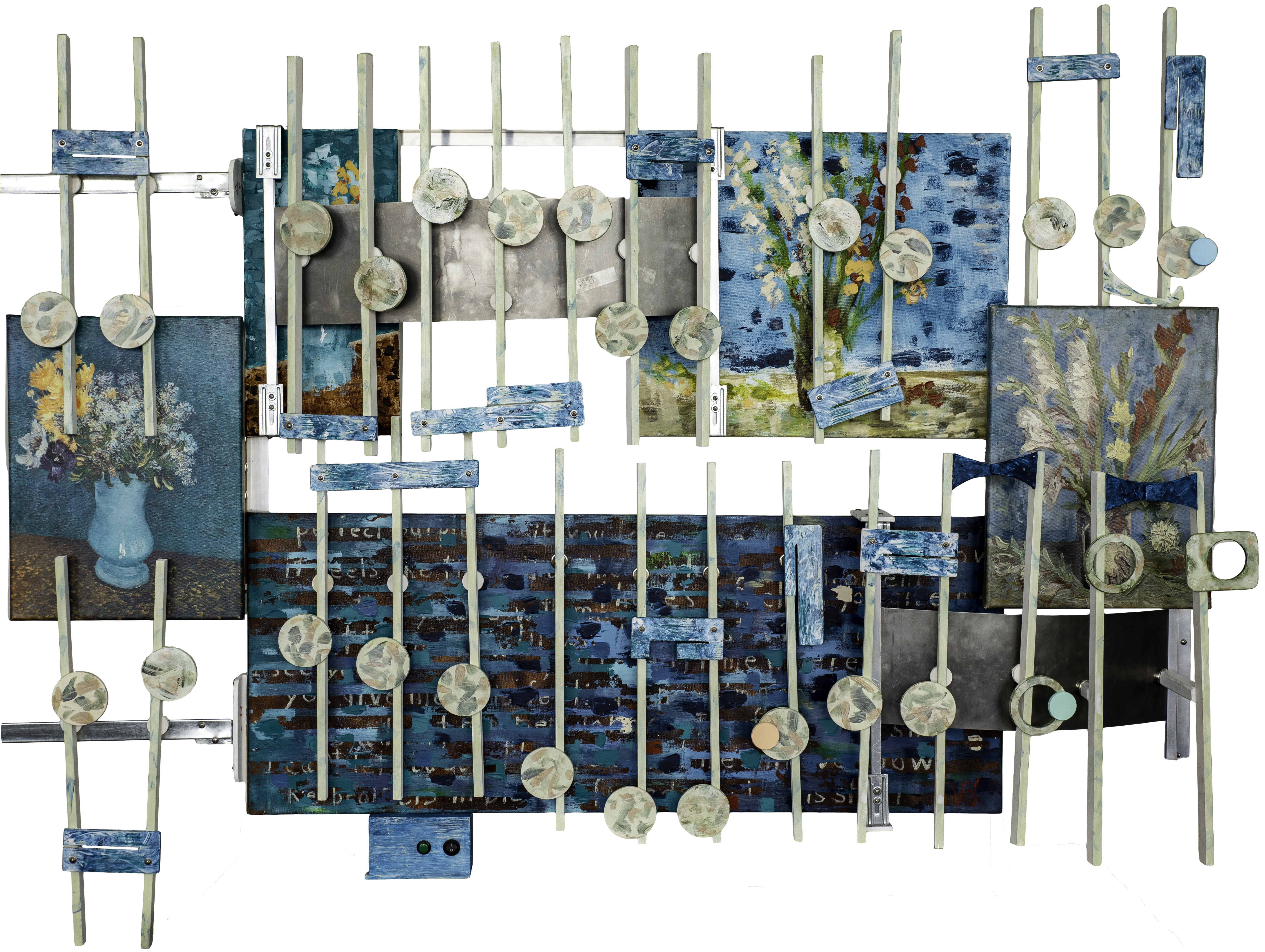
The JS Bach work chosen I understood because of its narrow width. The other two where each about the same size as the Beatles works, but they added variety in color matching well with the Bach piece. I did update the Bach the stereo system from a 2 watt to match the systems in the other artworks. But, again to my surprise the plan changed.

Everglow 2023, L64″
JS Bach BWV 974 Adagio 2023, L30″
Zombie 2023, L69″

This happened when I emailed Christy and told her the reason I created The Beatles Triptych was to show them in the upcoming exhibition. I then suggested another option that I was good with. I would show only two works: the center piece of the Triptych, Carry that weight, and Zombie. Finally, I would display two small photos of the other two Beatles artwork, one on each side of Carry. Well, Christy responded she did not want any photographs of artworks. She then asked for the dimension of the Triptych and Zombie. Her response after receiving the information was she would find the space to display the three Beatles works together. She also added Zombie, but that work would be displayed in a different location in the gallery. At most I wanted the Triptych, but Christy went out of the way in found space for a four. I thanked her.

Scott Von Holzen

Scott Von Holzen

S_V_H Zombie final music and image.

Zombie ≈ L69″xH41″x D9.5Outstanding depth on and off the wall

I like this artworks use of ubiquitous words that also appear in this music’s lyrics. Some of the phrases on the artwork were scratched into the still wet paint, while in other words, I used the convenience of acrylic pens to write away in my distinctive style. I like the unusual overall use of red shades of acrylic paint on this artwork. The solid red looking of the notes works well with the background colors. The paints I used for the notes are Compose Rose by Holbein, and these Golden colors, Quinacridone Crimson, Pyrrole Red, Red Light, and Pyrrole Dark Red, mostly hand applied.

This Zombie project started building the cover music on October 25th. That means I have finished this work under three weeks. What helped to speed up the creation process for Zombie is that the music box is a single finished piece that has a length of under six feet and 42 inches wide. That is the limit I have for traveling these artworks. Otherwise, over 72 inches would have needed two separate sections. That would make the artwork a lot more complex and time-consuming, see the project Yellow. This artwork also uses 3 1/4 inch size notes. Their size limits the sampling numbers of the cover music, saving production time.

Zombie. Completed. Where does this art go now? Inspired by the lyrics of Waylon Jennings “Lord, it’s the same old tune, fiddle and guitar. Where do we take it from here?” played live with Kris Kristofferson and Johnny Cash. That is the question that I may or may not resolve. After 17 years, I still do not have a consistent market for these music boxes. Therefore, I could take this music, down size it, to a 3×2 foot one size fits all standard design music box. These sized to sell boxes I could then offer custom colors, along with music of choice. This would surely reap bundles of commissioned sales on Etsy ranging from 300 to 500 dollars. Nay, that will not happen. Or I could replicate my most popular Etsy print and its classic style pumping out knockoffs commissions with the theme of pick your color, name that tune, for a grand or two. Nay, been there and now see there in the work of my fellow members of EmptyWallsArt.

Canon in D 2009

Again, to repeat, “Where do we take it from here?”

I do like the sound of the 20-watt stereo system used for this project. I also know that I dislike the two watt stereo systems I have used lately with these projects: Shenandoah, One, For No One, J S Bach Concerto 2023, What’s Up, Yellow, and Flight from the City. My thinking was that they were all smaller, less important projects. I thought I could save money and time using the simpler two watt systems. This worked reasonably on those projects if the cover music was less full, and I limited the number of instruments. And yet, my overall feeling of the sound from a 2-watt stereo system was okay, but disappointing. Two watts through 4 inch speakers is not enough power to project when I wanted more from the cover music. Considering that I value the artwork and the music as equal contributors to the quality of these music boxes, all those 2-watt systems, I now feel the balance is questionable. That leads me to the decision to use only the time consuming and expensive 20-watt system, with the better 5×7 inch speakers. Unless some other consideration makes the 2-watt system the obvious choice.

A snippet of the cover audio track for Novembers Music Box Zombie

Final thoughts. I added Zombie to my portfolio at EmptyWallsArt. After which I listened to these years’ snippets of music. As an observer I admit, they impressed me. And yet, it lingers: this art has yet to find how to “…break on through to the other side,” I know this will happen, eventually. My question is the timing. At 75 I am still pushing to “Keep on keeping on,” knowing “If you build it, he will come.” While being inspired by these Neil Diamond lyrics: “They have sweated beneath the same sun. Looked up in wonder at the same moon. And wept when it was all done. For bein’ done too soon. For bein’ done too soon.” Not done.

Scott Von Holzen

S_V_H What’s Up final image & audio

The project music box What’s Up final image. ≈L69.5″xH25″xD9″
What’s Up project music box’s cover music.

I find the color combination in this artwork challenging. The colors chosen for the canvases, the notes, and the stems all come from the 4 non-Blonds official video of this music. Looking at the video, the words “grungy girl rockin’ ” come to mind, represented by the artworks splashed on shades of black, gray, darker, deep reds, and brown. To offer a counter color theme, I applied 12 different pastel and soft colors here and there. These lighter, brighter colors represent a softer feminine pallet, adding interest and depth while reducing the color effects of the artworks’ main color theme. Because of the importance of this arts physical design, I use color as a tool to enhance the artwork’s appearance and not as the standalone theme.

I want to mention a little more about my repeating words that began with Don’t Give Up. Although they are difficult to see and read on this artwork, there are 15 dark shadow writings of both, don’t give up, on the main canvas, and 6 what’s up on the two smaller side speaker panels. On the main canvas, I have added 32 pink, what’s going on, and another twelve white on the speaker canvases. The total then is 44, somewhat legible, what’s going ons. The why of my use of repeating words is a long story. Those three words’ purpose here is to not to be overlooked, and not to let their meaning be only that of the music.

My chosen three words are from the music lyrics. I feel their use is okay since I see them as public language usage. Also, I could have taken, as I have done in the past, hours to handcraft them. I don’t have the time or patience for that anymore. Instead, I chose the unique look of my handwriting. A style of writing that fits well with the look and theme of this artwork.

Scott Von Holzen