S_V_H My Back Pages image1

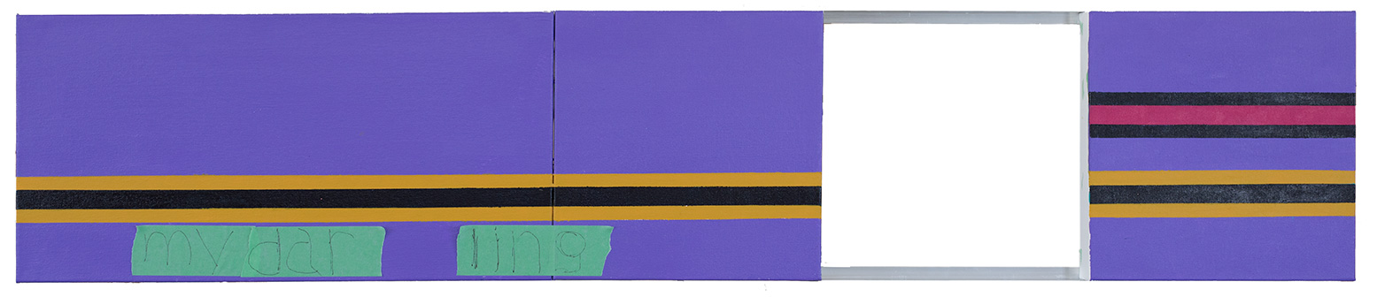
This is the first image for a small artwork, My Back Pages.   Bob Dylan wrote the music for this artwork,  but I remember the song from listening to the band The Byrds.  The Byrds recorded a number of Dylan’s music, including Turn, Turn, Turn, and another favorite of mine, Mr Tambourine Man. I have always wanted to paint this music, mainly because of a line from the music:”Ah, but I was so much older than, I’m younger than that now.”   For me, they where words in a song that I liked and I guessed defined only as a 60’s feeling.  Today, I can probably best summarized their appeal by a quote by George Bernard Shaw “youth is wasted on the young.”

What convinced me to finally attempt this artwork was  this My Back Pages video, from 1992.  The video includes these artists: Bob Dylan, George Harrison (The Beatles), Neil Young, Tom Petty, Eric Clapton, Roger McGuinn (The Byrds),  and the back up band, Booker T & MGs:

I am using colors that give this painting that look of the 1960’s.  That means, I will be using browns, muted greens and blues.

One reason I picked this music  was that I could do a smaller work ( this one is under 27 inches in length), in a shorter amount of time. That did not work. It never works.  The size of an artwork only affects a predictable amount of time. The real unknown, and largest consumer of my time, is the problem solving in the constructing of these artworks.  That leaves me with my this reasoning behind doing smaller works, and that is that they are easier to store, and sell. Big artworks create a wonderful first impression, but since I am in the beginnings of adding Art Fairs to help promote this artwork, smaller paintings make sense in every way.  So there it is. Until I can find a Gallery to represent my work, I am becoming the weekend Gallery in a white tent. At least, I am not selling them out of the trunk of my car.

Scott Von Holzen

S_V_H When Doves Cry image 1

This is the second painting dedicated to the music of Prince.  My first painting, Purple Rain originated from a request by a Prince fan.  The artwork ended up larger and a bigger project than first thought, and the fan turned it down because of the cost.  I was actually happy with the idea of keeping this work, considering it an unusually unique painting.  That lasted a week when, with regrets, I sold it to the Prince fan’s wife for their anniversary.

I am using the color ideas from the research I did for Purple Rain.  To make this small artwork stand out I have decided to give it its own unique twist:  I have chosen a new material to add interest and a unique look.

What is special with this painting is that hole in the artwork, in which I will float the music across. The idea of spacing between canvases originated with the artwork, Mon coeur s’ouvre à ta voix, where I used square pieces of wood along the backs of the canvases to connect them. The painted look of the wood looked great for that artwork,  but I had technical problems which included straightness. To avoid those issues for When Doves Cry,  I chose angled aluminum for its strength, straightness, and exceptional ease of use.

There are no YouTube videos available for When Doves Cry:

Scott Von Holzen


S_V_H Satisfaction Final Image

satisfaction_final
Two panels 26 3/4 inches in height by 50 1/2 inches in length.

Satisfaction, my first painting dedicated to the music of the Rolling Stones is finished. What I liked about this work is how well the dominate grays and shades of black worked with the here-and-there use of color.  The Impressionist painters avoided the use of  the black paint and only recently did I start using acrylic black.  I like the back-en-forth contrast between the blacks and grays and the brighter vibrant colors.  All these differences adds an extra push-pull to the music as it moves across these canvases.

The round wood pieces follow the flow, pitch, or the up and down movement of this song.  At first I painted them solid black with silver edges.  After I added and stripped those three half disks, which are my symbols for musical Ties or Slurs,  I knew that I had to do something similar with them.

The sharp edges of the stripping of the half disks reminded me of today’s digital images files.  Except, that when Satisfaction was going up the charts photography consisted of analog images on negatives. The look of half disks is dramatic, but for my notes to match the era of the music I chose short strokes of the different shades of gray and black, applied wet and blended to give the flow a symbolic look of negatives.

The different look of this musical artwork comes from its heavy use of neutral shades. This painting music brings back memories of a long time ago when I was young, and my world felt a lot more black & white.

Scott Von Holzen