S_V_H Satisfaction image 2

satisfaction_2
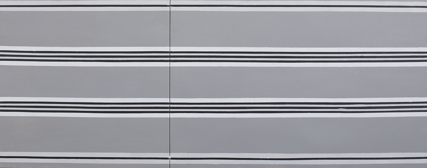
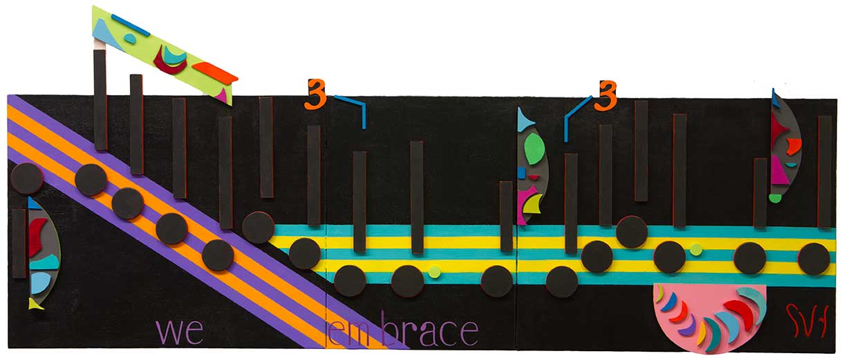
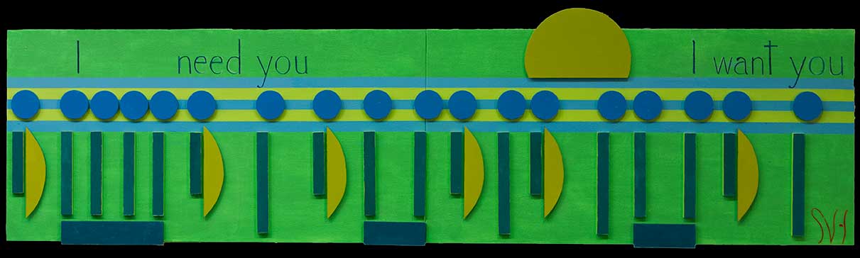
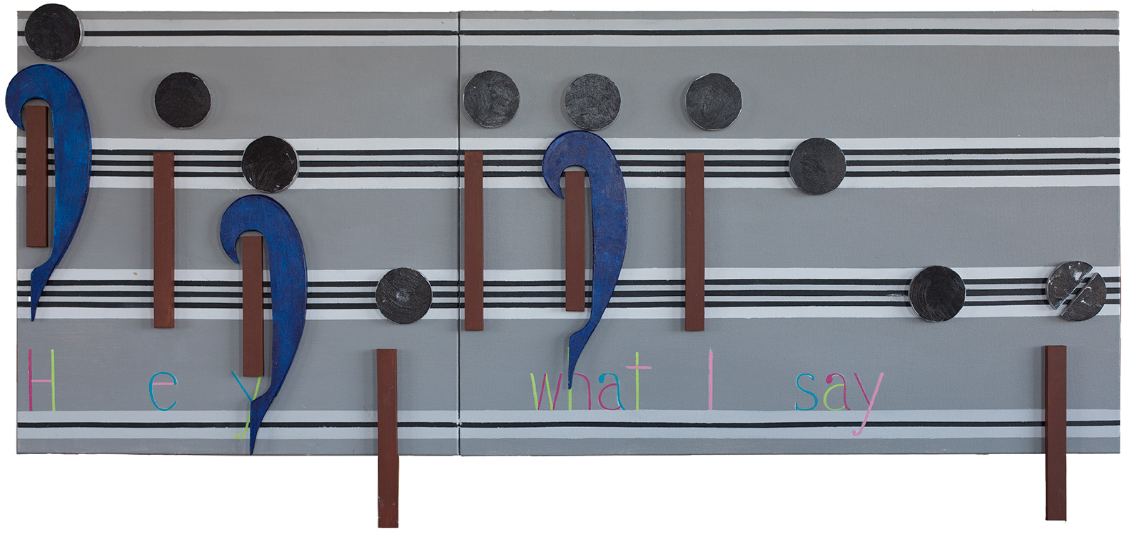
This image takes the original Black & White theme for this artwork, and look I have added all those colors.  I discussed before that when I think of this music I remember my life back than in mostly black and white.  Also, in the sixties, to be in tune with the times, I wore bell bottom  blue jeans, own a number of Navy pea coats, liked corduroy browns, and in general wore a lot of dull solid colors.  For those reasons, that is why I chose shades of gray to black to dominate this artwork, while using blues and browns for accent.  When I looked at the words for this artwork, without at first knowing the why, I knew I did not want to paint them in any dull colors or shade of gray.  I felt that none of those colors represented the lyrics of this music.  That is when I understood, what my feelings about this music,  where all about.

I remember the joy of listening to Satisfaction when it was new,  and sixty years later the Rolling Stones are still playing it. The words are still as exciting to sing today as they where when I was listening to them on AM radio,  in my best friend Tom’s Volkswagen Beetle, on a cold winter’s night as he drove us to the local dance bar, The Airway.  His car heater, barely kept us warm, and defrosted the windshield enough to see as long as we had our noses to the glass  But we did not care, for we where into music and into drinking a few beers on live band Wednesday.  That than was all what mattered.

Putting all of that into perspective,  I chose four of many Psychedelic colors, unknown to me back then, for the words because of their vibrancy and later dramatic effect on fashion. This artwork remembers, in its colors,  a distant music memory, that lives on today as one of music’s greatest, long-lasting Rock songs,  Satisfaction.

Scott Von Holzen


S_V_H Satisfaction Image1

satisfaction_1a

Satisfaction is finally here. This is the first image of Led Zeppelin’s Stairway to Heaven, on two canvas 50 inches in length by 20 inches in height.  My first contact with the Rolling Stones was  one of their early albums from 1965 that my brother bought: December’s Children.  On this album where two memorable songs, for me, As Tears go By, and Get Off my Cloud. That turned out to be the last Rolling Stones album I held in my hand.  As I have mentioned, I was a Beatles fan in the sixties.

Today,  I have almost 100 Rolling Stones songs in my music collection which at first, made it difficult to choose the first song to paint.  Actually, it turned out to be easy for I a choose my most memorable Rolling Stones song: Satisfaction.  I remember listening a lot to Satisfaction as a Junior in High School. It was the perfect teenage bad boy, hello girls, anthem for our time.

Here is the 1965 video of Satisfaction, released the same year,  on the album out of our heads:

After picking Satisfaction I checked out a lot of videos of the Rolling Stones performing Satisfaction all in color. Boy do these guys look old, and wow I just could not relate to any of those videos. Then I ran across an early video version of Satisfaction. Watching the video It was like flashing back to my youth. I could see myself and my high school buddies all in black and white. I then took the color plan for this painting from this black and white video. What really sold me on this video was watching Mick Jagger dance around in his strip pants.  I took the vertical pattern in his pants and used it in my background of this first image.

Growing up in the late fifties and early sixties, I lived in black and white world. I grew up with Howdy Doody on black and white television. The movies I use to watch at the out-door theater in Arpin where black & white. I remember that The Creature from the Black Lagoon, scared the hell out of me for many nights.  I also grew up with black and white photography.  Even in school all of my teachers used white chalk on black boards,  and in high school the Catholic nuns all wore the traditional black and white robes. It was a black and white world back than.  Even today when I think back to those days,  there where colors in my life, especially in the late sixties, but in my high school years, looking back I am comfortable seeing my friends, my brothers, my parents, and my so-called Life all in black and white.


Scott Von Holzen


S_V_H We Belong final image

weBelong_finalWe Belong is finished. This is a commissioned work in which I learned about the women of 80’s rock.  To my surprise I knew, and remembered, more music from that time than I would have ever thought.  Creating this artwork was fun, enlightening, and a nostalgic look back to decade when I bought my first CD player, and  CDs starting with Steve Winwood’s Back in the High Life.

We Belong is sung by Pat Benatar, one of the best solo female rockers , who in the late 70’s early 80’s presented herself as an independent,  feisty, tough, defiant, aggressive, woman with a commanding sexuality, and flawless femininity.   I thought, oh my god, how do I paint that. Thankfully, the music is the foundation of this artwork and not a single artist or a performance.  We Belong certainly does accommodate Pat Benatar’s  musical style,  but like each artwork they evolve,  and finish presenting their own performance.


Scott Von Holzen

purpleRain_FPurple Rain (late April)

Before We Belong I had the feeling that my style was becoming rather redundant.  Painting Purple Rain did help.  Because of my musical appreciation for Prince,  I felt some comfort doing  different twists of old ideas that where fun and that worked.  Then We Belong followed,  and I walked into the disruption I needed to get me out of this boring style rut.  Unlike in past when other artists paintings had given me new direction, this time I stumbled on a new path when I viewed my first Pat Benatar ‘s music videos.

It was my client who specifically mention Pat Benatar and who suggested We Belong.  I agreed to do the artwork knowing that at best I had heard Pat Benatar on the radio. My history of music in the 80s is that MTV was a premium cable channel, and my CD collection leaned hard towards Prince and Madonna. In short, I knew her name not the music.  To prepare for the artwork, for the first time I watched Pat Benatar’s 80’s performances.  By watching videos, researching her story, and listening to her radio station on Pandora,  I developed a fuller picture of this 80’s rock star.   A part of that discovery, that captured  my fascination,  was how much the color black dominated, in her dress, and in the darkness of her stage performances.  It became obvious to me that to create We Belong I would have to paint with a color I never use before, black.

Black,  from the beginnings of this art, never appears on my pallet. It was because of the influenced of the Impressionistic painters, who like Monet,  that never used black, that I shunned it, using  a dark blue when needed. Only recently have I experimented with black decoratively in the Waylon Jennings artwork.   In We Belong, because of the influence of Pat Benatar,  I realized that black would have to step out of the shadows.  To meet my client’s expectations, and mine I saw the color  black dominating this entire artwork.  To accomplish that I covered the entire canvases with multiple layers of  Carbon Black to form a solid shade, that becomes my look of a horizontal monolith. Next, I had to consider how to apply the stripping.

In Purple Rain there the two areas of especially interesting  stripping, that because of their size and placement,  followed the flow of the music.  I realized  that covering the entire We Belong with stripping, which happens in Purple Rain would not work. I did realize that only doing the stripping to follow the music, as in Purple Rain, would be enough to be  a foundation for the music to hang on.  Doing no more stripping the color black in We Belong still dominates and keeps it inline with the style of Pat Benatar.


We Belongs influence shows in this years Birthday painting, Cherish.  The Birthday painting is always under pressure from a short timeline to complete.  Continuing the trend started in We Belong save time and planning.  Cherish turn out to be a basic artwork that like We Belong gets its message across using simple elegance.  That is the difference between it and the more decorative Purple Rain. I never thought that a singer would affect the style of this art, but a feisty 80s rock singer did just that.

cherish_finishedCherish (July 31st)

Scott