The Tango Per Una Cabeza Image 2 plus what else is new

This artwork is stretching out to over 80 inches in length.  Of course this artwork reminds me of earlier works, especially with its length, but because of some resemblances, I will find ways to do something different with this work to not only make it unique looking, but to also coax this style forward. All I need to accomplish my expectations for this artworks is the ideas to make that happen, which at this moment do not exist. That may be because lately I have turned away from working on this work. That progress was held up, in order for me to work on new works I wanted for a couple of small art shows.

For the one day show this weekend at the Artisan Forge, I have created two smaller mini four note Beethoven 5th artworks including placing them in custom-built frames.

These mini Beethoven artworks each measure about 9.5 inches in length by 10.5 inches in height.  Also, new for this show I have created an extended musical version of Beethoven’s Für Elise.

This Beethoven artwork is also in a new custom frame with overall measurements of 33 inches in length by about 10.25 inches in height.  All three of these artworks have buttons to press to listen to the music:

For the Show all November at the Elmaro Winery near Winona Minnesota, I will be displaying only one artwork which is this updated earlier version of Für Elise. It was last year late that I showed my first version of Beethoven’s 5th that sold quickly at Elmaro, but without the music.

Finally, here is Beethoven’s Ode to Joy in the last of the new custom frames, that has been on display for a number of months at the Artisan Forge Gallery, but in a much larger, 20 by 24 inch frame.  These new custom frames, built to fit the shape of the artworks, I hope will present these little works in a much more appealing way.

Lastly,  I have this other very little addition to my Art Fair and Show inventory:

Next up back to work on The Tango artwork, but again there will be some distraction,  for I also need to start work on the Christmas painting for the 2018 Christmas cards.


Scott Von Holzen

S_V_H I Will Always Love you Final Image

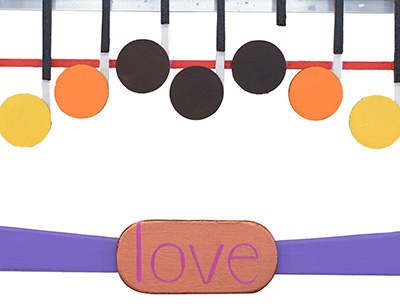
Two canvases with aluminum and wood features. 47.75 in Length by about 18.75 in height

I Will always Love you is finally finished. Although I did not have to, I picked an interesting, and challenging part of the music to paint. The problem is that it took so long to complete that I developed a new idea I would like to try.  This painting, I Will Always…., shares the same basic style of connecting  two canvases together with aluminum strips that I started in April with When Doves Cry.  Since than it has worked well with the music, but I don’t want my artwork to be too repetitive, so I am taking a little style break.

For this painting I was never crazy about combing the colors of turquoise and brown. That was the request of the owner of this artwork.  If I had to do it all over again I would have went with even smaller canvas to diminish the turquoise.  To compensate for the larger canvas I did try to cover up, or break up,  as much of the turquoise as I could with different shades of brown. I do like that I used different shades of the turquoise. I have been using a lot of solid colors for backgrounds lately, which is less interesting. For the future I think I will go with different shades of a single color, but keep the shading a lot closer together. I think in that way I can have the clean look of a solid, without being boring.

I used the Rainbow Flag colors to give this painting its own special look, and by only using the one word, love, I  covered the meaning of this music to the owners.

There you go. Another painting, that lucky for me is not headed to storage, but to Missouri.

Next up, I plan on doing something different.

Scott Von Holzen

S_V_H Burgundy Shoes Image 2

burgundyshoes_2I have been on the move.  Now,  after weeks of adjusting to my temporary routine, I am back. This is an advance image of this fine piece of music that tells a story of a girl taking a bus ride with her mother on an early spring day.

In Burgundy Shoes, as I have done in a number of other artworks,  if any of the lyrics give me design ideas, or mention colors, or a time of the year, I will find areas in the artwork to make use of those options. In this painting besides the girl’s burgundy shoes, there is mention of her plaid dress, her mothers red lipstick , lilac kerchief, and the green in the leaves of early spring.

It was obvious that burgundy would be the color of the background.  To harmonize the look of the painting I used colors that complement burgundy, in the stripping. Then I began to worked into the artwork more related  colors and those mentioned in the lyrics in shapes, and shades, consistent with the background.   The thinking for this painting is that the right use of color, in tune  with the music, along with a clean and balance design will improve the first reaction,  and curiosity of the viewer of  this relatively unknown music.

Scott Von Holzen


A shortest story  from a Temporary Studio:

When I do take a short afternoon nap I listen to my music to block out the world. Recently, I awoke from a respite to the song Burgundy shoes being played. This was a pleasant surprise for that is the music of my current art project. Outside my door I could hear my grandchildren playing.  I got up and enthusiastically walked out into the playroom playing aloud Burgundy Shoes.  I interrupted my precious three who were laughing and bouncing about like children do, just home from school.  I commented to them that the song they where hearing was the  music for my current artwork.  I guess my intention was to have them stop and  listen to the music as I explained to them that they actually inspired me to paint this music. Instead, I said nothing more after seeing that they all looked startled, and where staring at me with three unanimous looks of  silent confusion.  Feeling silly, and out-of-place, I retreated without another word, back to the safety of  their toy storage room, and my makeshift studio, to re-think my approach to public relations.

Scott


S_V_H Burgundy Shoes Image 1

brugundyshoes_2

Burgundy Shoes is small song musically by Patty Griffin, that elevates itself with its powerful lyrics. This song is a personal choice for me. I choose this music for I cannot listen to Patty Griffin’s music without thinking of my daughter Kinsey or her daughters Jordyn and Kendyl.  It also reminds me of a young boy, sadly a long time ago,  who also rode the bus home from school.  Without doubt I feel that my life has crossed paths with Patty Griffin’s.  Her music lets forgotten emotions know the warmth of acceptance and gratitude.

Burgundy Shoes Lyrics (in bold is the music of this artwork):

We wait for the bus that’s going to Bangor
In my plaid dress and burgundy shoes
In your red lipstick and lilac kerchief
You’re the most pretty lady in the world
Sun

The bus driver smiles, a dime and a nickel
We climb on our seats, the vinyl is cold
“Michelle ma belle”, the song that you loved then
You hold my hand and sing to yourself
Sun sun
Sun sun
Sun sun sun sun

Sun sun sun sun
Sun sun sun sun
Sun

The leaves are green and new like a baby
Tulips are red, now I don’t miss the snow
It’s the first day I don’t wear my big boots
You hold my hand, I’ve got burgundy shoes
Burgundy shoes, burgundy shoes
Sun


Patty Griffin first captured me when I saw a review of her Album 1000 Kisses on CBS’s Sunday Morning way back in 2002.  Until then I had never heard of her.  I bought the album  and have played her music,  and  have appreciated her song writing ever since.

Burgundy Shoes is one among of a number of other Patty Griffin songs that are special.   Some of my other favorites are Florida, Rain, Long Ride Home, Crying Over, Trapeze, and When it Don’t Come Easy.

Here is the studio version of Burgundy Shoes.  The music for this painting begins at 1:16 seconds into the song:

This is the only Live version that I thought was decent enough to present:

Scott Von Holzen


Burgundy Shoes  Technical Notes:

Below is the original first image of Burgundy Shoes.  You can see that the stripping is different from the latest image. What happened, is that I planed, calculated, thought it all through,  and still put the bottom vertical stripping in the wrong place. It could not be removed so I had to repaint the entire burgundy background.

brugundyshoes_1

I am lucky that although the lyrics are small they give me a lot of color clues for this artwork.  Of course it is easy to start with ‘burgundy shoes” which you see in the background. But the lyrics also mention “plaid dress,” “red lipstick,” and “lilac kerchief.” In the finish work you will see the influence of all those lyrics.  I am so lucky to have them.

As a note, my studio is down and packed away, for the big move to come.  Although disappointed,  to my delight,  I will soon be back with my music and my art, in a temporary home studio provided by my daughter and her family.

How lucky.

Scott

S_V_H We Belong final image

weBelong_finalWe Belong is finished. This is a commissioned work in which I learned about the women of 80’s rock.  To my surprise I knew, and remembered, more music from that time than I would have ever thought.  Creating this artwork was fun, enlightening, and a nostalgic look back to decade when I bought my first CD player, and  CDs starting with Steve Winwood’s Back in the High Life.

We Belong is sung by Pat Benatar, one of the best solo female rockers , who in the late 70’s early 80’s presented herself as an independent,  feisty, tough, defiant, aggressive, woman with a commanding sexuality, and flawless femininity.   I thought, oh my god, how do I paint that. Thankfully, the music is the foundation of this artwork and not a single artist or a performance.  We Belong certainly does accommodate Pat Benatar’s  musical style,  but like each artwork they evolve,  and finish presenting their own performance.


Scott Von Holzen

purpleRain_FPurple Rain (late April)

Before We Belong I had the feeling that my style was becoming rather redundant.  Painting Purple Rain did help.  Because of my musical appreciation for Prince,  I felt some comfort doing  different twists of old ideas that where fun and that worked.  Then We Belong followed,  and I walked into the disruption I needed to get me out of this boring style rut.  Unlike in past when other artists paintings had given me new direction, this time I stumbled on a new path when I viewed my first Pat Benatar ‘s music videos.

It was my client who specifically mention Pat Benatar and who suggested We Belong.  I agreed to do the artwork knowing that at best I had heard Pat Benatar on the radio. My history of music in the 80s is that MTV was a premium cable channel, and my CD collection leaned hard towards Prince and Madonna. In short, I knew her name not the music.  To prepare for the artwork, for the first time I watched Pat Benatar’s 80’s performances.  By watching videos, researching her story, and listening to her radio station on Pandora,  I developed a fuller picture of this 80’s rock star.   A part of that discovery, that captured  my fascination,  was how much the color black dominated, in her dress, and in the darkness of her stage performances.  It became obvious to me that to create We Belong I would have to paint with a color I never use before, black.

Black,  from the beginnings of this art, never appears on my pallet. It was because of the influenced of the Impressionistic painters, who like Monet,  that never used black, that I shunned it, using  a dark blue when needed. Only recently have I experimented with black decoratively in the Waylon Jennings artwork.   In We Belong, because of the influence of Pat Benatar,  I realized that black would have to step out of the shadows.  To meet my client’s expectations, and mine I saw the color  black dominating this entire artwork.  To accomplish that I covered the entire canvases with multiple layers of  Carbon Black to form a solid shade, that becomes my look of a horizontal monolith. Next, I had to consider how to apply the stripping.

In Purple Rain there the two areas of especially interesting  stripping, that because of their size and placement,  followed the flow of the music.  I realized  that covering the entire We Belong with stripping, which happens in Purple Rain would not work. I did realize that only doing the stripping to follow the music, as in Purple Rain, would be enough to be  a foundation for the music to hang on.  Doing no more stripping the color black in We Belong still dominates and keeps it inline with the style of Pat Benatar.


We Belongs influence shows in this years Birthday painting, Cherish.  The Birthday painting is always under pressure from a short timeline to complete.  Continuing the trend started in We Belong save time and planning.  Cherish turn out to be a basic artwork that like We Belong gets its message across using simple elegance.  That is the difference between it and the more decorative Purple Rain. I never thought that a singer would affect the style of this art, but a feisty 80s rock singer did just that.

cherish_finishedCherish (July 31st)

Scott

S_V_H Waymore’s Blues Final image

waymoreblues_FinalWaylon Jennings Waymore’s  Blues is finished. It took a crazy long three months to complete.  I started it in early May, but after working on the background I  halted work on it to switch my efforts to the commissioned Japan Bach painting, followed by another commissioned, We Belong, and then Cherish this years Birthday painting.  Waymore’s Blues is even a longer overdue painting considering that it has been over nine years since I last painted a Country Music artwork,  Crazy by Patsy Cline.

The biggest unique look,  that is also the obvious hook for this artwork,  comes from the design of Waylon’s leather embossed guitar.  I stylized the look of his guitar into a cool design that is the music in this painting.  Since the music  has such a dramatic look that than allowed me to go with a straight forward  background with clean straight lines, and  pure colors applied right out of their jars.  This kept the desigin of the background deceptively simple,  in contrast to the music,  and visually offers another side of Waylon Jennings.  As for my choice of the colors, white, black, blue and brown, they all became obvious after watching a few Waylon Jennings videos.   Black and white show in his guitar and strap, the blues come from his blue jeans look, and the browns comes from his abundance of head and facial hair.

Waylon sings, “I ain’t no ordinary dude. I don’t have to work.”  Every time words appear in these artworks  I pick them so that they offer alternate meanings from the music. In Waymore’s Blues ” I don’t have to,” challenge the viewer, especially if the music is familiar to them.

Here is Waymore’s Blues from a live performance of Waymore’s Blues at the Grand Ol Opry in 1978, with his guitar that is where the black and white designs you see in the artwork come from.

Scott Von Holzen


I have always like Waylon Jennings, but I am not sure why.  My guess may have something to do with my earliest child recollection of music which would the songs of Hank Williams. To this day I still like many of Hank’s hits such as, Your Cheatin’ Heart, Cold Cold Heart, I’m So Lonesome I Could Cry, Jambalaya, Hey Good Lookin’ and Kaw-Liga.  I cannot recall where or how I heard him sing, but probably it was my Mother’s love of music that I probably listened to Hank on the radio.  Another possibility is that  I may have heard Hank Williams being played on a jukebox. There is a good chance that my parents, in their twenties,  brought me along with them to one of the local taverns.  I would have heard the sounds of music like never before, and would have been apart of many memorable times my parents had in the early 50s with friends and family. Sadly, neither of them are around to confirm any of my short frames of memories of so long ago.

I know it is still a long stretch from Hank Williams to Waylon Jennings, especially after Hank Williams I have no other memories of Country music. In fact,  the next song I recall from my youth,  came about when I was taking accordion lenses.  I wanted to learn to play the music for Bye Bye Blackbird, but my teacher never found the sheet music ( Instead I painted Bye Bye Blackbird in 2012).  My next remembrance of music was the song High Hopes, probably song by Frank Sinatra (Painted and sold).  A few years later I do recall a pop hit, Speedy Gonzales  by Pat Boone. Then as a high school Sophomore in 1964, the music of the Beatles changed every teenager,  including starting me on this path to now.

I guess my appeal for Waylon Jennings, and his song Waymore’s Blue, could have come from it being more of a traditional Country song, without the twang, that was greatly influenced by the Blues.  Or maybe,  Waylon Jennings one of the original County Outlaws, involved from one of the most original, influential, and controversial singer, songwriters of his time,  which was also my time as a youth.   And now, much older, and in this time,  I have a moments opportunity,  to keep going down that musical path beyond just Hank to Waylon.

Here is Hank Williams singing his 1947 classic Move It on Over in this 1949 recording.  This early Rockabilly song greatly influenced  Bill Haley and the Comets classic hit, Rock Around the Clock, that became the anthem for the youth of the 50s, and brought Rock ‘en Roll into the musical mainstream (reference Wikipedia):

Scott

S_V_H We Belong image 3

weBelong_3We Belong  is starting to show of her charms.  All the parts of this music are now in place, which is always a major accomplishment for any artwork.  The color black along with shades of gray define this artwork, and the singer Pat Benatar.  To add depth to this look,  interest, and excitement to this painting, I am going to add a number of small, mostly curved wood shapes.  In contrast to the major neutral colors these add-ons, done in the  colors that define the eighties will soften, and enlarge the feminine.

Each of these artworks pushes this genre a bit more forward.  As long as the passion, and the need to know remains strong,  that is the direction I am heading. The one thing I am beginning to understand is that although I care deeply about each of these paintings, I know I can let them go if the time comes.  I am sure of that, for I believe it is this art,  that is leading me around the next corner, to the next piece of music, that will become the next painting,  that will steal my heart away, letting me, once more, feel seventeen again.

Scott Von Holzen

S_V_H Cherish Finished image

cherish_finished

Cherish, is finished with all the structure that makes up this music is in place.   Tomorrow, I will clean,  touch up, and add a number of small wood pieces to give the music at little more interest.

Cherish, is a wonderful song about unrequited love, that made it relevant in the 60’s and I believe it still holds today. That is one reason I painted it.  Many of my artworks I complete reflect the times I grow up.  Cherish is one of those 3 minute songs that have given hundreds of hours of remembrance,  and reflection to many of us. Sometimes it is good to look back, laugh at yourself, and realize how far you have come.  You envy your youth in those days, but know that the best is yet to come.

Scott Von Holzen


S_V_H Cherish image 2

cherish_2Cherish, this painting is unusual in that the flow of the music is a straight line.  The colors theme that I am uses comes from The Association Greatest hits album cover, and from there first album which included the song Cherish:

GreatestHits

firstAlbum

I watched a lot of Association videos, realized they had a lot of member changes, and confirmed that softer greens and blues was the way to go.Here is an early version of Cherish probably around 1967.


Scott Von Holzen