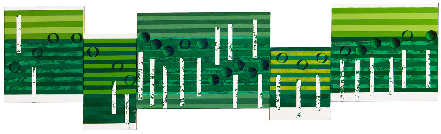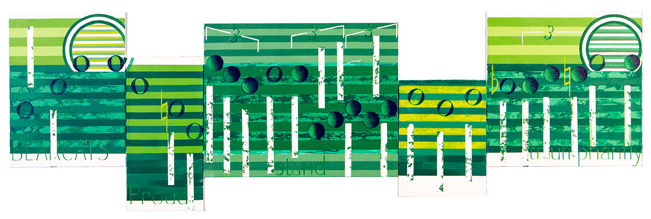
This is an image of Wings of Victory with all the musical features added. There is still plenty of work to do with the color, and to clean up the entire artwork. What you are seeing is close to the finished product.
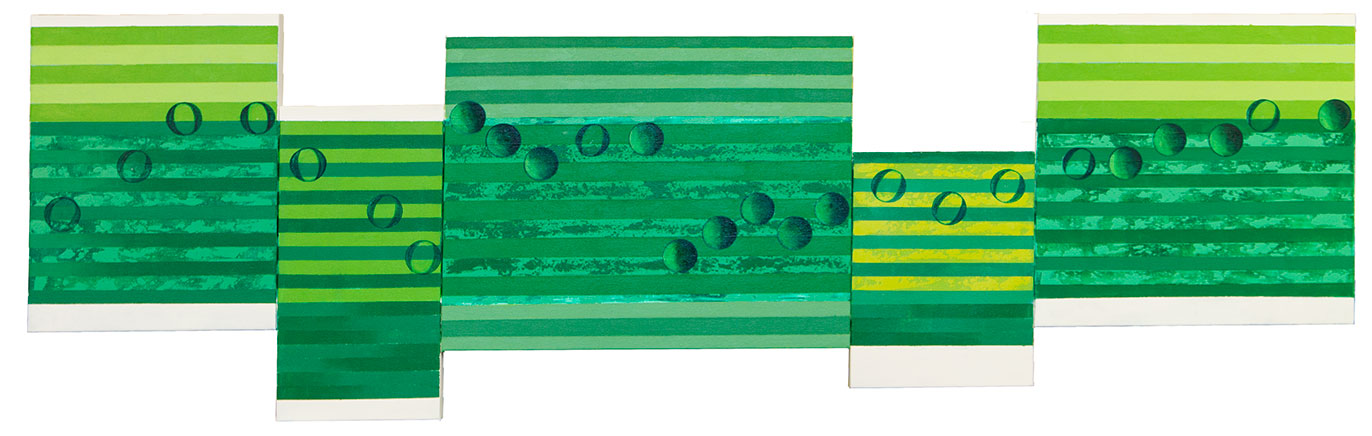
This has been a challenging work made difficult because of a limited pallet. In most of my works I paint the entire range of colors available. I use a lot of colors to add interest, create tension with neighboring colors, to increase the drama you see in the work, and to give me a pleasing appearance. I would get bored and lose interest painting a black and gray canvas. That would be to boring, even though I know at times painting can be tedious work. Still, it should never be dull.
Ever since the Japan Back paintings, and the client requesting a more “spontaneous” style I have questioned my painting techniques. They may have a point. Right now this is my thinking: I have seen plenty of musical artworks that are spontaneous abstractions of swirling colors, and shapes, that I feel I do not need to paint. Then there are plenty of examples in today’s modern art of solid shapes and strong lines, along with bright colors, most of which I consider sterile and just as boring as musical abstractions.
I believe music has a lot of structure, but I am not painting sheet music so from the beginnings of this art I have loosened up that structure that is continuing today. Maybe not as much as my Japan clients wanted, but I am aware that musicians deviate from that discipline of the notes having specific lengths of sound, such as Charlie Parker, but the music is still harmonic and present. Where does that place this art? Right now I believe it is somewhere between musical abstraction and painted sheet music. For now that is a good place. But, I do feel my thinking about the structure of music is beginning to loosen up. I give you a very small example.
If I am using only one canvas size, I would first have to figure out the proper size of my musical notes to make sure they all would fit in a limited space. For example if 80mm notes fit than I would define the up and down movement of my notes in terms of that same note size, 80mm. That changed recently with the Japan works. They were unusual artworks, for years now I have move away from rectangular works to long horizontal artworks, that better match the music. But I could not do that with the Japan works because of my predefined dimensions. What I did was instead of using 50mm movements up and down the artwork to match the size of the my notes, I choose 60mm to better enhance the sense of movement across the artwork, and to fill a lot of extra space.
Today, with Wings of Victory, I have taken this difference between the music and the flow direction further. With this artwork my notes are just over 40mm, but for the up and down spread I used 60mm. By increasing that difference in height between the music I have added extra impact to this fairly straight music, making it more interesting.
This style of portraying music is still young and I certainly know that it’s growth will continue for years to come. I am anxious to see more results of this evolution in musical acrylics.
Scott Von Holzen