S_V_H Wings of Victory image2


wingsOfVictory_2

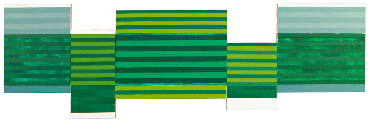
Wings of Victory the school fight song for Northwest Missouri State University.  It has taken two weeks to reach this stage of the background for this music. The University’s colors are green and white.  White leaves no options, so to create some interest and contrast I have mixed a lot, yes I mean a lot, of shades, and tints of different colors of green. This background has seen a number of changes, that I did not document.  Creativity is difficult using such a restrictive pallet, when I normally have used every color in the rainbow in most of my work. It has been s struggle to get this far with this background.  The schools green is a Pantone color of 342, which helps, but since it is a dark green, I have had to move towards lighter shades of green and yellow-green,  to give the artwork some life, that you certainly feel if you listen to the music.

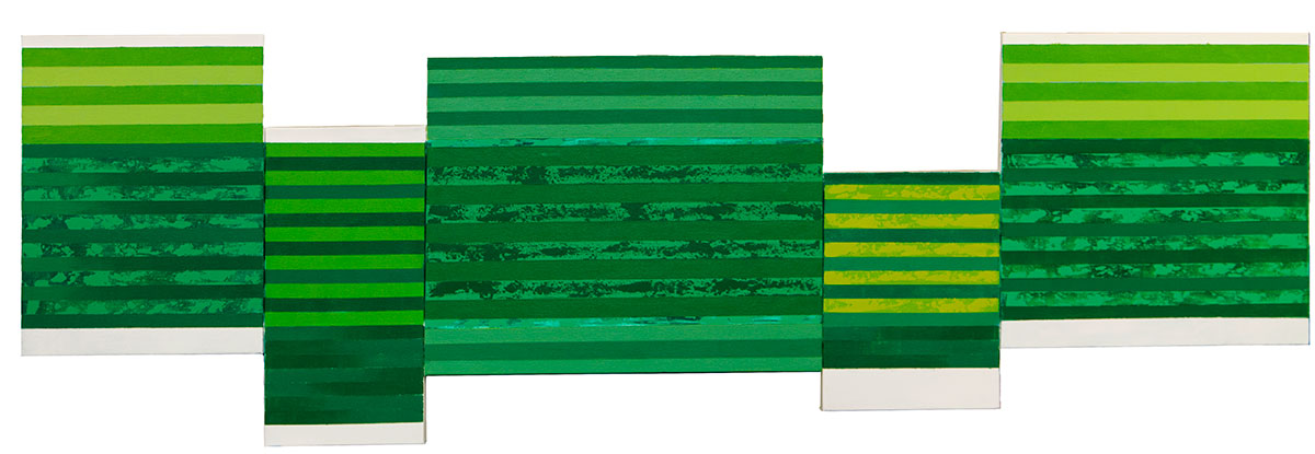
Like the two paintings for Japan, I am out of my comfort zone with this work.  When I look at this painting and the similar size, unfinished work Take Five (scroll down two posts),  my challenge is clearly visible.  I can only do so much with green, and that is what I need to solve to create a special artwork that the University will be proud to display.

Wings of Victory:

This music is what I would expect for a University band school theme song.  It does its job quite well.  I need to figure out how to take the emotions of their fight song and translate it into this artwork.  That would be easier without color restrictions, but that is not an option.  My challenge is to punch up this artwork to show the emotions of the music. I can do some of that with the design of the artwork.  More important would be If I  can figure out some way to bounce the different shades of green off of the white.  A lot of different color contrasts would help the most to pump up the emotions of this artwork.

Today, I have finished putting in the flow of the music, and have colored it in.  I will post pictures and more tomorrow.

Scott Von Holzen


S_V_H Wings of Victory

wingsOfVictory_1

I would think that only a few people recognize the song Wings of Victory.  It is a catchy tune that is an actually a University fight song.  My job is to paint it. The challenge so far is to find a decent acrylic Pantone 342 which is a green kinda on the darker side, not too dark, kinda bluest, not too blue, kinda something that I kinda can not match, and maybe should not try any more. It is important for me to match their schools colors as best I can. Since that white with this particular shade of green, I thought it would not be too hard to match.  I was wrong. After doing twenty some mixes I have come to the combo of equal parts of these Golden acrylic paint colors: Permanent Light Green, Phatho Green Blue, and Primary Yellow.

Today, I am still chasing shades of green for this project. I must have done over 30 tests.  I figure now if I go with a multiple shades of green with a tint of blue, I will have something for every viewer. This is a good learning lesson.  If another customer needs a specific color to appear in their painting, it is going to cost them because of hours of lost time I have spent trying to match this elusive green.

I started with Hookers green, Chromium Oxide Green, and Cobalt green.  I than wandered into Phthalo Green Blue Shade, mixed with Phthalo Green Yellow Shade, and then added a number of mix ratios of Titanium White.  I thought that was the combo, last night, and I painted away.  Tonight, it looked too blue. That is how I ended up with Phthalo Green Blue Shade but this time with a lighter green. Permanent Light Green, first double that of the blue, and then I switched to equal parts.  But, than it seemed I needed more green, so I added the Primary Yellow. I got the yellow idea from the Pantone 342 green which uses yellow. Before I was using white to shift the color lighter, but I found I could punch up the green and lighten at the same time by using the yellow. This has been a  frustrating and interesting learning experience. Understanding color, and the mixing of colors takes a long, long time to get right.  I’m a learning, and now it is time to move along and paint this music.

I need to explain the why it is time to move a long. Before I became a born-again artist (I started painting in 1975 and stopped in the early 80’s), I became an Ansel Adams, photography guy. I read and collected books of Ansel’s  reproductions. I spent hours,  more hours,  and more hours, taking pictures and documenting, so that I could learn how to take a better shot next time.  Than in my darkroom, I  spent horrendous amounts of time, trying to figure out the perfect techniques to produce the perfect print, from a negative I had used all of my ability  to capture the right amount of perfect light, with exceptional blacks and delicate whites.  In the end I did produce some decent 35mm, 2 and 1/4, and finally 4×5 sheet images, but with very few, very very few, fine prints.  I spent so much time trying to take the perfect negative and then to produce the perfect print, that I simple ended up far, far short of my original photography goal: becoming the next Ansel Adams. I ran out of time and will.  I learned but did not produce.  That is not going to happen again, not with this second chance at art.

I paint the imperfect artwork, and then move on to another attempt at perfection, that will also surely fail to meet my standards. But that is my plan and it works. Each artwork is like a friend that you know that has equal amounts of potential and flaws.   To accept the limits of each artwork, gives your art room to breath. I lost my breath with photography.

What I do is Paint it, and done,  I give it the best of my ability, and skills that I have at that moment. When finished I am proud of my efforts. I know I have not peaked, in skill or style.  I know that the next painting will be better than the last. And I know there is still a lot of great music that I must paint. That is that, and that is what keeps me in the game.

Scott Von Holzen


S_V_H Take Five image3

TakeFive3

Take Five painting looks different physically from the last image, because I had to make big changes.  When I first mapped out this painting, I stopped at a low note, that I thought would work. That was back in December, and only a couple of days ago did  I realized an error.   I used the original mapping of this music to build the artwork.  I only discovered the mistake after I had already posted a second image of this work. The error was  that the music had come up longer than my artwork.

When I re-check my work I saw that I stop the painting short, and had left out the end of the musical phrase that I wanted to portray.  I had to add more which meant I had to draw it over.  I made my music smaller but that was not enough. Finally, I had to add three 5 inch by 5 inches canvases to place all the music.  Even though I had to completely rearrange the music it still work with the canvases.  Now with image three, I feel better for it is displaying the complete phrase of Take Five, that I wanted to depict.  The challenge to make the existing artwork work with the new music,  was an interesting problem that I solved, and it certainly added interest to this painting.

Next up, I am taking a break from Take Five to work on a commissioned project for the University of NorthEastern Missouri. The canvas is all together, so I expect some paint to go down tonight.

Scott Von Holzen