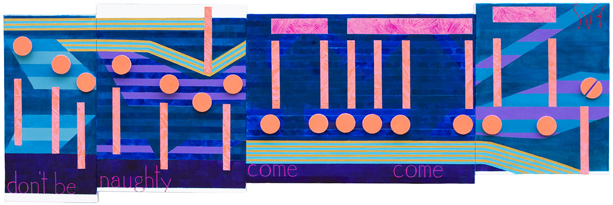
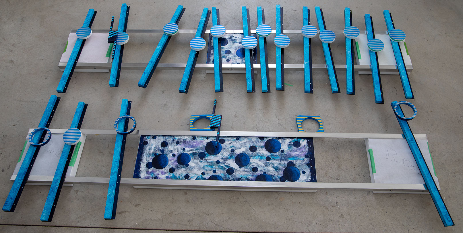
 This is the first image of 2019’s version of Over the Rainbow. What the image shows are the pieces (not yet attached) that I made since starting this project on the 9th of February. I am just short of three weeks into this project. My thinking is that in three weeks it would have been nice to almost be finished with this work, but of course I am still a week away from that. I hope. A big difference with my style, and that of other abstract painters, is I do not create these artworks in-the-moment. They are all well thought out and planned ahead, because of their difficulty to build. Even though I do learn from the past, each project is a new adventure in design, problem solving and recovery from mistakes. I have made this art this way since I began. Beyond a few commission works there have been no deadlines to meet, although I have met them all. I am no longer going to do any common commission works, that means, for now, my time is mine, for all that is worth.
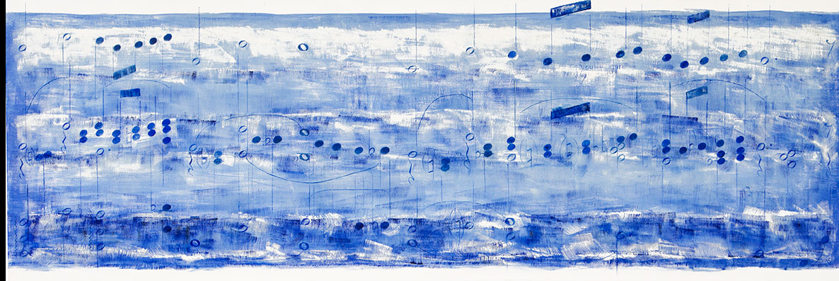
My first all music painting was Over the Rainbow. This is my second painting of that music done a few months later in July of 2006. This may also be one of the first artworks where I used an inch and on-half depth canvas with the unique size of twenty inches by sixty inches. Before this my standard artwork was a two foot by four-foot on a seven-eights depth canvas. I remember taking Rainbow to a family gathering at my father’s home soon after I had finished it. I do not remember any comments from anyone. I do remember why I took it which was because this song meant a lot to me.
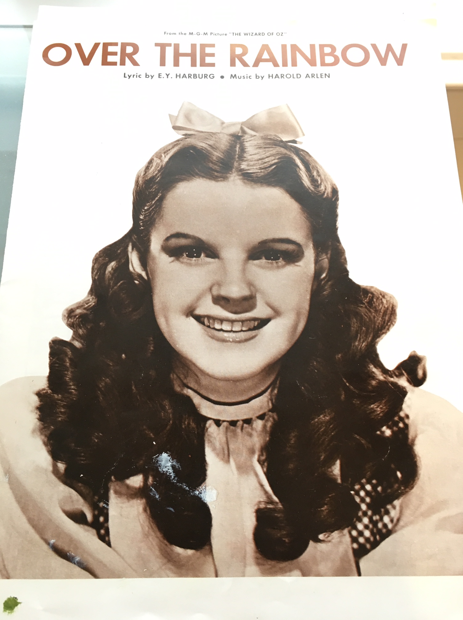
I grew up being fascinated by the movie Wizard of Oz, which way back than, aired once a year, around Christmas time. As a kid I remember being strongly moved by how the movie started out in black and white and then switched to color. Color television was new to me back than, with Disney Wonderful World of Color being a favorite program of mine. Here is a picture of Judy Garland on the sheet music for Over the Rainbow, I bought for the artworks from a sheet music store in Wausau now long closed.
Although I never understood the reasons why, or have forgotten them, I always felt that my Mother cared about Judy Garland. Maybe it was because of the lost of the middle sister, Bernadine from alcohol abuse, which, along with substance abuse, also took the life of Judy Garland four years earlier. It may have been that Mom saw in both their struggle to find happiness. I will never know.
I do not have a lot of memories of Bernadine, mostly because I was young when she lived near by. I can see her face, her short hair, thin but shapely body, and thought her voice, in comparison to Moms, sounded deeper, sharper, stronger. I am also seeing and hearing Judy Garland when describing Bernadine, which surprises me.
After we left Ashland, I do not remember seeing Bernadine or even having any memories of her for many years until 1973. That summer, Up North at the cottage, I received a phone call that Bernadine had died. I found Mom and Dad who were out to dinner at a local golf club. I believe I asked to speak with Mom, but do not remember Moms reaction. My last memory of Bernadine was at her funeral in 1973, when, by accident, I saw the closing of the coffin (Jack, Bernadine’s husband, died years later also from alcohol abuse). The story of the tragedies of Mom, Bernadine, and Judy Garland, contain for me many uncertainties and missing details, but I have grown up over the years believing that the song Over the Rainbow, and the story of the Wizard of OZ, is part of their story, also. Back than I may not have understood all of this watching the Wizard of Oz, but what has always been true for me, was the impact of that movie going from black and white to color. I cannot but today feel that like the switch to color in the Wizard of OZ, Mom, Bernadine, and Judy Garland live on in me because of this music speaks to their times. That is why I am painting Over the Rainbow again. No black and white to be seen. This artwork will be colorful which tells me that in this artwork, this time, their stories will have a happy ending. They only need to click their heels together three times, and I can do that for them.
Here is Over the Rainbow sung by Judy Garland from the 1939 movie Wizard of Oz:
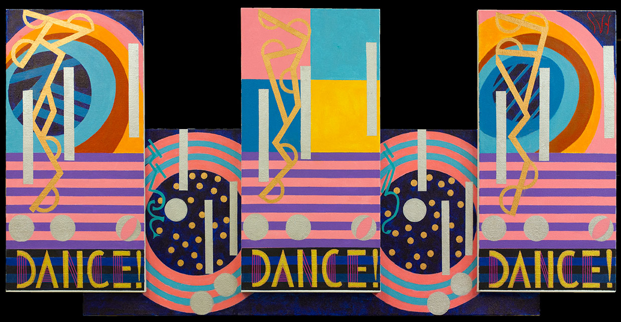
When you look at the 2006 version of Over the Rainbow, there are no rainbow colors. I think, now, that was artsy of me. The music I used for that painting, and which Judy sings is “Somewhere over the rainbow skies are blue and the dreams that you dare to dream really do come true.” In the artwork I painted the two words “you dare.” For this artwork I have chosen the words, “why can’t I,” which comes at the last few measures of Keith Jarrett’s emotional piano performance of Over the Rainbow.
Here is Keith Jarrett, Over the Rainbow live in Tokyo:
Lastly, I should mention that after finishing the first artwork of Over the Rainbow my original plan was to paint a new version of this music every six-months to track my style changes. I painted only two, both in that same year, 2006. So it goes.
Scott Von Holzen