S_V_H Your Song image 3

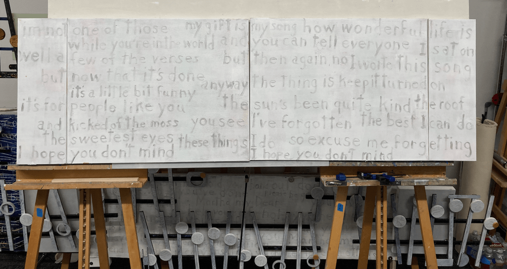
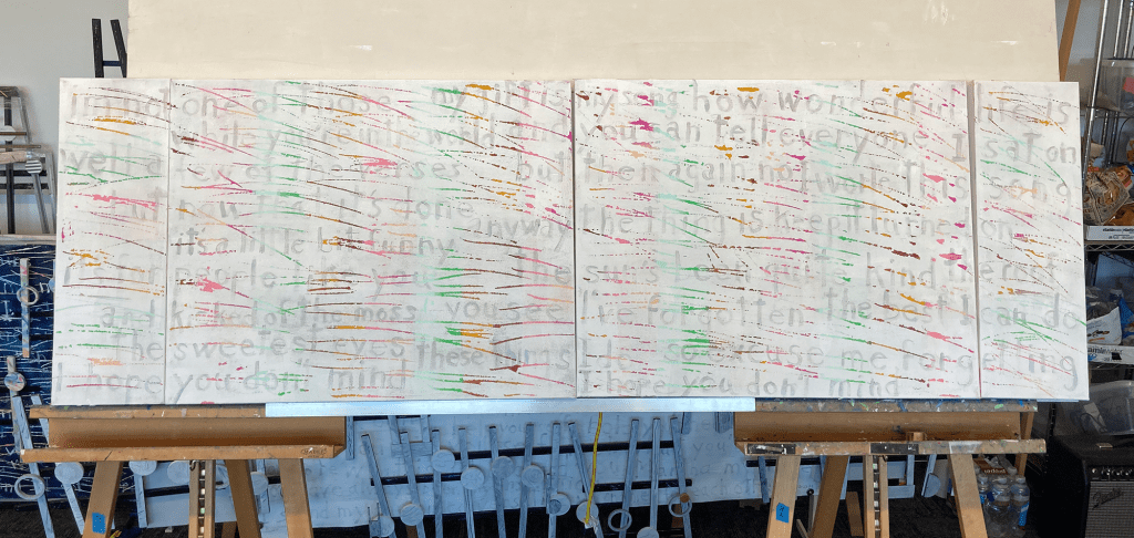
This is the last stage of my scratching technique, when I draw in the words. I dislike art that includes words to enhance the works’ lack of purpose. My words go with the music. They are there because they belong. They exist to add interest and offer the viewer the option to choose their meanings. I have always applied words in that way. If the music has words, I like to use them. I see them as decorative graffiti. I then scratch through them. This technique downplays their value and covers my print writing, which is awful, but important. My hand writing connects me to the artwork, not unlike Jackson’s Pollack hand print on his canvas.

I should mention how I choose the colors for this artwork. The background color ideas that appear through the scratching, and the top white layer of white, come from Elton John’s outfit in an early video of Your Song. The silver I used for the words I found in the glasses of Lady Gaga’s performance of Your Song at the 2018 Grammies.

Elton John’s live 1971 performance of Your Song.

This is a technical note: This image above is after the scratching was done. Issues are continuing with getting a clean scratching across the entire canvases. The top layer, in places, is rubbery. That means the pallet knife tears the top layer instead of clean ripping it away. This issue could be caused by the thickness of the paint, or that it needs longer drying time. The solution is further complicated by the rubbery issue not being consistent across the canvas. What is known is that as the days pass, the top layer firms up on the artworks and my test canvases. Letting the top layer of paint cure for maybe weeks, with testing, could be an answer, except that does not work for me. I live with each of these projects until finished. Only when completed do I start the search for the next music project. Hum, so the choice is?

Scott Von Holzen

S_V_H Burgundy Shoes Image 1

brugundyshoes_2

Burgundy Shoes is small song musically by Patty Griffin, that elevates itself with its powerful lyrics. This song is a personal choice for me. I choose this music for I cannot listen to Patty Griffin’s music without thinking of my daughter Kinsey or her daughters Jordyn and Kendyl.  It also reminds me of a young boy, sadly a long time ago,  who also rode the bus home from school.  Without doubt I feel that my life has crossed paths with Patty Griffin’s.  Her music lets forgotten emotions know the warmth of acceptance and gratitude.

Burgundy Shoes Lyrics (in bold is the music of this artwork):

We wait for the bus that’s going to Bangor
In my plaid dress and burgundy shoes
In your red lipstick and lilac kerchief
You’re the most pretty lady in the world
Sun

The bus driver smiles, a dime and a nickel
We climb on our seats, the vinyl is cold
“Michelle ma belle”, the song that you loved then
You hold my hand and sing to yourself
Sun sun
Sun sun
Sun sun sun sun

Sun sun sun sun
Sun sun sun sun
Sun

The leaves are green and new like a baby
Tulips are red, now I don’t miss the snow
It’s the first day I don’t wear my big boots
You hold my hand, I’ve got burgundy shoes
Burgundy shoes, burgundy shoes
Sun


Patty Griffin first captured me when I saw a review of her Album 1000 Kisses on CBS’s Sunday Morning way back in 2002.  Until then I had never heard of her.  I bought the album  and have played her music,  and  have appreciated her song writing ever since.

Burgundy Shoes is one among of a number of other Patty Griffin songs that are special.   Some of my other favorites are Florida, Rain, Long Ride Home, Crying Over, Trapeze, and When it Don’t Come Easy.

Here is the studio version of Burgundy Shoes.  The music for this painting begins at 1:16 seconds into the song:

This is the only Live version that I thought was decent enough to present:

Scott Von Holzen


Burgundy Shoes  Technical Notes:

Below is the original first image of Burgundy Shoes.  You can see that the stripping is different from the latest image. What happened, is that I planed, calculated, thought it all through,  and still put the bottom vertical stripping in the wrong place. It could not be removed so I had to repaint the entire burgundy background.

brugundyshoes_1

I am lucky that although the lyrics are small they give me a lot of color clues for this artwork.  Of course it is easy to start with ‘burgundy shoes” which you see in the background. But the lyrics also mention “plaid dress,” “red lipstick,” and “lilac kerchief.” In the finish work you will see the influence of all those lyrics.  I am so lucky to have them.

As a note, my studio is down and packed away, for the big move to come.  Although disappointed,  to my delight,  I will soon be back with my music and my art, in a temporary home studio provided by my daughter and her family.

How lucky.

Scott

S_V_H Vivaldi’s “The Four Seasons(Autumn)adagio molto Final image

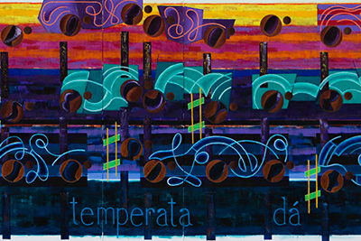
Vivaldi’s The Four Seasons – Autumn – 2nd  movement.  This artwork is composed of five canvas panels with a total length of 120inches by 40.75 inches, maximum height.  This work was started on May 28th and now 47 days later it is finished. The guesstimate is a minimum of 3 hours a day was spent working with this artwork.  This means about 130 hours to complete.  The amount of time an artist puts into a work is not a prerequisite for value or quality, but it is good information to have when planning.

Listening to One Night in Bangkok

Melissa Ferrick – Don’t Say Goodbye

Bruce Springsteen – Streets of Philadelphia

Etta James – At Last

If I look at this painting objectively, there is not much in art history that looks  similar to this, or that approaches the way this art depicts music.   That does not mean it is any good, but there is a feeling, that this new Vivaldi work is continuing the push of this art in an interesting direction.

What then was accomplished with this artwork? We can start with those interestingly portrayed musical ties that are crazy good in this work.  This is an image of your standard sheet music musical Tie:

Now, here is this artist take on a musical tie from this painting:
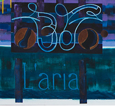
There is no comparison, one image is of standard musical notation, and the other has nothing to do with music and is a creation from imagination. Simply put, one can be played, while the other can be either appreciated or dismissed.

This artist take, on Vivaldi’s musical notes, took on the look of  individual planets (not intentionally) each with their own little moon (dotted half-note) that floats across the canvas.  Here is musical notation version of a dotted half-note:

 This is this artist take on a dotted half-note:

Throughout this work every object that floats over the background has been treated as an individual item which gets some of its inspiration from the musical manuscripts of Mozart at the British Library.   
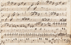
The way musical notation is jotted down is as individual as the musician.  Those varied pencil marks can then produce an infinite number of options when played.  So, it is in looking at music and with the understanding of this endless variety that is music, that has been a part of what has allowed this art to quickly improve and transform.

Tiny Dancer – Elton John –  from the album Madman Across the Water

Listening to Will Smith – Wild Wild West

Billy Eckstine – Misty

Suicide Blonde – INXS

One  technical issue that had been a concern of  this artist, was to not to create an abstract musical artwork that could be dismissed as decorative:  partially defined as a painted work on canvas that has the right colors to match the furniture, and is the right size to full the space on the wall. When the thought is about decorative painting Henri  Matisse comes to mind, and what was learned from his art that actually changed this art over the years. It is in this gowning process, and the better understanding of the great variety that is music, that allowed this art to be depicted however it was wished, and that any concerns with  decoration was nonsense.  The varied use of color and shapes are needed to enhance the feel and mood of the music. Since music is usually listen to, and since these paintings have no sound, this art needed to create visually images to arouse the music inside of the viewer. Plus in practical terms it would have been boring painting standard music notation, which would have killed this art.  Thank you Matisse. Matisse is also on that short history list of influential artists starting with Vincent Van Gogh,  Rembrandt van Rijn,  Henri Matisse, Pablo Picasso, Mark Rothko, Jackson Pollock, and J.M.W Turner.

Sting – Stolen Car (Take Me Dancing)

Janis Joplin – Try

Bowling for Soup – 1985

This artist believes that this work’s style certainly pushes forward. But  its limited use of add on canvases can be seen as an unavoidable short coming of this artwork. Otherwise, the best of this art is in the style and coloration of all those half-notes, those magnificent ties, the words that are large and look great reflecting the mood of the painting in their color, and the use and variety of colors in the background.

There are now ten more works of Vivaldi’s The Four Seasons, yet to paint, with the next one beginning tomorrow, delayed because of the multiple hours required to write this one blog entry.

Listening to Take Five – Dave Brubeck

Vivaldi – The Four Seasons – Winter – 1st movement the artist favorite.

Michael Jackson – Blood on the Dance Floor

Keb’ Mo’  – Soon as I get Paid

This now brings me to this years Birthday painting that everyone, that reads this blog, will have an opportunity to receive a sign photograph of that work, t0 be painted from beginning to finish, all in one day, July 31st. I will be posting another blog entry with the details.

Ending this blog entry with The Killers – All these Things that I’ve Done

Scott Von Holzen

S_V_H More Than You Know Final image

OK out there, here is the final image of  a great musical standard of the 20th century More Than You Know.  Listening to the Beau Brummels – They’ll Make You Cry.  I believe we use to play that song in the band, a long time ago.   On to Janet Jackson – Nasty,  which also feels good.  The personal preference is to be a nasty boy, but time and common sense has changed all of that. Billy Joel – A Matter Of Trust.

Some words about the words to this artwork, which are Luv you I do I do.  They are this artist interpretation  of the musical phrase, “Loving you the way that I do There’s nothing I can do about it.” The decision to paint a musical piece depends on these major things: How much does the music effect me.  For example can it be played over and over again, throughout the three or four weeks it will take to finish the work, and still sound fresh and meaningful?  Is there a musical phrase part of this music that has great interest and great opportunities to experiment with?  If there is a phrase that might work, and it contains words, can those words be twisted to  then become an expression of this artist.  And last, will the music fit on the available canvases.?  Actually, the first and biggest challenge is to go through the list of must paint music, and then convince all over again just why this music should be painted.  Some times it takes days, and no, no matter how practical it might seem, it is impossible to switch this artist mindset.  In other words, if  the current painting is More, there is no room for any other thoughts concerning the next work, which is now to be Heart.

More is an impressive effort that breaks new ground.  Above you are seeing on the top left the evolution of a musical beam.  On the whole right side you are seeing a a new take on a musical slur. Why should that make a difference?  Both of the examples above, show the slow but consistent effort to not paint boring things.  Certainly,  a curved line is a slur, and a rectangular box is a beam, but this art would have abandon a long time ago if that was all there is.  

Bruce Springsteen – Broke The Mold.  This artist understands all art evolves with repetition, but there is that moment that can separate the wall decoration painter from the born-to-lose artist.  This moment happens any number of times throughout an artwork.  Thanks, to the artwork, that demands to be different, and thanks to this artist is still lucky enough to feel what the work is saying, there is hope that the future will be full of of  swishes to swashes yet to come.

More Than You Know – Erroll Garner – Barbra Streisand – Dave Brubeck – Frank Sinatra – Judy Garland – Thelonious Monk – Dinah Washington – Billie Holiday – Ella Fitzgerald, and this artist’s very very favorite Sara Vaughan.

The third style point  used in this work, that has been mention, are the little abstractions that are the shafts used in five different locations.  At first they where thought of accomplishing something special, but soon those feelings faded away from that when they appeared to be lost in this work.  It was only adding the light green line along their edges did they seem then to pop back.

Platinum Weird – Will You Be Around.

It is the music that maintains this blog and the art.  It is hard to pull away from every night. It means that much.

Mozart – Piano Concerto No.22 III: Rondo.  From here next up is a 3 panel work  from the music of Don Henley entitled The Heart of the Matter.  The words chosen for this music are fitting and sum up the meaning of the music.  Those words are “forgiveness.”  You see if you can figure it out.

Something To Believe In – Poison.

And again Sarah Vaughan – More Than you know that is the finish to this blog post.

Scott Von Holzen

S_V_H More Than You Know image5&6

More Than You Know 24inches by 6 feet.

More is moving along without any long pauses.  A point to be made, is that the stem over the left musical object comes directly from the beams from L’estro Armonico:

After finishing the Vivaldi work, the idea was to repeat the abstract look of the beams, when working on Baby Love; instead they looked sully and out of place for the music.  That lead to search for other ideas, ending up with the surprising choice of the Hans Hofmann style beams. Although, the beams in Baby Love  worked quite well they lacked movement. They looked pretty, and organized, but just do not add to the flow of the work. And then there is this other problem with abstracted beams. Music has organization and working with abstracted beams only worked well when they where limited to shapes resembling the fairly natural musical look of narrow rectangles.  Yes, I understand up to this point in all of the history of artist’s painting music, that the excepted style is abstraction; but this art is going a different way, and replicating sheet music has never been acceptable.

Listening to Threshold – Little For Me  & then Gina Sicilia  singing Rest Of My Days.

So, with More it because apparent some other method of painting the beams was needed and finding that Kandinsky artwork, made that happen. Now, the beams in More are not only eye catching, like in Baby Love, but they have the added look of increasing the flow of the canvas.

That moves this art away from the abstracted beams. Since the method of using abstraction in this art, has evolved from a number of other previous attempts, it was thought that this could be tried on the lone stems.  The thought was by creating  little vertical abstractions, this would add interest, and variety to this canvas.  The issue became apparent, stepping back and looking at the entire work:  that the two different shaft designs interrupted the flow. The  advantage of consistent stems is apparent in the simple straight forward look and design of those green shafts in L’Estro.

Listening to Dinah Washington – More Than You Know &  to Jaco Pastorius – Wiggle Waggle (never heard of him)

This next image, created after pausing this blog entry, is the solution to improve the flow of this work.  A thin bright green line along the side of the stems was all that was needed to reconnect this image. Listening to Tina Turner – Better Be Good To Me & James Brown – Sex Machine

Now, happy with the progress of this work, it is time to figure out what can be done with the circles. Since More Than You Know, is a fairly soft music, they will probably be painted with that thought in mind.  Except…..It never ends the way the thinking starts.

Listening to Queen – We Are The Champions and finishing this blog with It’s A Man’s Man’s World by Seal

Scott Von Holzen

S_V_H More Than You Know image4

More than you know is taking a small inspiration from  Composition 8 by Vasily Kandinsky. Listening to Sarah Vaughan – More Than You Know.  This is a small progress note.  The beams (the objects above the circles) are  interesting in design and coloring.  Using combinations of different jars of magenta, yellow, orange, and some reds, mixed for different shades, the idea is to finish them in a style that is own my this artist.

The image color is fairly accurate, accept the white areas along the edges that have a blue cast that obviously should not be there. Therefore the whole image is titled somewhat to the blue side. It is important to the viewer, although everyone’s view is different, that it is know that this artist is trying to present his paintings  accurately, considering these are simple snapshots.  This image is taken with a Canon 7D camera, ISO 100, with a single Canon 580EXII attached flash.  There are white bounce boards along the bottom of the image to help the lighting.  The Canon flash is titled straight up to bounce of the white diffused ceiling title. That is that technical update.

Listening to Sarah Vaughan – More Than You Know.  The Kandinsky beams are interesting and a color challenge.  Using combinations of different jars of magenta, yellow, orange, and some reds, mixed for different shades, this artist’s desire is to finish the beams with a look that is more his own.

Del Shannon -Runaway ’67
Book of Love – Boy
Freddie King – You’ve Got To Love Her With A Feeling

Another consideration is that this music, generally, has been sung more by women. Because of Sarah Vaughan’s version of this music the color choices, will for certain, lean more to the feminine side of the color chart.  The beams, even in this early stage, are reflecting that preference. More Than You Know is not  a moody piece, nor bouncy, so the use of colors to move this work from right to left will be (at this moment), softer, and easy on the eyes.

Wildfire – Michael Martin Murphey.  This is kind of a long, long time favorite, maybe because of the piano.

John Mayer – Gravity
Fall Out Boy – Tiffany Blews

Scott Von Holzen
(all the music listed in these posts are in this artist’s favorite music playlist, which at this moment totals 1285 songs)

S_V_H Vivaldi – L’Estro Armonico, Op. 3, Concerto No. 2, Larghetto image7

Listening to Ain’t No Other Man (live) sung by Christina Aquilera.

Three days ago:
Here is some thought before actually doing the work. This morning, after finding a long loss link,  an article in theCityReview  about the Impressionist & Modern Art auction at Sotheby’s on May 3rd of this year. The first image is of Picasso’s Femmes Lisant (no idea how to pronounce that). What struck was not the selling price, it came up short, not the subject of the painting ( do not see that) but the colors and the rounded shape and interactions of those colors.  The personal opinion of this artist is that most of Picasso’s later works, generally from the 1930s fall short, appearing to be done just to keep himself busy.

Still, after looking at this one work, never ever seen, there is a thought that those colors, the rounded shapes, and the dark outlines, look like something that could happen.

Two days a go: It appears nothing happened.  This style of painting by Picasso, which includes Le Reve (The Dream), and another painting that this artist discovered while searching for images of Femmes Lisant, La Lecture, could not be worked into the beams. This current work is to far enough along and the attempts that where tried looked dumb  and where quickly washed off.  The plan is to look for the next work to have some interesting beams that can be drawn large enough to see what has been learned from Picasso.

One day ago: The artist remembered there where four eighth notes,  yet to be painted that could easily be done in a early 1930s Picasso style.

Today:  The eighth notes are not finished but the idea and the execution is there.

Listening to The Temptations Ain’t Too Proud To Beg.  This is a hold over favorite from the movie The Big Chill.  Jaime O today was looking at the blog site and at this painting and was wondering if the wavy lines where ocean waves?  No, they are not, those lines are this artist exercise in trying to do something interesting with the boring lines that in so many of these works, just start at one end and go to the other creating a basic straight line effect.  There is,   a lingering Mark Rothko style to the backgrounds that started with the first music painting, and continues today, so do not expect those waving lines to become a permanent style change.  They break the norm, which is what they where meant to do; but that is about it. They are there for future consideration, and that is about it.

The Who are singing Substitute followed by Chopin Waltz #3 in A Minor, Op.34/2

If you compare the eighth notes from Hallelujah, which are quite outstanding, to those that are being drawn in on Vivaldi work, you see a representation that is a lot less stagnant looking.   One of this artist goal’s is make every effort to create movement across the canvas.  Here in this work Picasso shows the way. The only thing that bothers this artist is that Picasso painted those works more then 70 years ago. All art builds on the past, but this artist still feels a quilt and a need to find, similar to Jackson Pollack quest, a way to paint differently.

Green Day Boulevard of Broken Dreams.

Final thoughts before getting back to painting: Not satisfied with the note heads. Not sure if the dark spots will hold.  Also, there is a need to pop the background.

Stevie Ray Vaughan & Double Trouble singing Cold Shot.

Scott Von Holzen

S_V_H Vivaldi – L’Estro Armonico, Op. 3, Concerto No. 2, Larghetto image5

A work of art based on the music of Vivaldi, 3 panel 24 inches by 11 feet.  Listening to
Vivaldi’s  Lute (Chamber) Concerto, For Lute (Or Guitar), 2 Violins & Continuo In D Major, Rv 93: III. Allegro. Classical music has long titles, but the best in its day may have had shorten names or maybe even nicknames: thinking the common name for Bagatelle No. 25 in A Minor (WoO 59 and Bia 515) for solo piano, Beethoven’s Fur Elise. There is so much to learn that is going to require more time then this artist can spend.

Progress note: Painted in the base color for all of the note shafts.  The dark blue is Prussian.  The shafts of the single notes are a tinted Turquois.  The inner shafts of the beamed notes are a Cobalt blue.  It is important, since a note head is never attached to the stem that they have a shade or tint of the note color to connect the two. Although, this music is soft in sound, it is the thinking that all of these stems should be painted with enough contrast to vibrate the flow across the canvas.

Listening to Beethoven’s  Piano Sonata No. 1 In F Minor, Op. 2/1: I. Allegro on Pandora. Na, this one will probable never be painted.

Strange is the effect of an art review article in the New York Times about Frans Hals at the Metropolitan.  This artist has seen a number of Frans Hals works and has always been impressed by his free use of the brush and the wonderful results he gets: there is lessons to be learned.  After reading that review last night,  using a filbert brush, and a nice blue, down the length of a couple of the Prussian shafts, back-en-forth the paint flowed.  No, it certainly was not a Frans Hal sleeve.  That was never the intention. It just seemed for no apparent reason to livened up that dark blue. Frans Hal had a reason for his brush work, no matter how freely it appears to have been applied. But when it comes to this art,  there is this lingering, guilty thought  that the artist must stay true to the music and not drift towards pretty colors and shapes that are just decorative. The problem with that thinking is that there is the real world of painting a representation of a a piece of clothing,  and this art that is attempting to paint the emotional and the physical flow music altogether on canvas.

Now, listening to Christina Aquilera in iTunes.

Look at Matisse and how decorative he was, thinking Harmony in Red.  Then there is Van Gogh and his stabbing brush work. Vincent took the real appearance of  the sky,  trees, and ground and created a difference visual perception in his short, sharp stabs of paint that is quite understandable today, unlike in his own time.  Since what they both do is art, then understandably, they free this artist to do any painterly interpretation of musical art that is wished. Wow, that a break through.  Your kidding me it took you that long to figure out the obvious?  This art is based only on one demand that each of these artworks only depict the realistic flow of one piece of music.  That is it, and anything beyond that added to the canvas is there to enhance the emotional impact of the flow.  It is simple, and this artist knows what he is doing, and how important it is sometimes to write down and discuss his thoughts.  This blog, at times, can help to clear the mind.   It is just believing that is the hard part.  Believing hard, and then harder, is what will make the dream real.

That is it, listening to Natalie Merchant and Wonder.

Ending this blog entry with John Lee Hooker and The King of the World.

Scott Von Holzen

S_V_H Hallelujah image4

Hallelujah 3 feet by 10 foot.   A thanks goes out to the receptionist at work that, on her own, commented (work related humor).  That is the first since June of last year.  Moving on.

A couple of  nights before there was only empty circles, and no idea what color to use to fill in.  Then the next night, just walking down and looking at the canvas the obvious color choice of  Cobalt Blue was chosen, over Ultramarine Violet that lacked cover.  The Cobalt worked for two reasons, it stands out from the background, but unlike a lot of work in the past, it also lifts the canvas gently from the background forward.  That is important for this music.   The idea of strong separation or contrast, notation from background, can work with some music, check out Chopin’s Valse.  This music demands a smoothness of flow, and an overall picture that bonds completely  with the viewer.

To explain, those three vertical calligraphy, or  Egyptian hieroglyphs objects are quarter Rests.  Their spacing was cut to fit the notation, and surprisingly they found their own way to express themselves.  You gotta wanna, and that is what you see expressed in a work that when  finished will define, and superbly  represent, this art in 2011. Guarantee, you gotta wanna.

Scott Von Holzen

S_V_H I Call Your Name image4

I Call your Name has gone in a different direction from image3.  Image3 was posted three days ago.   But since then it has been a struggle, a frustration, a disappointment, a concern, a triumphant,  and the awareness well understood,  that this journey will absorb a lot time, sometimes with  little to show. The time spent was with the problem with what to do with the notation, boring, been there, done that.

With Call we where back to oblong notation because the thought, from the previous work, a Chopin’s Valse that it was time to abandon the circle note.  The reasoning for that came about because circle notes  just float, and do not appear to be moving. That appearance of motion has always been important. You can see that emphases grow over the years, with the sharply raising of the angle of the notes done to create more movement.  A constant problem although, was the need for precise drawing and balancing, of the look of these notes over the entire canvas, required considerable time and effort. This was fine, at first, because the notation was considered the most important part of these artwork. This changed over time as a better balance in value caused an emphasis change to create better, and stronger backgrounds.   The quality of the backgrounds improved to where they can stand on there own, with or without the notation  Over dozens of these canvas the same drawing techniques where being used for the notation.  This has resulted in the same basic appearance of the notes from work to work: oblong with traditional style shading.

Then when the circle worked in Naive Melody with the eighth notes, it was thought that the circle could also worked for the notation.  After painting circle notation in Winter, and  No Sunshine, it became obvious that the notation appeared to be floating on the canvas  without the look of movement. In the last Chopin Valse work this became the issue.  The only thing that helped Valse was the extensive range of the notes, and some different tones used on the notes.  Shading the circle notes did not work like it did with the oblong note. The final thought with Valse was that this would be the end of the circle note.  With Call Your Name, a twist to that idea was tried.

On Call the notes where first put down as circles.  Then inside the circle it was attempted to draw in the the oblong notes.  This seemed a good idea because drawing the circle provided precise top and bottom locations.  The notes appear more rounded, then oblong, top and bottom, while the sides where drawn inside and the outside of the circle was then removed.  Some of the fourteen notes started to look good, so it then was felt it was time to shift the attention to the notation stems to see what could be done with them.

The note stems development has been stagnant over the last many works.   Imagine hanging  just above this computer desk is an example of the frustration in finding a unique way to portray a straight vertical line.  Basically, it has been that way, since the beginning of this art. The note stem is a vertical line, and its representation in this music has been important to help connect the notation and to pull the edges of the canvas into the picture. Then a thought occurred out of nothing:  the long rectangle line could be widened, like what was done in Naive, but instead of painting in  one smaller rectangle inside the larger one, two lines would be drawn, with different colors and lengths.  It then soon because obvious, that some of these inside rectangles, could be drawn just a little differently, and they could then easily come to represent piano keys.  That last revelation closed the deal.  These artworks are about music, and to just draw objects without any reference to music, seems at times too decorative: pretty color shapes adding up to being nothing more then filler.

Finishing the stems for the fourteen notes, and standing back,  those oblong notes now appeared not to work. They seemed out of the flow and appeared, style wise, less original.  They just did not seem to fit with the other looks going on this work, and it became obvious that they where going to require a lot more work to just to make them all look similar to each other.  Maybe, it had to do with the large amount of time spent on each of these canvas to draw and shaped the oblong notes, that had finally reached its limit. But, the circle, as a representative of the notes,  had a big issue: they have a float look but not a movement look.

The problem was how to use the simpler to draw, and certainly a huge time saver circle note, bit give give them a sense of motion. There was no compromise to be made. Either that circle had to move or it was go back to the oblong shape.  Out came the art books as the search began.  The Van Gogh technique of  small square dashes of mixed colors, executed at a angle, was the best that could be thought off as of yesterday night.  An earlier in that evening, an attempt at drawing  oblong notes inside the circle notes was tried, but that looked dumb. They were washed away and the angled brush strokes was all that was left to show from that nights work.

This morning the search for inspiration continued, all art build on the previous.  Nothing else came out of the Van Gogh books, but those short mixed brush strokes.  Nothing jumped out no matter how many pages where flipped though, or how many Georgia O’Keeffe interesting abstract works where viewed.  Then  grabbing  the first book of the New American Abstraction series, there it was on page 288, a circle painting by Alexander Liberman,  called Sun II.  It is a red circle painting with two smaller circles drawn inside.  The one circle was a  small solid but more importantly,  the other larger circle was a  line in yellow.  That was it, the circle as a line. The  idea was to draw the notation as a  large solid colored circle, and inside that draw a smaller circle as a line shape, and place it randomly about the outer circle. The sporadic placement of this inside circle appears to throw the outer circle out of place, and ah.. aha….motion is created.   Once again the door opened the way forward for this work and more to come.  And once again there is incentive for the the artist live on to fight through another day.

Scott Von Holzen