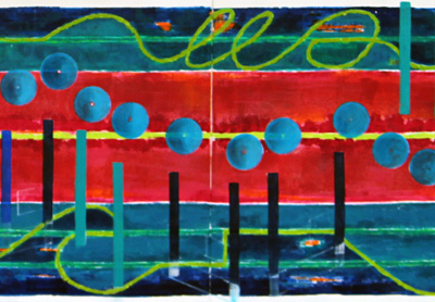
S_V_H Vivaldi – L’Estro Armonico, Op. 3, Concerto No. 2, Larghetto image7

Listening to Ain’t No Other Man (live) sung by Christina Aquilera.

Three days ago:
Here is some thought before actually doing the work. This morning, after finding a long loss link,  an article in theCityReview  about the Impressionist & Modern Art auction at Sotheby’s on May 3rd of this year. The first image is of Picasso’s Femmes Lisant (no idea how to pronounce that). What struck was not the selling price, it came up short, not the subject of the painting ( do not see that) but the colors and the rounded shape and interactions of those colors.  The personal opinion of this artist is that most of Picasso’s later works, generally from the 1930s fall short, appearing to be done just to keep himself busy.

Still, after looking at this one work, never ever seen, there is a thought that those colors, the rounded shapes, and the dark outlines, look like something that could happen.

Two days a go: It appears nothing happened.  This style of painting by Picasso, which includes Le Reve (The Dream), and another painting that this artist discovered while searching for images of Femmes Lisant, La Lecture, could not be worked into the beams. This current work is to far enough along and the attempts that where tried looked dumb  and where quickly washed off.  The plan is to look for the next work to have some interesting beams that can be drawn large enough to see what has been learned from Picasso.

One day ago: The artist remembered there where four eighth notes,  yet to be painted that could easily be done in a early 1930s Picasso style.

Today:  The eighth notes are not finished but the idea and the execution is there.

Listening to The Temptations Ain’t Too Proud To Beg.  This is a hold over favorite from the movie The Big Chill.  Jaime O today was looking at the blog site and at this painting and was wondering if the wavy lines where ocean waves?  No, they are not, those lines are this artist exercise in trying to do something interesting with the boring lines that in so many of these works, just start at one end and go to the other creating a basic straight line effect.  There is,   a lingering Mark Rothko style to the backgrounds that started with the first music painting, and continues today, so do not expect those waving lines to become a permanent style change.  They break the norm, which is what they where meant to do; but that is about it. They are there for future consideration, and that is about it.

The Who are singing Substitute followed by Chopin Waltz #3 in A Minor, Op.34/2

If you compare the eighth notes from Hallelujah, which are quite outstanding, to those that are being drawn in on Vivaldi work, you see a representation that is a lot less stagnant looking.   One of this artist goal’s is make every effort to create movement across the canvas.  Here in this work Picasso shows the way. The only thing that bothers this artist is that Picasso painted those works more then 70 years ago. All art builds on the past, but this artist still feels a quilt and a need to find, similar to Jackson Pollack quest, a way to paint differently.

Green Day Boulevard of Broken Dreams.

Final thoughts before getting back to painting: Not satisfied with the note heads. Not sure if the dark spots will hold.  Also, there is a need to pop the background.

Stevie Ray Vaughan & Double Trouble singing Cold Shot.

Scott Von Holzen

S_V_H Vivaldi – L’Estro Armonico, Op. 3, Concerto No. 2, Larghetto image5

A work of art based on the music of Vivaldi, 3 panel 24 inches by 11 feet.  Listening to
Vivaldi’s  Lute (Chamber) Concerto, For Lute (Or Guitar), 2 Violins & Continuo In D Major, Rv 93: III. Allegro. Classical music has long titles, but the best in its day may have had shorten names or maybe even nicknames: thinking the common name for Bagatelle No. 25 in A Minor (WoO 59 and Bia 515) for solo piano, Beethoven’s Fur Elise. There is so much to learn that is going to require more time then this artist can spend.

Progress note: Painted in the base color for all of the note shafts.  The dark blue is Prussian.  The shafts of the single notes are a tinted Turquois.  The inner shafts of the beamed notes are a Cobalt blue.  It is important, since a note head is never attached to the stem that they have a shade or tint of the note color to connect the two. Although, this music is soft in sound, it is the thinking that all of these stems should be painted with enough contrast to vibrate the flow across the canvas.

Listening to Beethoven’s  Piano Sonata No. 1 In F Minor, Op. 2/1: I. Allegro on Pandora. Na, this one will probable never be painted.

Strange is the effect of an art review article in the New York Times about Frans Hals at the Metropolitan.  This artist has seen a number of Frans Hals works and has always been impressed by his free use of the brush and the wonderful results he gets: there is lessons to be learned.  After reading that review last night,  using a filbert brush, and a nice blue, down the length of a couple of the Prussian shafts, back-en-forth the paint flowed.  No, it certainly was not a Frans Hal sleeve.  That was never the intention. It just seemed for no apparent reason to livened up that dark blue. Frans Hal had a reason for his brush work, no matter how freely it appears to have been applied. But when it comes to this art,  there is this lingering, guilty thought  that the artist must stay true to the music and not drift towards pretty colors and shapes that are just decorative. The problem with that thinking is that there is the real world of painting a representation of a a piece of clothing,  and this art that is attempting to paint the emotional and the physical flow music altogether on canvas.

Now, listening to Christina Aquilera in iTunes.

Look at Matisse and how decorative he was, thinking Harmony in Red.  Then there is Van Gogh and his stabbing brush work. Vincent took the real appearance of  the sky,  trees, and ground and created a difference visual perception in his short, sharp stabs of paint that is quite understandable today, unlike in his own time.  Since what they both do is art, then understandably, they free this artist to do any painterly interpretation of musical art that is wished. Wow, that a break through.  Your kidding me it took you that long to figure out the obvious?  This art is based only on one demand that each of these artworks only depict the realistic flow of one piece of music.  That is it, and anything beyond that added to the canvas is there to enhance the emotional impact of the flow.  It is simple, and this artist knows what he is doing, and how important it is sometimes to write down and discuss his thoughts.  This blog, at times, can help to clear the mind.   It is just believing that is the hard part.  Believing hard, and then harder, is what will make the dream real.

That is it, listening to Natalie Merchant and Wonder.

Ending this blog entry with John Lee Hooker and The King of the World.

Scott Von Holzen

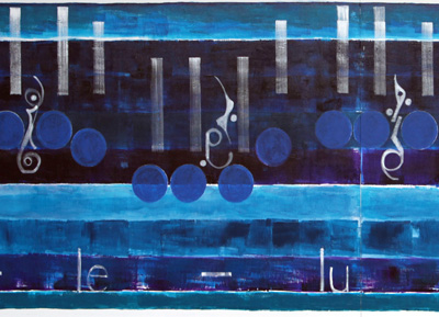
S_V_H Hallelujah image4

Hallelujah 3 feet by 10 foot.   A thanks goes out to the receptionist at work that, on her own, commented (work related humor).  That is the first since June of last year.  Moving on.

A couple of  nights before there was only empty circles, and no idea what color to use to fill in.  Then the next night, just walking down and looking at the canvas the obvious color choice of  Cobalt Blue was chosen, over Ultramarine Violet that lacked cover.  The Cobalt worked for two reasons, it stands out from the background, but unlike a lot of work in the past, it also lifts the canvas gently from the background forward.  That is important for this music.   The idea of strong separation or contrast, notation from background, can work with some music, check out Chopin’s Valse.  This music demands a smoothness of flow, and an overall picture that bonds completely  with the viewer.

To explain, those three vertical calligraphy, or  Egyptian hieroglyphs objects are quarter Rests.  Their spacing was cut to fit the notation, and surprisingly they found their own way to express themselves.  You gotta wanna, and that is what you see expressed in a work that when  finished will define, and superbly  represent, this art in 2011. Guarantee, you gotta wanna.

Scott Von Holzen