“We don’t make music – it makes us.”
David Byrne
“… music has been for some centuries the art which has devoted itself not to the reproduction of natural phenomena, but rather to the expression of the artist’s soul, in musical sound.
Wassily Kandinsky
“A painting is music you can see and music is a painting you can hear.”
Miles Davis
“Music is your own experience, your own thoughts, your wisdom. If you don’t live it, it won’t come out of your horn. They teach you there’s a boundary line to music. But, man, there’s no boundary line to art.” Charlie Parker
“Music is the universal language … it brings people closer together.”
Ella Fitzgerald
“A great song doesn’t attempt to be anything — it just is. Jay-Z
“Music is either good or it isn’t, it’s not someone’s opinion.” Toscanini / Tony Bennett
“My music is the spiritual expression of what I am — my faith, my knowledge, my being…When you begin to see the possibilities of music, you desire to do something really good for people, to help humanity free itself from its hangups…I want to speak to their souls.” John Coltrane
“Music is the universal language of mankind” Henry W Longfellow
“I good thing abut music, when it hits you, you feel no pain” Bob Marley
“Music is the sound of universal laws promulgated” Henry Thoreau
“After silence, that which comes nearest to expressing the inexpressible is music. Aldous Huxley
“Music is the reaching out towards the utmost realities by means of ordered sound” Ralph Vaughan Williams
“Music doesn’t lie. If there is something to be changed in this world, then it can only happen through music” Jimi Hendrix
“Music is life, and, like it, inextinguishable” Carl Nielson
“The pianoforte is the most perfect of all musical instruments: its invention was to music what the invention of printing was to poetry” George Bernard Shaw
“If music be the food of love, play on” William Shakespeare
“Music is everybody’s possession. It’s only publishers who think that people own it” John Lennon
“There’s not a string attuned to mirth, but has its chord in melancholy” Thomas Hood
“Music is a higher revelation than all wisdom and philosophy” Ludwig van Beethoven
“There are two golden rules for an orchestra: start together and finish together” Thomas Beecham
“The best way to get to knowing any bunch of people is to go and listen to their music” Woody Guthrie
“Music can change the world because it can change people” Bono
“You got to have smelt a lot of mule manure before you can sing like a hillbilly” Hank Williams
“You have to blame Thomas Edison for today’s rock ‘n’ roll. He invented electricity” Stan Getz
“I’ve said that playing the Blues is like having to be black twice. Stevie Ray Vaughan missed on both counts, but I never noticed” B. B. King
“I don’t know anything about music. In my line your don’t have to” Elvis Presley
“Music is forever; music should grow and mature with you, following you right on up until you die” Paul Simon
“Where words fail, music speaks” Hans Christian Andersen
“Music happens to be an art form that transcends language’ Herbie Hancock
“I don’t care much about music. What I like is sounds” Dizzy Gillespie
“Music is very spiritual, it has the power to bring people together” Edgar Winter
“My music had roots which I’d dug up from my own childhood, musical roots buried in the darkest soil” Ray Charles
“Music is the soul of language” Max Heindel
“Without music, life would be a mistake.” Friedrich Nietzsche
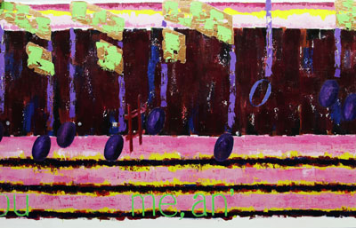
 A Chopin Waltz 36 inches by 8 feet. There was concerned that the flow of this notation would leave large areas of the canvas empty, which has not happen. The most interesting part of this drawing is the upper lines of the musical tie although they are questionable today. Also of concern is that the circles for the notes would have been a better balance if larger.

