S_V_H Closer image 1 update

This is what I now believe is the final look of the artwork layout with a disheveled Metaphorphsis2 in the background.

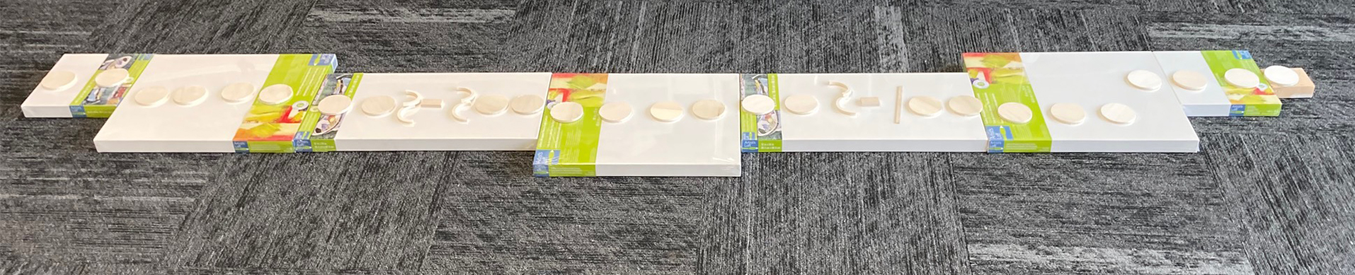
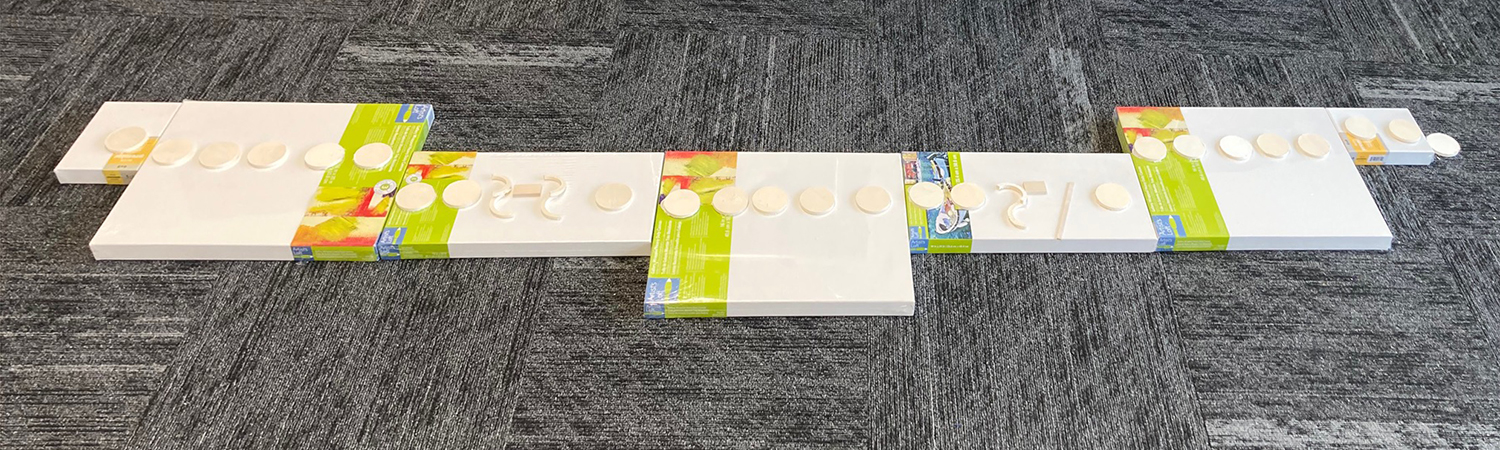
I posted what I thought was the final layout for this artwork in the previous blog entry. After returning to this layout a few days later, I did not like what I saw. It reminded me too much of the 2022 artwork, Metamorphsis2. The similarity concerned me. I wanted an updated look. I believe this current is a move in the right direction. It opens up the work but still leaves enough canvas to fill with the words “We ain’t never getting older.”

This is a late draft of the cover music for Closer.

This art is not about prettiness or technical excellence. It is about presenting a professional image both visually and in its performance that grades a very good (looks near mint until looking closer). That is the sweet spot for me. I put in my time, detail, and design in each artwork. Being concerned with aesthetic beauty, or the spectacular finish of near-mint fine-art craft would put me over the top. Anyway, a high-quality finish plagues much of today’s so-called art. I don’t underestimate the beauty, skill, and effort required to create a finely tuned and executed craft. Such art certainly has value and a big edge in today’s exhibition jurors. That may be why so much of today’s art I see as kitsch with a token hook to stand out from the crowd, or simply a piece of craft created by an artisan. See, this Washington Post article confirms some of my thinking about craft art. I am concerned with this art is will it fit in the car and will it store? Finally, does it reflect the person I see in the mirror? In the mirror, I see a face of a person who is all about what is art. When I look at my music boxes, I want to see that reflection in the workmanship and the music.

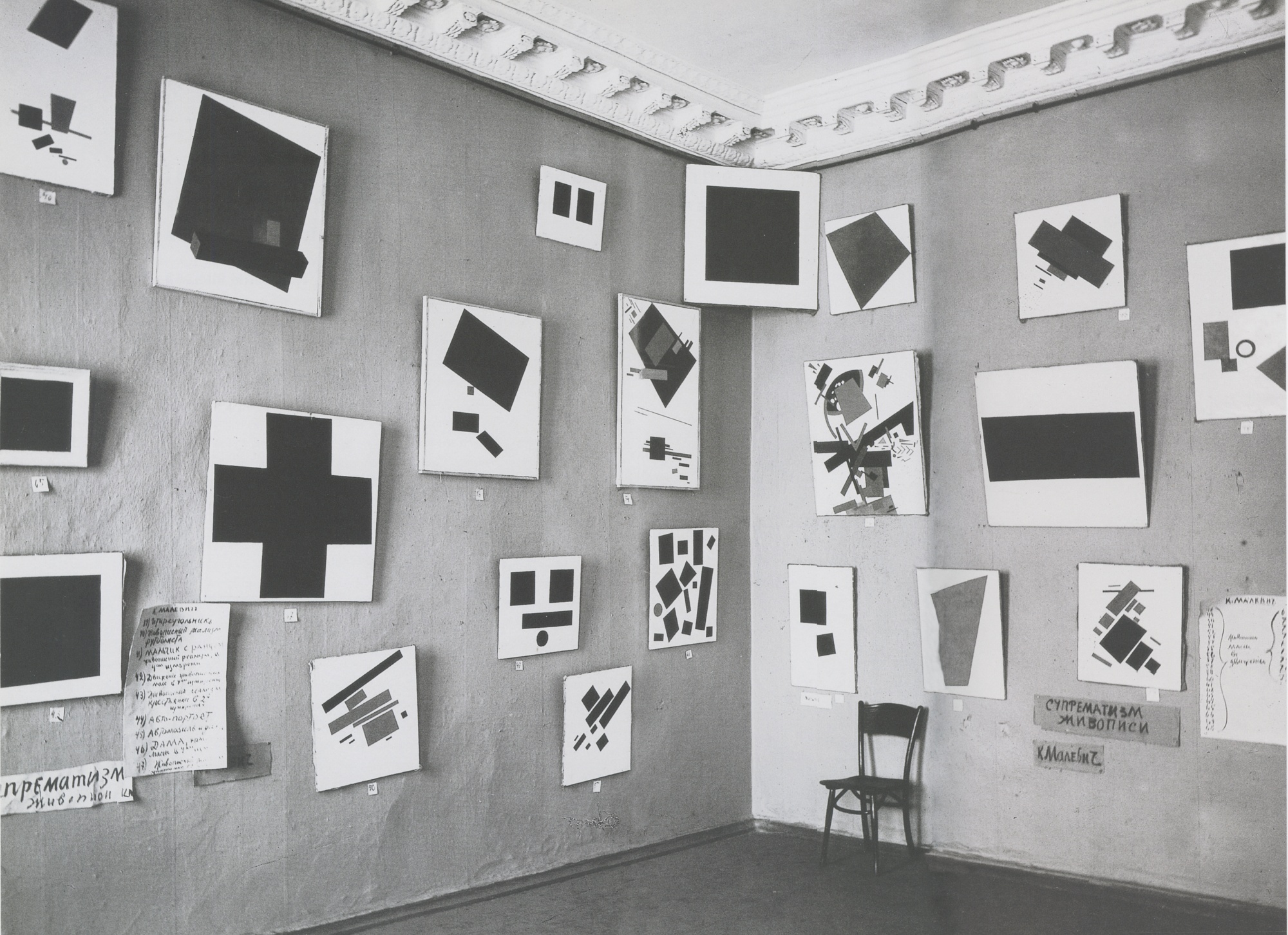
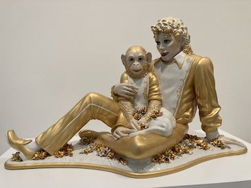
The image of Malevich’s Black painting seen below in the upper corner certainly is art, but not finely crafted. Below is a work by Jeff Koons that is also considered art. But is it art or just an expensive craft? One version sold for over five million dollars.

“It just seems to me seems to me, that only a really low IQ population could have taken this beautiful” form of expression that is art, ” It looked pretty good. It was pristine. Paradise. Have you seen it lately? Have you inspected it lately? It’s…… embarrassing”. It is all high craft and without curiosity, without imagination. Art with no purpose other than to look perfect on a stranger’s wall, or a vaulted investment. It just seems to me, in today’s contemporary art, the drive is not to create something original but to use a “hook,” that becomes a highly crafted ordinary.

MA section of Suprematist works by Malevich exhibited at the 0,10 Exhibition, Petrograd, 1915
Kazimir Malevich, 1915, Black Suprematic Square
Jeff Koons artist’s proof, on display at The Broad

Scott Von Holzen

S_V_H The music box Closer image 1

The first layout plan at ten feet works with the 3.5-inch notes I cut out for this project. Then I decided I wanted to include the incidentals.
The second plan increases the length of the artwork to 11 feet using the 3.5-inch notes and adding in those incidentals.
This third design returns the artwork back to a final length of less than 10 feet. I removed two 12 x 24-inch canvases. See the second image. I then returned to my very first image plan using 10 x 20-inch canvases as their replacement. My size constraints required that I cut out all new notes, reducing their size to 3 inches in diameter. A later decision was to replace each of the two smaller end canvases with rectangular pieces of metal.

One design factor for this new work was that its length of 10 feet did not include the speaker boxes. Usually, the added speakers mount onto the ends of the artwork. I cannot do that here because of the requirements of fitting all the music on the canvases and still keeping the 10 feet length. The solution for the speaker boxes was to use the two 16×20 end canvases for the speaker boxes. The musical notes on those canvases I will then place on a curved metal sheet. I showed an example below from Metamorphosis 2. This keeps the overall length as is, while the curved metal sheet also adds depth to the artwork. After taking a longer look at the purpose artwork, I decided I needed to reduce its length, but still retain all the incidentals. I did this by reducing the size of my notes from 3.5 inches to 3 inches.

Example from Metamosphsis2 using curved steel plates.

This is an updated draft of the cover music for the music box Closer. The music has more punch and a better up-and-down flow to the music.

The final artwork will display the three last lines from the cover music. Those lyrical lines are “We are never getting older, We are never getting older, and No, we are never getting older.” I am repeating the repeating idea that I used in the previous project: Don’t Give up. In that work, I wrote those three words probably a couple of hundred times. That many repeats won’t happen here because of the length of the lines.

Include in this art’s documentation, I will attend a reception at The Art Garage in Green Bay, Wisconsin on Friday, the 11th from 5pm until whenever I become bored. Pictures to follow. Of the seven members of EmptyWallsArt, only two Don and I will be there. All the others are attending to “family matters and shabby excuses.”

Scott Von Holzen

S_V_H Don’t Give Up followup

Me with Don’t Give up at The Art Garage

This is the artwork now hanging at The Art Garage in Green Bay, Wisconsin. The hanging, with the help of my wife Barb, went quickly and smoothly. We only forgot to check the works level, which I see is off a bit. We will correct at the reception on August 11th. This artwork is part of an exhibition of EmptyWallsArt. The rest of the members will “caravan” it over to Green Bay on Friday the 4th. Don’t Give up along with many other 3D works by the members will be on show until September 2nd.

I do not except much response to this show. The exhibition goes public; I believe on Wednesday the 9th and as of August 3rd all I see on their website is the wrong date for the reception in the listing (right side).

The Art Garage upcoming exhibitions page

To quote ColdPlay, “Nobody said it was easy.”

Anyway, I am moving on. This next project is a recent (for me that means less than a decade old) pop hit by the Chainsmokers. The live version lacks a lot of punch, and the voicing is only okay. The studio version, of course, is what convinced me to let-it-roll on what will be another interesting and desired challenge.

Here is my very, very drafty 1minute 15 seconds cover version of this 4 minute song. I put this music together in one day, and of course it sounds like I did. This cover is good enough to where I can now turn to the designing of the artwork.

Scott Von Holzen