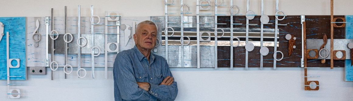

I have a number of large canvases left over from my Vivaldi Four Season project from many years ago. Three of those canvases each 36 inches by 48 inches are going to be the base for three Beatles songs from their album Abbey Road.
After finishing the music box Zombie I had no clue what song I was going to paint next. As always in this situation I would go through my to paint song list. This time, nothing clicked. I actually cross through a number of songs that I have been skipping for months, if not for years. Not on that list was Golden Slumbers, that was on one of my play lists or it may have popped up into my head while listening to Spotify while walking my dog, Zelda. The song is from the album Abbey Road, which has always been a favorite of mine. The timing of this song also felt right for me. Besides, I have always thought it was a wonderful pop melody that would be a good fit for piano and maybe the violin. My only hesitation was its release date, which was 1969, over 54 years ago.
Trying to find music that was a little closer to this current decade, I found the Spotify, a playlist of 73 songs called Best of 2000s. The list contained two songs I had already painted. A favorite was by The Killers, the 2004 song, Mr. Brightside, (no audio) painted in late 2016. The other was a 2014 commissioned work, Chasing Cars, by Snow Patrol (That was last I heard of that group). As for the rest of the music on that playlist I found I knew 17 more, but none I wanted to paint. That brought me back to the Beatles. I brought up YouTube to see if there were any covers. I found a cover of Golden Slumber by Dua Lipa.
Finding a current pop star doing a cover for this classic Beatles song gave this music credibility and a fresh connection to the music. I have always felt that of all the bands from the sixties, the Beatles would have the best chance to live on. Dua Lipa is a small proof. Finding her video lead me to another significant find that finally excited me to start another project.
The video above is of Paul McCartney singing Golden Slumbers, followed by Carry That Weight, and ending with a third song from the album Abbey Road, The End. Right away, I thought, Triptych. An artist triptych is three artworks that share a common theme, and are usually similar in size. I then checked my canvas inventory, and came up with three main 30×48 canvases, and six speaker-size canvases 11×14 inches.
Because of the size of the main background canvases, I stayed with the larger notes on used on the previous artworks, What’s Going on, and Zombie. The thirty-inch canvas height also allows two rows of notes.
These images for this triptych each show a layout for the music while keeping each work under six feet and forty-two inches wide.


I have this technical note, shown in the image of the stems, to document a change in design. This started after finishing Wildfire in January 2023. What I have done was to return to a previous idea of standing the stems on their edge in order to add depth to the music. This worked fine until I used the larger 3 1/4 wide notes. Those projects include What’s Going on, the last work, Zombie, and this current project. The problem was that the 1/2 wide wood I use for the stems is only about 10mm wide on edge. That look is too narrow for such large notes. The obvious solution would be to go to 1 inch wood, but that is expensive and would add considerable weight to the artwork. A better idea to accommodate the 3 1/4 wide notes, came from the 2019 artworks, Giant Steps and Over the Rainbow. In both works I attached to the stems, for support, 3mm plywood about 14mm wide. But instead of attaching them to the backside of the stems as seen in those projects, I am mounting those 3mm strips on the front side of the stem. It is the 3mm 14mm wide plywood that shows out to the viewer. Another equality important result in this design change is I am now eliminating a considerable amount of tedious sanding. The 3mm plywood is a finishing edge. Little sanding needed. Enough of that.
Scott Von Holzen


