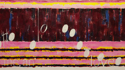
 Cry me a river right side. The words were hard to choose. The interesting part is that most viewers will never know what context the words that appears on these canvas have come from. But, they should seek out the original phrase and see how this art samples and defines its own meanings.
Some extra acrylic magenta was added to perk up more interest in the lower section finishing the base. Next added where the notes sketched in white to make sure they all fit in the space that has been provided. The number of notes is sixteen and the count on the canvas is sixteen. This phase in done.
A technical note in the past when the notes where first put down a water based oil white titanium by Windsor & Newton was used. The main reason is that these oils are slow to dry and changes and mistakes can be corrected without too much mess or any damage to the base.. The base is painted using heavy bodied, quick drying, acrylics mostly by Golden. Before the move to use acrylics for the base, there was a cost when mistakes where made and a note or sometimes many notes had to be removed, and the base repaired. That has changed with Cry.
The notes on Cry are being applied with an acrylic from Golden that is the type Open. That means it drys slower, and tonight it has worked well. A number of notes had to be erased or moved to better positions and it was easily done with a wet rag. We will see tomorrow morning how easily the titanium white is removed. This test will confirm one way or the other, which direction to go. The nice thing about the acrylics is that there are a lot more convenient colors to choose from over the Windsor & Newton water based oils.
That brings up another technical thought: there is this feeling that there are not enough different colors to create the unique individual looks each work demands. It is like there is a need for another primary color beyond Red, Blue and Yellow, and their mixes called something else. That is not going to happen without going into another dimension, which is where this art would like to go.
Until then though, with more experience with colors, creating more paintings with different combinations of mixes, should in themselves open other visual doors. In the end a dimensional shift may not be necessary. In the end it is the personnel need to keeps things interesting and not boring that will drive the colors that will keep driving the artwork.
Scott Von Holzen
