S_V_H Fine and Mellow image3

fine&Mellow_4

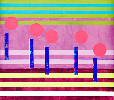
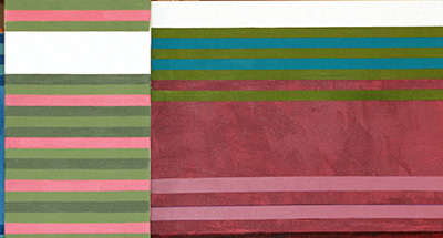
Fine and Mellow has been slowly coming together. The words for this artwork are, ‘love so fine.’  Billie’s words are, “He’s so fine and mellow.”  I have filled, with a few extra pieces of music, that colorful bowl on the far right, that ties the music.  Also, I would have liked the music flow, the circles, to have been larger to fill more of the background space. I did enlarge the  music from my original plans, but that had it limits.  What I have done since this image above, is in the spaces between the music, I have added extra stripping. Hopefully this adds interest, and improves the feel of a dark, imaginative, smokey bluesy atmosphere, of this artwork.

The pace of this artwork has been so slow, because much of my free time, my artist time,  has lately been consumed by practice, not my drawing skills, but expanding my musical skills. My artistic focus is music. Music to listen to, music to be painted, and now music to be played, on the piano, the alto saxophone, the violin, and the blues guitar.

The violin  is new to me, this last spring. I eventually see it playing Classical music.  The alto saxophone, also new a month or so ago, it is my Jazz instrument.  The blues guitar, came out of nowhere when I heard of the death of B. B. King.  I did play the folk guitar in college, so I have some history with the guitar, but playing the Blues, where all American music begins, will be my newest experience with music. The Last instrument is the piano. I have played a little keyboard, on an off for years, starting at the age of 7 years with the accordion.  My thinking is the piano is to key to understanding music theory, and is the instrument that, for me, brings everything about music together. The piano plays it all from B. B. King to Vivaldi.

Fine and Mellow is near completion, for I really do not know what else I can do with this painting. I would like to do more with it, but I am not sure what.  That means, pretty much as is,  I will have a final image out in a couple of days.

Scott Von Holzen

S_V_H Keep on Loving You image4

keepLovinYou_4

Keep on Loving you has been held up because of the Vivaldi I have pushed to complete.  Now over the next week I plan to move forward on this small work.  This is a spec work.  The person who requested this work will be able to buy this work for one-third less than my asking price, when finished.  I do not do a lot of ‘suggestions’ but at times they offer interesting challenges, to try to match the artwork to the customer, and to make a possible sale.

So what is going on with this work?  First,  I have been, and will hopefully continue to use,   a pallet that consists of a lot of the colors that where popular in the  nineteen eighties. The next step is to put in three rectangles along the bottom.  Then comes the fun part, playing with what music notation calls ‘ties’.  In music a tie is a curved line connecting two notes or more.  For me I have my own ties, and they have their own look, that has nothing to do with music, but are there to create interest, making the flow of the music more entertaining.  That how it do it.  Finally, I drop in some words that can relate to the music, but that are generic in themselves.  Lets see what happens.

Also, I have started a site on Etsy, call ArtinMusic  where you can buy a canvas print from over seventy of my works.  I have also added this work  as a print.  If you pre-order Keep On Loving You it will be at a discounted price.  That discount decreases the closer this work is to completion.  Right now you pay only $30.00 for a finished print,  instead of  final price of $50.00.  At the Etsy site you will find all of my greatest hits, mostly priced at fifty dollars each.

Scott Von Holzen

S_V_H Keep on Loving You image3

keepLovinYou_3

Keep on Loving You consists of four panels with an overall length of five feet four inches. This artwork is one of my new series  I call my mini-works. This background is now ready for the music.  I have tried to use many 80’s color shades for this part of the work. The thought is to give each canvass its own feel.  I believe I achieved that in this artwork. Next up I will be drawing in the flow of the music.

As for the color scheme for the music, ah…….I have not a clue. Picking the note color usually happens in a moment. I look at the work, and look at the colors that I have not use for the background, and I then find one that either stands out, or blends in, depending on what I believe is the overall feel of the music I am portraying.  So, is the music is in your face, or instead does it shy away, that is how I decide the colors to use for the music.  I then focus on the flow of the music. The moment that this artwork portrays actually decides the mood and the color drama I want to create.

Scott Von Holzen

S_V_H Keep on Loving You image2

keepLovinYou_2b

Keep on Loving You consists  of four canvases about five feet four inches in length.  This is an early 80’s piece of music from REO Speedwagon.  Here is a live video of Keep on Loving you:

Since this is a 80’s music I thought I would start this work using a  pallet from that time.  When I think of the eighties colors like Mauve, Seaform green, Plum, Harvest gold, and Cerulean blue, pop up after doing a little research.  You are going to see similar those colors along with other tints and shades of that 80’s look as this work progresses.  Keep on Loving you will not end with a totally nostalgic look, for I am kind-of a color wanderer when needed, and I think I  will find ways to give this artwork a modern appearance.  These tweaks in color happen because I like to contrast colors and objects.

Scott Von Holzen

S_V_H July 31st 2012 Birthday Painting

There has been good  responses, from my requests for musical suggestions, for this years Birthday painting.  This artwork begins and completes all in one day, today, Tuesday  July 31st.

The wining song for this 2012 edition of The Birthday Painting, is  Forever Young by Rod Stewart.

Here is the winning email with this years Birthday Painting:

“Hi Scott,
Finally, here are a few more to consider if you haven’t already decided – though I don’t have any baseline works of art to recommend w/them:
Simon and Garfunkel – I am a rock or The boxer.
Beatles – let it be
Rod Stewart – Forever young
The White Stripes – Jolene (Dolly’s rendition was familiar to me growing up; but I like the edge in the White Stripes version)
Have a GREAT birthday!!!!  Send me the link to the live blog so I can check in on the progress!

Thanks,”

But it was  this email which best described the feelings behind  their musical choice for the Birthday painting, and became the obvious first choice.

“Scott,

Not sure if this song will work for your birthday painting but I suggest “What A Wonderful World” by Louis Armstrong.  It has a mellow, easy going flow to it which helps me relax in my crazy fast paced life.  It also makes me appreciate the small things I take for granted everyday – my family, beautiful back yard & home, clean air & water, safe surroundings and most of all my life (being around to enjoy it)!

Happy early birthday!”

What A Wonderful World could have been easily chosen, because there has always been a feeling that this great music,  sung by the magnificent Louie Armstrong, would someday be revisited.

Unfortunately the mood of this song did not fit the theme for the 64th Birthday celebration.  But many thanks go out to Sara V for her most wonderful email and surely a future work.

Going over the list once again, I  suddenly,  grasped the words and realized what I had missed, which was Forever Young by Rod Stewart.  This song has a similar depth of  words, feelings and thoughtfulness as What A Wonderful World, but is more perky, making it a better fit.

So, I found this video:

MY GOD  take a look at those  girls and the passing car, and see how dated they look, and how dated they make this video look.

This awful video (what is the deal with that guy’s curly hair piece  near the end of the video) thankfully resulted in finding this updated Rod Stewart version:

This then lead to more searching which resulted in finding this video with Bob Dylan and Bruce Springsteen:

Bob Dylan actually wrote the original music for Forever Young,  which then Rod Stewart borrowed from for his song  also called Forever Young.

From the television show Glee, comes this acoustic version that is nice:

The search ends with another version of this musical theme of Forever Young,  called Young Forever by Jay-Z.  In the words, the mood and feeling,  this song relates well with both the Rod Stewart, and the Bob Dylan versions:

Check back ALL DAY LONG for Painting Updates.  The first should arrive by 9am Central Standard Time.

And congratulations go out to Maggie H this years winner of the 2012 Birthday Painting. She will soon receive  a signed and numbered image of the painting on glossy photo paper 13×19 inch.

There will be blog updates all day, so check back on the paintings progress.

Scott Von Holzen

S_V_H The Pretender final image

The final image of The Pretender from the music by Jackson Browne.  This first thing that is noticed is how small this painting is to those canvases that are around it.   The second perception is how strong this work stands, and how easily it makes its presence apparent in the room.  Obviously, it is the addition of the three other canvases that feel to be well placed, well balanced, and together add interest and uniqueness to the work. Although far from perfect, this artist never strives long for perfection.  Artistic perfection is a journey, a quest, an adventure, but never the goal.

Again, the colors appear, a little strong on my monitor, but a lot has to do with lighting, and this image is as close to reality as time an effort permit. Another thing that is wondered about with this type of work is how do you frame them.  I believe, to stabilize an artwork over time, a good frame is important, and yet, look at the challenge.  The thought is that someday to frame the main canvas and do cut outs around the three smaller attached pieces. Since the smaller canvases are fairly heavy and well constructed, they will probably maintain their shape well into the future, if the main canvas is well framed.

This work comes off well.  The words used can relate to the music, but they also can have many different meanings to the viewer.  The colors are varied and interesting, and they seem to all work well together, and with the music.  The work flows nicely from left to right with a soft beginning and a dynamic ending.

Now, next up is a very, very large project.  What this artist needs to do to make his statement is that is going to be attempted next.  This artist plans on over the next couple of years to do  Antonio Vivaldi’s The Four Seasons.  All twelve parts will be done on thirteen canvases starting with Summer RV 315, part 1, the first minute or so, of the Allegro non molto, which is the thirteenth work. This part of part one of Summer, just feels right to do as a separate work, especially considering how different it is from the rest of the Allegro. I do understand that there is a huge amount of knowledge that has to be learned about Vivaldi and this music, but for now I am going by this artist rules, until future knowledge says else wise

Then when all the pieces of The Four Seasons are completed, and framed, the thought is to put them on exhibition.  The plan, right now, is to put each Season in its own area and have the music playing in the background to match. The location for the first display will probably be here, where I live, and then hopefully we can go on the road, maybe to Madison, Milwaukee, and Chicago.

We shall see.  Right now this is all only a dream.  Not a single thing as been accomplished so far, besides the birth of an idea. There will be many obstacles, and not just time and money. We will all learn what this artist is made of.

Thanks, to all of you that have commented and click the Like button.  We are on our way.

Scott Von Holzen

S_V_H The Pretender image5

The Pretender 20 inches by 5 feet (1.524m) with three add on canvases.  The colors are appearing a little on the bright side on my monitor, so there is still some work to be done, to offer a realistic representation.

This week and more, have been filled with interruptions and other obligations, but no matter,  the time that is spent with this work have produced, small, but productive efforts.

The song and the words of The Pretender are soft and reflective, while still maintaining a rock beat.  This is a constant reminder when it comes to color choices.  It is important to maintain the mood of  this music, so that is why the blues and darker purples are there. The splashes of bright color add musical and artist contrasts, because, in many ways, this is an upbeat song:  it is the excepting of one’s own fate, and then getting on with it.

Musical slurs are a part of this painting. You see a lot of them on the lower right added canvas.  They have been evolving, in style, a lot this last year.  The  issue with slurs has always been how to make them stand out. That is where the different colored boxes help to do.  The boxes eliminated the need to work with the painting’s background color.

Now, after doing a number of canvases, with this  slur -in-box style, there has been some questioning. Going back to Van Gogh, again, and looking at a number of his olive tree paintings from 1889, the wonder is could Van Gogh’s late style be worked into these slurs, to open up the look?  Hum?

Hopefully this artwork will be done this week, which would be about a month spent.  That time spent is to long for a work of this size.  But, since finished works are display only a few months and then stored away, it may be time that is do to it.

Scott Von Holzen

S_V_H The Pretender image4

The Pretender the music of Jackson Browne.  Why, are there not more colors.  Sure there are a lots of reds, yellows, blues greens, and some mixture of them all, but at times, they all appear, in their groups, to be much the same no matter what names they are given.  I need more colors.  It feels limited that there are only three primary colors red, yellow, and blue. I could use a forth.  Until then I have been mixing combos like Diarylide Yellow and Indian Yellow Hue, or Quinacridone Nickel Azo Gold and Quinacridone Magenta, just looking for something different, that works.

Listening to Love Shack – The B-52’s

Not caring about those splotches of blue on the shafts.  When that happens, and it happens without notice, something is going to have to be done to make them work with the painting.  Everything evolves, and what looked decent at first can, like now, lose its appeal as other shapes and colors come forward. At times colors are tired, and then over painted, when they fail to work.  It is all very subjective: a quick look and the answer is clearly, yes or no.  There is rarely the feeling of that will have to do, except at the end.  When it is over, and time to move on, then good enough, is just that, good enough.

An artwork grows from nothing to something. It is that something that holds, at first all the big dreams and expectations of the artist.  And then, reality finally sets in hard after a few weeks, and the artist accepts what the painting always did know: time is not unlimited, but life is, and whatever that final something is is all that can be expected.  Time to move on.

Seal – Kiss From a Rose

There has been a lot of distractions interfering and limiting art time, this week. But out of all the interference and idea has developed to finally market this art. When this work is completed, that next new project, large in scope could change everything, and could span a couple of years.  We shall see.

Listening to Vivaldi – Opus 3 no2 in G minor -L’estro Armonico

Scott Von Holzen

S_V_H The Pretender image3

The Pretender 4 panels with main panel 20 inches (51cm) by 5 feet (152 cm). The color is off with the far left lower panel, which should be more golden than orange.  I will work on the photography.  There is a lot to learn for with these odd shaped works it is more difficult to get the perspective corrected.  Matching colors is always hard, but this usually improves with the updates.  Obviously, it is important that the viewer is seeing what the artist sees, and this means being carefully, and honest, when working with these images in Photoshop.

The three panels where chosen and placed to better display the flow of this music.  Adding them actually solves a problem that has existed since this art was started: finding the right size canvas to  fit the music chosen.

There has always been a limited number of canvas sizes to chose from.  Because of that, it became the common practice to drill holes in the sides, and connect multiple canvases together with bolts, so that the music would fit.   It is only lately, starting with the Mozart work, that the idea of placing canvases on top of others, just seemed the right thing to do.  This artist has in the past enjoy the creation of a couple of sculptures, made out of wood, so this, in a small way, will satisfy that desire, for now, while opening multiple doors.  The fun is just starting.

Listening to Coldplay – Moses

This size work was also chosen to offer flexibility in design and options, and to lower the cost of painting things over, if change is required.  A smaller work does lower the invested time, and can better maintain the momentum and pace for the learning and creative process to be put to canvas.  Once, the basics of multiple canvases is understood, that includes how they are carefully mounted,  it will be back to the big boys.

The Band – Up On Cripple Creek

Next up, is do more color work with the smaller three canvases, and then draw in the rest of the music flow that they will cover.  After that, my notes will  be given a color and that will decide what color options the body of the music will have.

Laura Nyro – Blowin’Away/Wedding Bell Blues.  She was a early favorite artist of a naive third year college student, staying in his first dorm room, on a big time campus.

Scott Von Holzen

S_V_H The Pretender image1&2

The Pretender image1 from Friday night.

Image 2 of The Pretender from Sunday afternoon.  This is a single panel, right now, 20 inches (51 cm) by 5 feet (152cm).

There was some time, and debate, between the finish of Mozart’s Eine and the choice to what to paint next. The original song choice was a Concerto in G minor by Vivaldi; but that would have been a big work that would have required a large canvas and another month dedicated to one work.  This artist wanted a break from that, and also wanted to do a smaller work that would use a lot less resources,  allow easier directional changes to be made, and different ideas to be tried, to see what sticks.

This artwork is an improvisation of  the song The Pretender,  written and sung by Jackson Browne. There where a number of great phrases, from this music,  that would have each required larger canvases, but  one small part of this music was found that would work on a 5 feet canvas.

Listening to B.B. King – Tired of Your Jive

The side thought about choices made: because of the shortness of time and the amount of effort that is required to complete each of these works, my thought is that once a particular piece of music is painted, I would never return to it for another canvas.  There are just too many great pieces of music still to be painted.  But, you never know, in the future a commissioned work for this music still leaves those other choices.  This is a good quality piece of music that fits well with Thunder Road and Hallelujah, in diversity and artist options.

What closed this choice of music, was watching the following video, where Jackson Browne explains the meaning of the music, and how it relates to many a working man and women’s life, including myself.  This music speaks of choices made whether we want to or not.  For now,  this life we lead, may not be the best option, but it does get us through the day.

Listening to  Little Milton – That’s What Love Will Make You Do.

Right now,  there will be two added canvases to this work, one top middle, and one lower right. Because of the impact of those two additions will be quite important, the thinking is to let this tempoary background stand as is, for now.  Next step is the drawing in of the music flow, to see where everything fits.  After that, the two extra canvas can be added, and the background finished up.  We will see.

I nice ending to this entry:  I’ll Be Back by Shawn Colvin.

Scott Von Holzen