S_V_H Heart of the Matter image5

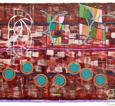
The Heart of the Matter 3 panels 30 inches by just over 8 and one-half feet. The sketch on the left came quickly Sunday night.  The weekend was spent mostly away from art, except for late Friday afternoon into the early evening.  When the painting stopped what had been accomplished of the sketch, were two straight lines, full of empty ideas. When returning home the solution for the design of the eighth beat became apparent to where it now appears to be flowing over the next quarter beat.  What colors will be used is still undecided, but there is a thought to try and not to duplicate the beams.

Van Morrison – Domino

Someone To Watch Over Me – Renee Olstead.

Bach: concerto for 4 Harpsichords.

Jackson Browne – the softer version of The Pretender.

It should be said, color choices are an important consideration and challenge for this work. So much of this art is abstraction, meaning there is no real world to be compared with. Since this is an art that paints music, the challenge is to use colors to fit a mood.   Since this music is tied closely to a single artist, the background colors came from the  different shades of brown that formed the album cover.  When it came to adding the music, this artist could then not resist brightening up the canvas for contrast, and to reflect the strength and message of this song.

What has occurred since, although, are color decisions that are being made to try and bring the background and the music closer together. Part of that can be accomplished by re-working the background, especially the more emptier areas.  This will help to create interest, and pull the background  forward along the flow of the music, to improve the blend, the harmony and unity of the canvas.

The choice of one word was done for two reasons, the three syllables offer an opportunity in design, along with the fact that it sums up the meaning of this music. Not sure of the color choice for letters, but brown was out and so was anything that look anything like a blue green combo. This green does work for starters, but, as usual, the letters will need more shaping to make them stand out to better match the meaning of the word, forgiveness.

Listening to Words Fail You – Kris Delmhorst along with the Bee Gees – Stop, Sly & the Family Stone – I Want to Take You Higher and Adele – LoveSong

Bruce Springsteen – Terry’s Song

Scott Von Holzen

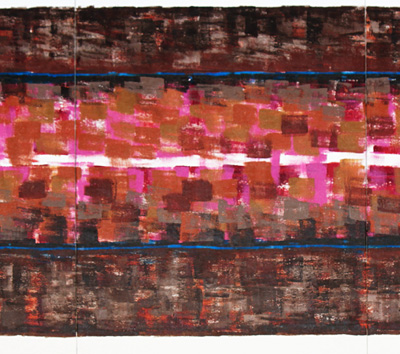
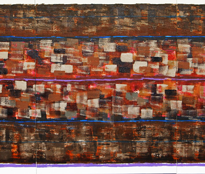
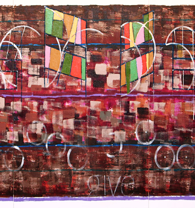
S_V_H The Heart of the Matter image2,3&4

Heart of the Matter a 3 panel work 30 inches by 8.5 feet in length.

Thoughts to oneself:  every painting wants to be the best.  They want everything.  No compromising.  No second best. They will steal from the rest, and then claim originality. They all are looking for that edge.  The search for that special look, is their quest, and their hunger.  No shyness. No fear of failure, for they know no none of that

Listening to Sparkling Diamonds – Nicole Kidman – Moulin Rouge

Now listening to Ridin’ High – 8 Ball & MJG followed by the Big Booper and Chantily Lace. The movement between image 2 and 3 is largely in the center area where the push was to bring more browns and brown tints into this area to pull this base somewhat closer to the original album artwork.  The artwork colors are always going to go the way of what works for the canvas, but since this music, unlike most of the other canvas, is tied tight to the music of Don Henley the base does show some influences.

Ella Fitzgerald – Satin Doll

This background is very dense.  Not sure that makes sense, but it does rhyme.  The colors are muted, but they certainly are expressive.  I had to walk over and take another look and the center,  zooms across the eight plus feet of this work.  These small reproductions are fair representations, but it is the size of the real artwork that needs to be seen, to clearly see what is going on with this background. This artist likes the browns, but they are not going to be a priority when this music is added.  You can see in the lines, with their use of a lighter blue, the shades of violet, that there is going to be big changes to come.

Elvis Presley – Funny How Time Slips Away.

The outlines of the beams are in place, so the next question is what colors to use.  Since the music of Heart hits you gently  throughout, a similar color theme that was used in  More was considered a possibility,  but not convincingly.
In the book 1001 Paintings You Must See Before You Die (a wide, wide range of works, with small reproductions)…… there is an image by Francisco de Zurbarán,  titled, Still Life with Lemons, Oranges and a Rose that can be seen in person at the Norton Simon museum in Pasadena. A passage in the book gives this description of the artwork, “The soft yellows, oranges, pinks, and greens……” Those colors are not unusual for classical artworks, but just their mention together,was enough to become the obvious color pallet  for this music.

Listening to:  Bon Jovi – I’ll Be There For You

Chopin: Waltz In C Sharp Minor, Op. 64/2, B 164,  forever a favorite.

Wild Wild West – Escape Club.  It happens to play at the right time.

The Heart of the Matter image 4, the colors that appear in these images, have been pushed to far to the red side.  This is the third day on this one blog post, and the mood is “..just what is going on with that background?….”     But first, the image above, shows the first few layers of colors that are the themes for the beams.   As you see above these colors do not look like any of the colors from the Francisco de Zurbarán painting, but I would like to point out, Zurbarán, (dead for 347years) probably would not have any issues with that.  The circle parts that sweep through all of those regular boring rectangles, are a carry over from More.   They are there because they create a wonderful……..

Chopin Nocturne Op.9 No.2  To good not to listen, ….carefully.

…they create a wonderful…affect in that they push this image across this canvas.  This one styling technique is a keeper, similar to the rounded notes.

This artist is tired, and need to regenerate.  Tonight, it is hoped more of the beams are colored, and that a peachy-pinky color might work for the circle parts.

Finishing this blog with Tom Petty –  To Find a Friend.

Scott von Holzen

S_V_H The Heart of the Matter image1

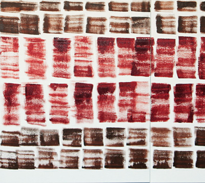
Heart of the Matter is 30 inches by over 8.5 feet in length.   This is a better size.  The 2 by 6 foot canvases are on the small side.  It is only when you move up in size that you no longer can dominate the canvas.  The rules change as the size increases.

There is little logic to what is the picture above. The beginning process starts with a bad feelings when looking at a blank canvas.  What you see is the results of using  Burnt Sienna and  a tube of Liquitex Quin Red-Orange.  Since Heart of the Matter, is a slower, and a reflective song,  those starting color choices made some sense.  For some strange reason it just did not feel right to use a three inch roller. The speed of  that way of applying paint  just did not fit the mood of this work.  The material choice was a number of dry three inch brushes, with a change from the usual horizontal direction, to short separated vertical strokes. Nothing was planned ahead.  Once the quick verticals started it was decided to keep on going.

Listening to The Boxer – Paul Simon, a favorite towards the end of the college years.

So, where do we go from here?  Well if you need to know, there is a feeling to fill up some of those white areas, but first, maybe, some horizontal lines to see if what effects they will have.  Not sure color, but probably some blues or different  tints of browns?

Listening to The Smashing Pumpkins – 1979  Do not remember 1979, except living and working up in Northern Wisconsin, and at that time, my first attempt at being an artist, was surely, in the early stages of fading from the daily routine.

Joe Williams – That’s All

Wichita Lineman – Gen Campbell  a thoughtful musical piece.

Miles Davis – It’s Only A Paper Moon.

Billie Holiday – If The Moon Turns Green

The Decemberists – o’Valencia!   Nice beat.

Scott Von Holzen