S_V_H Blood Brothers image2

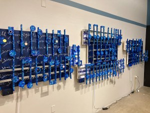
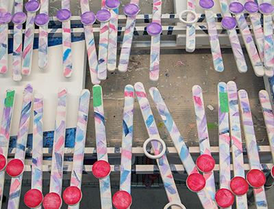
This image two of Blood Brothers I have staged to show the music before I attach it to the background.   My original idea was to attach two photos of me and my two brothers.  The first image placed at the beginning of the artwork would have been an early childhood image with me holding Jeff the youngest.  Then at the end of the artwork I planned to place a recent image of us three brothers.  The more I thought about this artwork and the great time being spent on its creation,  I decided to eliminated the photos.  I do not produce a lot of artworks in a year.  A personalize artwork would hurt its meaning.  The theme of this artwork, the bond of brothers, is  universal.  I left the photos out of this project and instead changed the white color of the music’s disks.

Instead of photographs representing my brothers,  I picked three different colors to represent we three brothers.  For the top section of the artwork I painted all the disks blue.  That color represents my brother Jeff, and the color of Chevrolet blue, that is his business over many years.  The middle color is a violet color to represent Roger. Violet is a color band from the Rainbow flag.  Finally, I choose a red color for me.   I have always signed my artworks in red.  That comes from Frank Lloyd Wright’s signature.  I did a paint test of these three colors.  I went with the artistic norm of the day and painted them in plastic solid colors.  Solid shades of color that I call baby colors did not look to be a part of the artwork.   Changing my mind, I took a damp cloth to remove the paint.  I stopped when my random removal of paint resulted in a look that worked with the artwork.  I then took a file and scraped each note hastily.  I then lightly sanded each disk.  Last,  I applied a light-colored  glaze that matched the note color.  There is some thought behind why I damaged the paint.

This art made a breakthrough with the artwork, Will the Circle by unbroken (rejected this year, my the Trout Museum SECURA exhibition).  I gave that artwork a rough worn look that I thought better represented the story of this classic country song,  and early Country Music.  I continued that look and idea of that theme with Blood Brothers I think the lyrics of this song tells a story of struggle, personal flaws, and faith in a family no matter the shortcomings or misunderstandings.  Maybe this music speaks to life full of complicated conflicts. That is what this artwork reflects in its lack of exhibition quality prettiness.    No bright, perfect art here. There is enough of that crap out there already.  Here you find bits of the truth in canvas,  wood and paint.   This art’s meaning is in the emotions of seeing that first paint scratch on your shiny new car, the red wine spilled on white linen, that decision you should have never made,  or the perfect life, that you never had.  Each morning we pick up the pieces of ourselves, and press on.  So it is with this artwork.


Scott Von Holzen.

S_V_H Stairway to Heaven Final Image

stairway_finalIn this final image of Stairway to Heaven I have moved away from the video as my color guide. For the rest of the wood enhancement to this painting I decided to go with colors that work with the existing color theme. Late into every painting, including this one,  my goal is to bring the over all look of a painting into harmony, a double entendre of sight and hearing.

Here is my take on this painting: Times they are a Changin.’  This is not a large work in my Catalog,  but by the standards of most people of modest means, which have been my art sales clients,  have a  lot easier time finding wall space, and justifying the cost,  for a 36 inch artwork than they would one this size..  All galleries, that would consider hanging this painting, always have to deal with limited wall space. Their walls are already filled with art. To make room one for Stairway a gallery would need to remove at least two or more other artworks.  That is probably not going to happen unless my sales pitch is exceptional.  That is why I mentioned the 36 inch artwork limit which has these advantages over even this size work: faster to produce, lower price, and a lot easier to market and sell.  There are no trade offs by going small.  I give every artwork the same amount of care, ability, and creatively.  The main advantage in size is greater visual impact.

Looking at Stairway, I can see the size effect,  but I can also see that I could have used smaller canvases in an irregular shape.  Doing anything besides your standard artwork rectangle would have created a more dramatic visual look. That may then counter size impact, as long as the limited amount of open space on a small work is not overly busy or cluttered. I do not have this option in the unfinished artwork Satisfaction, but I do see me moving philosophically, to that 36 inch length, in the next project which is Please, Remember Me, sung my Tim McGraw, followed by When Doves Cry.

Scott Von Holzen


S_V_H Stairway to Heaven Image 2

stairway_2Stairway to Heaven, second image, you can see this work taking on its own unique character.  I took a close look at this video and saw some of the lighting they where using.  You can see this in a snippet I captured from the video:

stairwaysnippetI then went totally abstract and did a mix of related colors spread all over the straight shafts you see above.  I am not trying to be fancy and am attempting only to replicated some of the colors of this video and their chaotic movements, such as, a blurry Robert Plant.

This is again the link to the video that the coloring for this artwork originates:

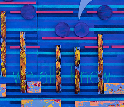
My words for this video “We all Know,” offer, what I always try to accomplish, multiple meanings for the viewer.  As part of this art since the beginnings their placement has been slowly changing. That is another discussion, but now words have no exact location, only a place in harmony with the Artwork.  That change in thinking is helping the Art of the Artwork to evolve from the restraints of the music.  Someday the Music will only be the starting point:   One day One that comes from One finally will be Two.

Scott Von Holzen

S_V_H Stairway to Heaven Image 1

stairway_1This is the first image for the artwork Stairway to Heaven, composed of three canvases 56 inches in length by 24 inches.  Over the years  I have considered, but never felt convinced, to paint this great rock classic song, or any other music by Led Zeppelin. I now realize that this avoidance reaches back to the day that my musical connection became personnel.

I was a sophomore in high school and on Sunday, February 9th 1964,  the Beatles, made their first black and white television American appearance, on the Ed Sullivan show.  It was the influence of The Fab 4 that formed my early musical tastes.  That meant that I ignored the music of Led Zeppelin which I considered to rough, to loud and to hard to listen to.  Instead I favored The Byrds, Crosby Still, Nash & Young,  The Mamas and the Papas, The Beach Boys, Ray Charles,  The Four Seasons, and Simon and Garfunkel, more so than The Rolling Stones, The Animals,  The Zombies, The Kinks,  Sly and the Family Stone,  Jimi Hendricks, or Janis Joplin. I do remember a moment when the influence of the Beatles was less when I made the rare album purchased of the 1970 record, Live at Leeds, by the Who.  To this day, though, I have no interest to listen to Heavy Metal music, or even classic Punk music.

After 46 years since its release I am now painting the music of Led Zeppelin one of the earliest hard rock bands.  Stairway to Heaven is a needed step forward in the broadening of my musical appreciation.

Here is the YouTube video where I found the color plan for this painting. Do not waste your time watching this entire video.  For all the positive reasons for liking a live music version I am afraid this example of Stairway to Heaven is awful.  Throughout this video I sense that Robert Plant is not into the music.  This is especially noticeable in the dramatic last section  of the song, after the guitar solo,  where Plant’s voice seems weak and disconnected from the music.


Here is the better studio version of Stairway to Heaven:


Scott Von Holzen


S_V_H Waymore’s Blues Image 1

waymore1aThis is my first artwork based on a Country song by Waylon Jennings’s  entitled Waymore’s Blues. This is another of many examples that the root of America’s music originates from the Blues, including Country.

First up is the studio version of Waymore Blues:

Now, this is a lot more interesting live version.  I like the back-en-forth conversation Waylon has with himself and the woman next to him.  She certainly  has the country look,  that leaves me wondering what is going on here. Waylon seems a little unsettled, and out-of-place compared to her.

This artwork is 20 inches by 60 inches in length.  For the background I wanted to use colors that depict a Waylon Jennings style.   Shades of blues became the obvious choice to portray his rough blue jean look.  Looking for another color that choice became obvious: brown, for it is hard to ignore Waylon’s full head of hair. As a nice contrast I added a strip of Silver which I see around the rim of his hats. I also added to the background my own stylized version of Waylon’s logo, which you see it in many of his videos.

I know the color Black is also a dominate color for Waylon,  but I am saving black and white for the music.  Those colors come from his guitar.

Embed from Getty Images


S_V_H Purple Rain image3

purpleRain_3

An Artist’s music can live forever, but they don’t, and if  touched by them, maybe this tweet says it best:
Thinking about how we mourn artists we’ve never met. We don’t cry because we knew them, we cry because they helped us know ourselves.     — Juliette (@ElusiveJ)

Here is a beautiful tribute 2 Prince Rogers Nelson, by a co-worker and extreme fan,  Shawn S.

I was and not I am even more focused on doing my best to make Purple Rain the painting a fine example of contemporary musical art. For What it’s Worth.

With this image you are seeing the music flow in place. Working with wood, and then attaching it to the canvas is a learn as you go experiment.  For example,  after gluing the music on to this canvas,  I had to figure out how to carefully remove dried glued wood from fragile canvas.

In this work two of my I beams dropped out-of-place, and needed to be removed, and re-positioned. It was not until I applied heat from a hair dryer to these misguided sticks,  that the damage to the painting dropped to almost nothing.  I was lucky that the move, and the repairs worked, and the painting is back to original condition. All of these mistakes are well deserved, and paid in full by a self-taught artist that is pushing Musical painting to extremes.

I am aware that when I start each of these artworks, that when finished they all fall a little short, have minor flaws, or don’t quite meet my expectations, and yet that works for me.  With each of these painting I start out with high expectations, and then slowly the artwork takes on almost human characteristics. May be a little of me moves into them.  Anyway, when completed they become,  a lot more real then perfect. Much more alive than, lets say, any Digital artwork. It is that human touch,  that ends up in them, that makes each of these artworks a part of me, or what connects us.  Each is an example that tells this artist that the best is yet to come.


Scott Von Holzen