S_V_H Embraceable You Final Image

embraceableYou_Final
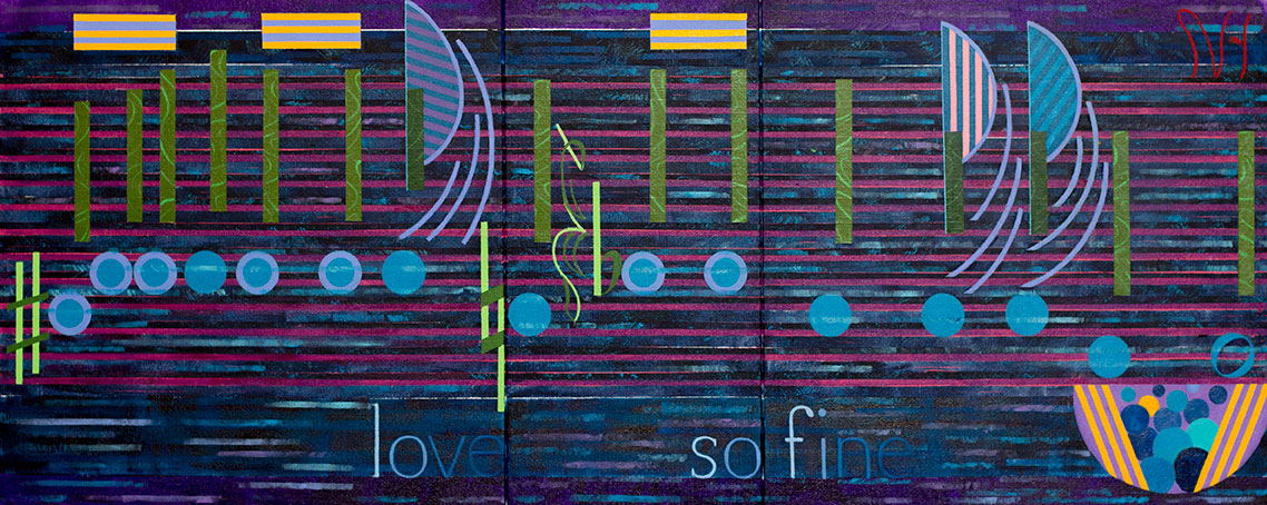
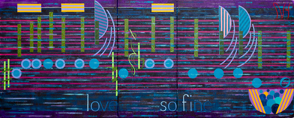
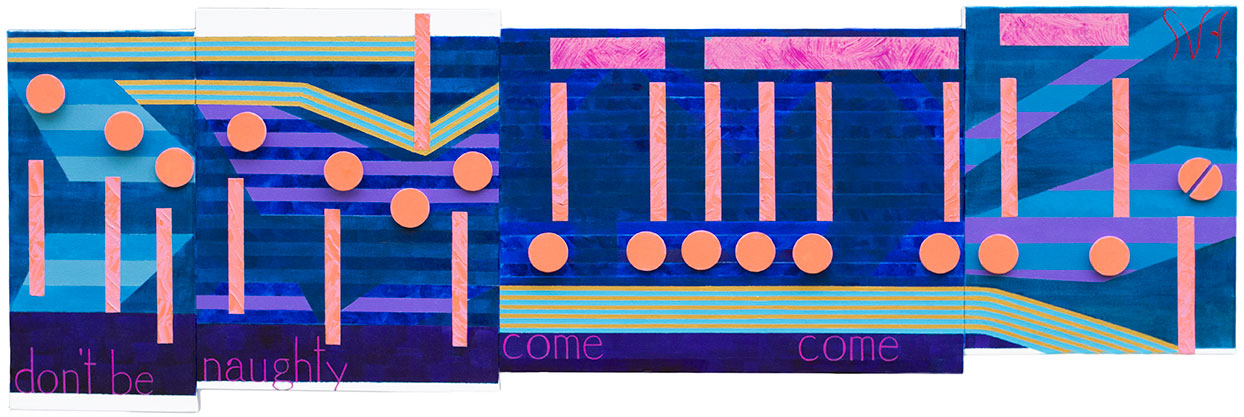
Embraceable you is finished. This painting comes from a Jazz Standard piece written  by George Gershwin in 1928.   This artwork consists of four canvas panels over sixty-four inches in length, and is larger than I had originally planed. What changed this artworks dimensions was my decision to add extra words, and then increase their size.  To make room for the larger font I needed to use larger canvases, which then required me to enlarge the music.

In the original plan I wanted to keep this artwork on the smaller size because of this music’s absence of drama (no slurs or ties, no flags, or beams), but my focus  changed from the music to the words to at least add some interest. That changed in direction created  a problem, absent if I would have used smaller canvases, of what to do with all that space between the music.  After a couple of, what I would consider,  tired attempts at stripping I realized I had nothing. That is when I turned to the painting, I Won’t Dance, a Jerome Kern Jazz Standard from the same time period as Embraceable you.  I Won’t Dance uses Art Deco treatments to mirror the times, and I thought a similar look might work with Embraceable.

IWontDance_Final

To start with I added narrow gold and blue striping across the entire work. That gave it the Art Deco look which did greatly improved the interest and the character of Embraceable.  I then repainted some of the original stripping to improve the contrast, and to blend better with the music.

I actually had to learn like this work. It fell out of favor early in its development, probably because of the changes I made to the original plan.  It got worse when I  questioned the colors used for the music.  I felt my color choices, chosen for their feminine look, where to close in tone which made the music appeared to have a plastic  look.  It was not until I added the Art Deco touches that I realized that the music worked fine with the new look of background.  In the final image you see how everything came together.

My feelings for this artwork have certainly changed a lot since I first chose this music.  I now think Embraceable You does achieved an interesting,  and unique look, that I like. This painting should feel very good about itself, getting out of me, what it needed.


Scott Von Holzen


S_V_H Embraceable You image1

embraceableYou_1

Embraceable You is larger painting consisting of four canvas panels measuring sixty-four inches by about twenty-four inches high.

Here are three different videos showing different styles for Embraceable You. Many of my artworks try to do the same thing by displaying different looks from one panel to the next.  I do this on purpose to better show the versatility that is in the music.  By using variety in looks I can, in this one way,  then push this art way beyond the limitations of sheet music. That has always been my goal since I started painting music. Music has no limitations, and so should not this art.

First,  is an upbeat version of Embraceable You from the 1943 movie Girl Crazy sung by a young Judy Garland.

Now,  compare that performance of Embraceable You with this one by Wynton Marsalis at the 1989 Newport Jazz Festival

And here is, I believe,  the 1947 Bluesy recording of Embraceable You, Commodore 7520B, sung my Billie Holiday that made it into the Grammy Hall of Fame.

This may seem obvious, but an important point that most music,  like this one piece, can have multiple interpretations.

Surprisingly in image 1 you are seeing a  style change in this artwork. What created this change was my decision in how I was going to handle the lower parts of the first two canvases.   These two canvases contain the main words chosen for this artwork, and I had a concern that the stripping I had along the bottom of both panels would not allow the words to stand out. The easiest solution, one that I have used in the past, was to darken the background where the words where to appear.  That is what I tried with a darker green.  What I found myself doing, though,  was backing off the color to allow the under stripping to stay visible. I decided to go against a solid block look I original thought that I needed for the words.

When I removed a small strip of tape, that I had forgotten along the lower edge, the original stripping remained.  At first I thought that this mistake needed to be over painted,  and then  I saw a new opportunity to finish the background in a different way.  I could still do the stripping, similar to what I have done in the past,  but now I would apply a transparent layer across the entire painting.  By taping sections before hand,  I found then I could keep the uniqueness of each panel, but create a result that brings all four canvases together as a single artwork, representing a single piece of music.

Finding a way to pull this work altogether was an early concern for me because of this music. My stripping, for this painting,  consisted of the two end panels having a similar coloring,  and the second and third panel each portraying a unique look.  This kind of diversity is a common technique I have used before, such as in Heavens’ Wall, but for this music something did not feel right.

To try to resolve these misgivings I did try ideas to shade or draw in some curves and lines to break up the background stripping, like in Heaven’s Wall,  but I washed off all of my attempts.  It was not until I pulled that small piece of tape, that I saw my answer. In a way, I am reversing the look of the background. Now, instead of trying to cover up, or break up, sections of the stripping, I apply tape to cover up some of the original stripping, and then paint over the entire background with a  transparent color  I accomplished the goal of pulling all four panels together, removing my misgivings.  This then is new look for my backgrounds that may  allow me to involve away from the experimental Cubist and Futurists ideas of line and shading.

This blog entry has taken some extra time, so here is Embraceable You with the music flow in place.

embraceableYou_2

Scott Von Holzen

S_V_H Fine and Mellow Final Image

+fine&Mellow_final

Fine and Mellow is finally finished. For its size this painting took forever to complete. Well  at less it felt that way.  I must admit things drag on way longer after I heard of the death of B. B King.  At that moment I could not stop spinning the Blues. Since Fine and Mellow is a Billie Holiday Blues song, with a great video, and B. B. King is the Blues, the Blues kept flowing through me. It is if it was hard for me to let go. I could not move on. Surely, during this time the death of my favorite Uncle, Walter, and our cat, Roxy, must have played a part. And yet there must come that moment, that we all understand, that Life is for the Living.  So this is it. After I post the blog entry, I am returning my music choice back to Quick Mix on Pandora, letting everything go including letting B. B. King fall back in place with the other 99 channels on Pandora.

Fine and Mellow, consists of three canvases about 20 inches by 50 inches in length. All during this painting, I have had  my concerns, after watching Billie Holiday sing this song with such great accompaniment, that I would have a hard time capturing that music. Of course, as always, I have to remind myself. I know that every painting starts out as if it is all about the music, but they all end up in some way a tribute to the music, but more so, an artwork that stands on its own merits. Sometimes I wonder  if the music is my excuse to paint another painting.

Looking at Fine and Mellow, it looks its best when the lights are lower which allows the background to stay dark. The brighter colors of the music are still there, but all those blues, in the background, take on more depth with the lights turned down. Surprisingly, What stands out with this work is the background. For a change I let the music flow float behind the background layers.  What caused this change in thinking was that the artwork looked boring compared to the black and white video. The stripping across the music woke this painting up.  At first I striped only the music flow, but that changed, and by letting the music blend more with a background, this painting found its own way to stand out from my other works.

This is a second final image, that I finished this morning. I added a lot more stripping across most of the major parts of the music, causing the background seep a lot more to the surface, and finally creating the look I wanted from the start.

fine&Mellow_finalb

The nice parts of this painting are my use of the color yellow and those shades of green. The words I consider to be well done, in how they blend into the background, an important part in helping to define the feelings of this painting. But the winning aspect of this artwork, and the biggest improvement is without doubt the strong emphasize given to the background stripping. All those different colors and shapes in the stripping greatly effected the mood of the entire artwork  with the added feature of filling in empty spaces with interest.

In the video you see this back-en-forth between Billie and the musicians. One of the goals of this artwork was to recreate that movement with the contrast of the background with the music. Like in the video, everything has to come together to succeed, and hopefully that is also happens in this artwork.

To end this blog entry and this special Time with Billie’s Fine and Mellow, how about spending a few last minutes with the Blues and B. B. King,  singing “When It All Comes Down (I’ll Still be Around)


Scott Von Holzen