S_V_H Blood Brothers image2

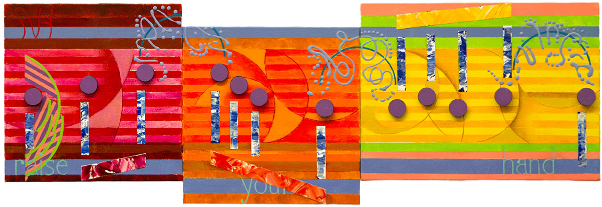
This image two of Blood Brothers I have staged to show the music before I attach it to the background.   My original idea was to attach two photos of me and my two brothers.  The first image placed at the beginning of the artwork would have been an early childhood image with me holding Jeff the youngest.  Then at the end of the artwork I planned to place a recent image of us three brothers.  The more I thought about this artwork and the great time being spent on its creation,  I decided to eliminated the photos.  I do not produce a lot of artworks in a year.  A personalize artwork would hurt its meaning.  The theme of this artwork, the bond of brothers, is  universal.  I left the photos out of this project and instead changed the white color of the music’s disks.

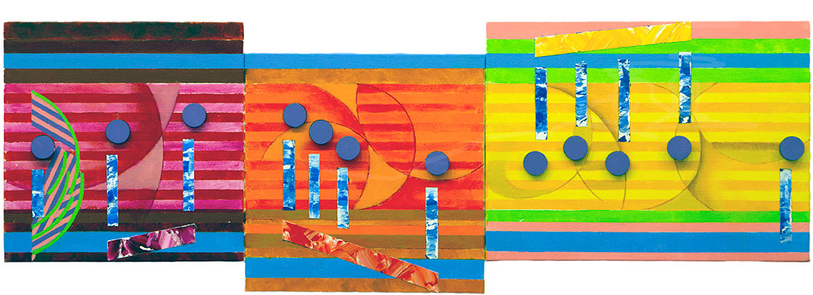
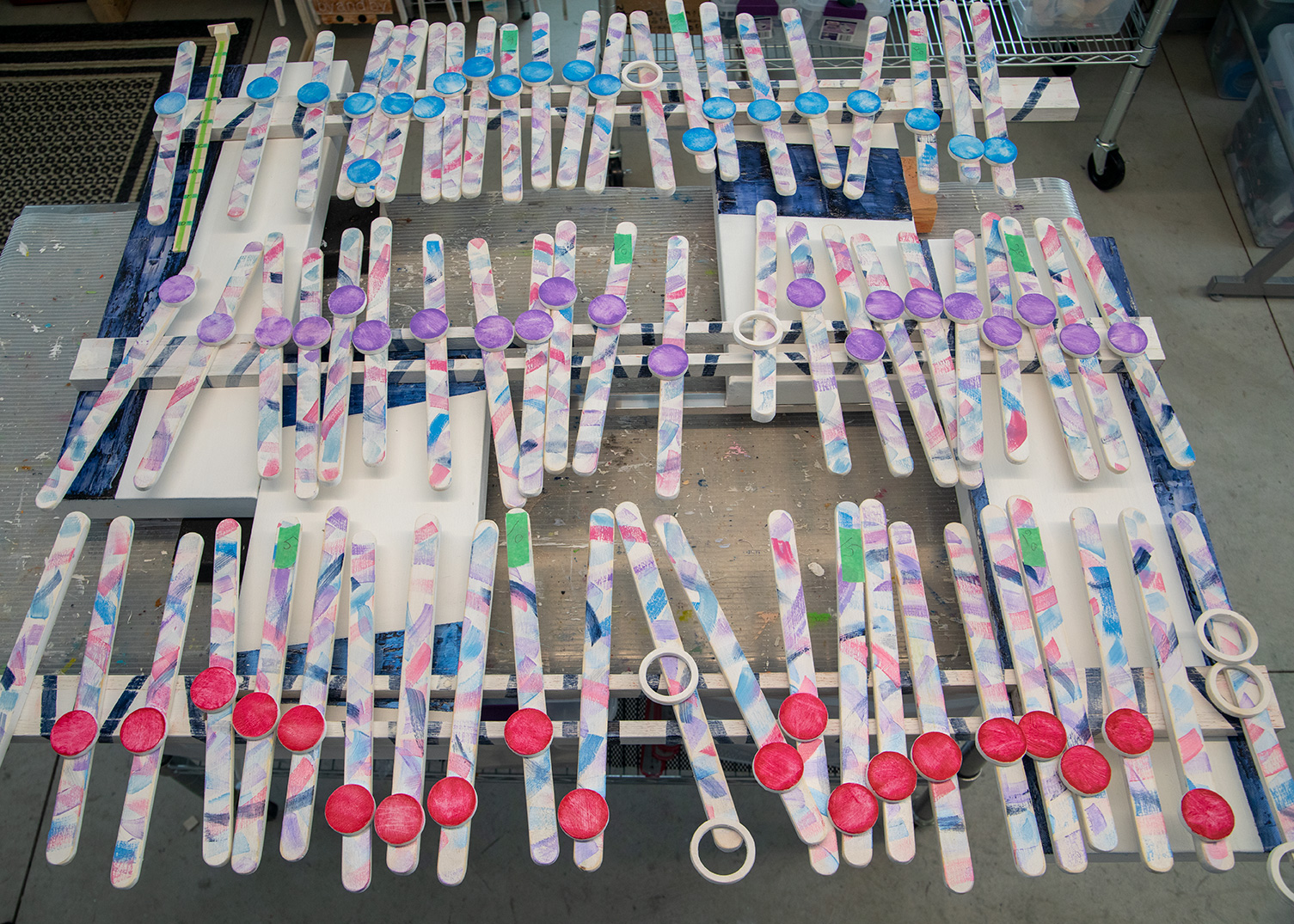
Instead of photographs representing my brothers,  I picked three different colors to represent we three brothers.  For the top section of the artwork I painted all the disks blue.  That color represents my brother Jeff, and the color of Chevrolet blue, that is his business over many years.  The middle color is a violet color to represent Roger. Violet is a color band from the Rainbow flag.  Finally, I choose a red color for me.   I have always signed my artworks in red.  That comes from Frank Lloyd Wright’s signature.  I did a paint test of these three colors.  I went with the artistic norm of the day and painted them in plastic solid colors.  Solid shades of color that I call baby colors did not look to be a part of the artwork.   Changing my mind, I took a damp cloth to remove the paint.  I stopped when my random removal of paint resulted in a look that worked with the artwork.  I then took a file and scraped each note hastily.  I then lightly sanded each disk.  Last,  I applied a light-colored  glaze that matched the note color.  There is some thought behind why I damaged the paint.

This art made a breakthrough with the artwork, Will the Circle by unbroken (rejected this year, my the Trout Museum SECURA exhibition).  I gave that artwork a rough worn look that I thought better represented the story of this classic country song,  and early Country Music.  I continued that look and idea of that theme with Blood Brothers I think the lyrics of this song tells a story of struggle, personal flaws, and faith in a family no matter the shortcomings or misunderstandings.  Maybe this music speaks to life full of complicated conflicts. That is what this artwork reflects in its lack of exhibition quality prettiness.    No bright, perfect art here. There is enough of that crap out there already.  Here you find bits of the truth in canvas,  wood and paint.   This art’s meaning is in the emotions of seeing that first paint scratch on your shiny new car, the red wine spilled on white linen, that decision you should have never made,  or the perfect life, that you never had.  Each morning we pick up the pieces of ourselves, and press on.  So it is with this artwork.


Scott Von Holzen.

S_V_H Heaven’s Wall Final Image

heaven_Final

Heaven’s Wall is finished. This little work, only 40 inches in length, turned out to be an experimental artwork where I changed up my style.   One new change occurred in the background where I added curved lines on each panel. I then shaded along those lines to blend out some of the stripping. This accomplished three things:  added motion to the background, broke up the stripping (a more musical look), and finally created overall a large amount of added interest.   This I followed up with another exercise in drip painting.  Although I answered some questions, and accomplished what I wanted to,   I still do not have consistent control, or a comfortable feeling towards dripping.

That first flow note on the left I manage to create a different look based on an earlier work, Fine and Mellow.  I like the use of the colors pink and green around that note,  Those colors where also used in the far right panel, which helps to unite the three canvases.

Heaven’s Wall is my first artwork that has a feel for Gospel music, although I probably would not say that this is a Gospel piece, more Rock than church choir,  the music certainly is up lifting and the words do have a Gospel message.  The decision to paint Heaven’s Wall came easy.  I was out walking, and wondering what I was going to paint next, when this song played in my headset.  I ignored the fact I had recently finished another Bruce Springsteen artwork, The Ghost of Tom Joad,  maybe because the timing of the music fit the time I was in at that moment of choice.

Tomorrow,  I will embed a video about this finished painting in this blog.  In that video I could say something which inspired me to create this painting, but I will probably not.  At this point my only thoughts are I am glad the project is over,  lets clean up,  and put together the next  artwork, to see if I can do better.

I start each artwork with lots of enthusiasm, purpose, thought, and dedication.  When finished  all that euphoria that went into the painting has all emptied out, in what you see in it.   The finished work is then left alone on the easel, waiting its turn to be slowly moved about, from here to there, until it finally finds its self stack, losing its identity,  one among  all the others.

Scott Von Holzen

S_V_H Heaven’s Wall image 3

heaven_3This is the third image, of artwork of the music called Heaven’s wall.  The flow of the music is in place.  What is left to do is add three ties, the words, do clean up, and hopefully finish this painting tomorrow.  The final step is the clean up process in which I sharpen edges, touch of the paint, and add interest to those areas in the background to improve the contrast of the music and the background.

What else is new is that I worked on the three-dimensional look of the artwork, which is hard to see in the image above. I did spread the paint on thick for my beams and my shafts.  I also lifted the musical flow off the surface of the canvas at those spots where I will add the words.

This is not a complicated work, and not a large work, but what I keep discovering is that size means little in these painting.  I have this silly expectation that I can complete smaller works quicker, and in that way I can increase my production of artworks.  So far I have never seen that happen.  It takes about the same amount of effort, and time to produce each artwork no matter its physical size.    The larger works do need a little more paint, a little more time to spread that paint,  and more canvas,  but the materials, and way more important, the time to complete different size works I have found to be negligible.  Still,  because of common business practices,  my charge difference between  a large artwork that is six feet in length, in comparison to a three-foot painting, has always been considerably more. That makes obvious sense and is a good reason  that I should do larger paintings,  which give a greater return for my time spent.  In the past I have done larger painting, of course not for the return, but instead because painting big works is a lot more fun to do, and for their greater visual impact.  But that thinking, lately, has changed.

I still like painting large works,  but lately I have seen a dramatic increase in the cost of shipping of long objects.  This has made the pricing of many of my earlier larger artworks a lot more difficult. It is hard to balance what I think is my perceived value of a painting, and the final cost of that painting to the buyer.  Since most of my potential customers live hundreds to thousands of miles from me,  that extra cost does become a  consideration for doing smaller works.   Even a greater persuasion for me to produce smaller painting is the reality check that none of my customers, so far, have been collectors.

My current buyers are people who do not want an artwork to dominate an entire wall, like the art for the art itself, and have limited funds. What that means is that they want small works, to a point that even three-foot in length may be too long for their needs. This is all good for keeping my  shipping costs lower,  but it also does suppress my asking prices.

I understand this art has never been about money, but it would be nice to at least cover my time.   Going beyond that, the biggest advantage for painting smaller works may be the practical consideration that they will take up a lot less storage space.  That means I can stack more discounted priced artworks, instead of only a few large premium paintings, in my limited studio space.  Wow, that is a relief.
Here is a live version from a Bruce Springsteen concert in Perth in 2014:

Scott Von Holzen