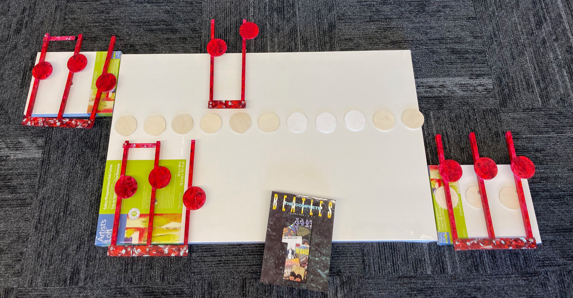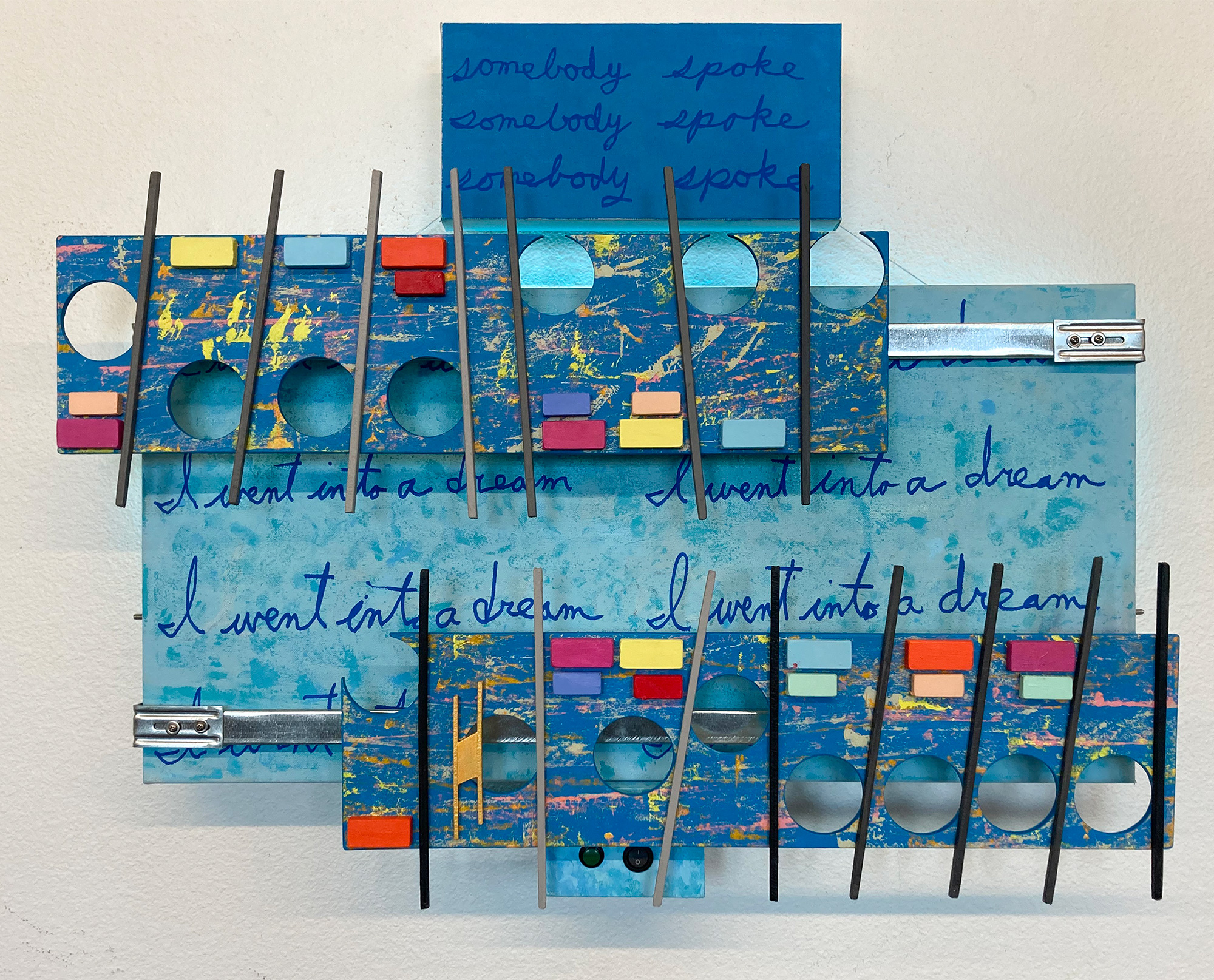
This tiny artwork took two weeks to complete, which is about half the time of the larger works. Future minor projects will go faster if I make these small works a series and use a similar template. The reason for this size is to fit better in smaller exhibition space, allow me to take more artworks to an exhibition, and finally to have a price range about half that of the larger works. I do not know how complicated they will become, but they will, and when they do, allowing two weeks, pricing them lower by fair for me, that amount of time allowed for each project seems reasonable. I do like with this work how easy the decision was to try new ideas. I can see already that innovations will happen faster, along with expense and time savings, for these small works are less risky.
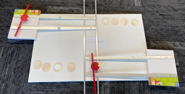
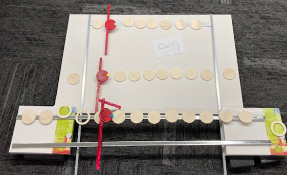
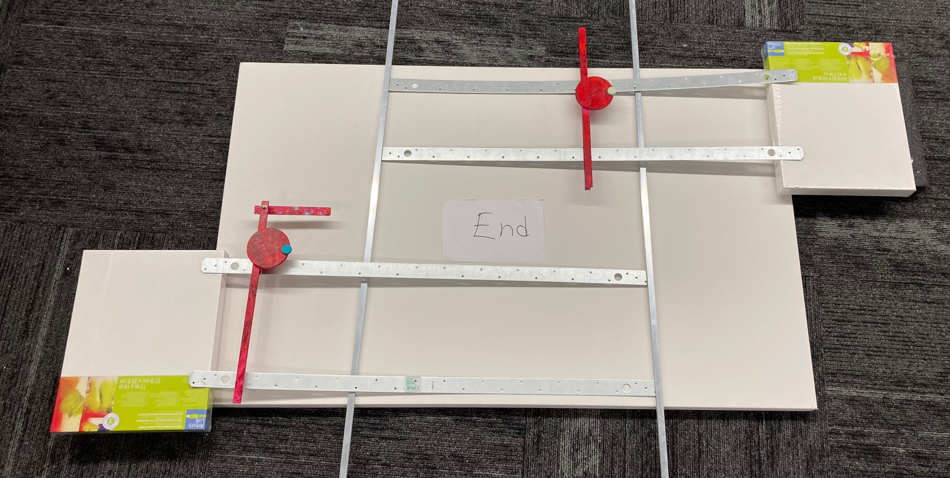
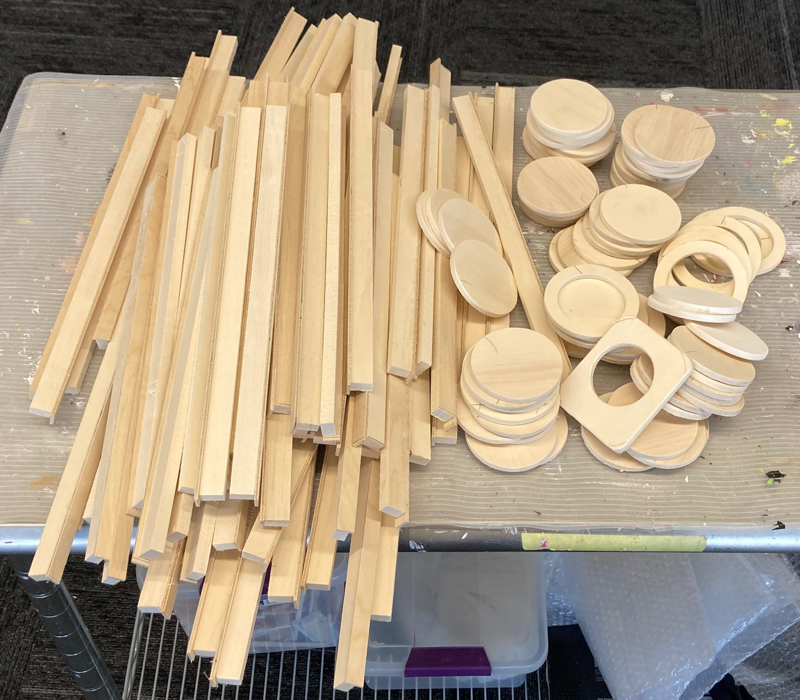
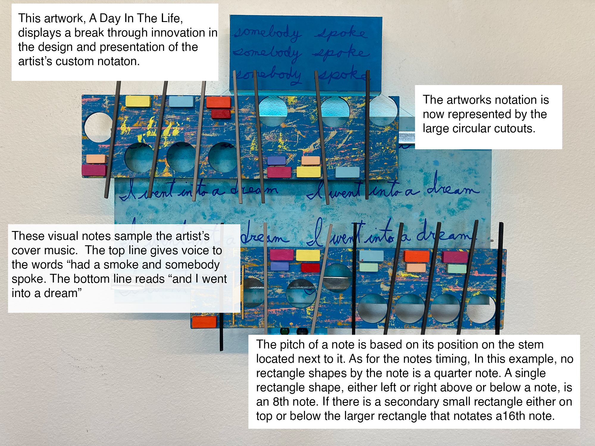
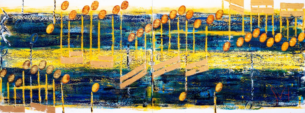
For example, the stereo system for A Day uses a one piece 2Watt system. Compared that to the much larger Zombie, that requires an expensive 20 watt system comprised three separate components and larger speakers. The benefit of that is a much better sound system. Another time and expense saving for small art is in the simplified custom notation, explained in the image below.
Of course this innovation and style change requires a better attitude towards small works. When I first looked at this tiny artwork all alone on a twenty foot by ten foot high wall, it looked lost. To change that look and to help promote these tiny works, the plan is to place a big artwork in between a group of these small works on each side. This type of presentation would actually create for the viewer a back-en-forth movement between the pieces, creating a striking and positive visual between big and small artworks. To make this work, first I need an attitude change from big art that reflects big music to small art that points to the music. And the game of chess was the answer.
I enjoyed video games when they first became popular. I remember the original Nintendo and my favorite console, Sega Genesis. Overtime I realized that playing video games took too much of my free time. I stop playing. It is only recently I returned to gaming by playing chess online. I always play against the chess bots. They allow me to stop and go whenever. More important, playing against the bots reduces the stress of competition while teaching chess strategy, stimulating and challenging my thinking. I would have thought creating art would accomplish a similar goal, but it appears not to with de Konning. All this came to mind when I saw my first photo standing next to this tiny artwork. After exhausting all of my small art remarks I knew it was time to come up to an alternative approach, compare to all my previous failed strategy for creating small art. Then I realize I could compare this art adventure to a game of chass. I saw these tiny artworks symbolically as the pawns in a game of chess as well as in the art market.
Pawns in chess are the weakest chess piece. Unless they are not. The pawn is the only chess piece that can turn itself into another piece, including the game’s most powerful piece, the Queen. I am not going into the details of chess on how the lowly pawn can win the game, but I do see a comparison between the pawn in chess and my mini artworks. I see if played right, these tiny works of art might be the right move forward (pawns only move forward) that I totally underestimated in the past.
Thinking of the art market as a strategy of chess helps puts everything in its place. In comparing a pawn in chess with these small works of art my current plan is to move these little artworks forward one step at a time with the help of a companion Queen or Rook. Each step forward in chess is like a step forward for small works of art, bringing them nearer to the other side of the chessboard, or, in art terms, the upscale market. It may be possible to turn pawn art into the queen of the contemporary art world.
Optional: Commentary about the where, the why, and the reasoning behind this art, my current observations.
For almost two months I experimented with try tele visit therapy suggested by my doctor. Part of my routine was to note my thoughts before and after a session. One note of mine that stood out, that seemed to put my art and my therapy into a firm perspective said this, “Everything would make sense……if this art sold.” I do not remember any reaction or comment from my therapist. But I knew what those words meant and that conerned me. It was soon after that I saw the end of my tele visits was near. The more I thought of those words, it became clearly to me that I needed a honest examination of what was my motivation to continue down this art path, for I was feeling that after 18 years and 755 blog entries, this art’s momentum felt stagnate. I was wondering if I was losing my sight of this art’s message.
Years ago this naive and enthused want-to-be artist found a message to paint and took that first step forward. Over time that first step became a step, another and then it turned to the left, then a step back, then a turn to the right was followed by a step backwards, that then surprisingly became two steps forward, which lead quickly into a spin around two steps back. To now to here eighteen years later. I cannot help the feeling that I am strangely standing near that same first step. Why do I feel that?
As I have mentioned, the marketing of this art or “…getting it out there..” has been challenging, with some enjoyable moments. Most of those came in the early years when this art was two dimensional. I ended selling early a dozen artworks on Etsy with the last sale in 2017. The next sale came in 2021. I welcomed it reluctantly, for it was a favorite of mine, “Walking in Memphis.” That one sale did confirmed in me the importance of this art over the money. Soon after I took the sister artwork of “Memphis,” The Blue Danube, of the market adding it to my personnel collection.
Now, in 2024, I am pushing forward with A Day in the Life, hoping that it will be the first of many mini works to find a market, the large works failed to do. These smaller size works also be a better fit in a residential space. For now, I am letting go of my overly youthful art idea of a museum wall. The reasoning is simple: this art has struggled over eighteen years to define even the smallest existence of a market. Then if there is no market, why do I keep painting music? Why am I creating musical artwork after musical artwork that rarely travels beyond the studio? Unexpectedly, I was reminded again why I paint music.
I was looking for a podcast while doing my (must be short) strength exercise routine. That is when I clicked on the podcast: Make Art not Content. I felt relatable to its title and how I obviously approach art. I scrolled down and found this episode: “What Every Struggling Artist Can Learn From Taylor Swift’s Rise.” The podcast tells a story of how Taylor saved her career and turned it around to where her stardom is now bigger than ever. The podcast summarized her accomplishment by offering other struggling artists three pieces of advice learned from Taylor’s experience: Find your allies. Make your journey about something bigger than yourself” and finally “Make more art.” I wondered, could my loyalty to this art be bigger than me, and that is the driving force of this art for the last eighteen years?
Throughout art history there are hundreds of images, of people playing musical instruments, dancing to music, singing music, listening to music, character images of music notation, and lots of abstractions depicting music, but nothing displaying the actual music as the subject. That is where I came in. I saw that and thought I found my unique art niche. I said then and believe now that this art has always been about the idea of combing art and music into what I define today as one meaning. Sales are also nice, but if this art was about the money, I would have stopped its evolution early on.
In our living room hangs the 2009 artwork Canon in D. I sold more Etsy prints of this one artwork than any other. I see why. It depicts an art style of sheet music that is appealing in its design and subject. I could have continued painting in this way dozens of other great songs. I am convinced if did that I would I would have quickly found my market as the portrait painter of a song. But I did not. I did not because I thought this art was about combing art and music in an ever higher, undefinable artistic levels of expression. That was the original goal. I have always thought that the meaning of this art was simple: keep the momentum going and all will end well. When asked the why you do this (a rare event) I have said I wanted someday to answer the question: “Did he make it?”
That thinking continues to this day even after eighteen years, because this art has presented me with unlimited opportunities to express and to grow my knowledge of art and music. I may never think I am at the end of combing art and music together into one meaning? I truly feel there are still unlimited amounts of techniques and styles I have yet to discover to take portraying a song to the even higher levels of artistic creativity. As I think through Taylor’s strategy, I remembered that when I first started this art I surely thought I had the time to find my market and to reach my goals. But that was eighteen years ago. I don’t know if I have eighteen more years to see this art, though. I see my time to build up this art verging on the words; I don’t know. The plan is to keep pushing this art hard forward with no further hesitation to reach a point where others may want to take up the challenge. The quest is a final combing of music into art and art into music that defines both meanings equally.
I do not want to forget Taylor’s third technique for success: Make more art. And the key to that success is to work fast. Maybe my quicker little pawn art has arrived at the right time. If so, for now everything makes sense…...if this art keeps growing.
Scott Von Holzen