S_V_H Love is All Around image1,2 &3

loveAllAround1


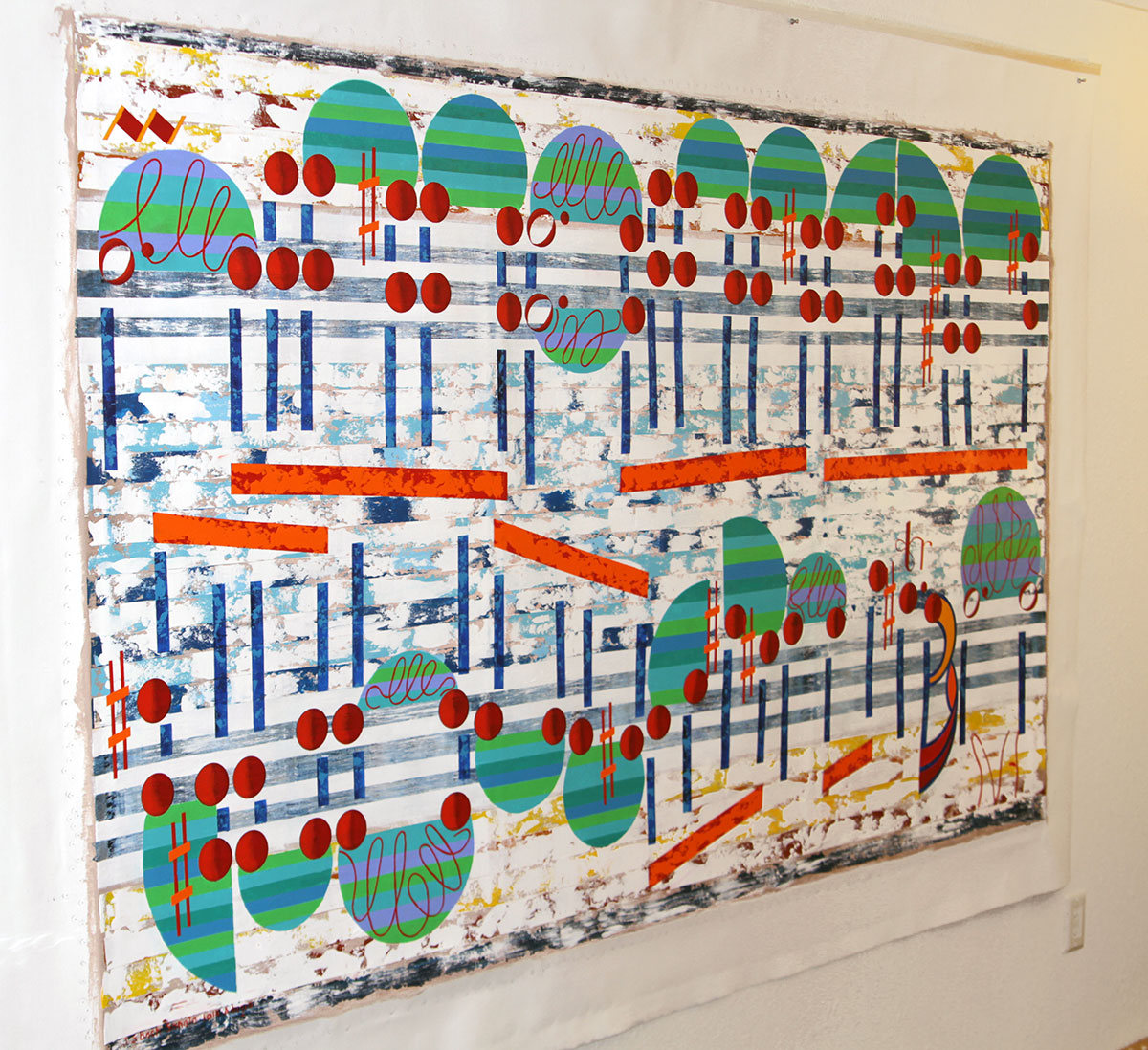
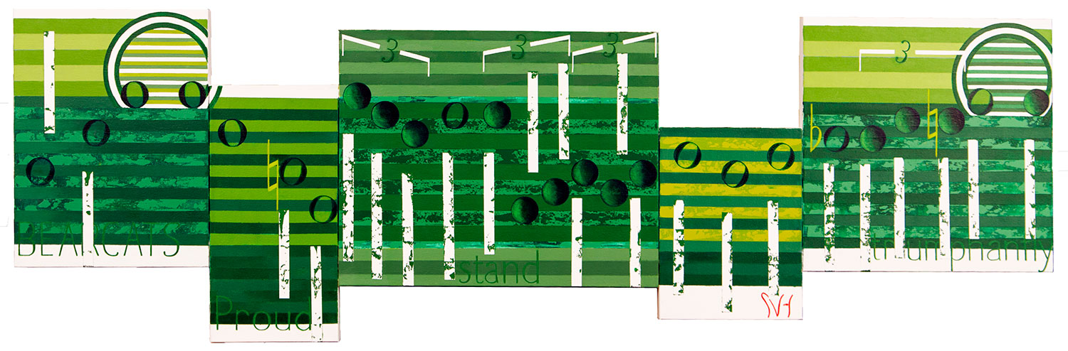
Love is All Around consists of 5 canvas panels 69 3/4 inches in length by a  height of 39 1/4 inches.

The Troggs original version of Love is All Around 1967-68 peaked on the US Billboard charts at No. 7.


Wet Wet Wet version is from the 1994 soundtrack to Four Weddings and a Funeral, that became another hit in the U.K.

loveAllAround2


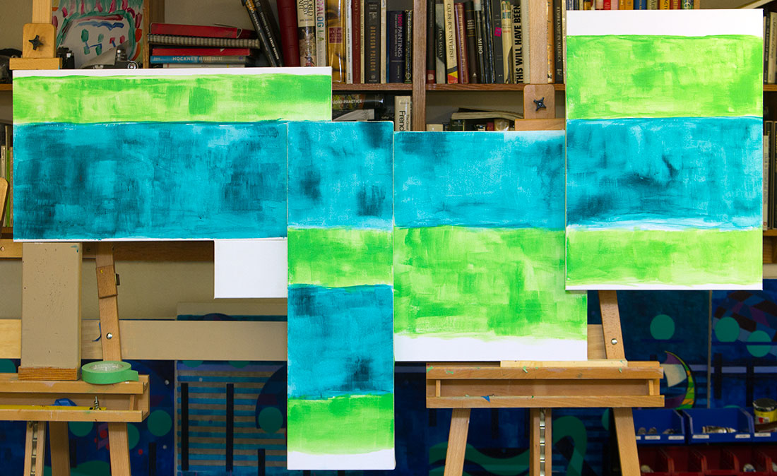
The first image of Love is all Around is from Monday. The above image two is from Tuesday evening.  All images that are image ones are about putting paint to cover parts of the white canvas.  It is about making that first statement. It is about making those first assumptions. It is about just getting it started.  A lot of work has already gone into this work. One of first steps is finding those interesting parts of the music. Then next is seeing what parts I like that might fit in the length of the work I chose.  Next, comes finding the canvases to fit the music, which requires trials to see what will work, and how the pieces will fit together.  Then there is a final check to see that all the music will fit correctly into the spaces provided, and that all the measurements are correct.  If that all makes sense I finally flipped the canvas over and screw and bolt them together. Now the artwork can be put on the easel.


loveAllAround3

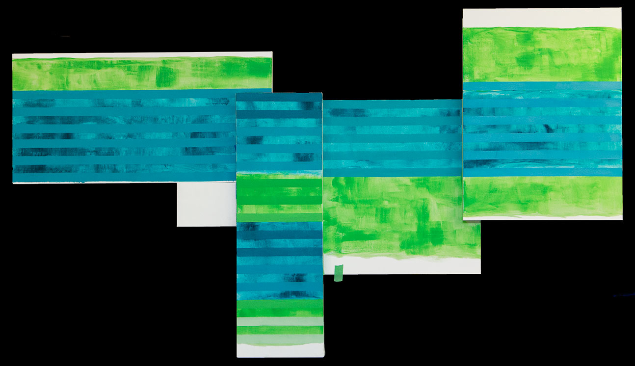
Love is all around third image Thursday. I have taken some lessons from the 17 foot Vivaldi, still in progress,  standing next to All Around.  In the Vivaldi I used some stripping but unlike Take Five, I kept some open spaces. The method I used in the Vivaldi to create the feeling of winter snow in these areas was to strip them with my homemade squeegee.  I created stripping in a freer way, which is something I have decided to try to do more of. Last night I put down the first strip, a turquoise color, over the blue-green, and I thought it may work.  Tonight I knew exactly what I had to do, and that was to re-strip these area with a slightly lighter green. That worked to blend all the colors together, and helped to tone down the darker color, which allow the other, more formal strips to stand out.  Now I am happy, and near the finish for this background.  For now.


Scott Von Holzen


S_V_H Bach BWV 1065 & BWV 1014 Update

DSCF9922

The Grand Bach Hotel in Kyoto Japan.  These are two photos sent to me by my one contact in Japan, Asako Takigawa.


DSCF9923


Here is a new image from the newly updated website of the Grand Bach Hotel in Kyoto Japan.  And yes, that is my painting.  I would never have thought back in 2006, when I started this journey to portray music, that I would  paint not one but two Bach’s paintings both where meant for this grand hotel.  Only one made it to Japan.  The second painting BWV 1065 is what you see.

grandBach&Me

The first artwork, BWV 1014 hangs today tacked to the wall in my studio.  Eventually, it I will have to frame it for sale. For now, I like it just where it is, close to me.   Scott Von Holzen


BWV1014

S_V_H Wings of Victory final image

wingsOfVictory_finalWings of Victory final image. All through this art project I was uneasy about the direction I knew I had to go. I needed to stay the course to satisfy my own expectations, and hopefully those of Northwestern Missouri State University.  I even struggle with the signature.  This is a green painting, and my signature is a special red. I could not place it to the far right bottom, always my first choice.  Putting it here or there, up or down, left and right, just did not seem to work. Eventually, I put it on the far right of the first far right canvas where it would fit.  I tried to finished the night before with the signature, but each time I drew it in, I erred and had to wash it off.  I was not sure this was the right place, or that the signature was the right size, so I gave up that night.  On Monday late afternoon, I took my brush and signed the work in the same spot as the night before.  The signature was the right size and the right shape.  I filled in the color and that was it.  I stood back and looked at the work and at that moment I realized that adding that signature was all this work needed.  Those three red letters brought the entire work into perspective and finally I have a satisfying feeling with this effort, and this artwork.

Wings of Victory was an interesting challenge, with me working almost exclusively with a color that I use everywhere on everything, but still not one of my favorites. I live in the blues. With all the problems  and repetitive frustrations over not being totally convinced that I had found just the right shade of green, this artwork still became a finished piece. The world is full of unfilled promises, goals, aspirations, dreams, that in the end would not fill a 3 and 1/2 inch floppy disk.  This work cost be a terabyte, but it was worth it.


Scott Von Holzen