S_V_H Stand by Me image3

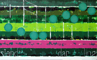
Stand 24inches by 6 feet.  There was some hope that more could have been done before taking this picture, but sometimes it takes time for the ideas to develop.  You see, this is not a clone of Hallelujah.  This work would not let that happen.  It is clear it does want the best from the past, but it also demands to find its own solid footing.

Building on the past is important, for this artwork comes from way inside, and is never part of any master plan or really any ideas on paper, beyond the basics.  Those current basics are fill the canvas with multiple sections of color and try to create as interesting a background as possible.  Then when the flow of the music is down, go back over the background and make the open areas even more interesting.   The flow of the notes is always from left to right with all of them being the same size and colors to keep the flow moving. Words are used if words where used in the music.  The signature is generally done in Light Red and is put in an empty area and large.

This work is slowing growing in meaning.  It will still take time to move away emotionally, from Hallelujah.  Each of these works have a strong emotional bond with the artist that lasts till it is removed the final time from the main easel.  The bond is then broken, and the spiritually relationship between the artist and his work slowly make the transition require in order to move on.

It has been interesting, when updating the website with past works these last few days, how much has been forgotten, including the names of the works.  What a surprise.  So much from the heart is put into each of these paintings, some much of the focus is concentrated that plans for starting the next, never mature. So much emotion is put into the choice of the music that is  has to be played each night.  So much is given to create the best possible artwork, that it is strange to see how quickly everything that has been done is forgotten.  Life is always about moving on.  Life is a lot about forgetting the past. Life is a fleeting remembrance.   Thanks to this blog and its real purpose, the documentation to preserve the story of this artwork, the artist survives to paint another day.

Artist note:  This is the 161 blog entry and still it appears this blog is reaching no one.  That is understandable.  This artist knowns he can do more to make things happen.  This artist also knows it is going to take time.  This artist knows….but.

Listening to Aimee Mann’s It’s Not from her album Lost in Space.  That song set the mood for this night.  Also The Stand By Me music that is best like, and played each night is by Playing For Change.

Scott Von Holzen

S_V_H I Call Your Name image5

I Call Your Name,  but what do you call this artwork of the same name?  The one response that was heard was Art Deco.  That is interesting for Art Deco is an artistic and design style that is much appreciated, but never figured into what has been painted.  Still, the look is great and today the feeling is that this is an artistic moment.

These realizations have occurred a number of times in this artistic career, with the last being the Birthday painting.  It has been that way for over the five years of this art project, and over the next ten years there is going to be many such moments, each better than the last.  That is how it works, that pause that surprises, is what keeps the artist moving forward, no matter the cost,  at all costs.  It is these few moments in the many hours of painting that are the nudges, the pat on the back, the unexpected complement, the self realization of just why all the effort is worth all the effort.

On the bookshelf are are dozens of Art Books that detail that path taken by hundreds of Artist, each deserving, each rewarded or not based almost on a flip of a coin.  There are no guarantees, there has never been a naive understanding of what needs to be done to overcome obscurity.   That point is what good does a creative artist accomplish if the work does not get seen by other artists and the influence, hopefully grows which just drives the moments further.  It is fun, the dream, the challenge, the goal, no matter, it is all worth living. If you got it, you gotta do it.

Scott Von Holzen

S_V_H I Call Your Name image4

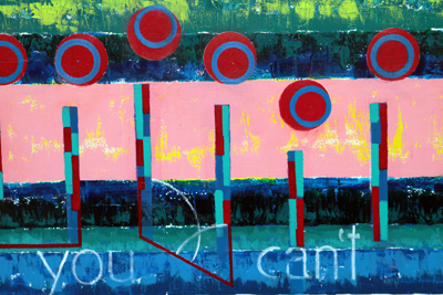
I Call your Name has gone in a different direction from image3.  Image3 was posted three days ago.   But since then it has been a struggle, a frustration, a disappointment, a concern, a triumphant,  and the awareness well understood,  that this journey will absorb a lot time, sometimes with  little to show. The time spent was with the problem with what to do with the notation, boring, been there, done that.

With Call we where back to oblong notation because the thought, from the previous work, a Chopin’s Valse that it was time to abandon the circle note.  The reasoning for that came about because circle notes  just float, and do not appear to be moving. That appearance of motion has always been important. You can see that emphases grow over the years, with the sharply raising of the angle of the notes done to create more movement.  A constant problem although, was the need for precise drawing and balancing, of the look of these notes over the entire canvas, required considerable time and effort. This was fine, at first, because the notation was considered the most important part of these artwork. This changed over time as a better balance in value caused an emphasis change to create better, and stronger backgrounds.   The quality of the backgrounds improved to where they can stand on there own, with or without the notation  Over dozens of these canvas the same drawing techniques where being used for the notation.  This has resulted in the same basic appearance of the notes from work to work: oblong with traditional style shading.

Then when the circle worked in Naive Melody with the eighth notes, it was thought that the circle could also worked for the notation.  After painting circle notation in Winter, and  No Sunshine, it became obvious that the notation appeared to be floating on the canvas  without the look of movement. In the last Chopin Valse work this became the issue.  The only thing that helped Valse was the extensive range of the notes, and some different tones used on the notes.  Shading the circle notes did not work like it did with the oblong note. The final thought with Valse was that this would be the end of the circle note.  With Call Your Name, a twist to that idea was tried.

On Call the notes where first put down as circles.  Then inside the circle it was attempted to draw in the the oblong notes.  This seemed a good idea because drawing the circle provided precise top and bottom locations.  The notes appear more rounded, then oblong, top and bottom, while the sides where drawn inside and the outside of the circle was then removed.  Some of the fourteen notes started to look good, so it then was felt it was time to shift the attention to the notation stems to see what could be done with them.

The note stems development has been stagnant over the last many works.   Imagine hanging  just above this computer desk is an example of the frustration in finding a unique way to portray a straight vertical line.  Basically, it has been that way, since the beginning of this art. The note stem is a vertical line, and its representation in this music has been important to help connect the notation and to pull the edges of the canvas into the picture. Then a thought occurred out of nothing:  the long rectangle line could be widened, like what was done in Naive, but instead of painting in  one smaller rectangle inside the larger one, two lines would be drawn, with different colors and lengths.  It then soon because obvious, that some of these inside rectangles, could be drawn just a little differently, and they could then easily come to represent piano keys.  That last revelation closed the deal.  These artworks are about music, and to just draw objects without any reference to music, seems at times too decorative: pretty color shapes adding up to being nothing more then filler.

Finishing the stems for the fourteen notes, and standing back,  those oblong notes now appeared not to work. They seemed out of the flow and appeared, style wise, less original.  They just did not seem to fit with the other looks going on this work, and it became obvious that they where going to require a lot more work to just to make them all look similar to each other.  Maybe, it had to do with the large amount of time spent on each of these canvas to draw and shaped the oblong notes, that had finally reached its limit. But, the circle, as a representative of the notes,  had a big issue: they have a float look but not a movement look.

The problem was how to use the simpler to draw, and certainly a huge time saver circle note, bit give give them a sense of motion. There was no compromise to be made. Either that circle had to move or it was go back to the oblong shape.  Out came the art books as the search began.  The Van Gogh technique of  small square dashes of mixed colors, executed at a angle, was the best that could be thought off as of yesterday night.  An earlier in that evening, an attempt at drawing  oblong notes inside the circle notes was tried, but that looked dumb. They were washed away and the angled brush strokes was all that was left to show from that nights work.

This morning the search for inspiration continued, all art build on the previous.  Nothing else came out of the Van Gogh books, but those short mixed brush strokes.  Nothing jumped out no matter how many pages where flipped though, or how many Georgia O’Keeffe interesting abstract works where viewed.  Then  grabbing  the first book of the New American Abstraction series, there it was on page 288, a circle painting by Alexander Liberman,  called Sun II.  It is a red circle painting with two smaller circles drawn inside.  The one circle was a  small solid but more importantly,  the other larger circle was a  line in yellow.  That was it, the circle as a line. The  idea was to draw the notation as a  large solid colored circle, and inside that draw a smaller circle as a line shape, and place it randomly about the outer circle. The sporadic placement of this inside circle appears to throw the outer circle out of place, and ah.. aha….motion is created.   Once again the door opened the way forward for this work and more to come.  And once again there is incentive for the the artist live on to fight through another day.

Scott Von Holzen